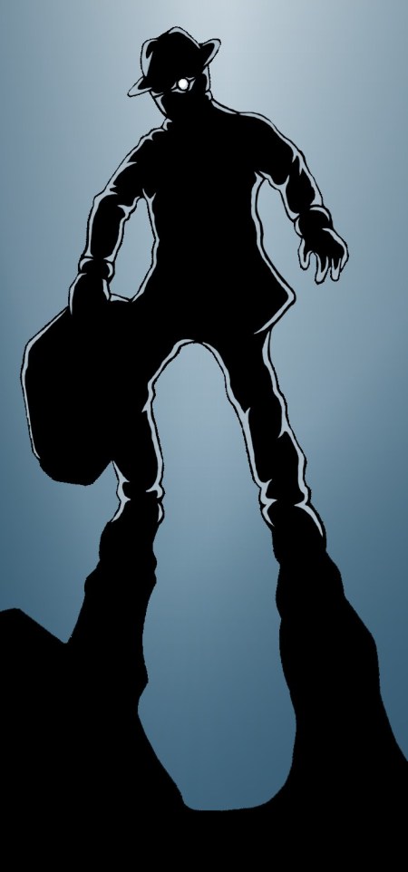
Having some free time today I felt like experimenting a bit, this being the result:

Antagonist Baby Face in a suitably menacing pose. What's in the case? You'll have to wait and see...
Again it seemed a cold mood was in order so I used a similarly restricted palette of blues to my previous concept of Scratch but placed all the focus on the character – Baby Face – and removed scenery altogether going for a super abstract silhouette. Having recently read Frank Miller’s Sin City: The Hard Goodbye I suppose this started out as an attempt to emulate him to some degree, however I was also considering the dark suited villains of classic Noir and the way their presence would be emphasised through high contrast lighting and threatening shadows.
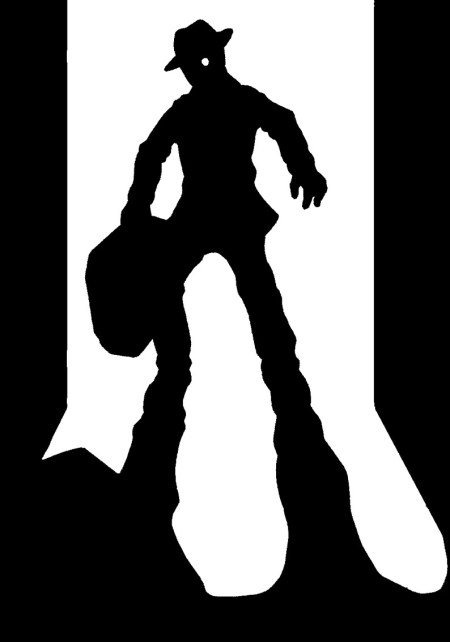
I added the highlights around his figure via computer on a whim as it appeared a little too stark against the coloured background with just a pure black outline – perhaps not an entirely successful effect but one which adds a greater sense of atmosphere and menace I think. Additionally I’ve included the basic black & white version below for comparison. Note the walls and slightly different arm/body shape, changed for the better I felt but then I quite like the original’s simplicity in some ways.
Which do you folks prefer?

I prefer it with the backlight effect, but I prefer the composition of the other one with the “walls” on the side. Especially since when someone is backlit, the “viewer” must be in a dark space. And he seems less “floating this way”. However, I think that both are good.
@demontales: I did originally have the walls in the colour version but they looked wrong somehow, I couldn’t put my finger on why but they had to go :(
You have a point though; it doesn’t really make sense in terms of the lighting and gives him the effect of hovering (not the sort of future I have in mind XD). Thanks for the pointers anyhow!
I may have an idea of why it looked weird, but I might be wrong: maybe it’s because the gradient in the blue doesn’t give an idea of where the the ground starts, while the walls give that clue.
@demontales: Yeah, that sounds about right. It wasn’t strictly intended as a realistic image but the lack of definition between floor and backdrop is a problem. The B & W image gets away with it being more abstract, but as soon as colour gets involved it just ends up looking confusing.
I had planned to do more of a background initially but felt it went against the minimal aesthetic I was experimenting with.