Marvel and Me (Part 3)

July 23, 2012

As anyone following this series of posts will be aware, there’s been more than a little friction between ‘The Marvel Way’™ and my own way thus far.

Stan Lee and John Buscema (RIP) were both men at the top of their game during the books initial publication and I wouldn’t presume to question their professionalism or understanding of the medium, but as a comparison to my own work and approach there have been some irreconcilable differences in our practice. That said, besides being thoroughly expected given the conflicting goals of our genres – heroism/anti-heroism, superhuman/Inhuman etc – along with the book being more than three decades old, they have gone some way to refocusing my project, considering exactly what Branch is meant to be and I how I should go about continuing to develop it.

There have been areas of overlap too though which have proven remarkably helpful as general tips in the medium, so it’s not as if I’ve learned nothing new from this study and pleasingly the books final chapters prove to be some of the most applicable and broadly useful yet.

Picking up with composition Lee starts with an explanation on the ‘flow’ in an image, a concept familiar to me treated in a typically methodical manner here. The pencilling in the simplified versions of the examples below charts the important elements in the panel (e.g. characters) within arrangements of simple shapes, identifying strong groupings and simple, appealing patterns. As he puts it:

‘The shape is never drawn first (…) Rather, the picture is originally sketched out with the shaded areas taking form in the artist’s mind. Sometimes, after a picture is drawn, too many elements fall outside the basic shaded areas. In such instances, the artist changes his drawing until everything falls within a pleasant, unified mass.’

(Lee, Buscema, 1978, p110)

I’ve never explicitly thought of my own compositions in these terms but I do typically work by a similar grouping of elements, often two clumps of people, usually on a foreground and background basis. Flicking through my first issue it’s reassuring to see that this test can be applied to almost all of my panels with the few violations being ones I was unsatisfied with in the first place. When in doubt of an image’s arrangement this could be a handy trick to test it and figure out potential improvements.

Getting into the details more, these compositional thoughts are expanded on with a breakdown on ‘camera angles’.

As shown above, importance of the angle chosen is emphasised by the enormous boost in drama and tension created with a lowered ‘Dutch angle’ over the flat side-on view. The angle is irregular and unexpected, preventing the flow from becoming monotonous while giving the character in question a more dynamic appearance.

This is advice I’ve always been aware of thanks to my film education – similar rules apply – but haven’t followed as closely as I perhaps should have. It pains me to draw attention to it, but looking back over Branch most of my angles are completely flat with the horizon line. Sure, I’ve kept the distance from the subject and elevation fairly varied throughout but there are only a handful of exceptions where the ground and panels bottom line are not parallel.

I hesitate to use the word ‘lazy’ to account for this but I may have been inadvertently avoiding such adventurous angles due to the difficulty they create; the more bizarre the viewpoint the more exaggerated the perspective and subject foreshortening become. Put simply, I haven’t had the confidence to attempt them.

This is not all bad in light of the fact much of the comic thus far has been built up where I wanted to save the most intense visuals for the most intense scenes. Still, very soon I won’t have that excuse and the only way I can seriously expect to develop my skills is by taking a few artistic risks – this is one of them.

The next chapter moves onto layouts with the initial instructions being fairly rudimentary but fundamentally important, as Lee puts it alongside Buscema’s example (below):

‘Remember to always lay out the entire page before you finish any individual drawing. Also, always draw the entire figure in each panel, even if it won’t all show in the final artwork.’  

(Lee, Buscema, 1978, p126)

I already do this process of rough sketching first albeit with a few variations on their template. In my case it tends to be a super-rough disposable version first to consider basic layout and composition, followed by a separate detailed sketch which will then be worked over digitally – applying hard lines, colour and text as required – perhaps not a wholly orthodox method by Marvel’s standards, but regardless, adequate for getting a sense of the overall page before working in details.

This matter of drawing the ‘entire figure’ outside of panels is somewhat alien to me however; I do often allow scenery to extend along perspective lines into the gutters if I’m having difficulty planning out a background but with figures I usually just take my chances and try to capture the fragment in question. All the same, I do see the value in this method as it allows the artist to consider the part in focus as piece of a whole and thus how well it functions as part of that whole.

Once in a while after obsessing over the minute details of a face, expression or hand I will indeed fail to notice that the form itself is warped due to reduced anatomical awareness; whereas when I’m capturing the majority of a figure I find this almost never happens. My usual solution these days is to periodically place a mirror alongside such drawings to bring attention to faults early on but as a more practical method I’ll try the Marvel recommendation on my next page.

The next area covered (no pun intended) I find to be possibly the most infuriating aspect of comic book production while somehow being one of my favourites too. Naturally, covers…

When they’re done right I love comic book covers, they’re an art unto themselves and while I’m not quite sure I agree with Lee’s assessment of them as ‘the single most important page in any comicbook’ he’s spot on about their function: ‘if it catches your eye and intrigues you, there’s a chance you may buy the magazine. If it doesn’t cause you to pick it up, it means one lost sale’ (p138).

There’s a magic to the best covers; an image which concisely captures the essence of a comic while having enough standalone appeal and/or intrigue to convince readers it’s a worthy purchase. I’m especially aware of this coming off the back the recent MCM Expo in London, witnessing how others sold their work at face value, while having to do the same myself.

No matter how much I might love covers though, I find that getting them right can be a small nightmare. Comics are a medium which thrives on efficiency of visual communication, however, while a narrative page doesn’t have to be visually astounding or self-contained as part of a sequence a cover lives and dies on these qualities. Missing the mark even slightly could lose you a potential reader, regardless of the overall quality of the work. Shallow it may be, but covers will almost always be what ultimately sells a comic.

Take the collection of Buscema roughs above for example for the same issue as the previous image, each illustrates some kind of mistake; the first has the characters too small, the second fails to show its star’s face and the third does the same for Spider-Man. There are a whole plethora of potential pitfalls for a cover like this and getting that perfect composition is nearly always a challenge. Even experienced professionals with otherwise consistent quality can deliver a dud once in a while with only the slightest misjudgement.

Lee does offer a rundown of things to be kept in mind when making a cover, however once again I find some of these tips to be quite Marvel specific :

‘Always leave enough room at the top of the illustration for the logo (title of the magazine).’ (Lee, p140)

Common sense really, but possible to forget when one is sucked into an image rather than text based concerns.

‘Nothing important must be drawn at the outside edge of the bottom or right side of the cover, because some of that paper is trimmed off at the printing plant. This area, approximately a half inch in width, is referred to as the “bleed”.’ (Lee, p140)

While on a basis of good composition I typically wouldn’t draw important elements near the edges of a cover, I did run slightly afoul of this printing my first issue. Pages tend to be alright thanks to their gutters but with a cover where colour and line work extends to the very edge of a page I’d do well to allow proper margins for the bleed when preparing a physical issue.   

‘There must be a number of “dead areas” on the cover – areas which although exciting- looking to the reader, are unimportant enough to be covered over by dialogue balloons, captions, and/or blurbs if the editor so desires.’ (Lee, p140)

I do attempt to do this as I would within any other page but rarely in any formal kind of way; given the style and genre of my comic I’m not prone to including much in the way of dialogue balloons or blurbs on covers since I’d prefer to have an image do the talking.

‘Since colour on a cover is vitally important, the artist mustn’t use too many heavy black areas in his illustration. The expression employed in the Bullpen is: “Leave the drawing open for color.”’ (Lee, p140)

This one goes almost entirely against the grain of my own work; besides having a noirish influence which makes heavy black areas dramatically beneficial – especially for a cover – I’ve thus far used a restricted colour palette and stylised texturing for my two efforts. It’s not to say that colour isn’t potentially important, but it’s dependent on context and in the case of cyberpunk and its dystopian themes bright Marvel colours across the board may not be exactly the best decision…

‘The drawing must be provocative enough to make the reader want to get the magazine and read the story, but it mustn’t give the ending away, or tip the reader off to any surprises.’ (Lee, p140)

The last piece of advice here loops back to the initial point about a cover selling a comic, ‘provocative’ is something just about every cover wants to be, to capture the reader’s attention and make them think. Not spoiling it is an obvious point too but I can think of exceptions where part of a surprise within is revealed to great effect, luring readers in without compromising the plot.

Finally, the books last chapter covers inking.  At a glance this part seems redundant to a project I am now inking digitally when all the techniques covered here are traditional; still, one particular page caught my attention. Running by some posture advice – mine’s terrible but I try – brush specific tips and matters regarding the pencil/inker – I’m both –  they have a summary on use of the ‘feathering’ effect with two examples demonstrating the difference between economic usage and overcooking:

It’s ironic I should be seeing this now but it at least affirms some of my more drastic changes to Branch’s style across the project. My earlier pages exemplified much of what’s wrong with the image on the bottom, being furiously feathered and crosshatched out of some stubborn belief that greater detail equates to greater art. As Lee explains in relation to the example:

‘Adding too many details and too much texture in the inking has made the figures blend with the background instead of standing out in a sharp relief as the penciler intended. In short, the picture has become much harder to read, less pleasant to look at, and will be more difficult to color.’

(Lee, Buscema, 1978, p149)

It’s not that maximalist inking can’t look great – artists such as Bob Crumb prove this – but I most certainly lack the skills to pull it off at present, while as I’ve stated before and as Lee emphasises it’s a lot more difficult to colour without creating a murky mess. At this point, I can’t really argue with any of this advice.

So, to wrap this unwieldy beast up: have my thoughts on Marvel changed?

I can’t deny that I’ve learned a great deal more than expected from a book I’d initially set out with intent to criticise rather than directly study.  The truth is that whatever I might think of Marvel they’re successful professionals, who’ve run a successful business for the better half of a century. I can pick at artistic integrity from the security of amateur publication all I want but like it or not they’re a part of comic book history and for all our differences I’d be a fool not to respect anyone/thing that  can teach me something.

I’ll most likely continue to love hating Marvel for their overblown media franchises, seemingly zillionth iteration of disposable plot developments and inexplicable crossovers with zombies – Just as I’ll continue to hate loving their colourful characters, obscure mythology and addictive Saturday morning cartoons.

We’ve got a love-hate relationship, Marvel and me…


Marvel and Me (Part 2)

June 20, 2012

Picking up where we left off with my study of Marvel’s production process, the next four chapters on detailed figure drawings, poses and heads largely deliver more of the same; general tips on drawing construction interspersed with more superhero specific touches. As before I’ll be taking note of advice applicable to my own work, while examining where our approaches conflict and why.

Anyway, I formerly mentioned how the book’s suggested figure planning method of cylinders and cubes differed from my own approach of loosely sketching ovals and shapes to build up form, being perhaps too stiff for my liking. As it turns out, it isn’t entirely dismissive of alternatives:

This ‘scribbling’ method is described as being suitable for ‘a more advanced student’ (p56) which feels like a slightly arrogant assumption to make of myself – my anatomy still has problems – however, it’s more or less how I do things already while also it feels far more natural and effective to me than a forced collection of rigid polygons. Lee’s explanation of the process closely resembles my own reasons for using it:

‘As John explains it, it’s like being a sculptor and building a figure with clay. You just keep adding these loose little lines until the figure starts taking shape. Another important thing about scribbling is that it helps you to loosen up and get a feeling of movement and action. Do your scribbling lightly, and try to train your eye to spot the lines that are correct and to reject the ones that aren’t. Then, as you continue to mold the figure with your pencil, you emphasize the important lines and eventually lose the others.’

(Lee, Buscema, 1978, p56)

Naturally this is built up over a stick skeleton to set out the basic pose, but the whole idea of flexibly shaping up the figure and garb does more for my style than their former suggestion. As demonstrated with Thor’s cape in the example, loose clothing is easier to figure out and draw satisfactorily this way; superheroes are known for their skin tight preferences but my cast’s looser clothing typically favours a looser method of drafting.

Fitting too that ‘movement and action’ should figure into this method so heavily as I feel they’re an area of inexperience for me, presenting a daunting hurdle with their imminent arrival in Branch. As such, the next example is of particular importance:

No matter how much they might try to hide it, comics – excluding the motion variety – are ultimately a static medium where movements are implied rather than shown; reader imagination fills the gap, usually helped along with little nudges such as speed lines or an onomatopoeia. As demonstrated here though, the extremity of a pose can do a lot for the impact of an action creating a tangible sense of motion and excitement.

Indeed, it’s an idea which remains applicable across any genre of the medium aiming to do so, on the other hand it can be overdone:

‘Even when characters are just standing, the same rules apply. Notice the figures on the facing page. In each case, the smaller figure is okay. But just okay. Not particularly dramatic, not overly heroic, and certainly not very interesting. Now then, see the larger figures, which illustrate the same poses, have more drama to them, more heroism, and far more interest (…) Basically, the smaller figures are perfectly adequate drawings; but the larger ones are Marvel-style drawings!’

(Lee, Buscema, 1978, p66)

I barely need to expand upon the point since Lee pretty much says it anyway, but this is clearly Marvel-specific direction. Showing characters striking a pose between action is all well and good for those “I CHALLENGE YOU GALACTUS!” moments, however considered in a cyberpunk context it would end up being unintentionally ridiculous.

The key problem is that it’s once again intended to draw attention to heroic qualities, however, when the characters are anti-heroes – as both Scratch and Curt most definitely are – having them strutting and waving their arms around like speed infused ravers all the time is liable to destroy any accumulating tension, while also undermining credibility. Marvel isn’t often admired for its subtlety, being mostly straight to the point with action and thrills whereas I’ve purposefully delayed my own in favour of atmosphere and plot development. In my case there will be moments of violence but I’d rather play everything in between down to ensure they retain as much impact and shock as possible.

Moving on to heads; I noted in my previous post that their basic construction was roughly the same as my own. When it comes to the details though we differ on just about everything:

Once again the focus is squarely on heroic qualities with all the friction that entails between our approaches, though the main issues are a little more deep-seated.

When I’m roughing a face I always draw up guidelines for eye/ear level, along with the mouth, brow and chin but in this case everything has a near mathematical precision which honestly doesn’t appeal to me. As shown on the right head above an equilateral triangle with its tip at eye level allows mouth and chin width to be calculated precisely, but supposing I don’t want them to be precise? Supposing I want to exaggerate these features for a certain character or expression? What if they have an abnormally small mouth? A weak chin? Mad eyes?

Call it ignorance but figuring out these features for each character by my own means and making them distinct is one of my savoured little joys when I’m drawing. Take that away and it’s just an equation.

Also worth noting is the greater adherence to anatomical realism here whereas my own style is purposefully exaggerated or offbeat in certain areas; I tend to draw eyes larger to amplify specific characteristics such as Scratch’s expressions of faint irritation or Curt’s eyes-popping-from-the-head panicking, while elsewhere I deliberately draw noses in a slightly weird fashion as a stylistic trademark to give my work an identifiable feature.

Specific tips on drawing female faces also run somewhat afoul of my intentions. Much of it is fairly obvious stuff which I can’t argue with such as giving them a smaller chin and nose, however this is once again a case of 1970’s Marvel and their slightly narrow minded view on superwomen – almost all the emphasis is on making them ‘adorable(p98) which is all well and good for comics targeted specifically towards those of the XY chromosome but disappointingly limits the scope for character depth.

Take this advice:

‘Keep your female faces simple. Use no extra expression lines on the forehead, or around the mouth and nose. We repeat, you don’t need a lot of lines to show expression. Keep it clean and open.’

(Lee, Buscema, 1978, p100)

There is some value in this point as I used to completely overcook expressions (and still do to some degree) making characters appear unintentionally manic, still, reading between the lines the disproportionate emphasis on not using expression lines betrays a fear of undermining beauty or making their heroines appear – god forbid – older. Their example page at the end of the chapter featuring a collection of sobbing, kidnapped, seduced, devious or insecure women doesn’t help much in this regard either.

All this is not to say I didn’t design my women (and men for that matter) to be aesthetically appealing in some regard, while I can already imagine events later in Branch’s plot could be perceived as exploitative in the wrong light – no doubt I’ll be on the receiving end of the criticism someday – Still, for the most part I didn’t want any stunners; not ugly maybe and interesting in their own right but away from the realms of shallow fantasy fulfilment, just regular old cyborgs going about their day…

To close this segment on a more positive note I’d like to include one quick tip which is worth taking onboard.

Lips align with the nose in a diagonal line outward while nose bridge, nostril and mouth corner do the same. Since I often struggle with profiles this is a pointer that I should permanently burn into my brain. Even with my usual facial exaggerations it’s a solid way of avoiding simian jaws and splodge noses without being especially restrictive on style.

That’s all for now folks! All being well I’ll conclude things with part 3 next week ;)


Marvel and Me (Part 1)

June 12, 2012

Let’s get it out of the way: I’ve got something of a love-hate relationship with Marvel.

I’ve read plenty of their comics, know their history, will fiercely debate the legitimacy of their various film adaption’s in unreasonable depth and yet I wouldn’t consider myself much of a fan. For all their great characters and striking artwork, I often feel the storylines are repetitive and shallow with an increasing sense that the Marvel universe does more as a brand than an immersive setting.

So when I say I’m doing a write-up on Stan Lee and John Buscema’s How to Draw Comics The Marvel Way (1978) I should firmly emphasise that I have no intention to follow this instruction directly. Not to disrespect either them or the company, but since very early on I’ve been determined to follow my own path, develop my own style and stay true to my own feelings. I am however, not adverse to learning things and feeding them into my own practice; while I may not be following the advice within word for word, I felt an analysis of the book might have other merits.

What I want to do here is take a look at the Marvel approach and compare it to my own, taking lessons onboard where they’re relevant but also considering exactly where we differ and why. Superhero gallantry stands in stark contrast to the grey morality and grittiness of cyberpunk but the contextual awareness offered by such a comparison may be just what I need to define my own practice more sharply. Like it or not comics are a medium dominated by the superhero genre and Marvel has emerged as one of the most successful companies in this field, I don’t want to follow in such well trodden footsteps if I can help it but examining their tracks could teach me something all the same.

As indicated by the ‘part 1’ I’ll be splitting this study up since I have a feeling I’ll have a lot to talk about and  the consequent article might be a touch unwieldy (although it ended up enormous anyway – sorry). This way I can keep everything manageable and get on with other things between posts.

Let’s start with the preface’s opening paragraphs:

‘while there’s a plethora of “How to Draw” manuals gallantly glorifying any bookseller’s shelves, up to now there’s been no book available to tell a budding young Buscema, or Kirby, Colan or Kane how to draw comicbook superheroes, and –most importantly – how to do it in the mildly magnificent Marvel style.’

(Lee, Buscema, 1978, p8)

Right from the off no pretence is made, this is an unapologetic step-by-step on how to draw superheroes like Marvel. When I looked at Scott McCloud’s Making Comics I noted his more contemporary open minded approach, which refreshingly didn’t tell you what to do but rather indicated how you should approach it. This on the other hand is a straight up ‘how to’.     

Having been written in 1978 I’m sure the novelty of such a comparatively rigid guide was still fresh before they completely flooded the market in more recent decades. Still, coming from the ‘bronze age’ of comics – after seeing a steady evolution through the silver and golden ages – from a man at the medium’s forefront it doesn’t seem like such a bad place to start examining Marvel’s methods.

Moving on past all the rudimentary sections on equipment and terminology (both of which I’ve seen reiterated similarly in dozens of books) things get a little more interesting around the object building exercises.

At this stage the lessons are still fairly fundamental so this one and a few like it are worth taking onboard.

The way I construct faces is similar to the example here but I tend to rough out figures with ovals and spheres rather than cylinders and cubes, attempting to roughly chart musculature of limbs and the chest over lines which form the bones. It would be tempting to dismiss the building method here as stiff and robotic but on the other hand it offers a more careful assessment of depth and proportion at an early stage in planning – at very least it might be worth a try.

The basic instructions on 1, 2 and 3 point perspective are all pretty straight forward; however there are a pair of tricks which I wish I’d know of earlier:

The first method for dividing walls is incredibly useful not only in order to figure out wall or surface divisions but also as a way to judge distance and level of foreshortening required for surrounding objects. Up till now I’ve guessed these, winging it on instinct with frankly mixed results. Having a rule to work out distance and scale with so simply is a massive help.

Being able to figure out checkerboard flooring on the other hand is invaluable. My recent spaceport scenes had me using this effect and tearing my hair out over whether I was doing it right; I did eventually devise an adequate method (along with a sort of shortcut) but the one above is pleasingly stress free by comparison and ensures the individual tiles are evenly sized at any perspective.

Moving on we start to get more Marvel-specific tips which aren’t so universally applicable. Take Lee’s thoughts regarding how male superheroes are drawn up:

‘Most average guys are about six-and-a-half heads tall. But take a look at this sketch of Reed Richards. Notice that he’s eight and three quarter heads tall. If we draw a hero he’s got to look like a hero – he should be of heroic proportions. Unfortunately, the normal six-and-a-half-head-tall proportions would make him seem somewhat dumpy when drawn in a Marvel mag.’

 (Lee, Buscema, 1978, p42)

As stated and shown, the emphasis is on making characters appear physically heroic to the degree where basic anatomical rules are exaggerated in the process; a point expanded upon further into the book. Of the comparison below between Captain America and a normal male he writes:

‘Note that the superhero is larger, with broader shoulders, more muscular arms and legs, a heavier chest, and even a more impressive stance. There’s nothing weak looking about the fella next to Captain America, but a superhero simply has to look more impressive, more dramatic, more imposing than an average guy. Perhaps the most important single point to remember is that you should always slightly exaggerate the heroic qualities of your hero, and attempt to ignore or omit any negative, undramatic qualities.’

 (Lee, Buscema, 1978, p46)

Hmmm, now while I won’t say there’s anything wrong with making superheroes appear super the ‘ignore or omit any negative, undramatic qualities’ part doesn’t sit so well with me. This was written before Watchmen and the like turned the genre upside-down in the 80’s and really took the idea of flawed heroes somewhere, but quite frankly the whole concept of perfect super human saviours does little for me. In fairness, the visual intentions are almost entirely aesthetic and this is a How to Draw and not How to Write but for me this marks out a great deal of what I’m glad comics have largely progressed beyond or at least provided decent alternatives to.

In my case the intent was quite the opposite; my co-protagonist Curt is someone I deliberately imbued with negative and largely undramatic features on the basis I wanted him to be a credible, distinctly human window into Branch’s world: he’s short, scrawny with a rash of stubble and a decidedly sickly look around the eyes. He’s not there to wow anyone, but rather to make a sympathisable connection with the readers as a convincingly flawed character.

On female character drawings too, Lee states that women should be less ‘angular’ (p43) and that muscles should not be emphasized, ideally appearing ‘smooth and soft’ (p44). As a heterosexual man and someone reasonably well educated on gender differences in anatomy I’m not going clamour for muscle women on par with their male counterparts – still this outline strikes me as slightly narrow minded, harking from an age when female superheroes were mainly present to provide sex appeal for a mostly male demographic (although there’s still plenty of that lurking around).

In contrast to this idea, Scratch is a great deal more angular than Curt and a great deal tougher too. I have bent the rules a little on this one given that she’s a cyborg and the technology naturally tends to bring a hard edge into the design; still I really wanted that quality in the face of gender stereotypes and an exploration of someone who has had their entire life reconfigured with their body. 

Before I get branded a hypocrite when someone checks out my Sasaki redesign and spitefully notes the increased exposure of leg I should clarify that I don’t think there’s anything wrong with sexy qualities in a character – of either gender – providing they have a basis in their personality, the setting and they aren’t the only quality a character possesses; put simply, they exist for the character and story, rather than purely the gratification of the audience.

Even pornographic/erotic material doesn’t necessarily strike me as horrendous when it has honest intent.  The only thing that truly bothers me is the stuff which pushes its characters under a banner of empowerment, concealing its objectifying intent beneath a layer of sleazy dishonesty. Marvel may have cleaned up its act somewhat in recent decades along with almost all of our media, but there’s no denying that comics have a pretty rough track record in this area.

So, I’ve emphasised difference in approach here but what of the why? To my mind the answer is that it comes down to genre differences and the way reader enjoyment is administered in each.

Take Marvel’s superhero comics; the appeal is pretty straightforward from the moment you look at their covers, incredible people doing incredible things. Psychologically this most likely taps into reader wish fulfilment, the desire to be more than we are, be important, admired and powerful. That much is basically promised upfront – straight up fantasy.

Of course that would be pretty boring without plot complications and in most cases there will tend to be a dilemma coupled with a character flaw. The hero/heroine will be tasked with overcoming this hurdle and –assuming it’s not Watchmen or Kick-Ass – eventually do just that. Tony Stark will have heart/reactor problems, Spider Man will struggle to balance his love life with crime fighting, Hulk will have an angry spell and Wolverine will be Wolverine.

Cyberpunk on the other hand is a masochistic genre.

The appeal is not so straightforward nor so broad as a superhero fantasy; characters don’t start on a high before hitting a low and triumphing on an even greater high point, rather they start on a low, go lower somewhere around the midpoint before finally finding a resolution at the end which will almost certainly be bitter sweet. Even as a fan I’d struggle to explain exactly why these stories work for me but I have feeling it falls between technological fascination, morbid curiosity and the recognition of irrepressible humanity amongst typically adverse conditions.

The genre’s protagonists in particular are almost always anti-heroes. Looping back to my earlier point about how superhero comics tend to avoid obviously negative attributes, what I love about cyberpunk is how it embraces them whole heartedly. True, these characters will rarely be evil to core and moments of redemption tend to occur sooner or later, but it’s hard won and practically never unconditional. In Strange Days Lenny Nero starts out as desperate sleaze merchant, Neuromancer’s ‘Case’ begins as a drug dealer with a failing liver and handful of ruthless murders, Spider’s behaviour in Transmetropolitan mostly appears crass and borderline psychotic while Blade Runner’s miserable Deckard takes on a job “retiring” replicants.

I’ve set myself an uphill struggle perhaps, and I certainly felt it at the expo. Neither Scratch nor Curt are presently particularly likable and frankly they shouldn’t be, emanating sub-zero temperament and phobic cowardliness respectively. Marvel comic characters are designed to be immediately likeable and aesthetically attractive, delivering reader enjoyment almost immediately. In my case I’ve followed a cyberpunk aesthetic where ferocious attributes are concealed beneath trench coats and shadow rather than bared in tights, while acts of bravery and compassion are the exception rather than the rule.

When a character is unpleasant from the start you need to work harder to find the qualities which really shine, but it’s for that very reason that I believe they shine all the brighter in the end. I like to dip into a super story from time to time, but the characters who stay with me will always be the ones who worked for my respect and surprised me.


Cover Me!

May 1, 2012

With the MCM Expo under a month away and a pressing need to make Branch into some kind of physical volume, I spent this afternoon investigating local print options. I’ve found a few good deals and have a pretty clear idea as to what format I’ll be going with , but while I was mulling over the details of exactly what I’ll be printing it occurred to me that I’ve neglected something important.

Currently I’m thinking I’ll be going with A5 colour books of some sort as I’d like to keep things modest and affordable, while I also feel that the lower number of larger panels I favour wouldn’t sit as comfortably in A4 format. Ideally I want to power through a few more pages before printing so that I can bring the plot to a satisfactory ‘to be continued’ point I have in mind, however first and foremost I realised that I need a cover.

I have my ‘ACT 1’ cover but I intentionally made it as a stand in and it feels somewhat inadequate for a printed iteration. Not only do I need art and text that will wrap around both covers but the importance of an appealing advertisement cannot be underestimated; people say don’t judge a book by its cover but quite honestly most of us do, particularly with comics where the visual aesthetic has such a major role in what’s being read. Not having a cover prepared for a comic strikes me as being like not having an outfit prepared for a dance ball – showing up naked is not the way to go with either.

Putting it bluntly a new cover is my most urgent priority right now. I’ve got some design ideas as to how it might look, but rather than simply charging into it blindly as I have every other time it seemed prudent to do a little homework and look for possible inspiration and pointers amongst my own comic collection.

So, without further ado here’s a small – though varied – cross-section of my favourite first volume covers along with why I think they work:

Transmetropolitan: Back on the Street – Cover art by Geof Darrow

Starting with something truly cyberpunk for the sake of relevance, Darrow’s first cover for Transmetropolitan is a fine representation of Warren Ellis’s grubby future and unhinged protagonist ‘Spider Jerusalem’.

Considering Spider’s portrayal first, he’s pretty much centre stage here much as he is in the comic itself, seemingly looking at the viewer while holding a confident pose; from this alone we already get a sense of his personality as the fearless gonzo journalist, his chain smoking also being openly displayed while his strange tattoos suggest a complicated and unpleasant history. The way his skin has been left largely uncoloured is another nice touch too, giving him an otherworldly kind of quality while creating a strong contrast with the backdrop – a indication of his charismatic presence perhaps?

The background itself meanwhile appears to be consciously muted in greys, greens and dark blues to keep the emphasis on Spider and thanks to the raised angle seemingly stands beneath him –another character hint – and is packed with litter, grime and filth of several varieties. This is evidently a used future and not a pleasant one at that.

The title format is a nice finishing touch I feel as it embodies a sort of trashy magazine look thanks to font and orientation down the side, a representation of the story’s news focus and once again its pervasive grubby atmosphere. The back cover is a little uninspired by comparison, being a recycled image of spider against and abstract backdrop, though points for quoting one of Spider’s best lines: “If you loved me, you’d all kill yourselves today.”

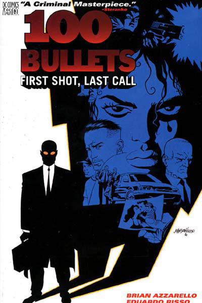
100 Bullets: First Shot, Last Call – Cover art by Dave Johnson

A more stylised effort here; Johnson’s work captures Eduardo Risso’s high impact art for the series while emphasising the premise and neo-noir tone.

The whole character-collage thing with covers and posters can go horribly wrong in some cases but what pulls it altogether here is the fact everyone pictured falls under Agent Graves’ shadow. Connotations of control, conspiracy, mystery and evil are all present but most of all it neatly encapsulates the central premise; Graves appears offering someone the chance for revenge, a perfect murder with 100 untraceable bullets, in almost every case casting a proverbial shadow over their lives.

The restrained colour palette works in favour of the general look too, preventing the image from feeling overcrowded or messy. Almost everything is black and blue against a white backdrop, an echo of classic noir’s monochrome stock perhaps or least another way to help make the cover design feel cohesive. The exceptions of Graves’ orange sunglasses and the red title text simply help draw more attention to them initially, catching the viewers eye first before they assumedly look to the cast – a nice solid hook for intrigue and purchase.

Appleseed: Book One – Shirow Masamune

A resolutely old school 1980’s manga cover drawn by Shirow Masamune before his descent into a dark realm of underclad women and overbearing technophilia…

Ahem, anyway there’s nothing particularly clever about this one but for the most part the straightforward design works in its favour; Masamune is clearly confident enough with quality of his artwork to put it front and centre unhindered and since much of Appleseed’s appeal arises from its cool cyborgs, robots, mecha, vehicles and firepower, showing them off up front is by no means a bad idea.

Besides this, the focus is firmly upon two things: the relationship between Deunan (the lady) and Briareos (the big cyborg) along with a large scale struggle to establish a peaceful future on post apocalyptic earth. The close relationship between the two characters is made explicit by how Briareos literally carries Deunan here, while the background earth covered in lights and computer marks indicates the epic scale of the story and connected technological themes.

I suppose it’s pretty cheesy but it must have done something right to make me buy it…

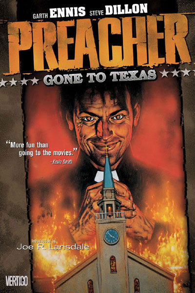
Preacher: Gone to Texas – Cover art by Glenn Fabry

Fabry’s covers stand apart from my other examples in that they actually appear to have been painted, marrying uncanny realism with the supremely grotesque content Preacher explores. There have been ongoing attempts to get TV and film adaptations of the series off the ground but in most cases they seem to have stumbled due to the sheer level of controversy and gruesome material involved. Preacher may well be able to push so far since its impact is arguably softened through the filter of a comicbook, what I love about its covers is how they strip that away and display this world down to the last cringe inducing wrinkle, bringing if far closer than you’d comfortably like.

Preacher’s first cover is one of its best; our titular preacher Jesse Custer – looking very Michael Keaton – smirking over the flaming wreckage of his own church; the event which gave him his troubling new power ‘The Word’. Combining the elements of religion and gleeful destruction it’s a fair statement of intent for what to expect; suffice to say if you’re a devout Christian of the “ban this sick filth” persuasion then the awaiting orgy of violence, horror and gallows humour probably won’t be your bag, for most others the direct stare and grin are a morbid invitation: “Go on. Read me.”

Special mention should go to title and subtitle fonts too, both aspiring to an old west aesthetic, A fitting touch given that I’ve always felt Preacher is a western at heart. Besides having probably hundreds of references to the genre, take away the modern day setting and fantasy elements then there’d be absolutely no doubt; that and Jesse has John Wayne as an imaginary friend…

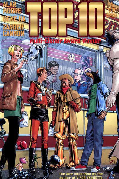
Top Ten: Book 1 – Cover Art by Gene Ha and Alex Sinclair

If I liked 100 Bullets for its conservative style then in the case of Alan Moore’s Top Ten it’s the sheer amount of little details which won me over. Gene Ha’s covers and art for the series are always packed with things to look at and small jokes, making it pretty much sublime to my mind in combination with Moore’s standard of writing. As should be evident from the pictured cover it’s an ensemble cast again, but with one crucial difference to what most would instinctively draw; It’s completely anti-dramatic.

To give a little context Top 10’s central conceit is that everyone in the world is a superhero, from top executives right down to the homeless, being special is really nothing special. As such, the ‘Top 10’ of the story are a police force tasked with keeping this burgeoning population of the super powered under control and frankly, having a hard time with it. While they are all super in some way, at the same time they’re all completely human and fallible, often to hilarious effect. At the end of the day they’re cops who just happen to have powers, so picturing them standing around talking over lunchtime coffee seems completely appropriate.

It’s a witty and somewhat refreshing twist compared to Marvel style WHAM BAM! covers, the appeal arising from the intrigue and humour of seeing the heroes being distinctly un-super… Still being completely honest I’m sure the part about ‘Multi-Eisner Award Winner’ and the name ‘Alan Moore’ probably went some way to helping.

Parasyte: Volume 1 – Hitoshi Iwaaki

What the hell is that?!

But seriously, I like this one and indeed all of Parasyte’s covers for the sheer weirdness factor. It’s a demonstration that a covering image doesn’t always need to feature attractive characters or stylised collages; if it’s genuinely bizarre and imaginative enough sometimes it’s enough to get people reading.

Aaaanyway, having run through a bunch of professional covers, returning to my own with fresh eyes what could be better?

Mostly, I feel like it’s too flat and too basic. As I’ve covered there’s nothing wrong with a strong simple cover but there’s really not enough here to make people care. A shadowy figure with their back turned tells us very little on its own; it might of cut it within a printed issue but not as the sole image promoting it.

Just about every example I’ve looked at suggests something about the characters and plot, so in this respect a viewpoint and rendering style showing more of Scratch in a more interesting pose makes sense, an emphasis on her cyborg features would also be a good move in relation to the human-machine symbiosis themes the story explores – It might even be worth getting her full figure in to so areas such as her hoofish feet can be shown for additional intrigue.

I’m of half a mind to include Curt on the cover as he is effectively co-protagonist but I wonder if this might be unnecessarily complicating things (e.g. including a sweaty, cyberphobe on the cover may not appeal as directly an ice cold cyborg detective).

There are things I’d like to keep though such as the alphanumeric title design, while I’d also like to reuse circuit pattern effect on the shadows as it adds a more original touch and adds further emphasis on the idea of a dependent relationship between people and technology.

Bottom line, I won’t know what works for sure until I try. Time to get experimenting!


Pick Me Up Graphic Arts Fair

April 9, 2012

A couple of weeks ago I visited London for two things; the possibility of a job interview and Somerset House’s Pick Me Up graphic arts fair. With the former opportunity falling through at the last minute – special thanks to those guys – I can’t deny being more than a little disheartened, fortunately though the fair proved to be more than worthwhile.

Before even entering the exhibition space I caught an informative talk by Derek Brazell – an illustrator perhaps best known for his children’s book covers – covering practical matters those looking to enter the business should take into account. Some of this overlapped with what I’d heard from or been told by other professionals but a great deal of it was fresh advice which I’d do well to heed as I begin looking for work.

In particular, he emphasised the importance of running an illustration career like a business even if you’re freelance, taking finance, image and work resources as seriously as possible. In line with this I need to start organising both a physical and online portfolio of my work before I graduate, considering exactly who my work might appeal to and how best to interest them. Covering legal matters as well – always something I struggle to get my head around – he managed to explain in a surprisingly headache free way the distinctions between copyright and licensing, common pitfalls with commissions and plagiarism grey areas. Forewarned is forearmed as they say.

Moving onto the fair itself, the main exhibition consisted of 20 international artists; all distinct and impressive with a notable lean towards psychedelic imagery, with a few in particular bearing noteworthy relevance to my own work and themes:

Appearing under the title ‘Back to Basics’ the colourful selection of papercraft oddities pictured above from French studio Zim & Zou (Lucie Thomas and Thibault Zimmermann) was the first thing to catch my eye. Beyond a general affection for retro and redundant technologies, I was frankly gobsmacked at the level of detail and care which had gone into the paper renderings of walkmans, gameboys and old camera’s.

Maybe I’m digging too deep looking for a commentary on outdated technologies, but I felt like the medium and choice of bright, unexpected colours said something of the charm that these items take on in retrospect. Alternatively though, it could be that their fragile paper construction speaks of the fragility in the cutting edge; all these things were at one time the best money could buy, a few decades on their simply left in the dust, relics of a bygone age with more value as curiosities than functional tools.

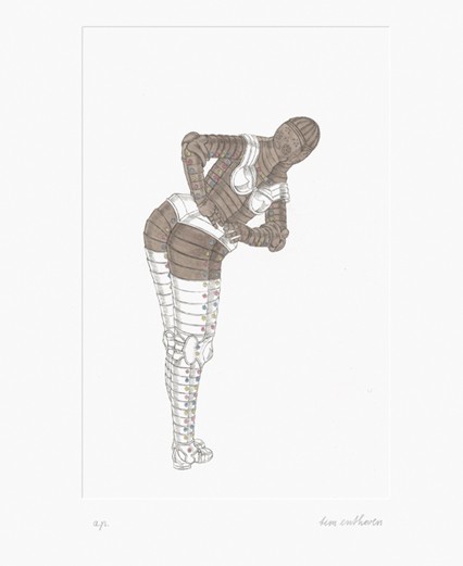
The work of Dutch artist Tim Enthoven caught my attention because of its bizarre balance between humour and perversity, with etchings such as the one above picturing suits of armour in inappropriate poses. The sight of a metal behemoth pole dancing is funny enough in its own right, but what really struck a chord with me was how it tapped into one of my core themes regarding technology being humanised through human applications. If you’ll forgive the pun, I liked how the normally intimidating presence such armour would have was disarmed by the ridiculous context.

More than anyone else though, it was the work of Paul X Johnson which really stole the show for me:

As illustrated by Behold a Pale Horse (above) there’s an immediately evident Noir feel to his work. Here, between the sunglasses, era haircut and muted chrome palette I automatically find myself thinking femme fatale. Of even greater relevance are the little hints of Sci-fi embedded in the prints; the chimneys add an intriguing industrial touch but what are the crystal like objects in the middle ground? And that horse is a bit familiar eh? Reminds me of a certain neo-noir/SF movie scene… speaking of which:

If that isn’t the ‘Rachael’ and synthetic owl from Blade Runner then I’m a replicant. Besides making a clear point of his inspirations, there’s more to this piece than straight up homage; the face and haircut aspire towards photo realism and yet we have a completely angular, hard-edged body bellow with what I’ll take a guess are strings rising from the shoulders – perhaps suggesting marionette like control from a certain someone

Intentional or otherwise the prints exude a distinctly cyberpunk vibe, while having a gorgeous aesthetic to boot. Being apparently made through a mixture of traditional and contemporary media it also seems fitting I should write about them now in light of my decision to do the same with Branch.

So yeah; another nice turn around for what could have been a botched trip to London and a fine opportunity to recharge my inspiration batteries!