Cover Me!

May 1, 2012

With the MCM Expo under a month away and a pressing need to make Branch into some kind of physical volume, I spent this afternoon investigating local print options. I’ve found a few good deals and have a pretty clear idea as to what format I’ll be going with , but while I was mulling over the details of exactly what I’ll be printing it occurred to me that I’ve neglected something important.

Currently I’m thinking I’ll be going with A5 colour books of some sort as I’d like to keep things modest and affordable, while I also feel that the lower number of larger panels I favour wouldn’t sit as comfortably in A4 format. Ideally I want to power through a few more pages before printing so that I can bring the plot to a satisfactory ‘to be continued’ point I have in mind, however first and foremost I realised that I need a cover.

I have my ‘ACT 1’ cover but I intentionally made it as a stand in and it feels somewhat inadequate for a printed iteration. Not only do I need art and text that will wrap around both covers but the importance of an appealing advertisement cannot be underestimated; people say don’t judge a book by its cover but quite honestly most of us do, particularly with comics where the visual aesthetic has such a major role in what’s being read. Not having a cover prepared for a comic strikes me as being like not having an outfit prepared for a dance ball – showing up naked is not the way to go with either.

Putting it bluntly a new cover is my most urgent priority right now. I’ve got some design ideas as to how it might look, but rather than simply charging into it blindly as I have every other time it seemed prudent to do a little homework and look for possible inspiration and pointers amongst my own comic collection.

So, without further ado here’s a small – though varied – cross-section of my favourite first volume covers along with why I think they work:

Transmetropolitan: Back on the Street – Cover art by Geof Darrow

Starting with something truly cyberpunk for the sake of relevance, Darrow’s first cover for Transmetropolitan is a fine representation of Warren Ellis’s grubby future and unhinged protagonist ‘Spider Jerusalem’.

Considering Spider’s portrayal first, he’s pretty much centre stage here much as he is in the comic itself, seemingly looking at the viewer while holding a confident pose; from this alone we already get a sense of his personality as the fearless gonzo journalist, his chain smoking also being openly displayed while his strange tattoos suggest a complicated and unpleasant history. The way his skin has been left largely uncoloured is another nice touch too, giving him an otherworldly kind of quality while creating a strong contrast with the backdrop – a indication of his charismatic presence perhaps?

The background itself meanwhile appears to be consciously muted in greys, greens and dark blues to keep the emphasis on Spider and thanks to the raised angle seemingly stands beneath him –another character hint – and is packed with litter, grime and filth of several varieties. This is evidently a used future and not a pleasant one at that.

The title format is a nice finishing touch I feel as it embodies a sort of trashy magazine look thanks to font and orientation down the side, a representation of the story’s news focus and once again its pervasive grubby atmosphere. The back cover is a little uninspired by comparison, being a recycled image of spider against and abstract backdrop, though points for quoting one of Spider’s best lines: “If you loved me, you’d all kill yourselves today.”

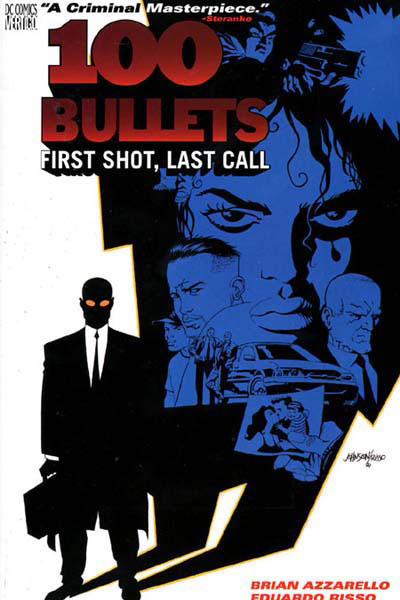
100 Bullets: First Shot, Last Call – Cover art by Dave Johnson

A more stylised effort here; Johnson’s work captures Eduardo Risso’s high impact art for the series while emphasising the premise and neo-noir tone.

The whole character-collage thing with covers and posters can go horribly wrong in some cases but what pulls it altogether here is the fact everyone pictured falls under Agent Graves’ shadow. Connotations of control, conspiracy, mystery and evil are all present but most of all it neatly encapsulates the central premise; Graves appears offering someone the chance for revenge, a perfect murder with 100 untraceable bullets, in almost every case casting a proverbial shadow over their lives.

The restrained colour palette works in favour of the general look too, preventing the image from feeling overcrowded or messy. Almost everything is black and blue against a white backdrop, an echo of classic noir’s monochrome stock perhaps or least another way to help make the cover design feel cohesive. The exceptions of Graves’ orange sunglasses and the red title text simply help draw more attention to them initially, catching the viewers eye first before they assumedly look to the cast – a nice solid hook for intrigue and purchase.

Appleseed: Book One – Shirow Masamune

A resolutely old school 1980’s manga cover drawn by Shirow Masamune before his descent into a dark realm of underclad women and overbearing technophilia…

Ahem, anyway there’s nothing particularly clever about this one but for the most part the straightforward design works in its favour; Masamune is clearly confident enough with quality of his artwork to put it front and centre unhindered and since much of Appleseed’s appeal arises from its cool cyborgs, robots, mecha, vehicles and firepower, showing them off up front is by no means a bad idea.

Besides this, the focus is firmly upon two things: the relationship between Deunan (the lady) and Briareos (the big cyborg) along with a large scale struggle to establish a peaceful future on post apocalyptic earth. The close relationship between the two characters is made explicit by how Briareos literally carries Deunan here, while the background earth covered in lights and computer marks indicates the epic scale of the story and connected technological themes.

I suppose it’s pretty cheesy but it must have done something right to make me buy it…

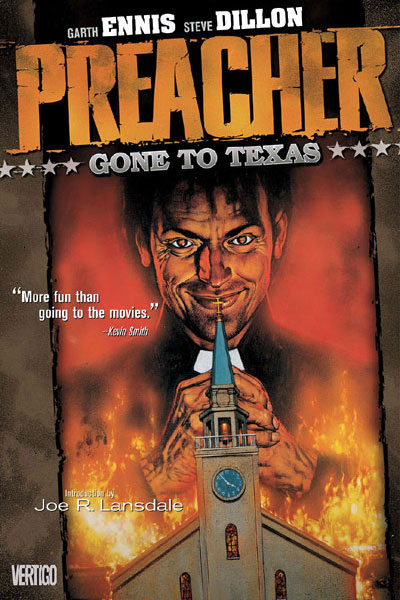
Preacher: Gone to Texas – Cover art by Glenn Fabry

Fabry’s covers stand apart from my other examples in that they actually appear to have been painted, marrying uncanny realism with the supremely grotesque content Preacher explores. There have been ongoing attempts to get TV and film adaptations of the series off the ground but in most cases they seem to have stumbled due to the sheer level of controversy and gruesome material involved. Preacher may well be able to push so far since its impact is arguably softened through the filter of a comicbook, what I love about its covers is how they strip that away and display this world down to the last cringe inducing wrinkle, bringing if far closer than you’d comfortably like.

Preacher’s first cover is one of its best; our titular preacher Jesse Custer – looking very Michael Keaton – smirking over the flaming wreckage of his own church; the event which gave him his troubling new power ‘The Word’. Combining the elements of religion and gleeful destruction it’s a fair statement of intent for what to expect; suffice to say if you’re a devout Christian of the “ban this sick filth” persuasion then the awaiting orgy of violence, horror and gallows humour probably won’t be your bag, for most others the direct stare and grin are a morbid invitation: “Go on. Read me.”

Special mention should go to title and subtitle fonts too, both aspiring to an old west aesthetic, A fitting touch given that I’ve always felt Preacher is a western at heart. Besides having probably hundreds of references to the genre, take away the modern day setting and fantasy elements then there’d be absolutely no doubt; that and Jesse has John Wayne as an imaginary friend…

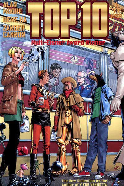
Top Ten: Book 1 – Cover Art by Gene Ha and Alex Sinclair

If I liked 100 Bullets for its conservative style then in the case of Alan Moore’s Top Ten it’s the sheer amount of little details which won me over. Gene Ha’s covers and art for the series are always packed with things to look at and small jokes, making it pretty much sublime to my mind in combination with Moore’s standard of writing. As should be evident from the pictured cover it’s an ensemble cast again, but with one crucial difference to what most would instinctively draw; It’s completely anti-dramatic.

To give a little context Top 10’s central conceit is that everyone in the world is a superhero, from top executives right down to the homeless, being special is really nothing special. As such, the ‘Top 10’ of the story are a police force tasked with keeping this burgeoning population of the super powered under control and frankly, having a hard time with it. While they are all super in some way, at the same time they’re all completely human and fallible, often to hilarious effect. At the end of the day they’re cops who just happen to have powers, so picturing them standing around talking over lunchtime coffee seems completely appropriate.

It’s a witty and somewhat refreshing twist compared to Marvel style WHAM BAM! covers, the appeal arising from the intrigue and humour of seeing the heroes being distinctly un-super… Still being completely honest I’m sure the part about ‘Multi-Eisner Award Winner’ and the name ‘Alan Moore’ probably went some way to helping.

Parasyte: Volume 1 – Hitoshi Iwaaki

What the hell is that?!

But seriously, I like this one and indeed all of Parasyte’s covers for the sheer weirdness factor. It’s a demonstration that a covering image doesn’t always need to feature attractive characters or stylised collages; if it’s genuinely bizarre and imaginative enough sometimes it’s enough to get people reading.

Aaaanyway, having run through a bunch of professional covers, returning to my own with fresh eyes what could be better?

Mostly, I feel like it’s too flat and too basic. As I’ve covered there’s nothing wrong with a strong simple cover but there’s really not enough here to make people care. A shadowy figure with their back turned tells us very little on its own; it might of cut it within a printed issue but not as the sole image promoting it.

Just about every example I’ve looked at suggests something about the characters and plot, so in this respect a viewpoint and rendering style showing more of Scratch in a more interesting pose makes sense, an emphasis on her cyborg features would also be a good move in relation to the human-machine symbiosis themes the story explores – It might even be worth getting her full figure in to so areas such as her hoofish feet can be shown for additional intrigue.

I’m of half a mind to include Curt on the cover as he is effectively co-protagonist but I wonder if this might be unnecessarily complicating things (e.g. including a sweaty, cyberphobe on the cover may not appeal as directly an ice cold cyborg detective).

There are things I’d like to keep though such as the alphanumeric title design, while I’d also like to reuse circuit pattern effect on the shadows as it adds a more original touch and adds further emphasis on the idea of a dependent relationship between people and technology.

Bottom line, I won’t know what works for sure until I try. Time to get experimenting!


Influence: Mike Mignola’s Hellboy

February 29, 2012

I’ve decided to try something new here; given that lately I’ve had difficulty finding time for research writeups and been increasingly locked into production itself it seemed a slightly different approach might be in order.

Up till now I’ve largely written about films, comics and other illustrative sources in a kind of review style which has been stimulating and a lot of fun, it has however proven to also be quite time-consuming. I’ve looked at a lot of sources which have influenced my artwork and storytelling but often not had time to acknowledge them properly as I felt obligated to do a lengthy analysis or nothing at all.

To change things up a bit I thought I might do a few smaller summaries of ‘influences’ giving a concise rundown on exactly what I like about them, why they’re relevant and what I should take from them. I’m not going to stop doing longer reviews altogether, but this way I can cover a lot more material and prevent embarrassing periods of inactivity on my blog.

So, without further ado…

What is it?

Hellboy Volume 1 (Library Edition) containing Seed of Destruction and Wake the Devil; a rather generous Christmas present from a good friend. I’d heard lots of other big names in comics talk about Mignola’s work but previously my only real exposure to it had been through the brilliant (though sadly unsuccessful) TV pilot to The Amazing Screw-On Head.

What do I like about it?

Lots. Admittedly the story and characters are a little too dry for my tastes to begin with but it’s quickly made up for by bold artwork, strong atmosphere and a quirky sense of humour. Similar to Miller’s approach with Sin City, Mignola’s art style creates dramatic images that are in many ways remarkably simple; what it lacks in detail it compensates for with eye-popping contrast of ink black shadow and colour with strong composition. Special mention should additionally go to the memorable character designs and use of typography too.

How is it relevant to my own work?

Being placed firmly within the fantasy genre thematically there isn’t much relevance to a cyberpunk comic, on the other hand, stylistically I found a great deal to draw upon. While the visuals seem to have more of a gothic than noir lean, they adhere closely to the idea of ‘less is more’ with details tending to be minimal or abstract. Almost every scene is bathed in pitch black shadow with emphasis upon highlights and silhouettes, nurturing a brooding atmosphere and fitting sense of lurking danger. Handled differently it might have appeared clumsy and incoherent but Mignola always knows exactly what to exaggerate and what to hide.

What Hellboy demonstrates is that not seeing everything can result in imagery that is not only economical but more distinct and eye-catching than a cluttered maximalist approach creates in many cases – suggestion rather than rigid visual explanation if you will. Being so understated the art doesn’t always amaze on an obvious level perhaps but it’s always clear, streamlined and effective.


Pulling Faces: The Art of Paddy Hartley

February 23, 2012

I must admit recently I had lost track of the college’s lecture programme, having missed a fair number of talks under the assumption they were on hiatus before learning they’d restarted again. We’ve previously had some very interesting and inspirational speakers from a wide variety of mediums and last week’s was no exception.

I felt  Paddy Hartley (or ‘Patrick Ian Hartley’ as he’s sometimes known) was worth at least a brief mention here as his work stems from interests in body modification that are comparable to my own. As his website puts it, the majority of the art’s focus is on ‘the way in which the human body is changed, modified and reconfigured either by choice or circumstance’ – unintentionally or otherwise, it certainly has a post-human ring to it.

Originally commissioned a decade ago for an exhibition ‘Short Cuts To Beauty‘ at London’s V&A Museum, the striking ‘face corsets’ pictured above and below were made by Hartley in response to a variety of inspirations. Besides projecting a grotesque parody of cosmetic procedures and ways they lift and reshape the flesh he revealed a deeper, more scientific dimension to his work aswell; as part of his research into the project he worked with a biomaterials scientist Dr Ian Thompson, specifically learning about ‘bioactive glass’ and its use replacing damaged parts of the skull due to its remarkably bonding properties with organic matter.

What’s most interesting about all this is that it was a genuine collaboration with benefits to both sides. Hartley learned a lot about facial reconstruction and anatomy from Dr Thompson, however Dr Thompson was reputedly able to refine the casting of implants and further the field generally thanks to Hartley’s expertise in molding techniques. Having ruminated on the possibility of science doubling as art in my Power of Making write-up this certainly makes another strong case for it.

Considering the visual impact of these pieces on a purely visceral level I get an odd sense of conflict. There’s something mildly disturbing, even intimidating about them but in another way they’re actually quite beautiful; despite having no idea how to work a sewing machine when he initially embarked on the project they display a high level of refinement and thought in their design and construction while apparently being rather durable to boot – they’ve even made it through wind tunnels intact!

It seems to me that this conflict extends to the various contexts they’ve been used in aswell; besides garnering artistic acclaim in recent years the corsets have made a rather sizable splash in the fashion world, while Hartley also begrudgingly admitted they’d attracted fetishistic interests he’d rather have avoided. It could be that this diversity in interested parties and applications tells us something about the diversity in reasoning for and connotations attached to body modification generally. Just as one surgical implant might save a person’s life another may be there for altogether more aesthetical reasons.

In line with this, the talk took on a far more serious tone when he discussed one of his other projects ‘Facade’.  Similar to the other collaboration he worked with The Gillies Archives (named after the pioneering plastic surgeon Sir Harold Gillies) focusing on the ‘untold stories‘ of WW1 soldiers who’d suffered severe facial disfigurements. The final pieces (below) integrate photographs of the men in question alongside messages from their letters with replica army, naval and airforce uniforms.

The masks in particular are a unique touch, with fabric representing the servicemen’s injuries and the then cutting edge processes used to reconstruct their faces. Hartley didn’t elaborate on the exact reasoning behind this design but for me at least it seemed to emphasise the process of repair and replacing what was lost – something my own graphic holds at the heart of its themes.

As a part of all this, he insisted on showing photographs, drawings and diagrams of the men he’d based these outfits on and as much as it shames me to say it I had a hard time looking at many of them. I don’t consider myself particularly squeamish nor am I one to judge on appearances, but seeing such traumatic injuries and thinking about the pain they’d suffered was something I found surprisingly affecting. More than anything, I just felt angry with myself for having this response; given my subject matter can I really justify horror and disgust towards disfigurement and reconstruction when it’s at the heart of my own story?

It’s true that Branch is predominantly populated by characters who’ve already undergone a procedure for cyborg modification and replacements, while for many it’s meant to have been a voluntary rather than necessary decision. Regardless, after seeing historical examples of surgical repairs I feel as though I may not have attached enough weight to the issues I’m tackling.

Besides his aesthetics, if there’s one thing I should definitely take from Paddy Hartley’s work it’s the importance of being able to face the seemingly unpleasant with an open mind rather than revulsion and a blind eye. I might be working in science fiction, but I’d do well to remind myself from time to time of the realities that underpin the ideas and very real people who live them.


Do My Cables Look Big in This?: Cyberfashion

December 16, 2011

When I met with the college’s lead fashion tutor last week for advice on character design and clothing, you may recall there was a degree of disagreement. Nevertheless, while I might have been at odds with some suggestions on reflection I found that many of the criticisms rang true. As is often the case with the project I’ve been completely sucked into certain areas while I’ve neglected others – fashion being one of them.

Conveniently and somewhat kindly, Lucy Markham – a fellow MA student – offered to meet up and provide another fashion perspective on my project. Doing so yesterday she threw a number of interesting research ideas my way, but most pertinently she highlighted an obvious area I’ve completely overlooked; besides being a genre, cyberpunk is also a subculture fashion.

To date I’ve been drawing most of my clothing concepts from the early 1940’s in order to connect with genre roots in film noir and detective fiction of the era, which was certainly a better move than falling back on SF clichés. Still, what’s becoming strongly apparent as I progress is the need for variety and range in the character’s appearances; not everyone can wear a suit, tie, trench coat or gown. In order to create a genuinely immersive environment I need to draw upon a broader set of influences.

Having been lead to a number of specialist websites in ‘cyber’ clothing (thanks Lucy!) I’ve spent the last day or so exploring what the internet has to offer, being the most immediate and up to date source for this kind of niche. Indeed, there’s a bigger market for this kind of stuff than I knew, but before I go into the examples which I found useful its important to explain a couple of issues regarding the ones I didn’t.

First of all: cybergoths.

No offence to them or anything. In fiction gothic can work marvelously with more traditional cyberpunk stylings – the work of Tsutomu Nihei being one of the best examples I can think of – still I struggle to find relevance for it in my own project. I’ve tried to remain careful of tone and consistency in Branch’s design and frankly the romanticized nature of gothic influences seems a poor fit for the kind of cynical used future I have in mind. I wouldn’t rule out the possibility of inadvertent gothic touches – one scene near the end of the script comes to mind – but I doubt it will ever become a major influence.

Additionally, while it’s uncommon I noticed a few instances of steampunk and cyberpunk being mixed up or similarly combined. Again, a heavily romanticized genre which elaborates on historical possibilities rather than future ones. Again, largely irrelevant to my own work.

My second set of disregarded sources present a larger problem with cyberfashion: genre awareness.

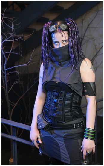
As illustrated by the lady above cyberfashion often plays on cyberpunk themes and iconography, integrating circuitry, parts of machinery and a typically industrial vibe. In reality I find this to be pretty cool, but in a fictional context it becomes more problematic.

The issue is motive. As a real life fashion people adopt the look in order to be idiosyncratic and possibly to reflect adoration of the cyberpunk genre, whereas within cyberpunk fiction a character’s dress will typically reflect the world they live in lacking the self-awareness the former has. To put it another way: in Branch, would characters bother with superfluous circuit patterning and nods to fictional cyborgs when they are already cyborgs themselves? In the end the result would be a broken fourth wall and a loss of immersion.

Excluding these subcategories what I’m left with is a more muted collection of what might be called industrial punk. Suddenly integrating such a thing with 1940’s influences might normally seem like an impulsive move, but looking over my backlog I realized that hints of it may inadvertently already be present. Perhaps it’s from the 80’s/early 90’s SF influence Lynn criticised but touches of punk do permeate the more restrained noir era clothing. Heck, the security guard who appears on pages 9 to 11 was at least partially inspired by a cyborg henchman from Tetsuo II:

Other things like Curt’s decidedly punkish hairstyle arose incidentally from random design ideas and character quirks, still, all the more reason to directly acknowledge the references and research them properly. So without further ado let’s look at some of the research examples that did work for me and talk about why they work:

The trousers pictured above – the first two taken from Bizzare.nl, the last from crisiswear.com – appealed to me thanks to restraint in design compared with most others (e.g. no ridiculous chains, no manskirt, no tribal script down the side etc). Yes there’s still a fair amount of goth exaggeration to the boots, but otherwise things are nice and simple. They have a hard-wearing look probably taken from worker’s gear and while the straps and rivets are fairly redundant they have aesthetic appeal without being over the top. The tool holster on the last image is also a neat addition, further emphasising a sense of functionality with a sort of engineering/technical edge.

Again taken from crisiswear and again striking for its simplicity, I like this cowl because it’s not too over the top. It’s undeniably decorative rather than functional but projects a sense of functionality through inclusion of facets from working clothes; again straps and rivets (beginning to see a pattern here?). It looks like it was made for a practical purpose, even if it’s not.

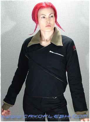
This aviator’s jacket from cryoflesh.com isn’t too different in most respects from its everday counterpart, however the ‘V’ which wraps over makes a bold visual statement without obliterating the garments basis. I also can’t help thinking this may have been influenced by the folding design of Japanese kimonos which brings me to my last example and closing thoughts.

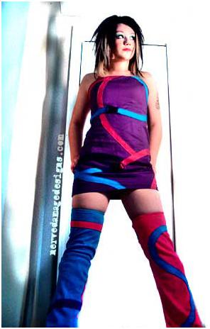
I selected the above ‘spiral out’  here from NerveDamage because it shows a very different side to cyberfashion. Unlike the previous three examples this outfit eschews muted blacks and dark blues and adopts eye searing neon. It’s flamboyant rather than functional, being purely aesthetic. More than anything though these colours, the general design and hairstyle all remind me of the wilder designs for characters in Japanese manga and anime.

Following this line of thought I’ve decided to redesign my character Sasaki with more of a cyberfashion slant. This is partially to provide a sort of prototype to try applying these influences to, while unlike much of my cast she hasn’t been shown in the comic yet giving me freedom to tinker. However, the main reason is that in retrospect she strikes me as a missed opportunity; as a play on Japan’s otaku it seems a shame not to capitalise on the parallels between cyberfashion’s manga/anime influenced designs and the characters ethnicity/basis. Putting aside dysfunctional characteristics she’s also one of the cast’s only truly upbeat personalities whereas the current design conversely seems drab and uninspired. Much of my character design has been relatively formal and muted but if there’s appropriate subject for something a little wilder, it’s Sasaki.

I can’t say how successful this new design direction will be, but hopefully by experimenting on a small-scale first I can get a sense of how well it  meshes with my existing universe and be able to apply it with greater confidence to the wider setting.


Arkham Asylum: A Serious House on Serious Earth

October 19, 2011

It’s been a while since a work of fiction has given me nightmares. Before I crashed head first into puberty just about anything could scare me, with glimpses of TV past 9 p.m. or the child catcher liable to provoke frantic checks under the bed and a flashlight clamped within sweaty hands for the next few evenings. Still as time presses on and experience adds up one can’t help but be desensitized to the scares of old, making the genuinely horrific all the more memorable for its scarcity.

So it is that when I say Arkham Asylum: A Serious House on Serious Earth (1989) is the stuff of nightmares, I mean it. This is less heroic empowerment fantasy and more intense psychological horror.

The 80’s had already seen one industry grabbing reinvention of Batman in the form of Miller’s The Dark Knight Returns (1986) but it would perhaps be more accurate considering Arkham to be a deconstruction of the iconic crime fighter. For the most part, in spite of the Caped Crusader’s presence this rarely feels like a hero comic; casting off the usual adventure elements in pursuit of something much more surreal and disturbing.

The writer Grant Morrison – now a well renowned industry figure – describes the comic as being a reaction to the ‘very literal, “realistic” “left brain” treatment of superheroes’ which had become popularised at the time by Watchmen (1987) and its ilk. Here with our ‘hero’ being coerced into visiting the titular psychiatric hospital by a hostage situation, the story presents a far more vulnerable and uncertain Batman than most other works in the canon, standing in sharp contrast to the decisive, powerful vigilante imprinted on the cultural consciousness. While violence is present, the focus is moved away from physical confrontation towards something of a philosophical battle against Arkham’s inmates with the core of the narrative possessing a dreamlike tone. In essence an offensive is taken on Batman’s sanity, challenging the formerly clearcut boundary between hero and psychopath, questioning whether he really belongs outside at all.

Amplifying this unsettling atmosphere by no small amount, the unique artwork of Dave McKean doesn’t so much add to the comic as feel symbiotically integral to the experience. The illustrations possess an unconventional painterly quality, avoiding the medium’s typical hard lines and flat colouring in favour of expressive blurring and gritty, dense texturing. It’s a style which also has enormous range going from eerily realistic to bizarre photo collages and surreal imagery – perhaps to reflect the changes in mood and gradual erosion of sanity throughout. Apparently McKean has retrospectively criticised his approach at the time as hampering the storytelling, but ironically I feel it actually strengthens it.

There are other clever little visual touches too such as the pencil sketched scenes near the beginning, emphasising a tangible sense of dreariness to external reality before entering the asylum. Character designs take on a distinctly unusual quality aswell; the Joker in particular possessing devilish, bulging features and an over-exposed glow of white make up making him seem more inhuman than ever. Batman meanwhile often appears animalistic, with the suit appearing to be inseparably fused to the man echoing his namesake in the most literal sense and giving him the air of some sinister gothic monstrosity. As the joker puts it when a henchmen suggests unmasking him: “That IS his real face.”

I’m still missing a large portion the story here though, while it might be assumed Batman is automatically the central character he shares a significant portion of the narrative with Amadeus Arkham, the asylum’s troubled founder. In a thread running parallel to the hero’s we see how the founder attempts to cure madness in others only to be inevitably consumed by it himself, creating a worrying comparison to Batman’s own crusade against crime. Just as Amadeus is shown to be far too close to insanity to define it himself, under scrutiny Batman is not too dissimilar to the colourful villains he locks away – a traumatized vigilante dressed as a bat suddenly struggling to justify his actions.

It gets under the skin and presents a disturbing perspective on the Batman mythology, but remains utterly compelling from start to finish. Most superhero narratives see their leads become dispirited and drop the ‘super’ mantle at some point or another, before reclaiming it to ‘become’ xyz-man again. Arkham Asylum takes a unique path by having Batman do the exact opposite for its conclusion – to admit that when all’s said and done he really is “just a man”.

Contemplating its wider context, I imagine this was a considerably important stepping stone in the continued evolution of comic books as a creative medium too. Neil Gaiman’s Sandman (1989-1996) and its metaphysical themes feel like a logical continuation of those sparked here, while I doubt that Dave McKean’s involvement as cover artist was coincidental either. I realise the relevance to my own work is pretty tenuous in most respects, but I felt there was value in writing about Arkham – if for nothing else – because of its daring  experimentation within a genre which often feels constrained by convention and for how considerably removed it is from my usual reading material.

To put it another way: anything which has the power to give me nightmares these days has definitely got something right, though it may still have some ground to cover on the child catcher…