When I met with the college’s lead fashion tutor last week for advice on character design and clothing, you may recall there was a degree of disagreement. Nevertheless, while I might have been at odds with some suggestions on reflection I found that many of the criticisms rang true. As is often the case with the project I’ve been completely sucked into certain areas while I’ve neglected others – fashion being one of them.
Conveniently and somewhat kindly, Lucy Markham – a fellow MA student – offered to meet up and provide another fashion perspective on my project. Doing so yesterday she threw a number of interesting research ideas my way, but most pertinently she highlighted an obvious area I’ve completely overlooked; besides being a genre, cyberpunk is also a subculture fashion.
To date I’ve been drawing most of my clothing concepts from the early 1940’s in order to connect with genre roots in film noir and detective fiction of the era, which was certainly a better move than falling back on SF clichés. Still, what’s becoming strongly apparent as I progress is the need for variety and range in the character’s appearances; not everyone can wear a suit, tie, trench coat or gown. In order to create a genuinely immersive environment I need to draw upon a broader set of influences.
Having been lead to a number of specialist websites in ‘cyber’ clothing (thanks Lucy!) I’ve spent the last day or so exploring what the internet has to offer, being the most immediate and up to date source for this kind of niche. Indeed, there’s a bigger market for this kind of stuff than I knew, but before I go into the examples which I found useful its important to explain a couple of issues regarding the ones I didn’t.
First of all: cybergoths.
No offence to them or anything. In fiction gothic can work marvelously with more traditional cyberpunk stylings – the work of Tsutomu Nihei being one of the best examples I can think of – still I struggle to find relevance for it in my own project. I’ve tried to remain careful of tone and consistency in Branch’s design and frankly the romanticized nature of gothic influences seems a poor fit for the kind of cynical used future I have in mind. I wouldn’t rule out the possibility of inadvertent gothic touches – one scene near the end of the script comes to mind – but I doubt it will ever become a major influence.
Additionally, while it’s uncommon I noticed a few instances of steampunk and cyberpunk being mixed up or similarly combined. Again, a heavily romanticized genre which elaborates on historical possibilities rather than future ones. Again, largely irrelevant to my own work.
My second set of disregarded sources present a larger problem with cyberfashion: genre awareness.
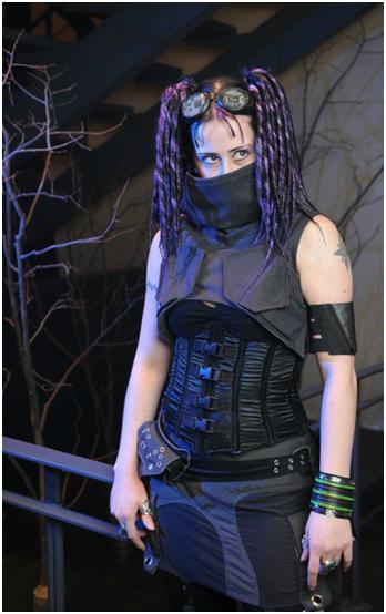
As illustrated by the lady above cyberfashion often plays on cyberpunk themes and iconography, integrating circuitry, parts of machinery and a typically industrial vibe. In reality I find this to be pretty cool, but in a fictional context it becomes more problematic.
The issue is motive. As a real life fashion people adopt the look in order to be idiosyncratic and possibly to reflect adoration of the cyberpunk genre, whereas within cyberpunk fiction a character’s dress will typically reflect the world they live in lacking the self-awareness the former has. To put it another way: in Branch, would characters bother with superfluous circuit patterning and nods to fictional cyborgs when they are already cyborgs themselves? In the end the result would be a broken fourth wall and a loss of immersion.
Excluding these subcategories what I’m left with is a more muted collection of what might be called industrial punk. Suddenly integrating such a thing with 1940’s influences might normally seem like an impulsive move, but looking over my backlog I realized that hints of it may inadvertently already be present. Perhaps it’s from the 80’s/early 90’s SF influence Lynn criticised but touches of punk do permeate the more restrained noir era clothing. Heck, the security guard who appears on pages 9 to 11 was at least partially inspired by a cyborg henchman from Tetsuo II:
Other things like Curt’s decidedly punkish hairstyle arose incidentally from random design ideas and character quirks, still, all the more reason to directly acknowledge the references and research them properly. So without further ado let’s look at some of the research examples that did work for me and talk about why they work:
 The trousers pictured above – the first two taken from Bizzare.nl, the last from crisiswear.com – appealed to me thanks to restraint in design compared with most others (e.g. no ridiculous chains, no manskirt, no tribal script down the side etc). Yes there’s still a fair amount of goth exaggeration to the boots, but otherwise things are nice and simple. They have a hard-wearing look probably taken from worker’s gear and while the straps and rivets are fairly redundant they have aesthetic appeal without being over the top. The tool holster on the last image is also a neat addition, further emphasising a sense of functionality with a sort of engineering/technical edge.
Again taken from crisiswear and again striking for its simplicity, I like this cowl because it’s not too over the top. It’s undeniably decorative rather than functional but projects a sense of functionality through inclusion of facets from working clothes; again straps and rivets (beginning to see a pattern here?). It looks like it was made for a practical purpose, even if it’s not.
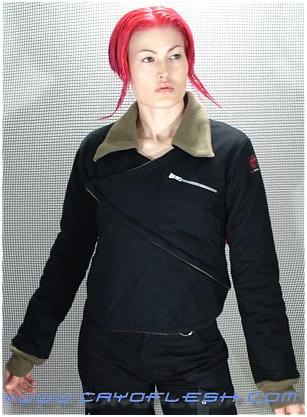
This aviator’s jacket from cryoflesh.com isn’t too different in most respects from its everday counterpart, however the ‘V’ which wraps over makes a bold visual statement without obliterating the garments basis. I also can’t help thinking this may have been influenced by the folding design of Japanese kimonos which brings me to my last example and closing thoughts.
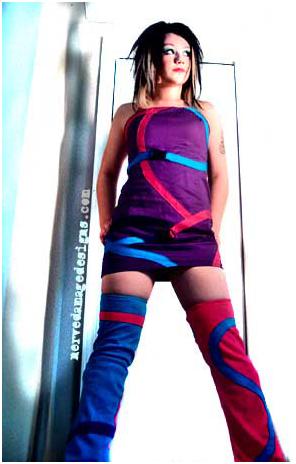
I selected the above ‘spiral out’ here from NerveDamage because it shows a very different side to cyberfashion. Unlike the previous three examples this outfit eschews muted blacks and dark blues and adopts eye searing neon. It’s flamboyant rather than functional, being purely aesthetic. More than anything though these colours, the general design and hairstyle all remind me of the wilder designs for characters in Japanese manga and anime.
Following this line of thought I’ve decided to redesign my character Sasaki with more of a cyberfashion slant. This is partially to provide a sort of prototype to try applying these influences to, while unlike much of my cast she hasn’t been shown in the comic yet giving me freedom to tinker. However, the main reason is that in retrospect she strikes me as a missed opportunity; as a play on Japan’s otaku it seems a shame not to capitalise on the parallels between cyberfashion’s manga/anime influenced designs and the characters ethnicity/basis. Putting aside dysfunctional characteristics she’s also one of the cast’s only truly upbeat personalities whereas the current design conversely seems drab and uninspired. Much of my character design has been relatively formal and muted but if there’s appropriate subject for something a little wilder, it’s Sasaki.
I can’t say how successful this new design direction will be, but hopefully by experimenting on a small-scale first I can get a sense of how well it meshes with my existing universe and be able to apply it with greater confidence to the wider setting.


Funnily, I’ve been introduced to the cyberpunk fashion much before the literary and artistic aspect. I’ve often thought the two didn’t always fit together though. As you noted, a big part of it is mostly aesthetics. It is also a fashion style that can become quite expensive, and looks like it, no matter the era. Weird considering times are often hard in cyberpunk stories(or so it appears to me, I got a lot yet to discover about it). However, the choices you’ve made seem wise. Curious to see where they will lead to.
@demontales: The cost aspect of cyberfashion is a good point, one I didn’t think of either! Indeed, you’re right, cyberpunk futures often have a ‘make do’ aesthetic where clothes are either scavenged or are the universe’s fashion standard. In reality it’s pretty much the complete opposite. A strange contradiction…
Anyhow, I’m currently midway through the mentioned redesign; so it should surface on here fairly soon ;)