The Ultimate Enemy is still Man: Outland

September 28, 2011

There have been times I’ve purposefully turned a blind eye to wrong doing. Usually small inconsequential things that were unlikely to cause real harm, others not so much. I’m not proud of it and I’ve nearly always regretted it, but it still happens and I think I can venture to say I’m not alone in my guilt. It’s a regrettably human trait, but when we’re surrounded by others who are willing to ignore a problem there are exceptionally few who will risk rocking the boat.

I was recommended Outland (1981) – not to be mistaken with Outlander (2008) – by Paul Gravett a few months ago as an example of an “intense environment” in space comparable to my own setting of Branch, so finding it at bargain price I gave it a much overdue watch.

The synopsis is a familiar one: set aboard a future mining colony on the Jupiter moon ‘Io’ the arrival of a new police Marshall William O’Neil (Sean Connery) stirs up trouble amongst workers, administration and fellow officers alike as he begins investigating a string of unexplained suicides. It’s an admittedly simple setup which stripped of its sci-fi setting, might just as easily be a traditional cop thriller or western of the ‘law man visiting a corrupt locale’ template. At the same time, just as Paul Gravett’s recommendation indicated, I would argue that the setting is one of the film’s most distinctive features.

Being set in a location so distantly removed from civilisation it’s the perfect scenario for human behaviour to go astray, with boundless greed and corporate corruption lent credibility through the environment. Taking a hard sci-fi approach, visually the movie has aged quite well thanks to the functional design seemingly drawing upon traditional mines and oil rigs. There are some surprisingly considerate details too further enforcing the ‘form follows function’ design approach – if you’ll excuse me being a total nerd – perishable foodstuffs are a rarity onboard, believable safety measures are shown and the only firearms used by the police are shotguns; an obvious precaution against puncturing walls and causing decompression. Just about everything has a grimy, worn in quality which on most occasions proves entirely immersive, essentially feeling like a living breathing work space rather than a glorified stage set.

Of particular note is the impressive claustrophobia nurtured throughout adding to the intensity with very little in the way of open spaces and the few there are being dimly lit, gloomy hovels. Even during sequences in the vacuum the grubby space suits perpetuate the sensation of being cramped, leaving the occupants and viewer no escape from the oppressive atmosphere. I’d also like to draw attention to the recurring motif of a hexagonal tunnel (below), for me a visual which creates a disturbing connotation to bee hives in light of station’s obsession with productivity at any cost.

It’s the latter aspects which I would most likely draw upon in my own work, attempting to replicate the feel of a tangible universe through effective implementation of a used future aesthetic. I’ve already researched local industrial estates as a part of my inspiration so the functional, work ready feel of film is of most obvious use to me. But more than this, I suppose what I really want to capture that Outland does so well is the sense of being trapped, overwhelmed and having no escape.

It couldn’t really be called cyberpunk mind you. ‘Low humanity‘ is on display throughout but the technology is incidental with the thematic focus being the enduring greed of humankind rather than the ramifications of killer robots, genetic engineering, cyborgs or computers. Indeed, the film is quite remarkable in this regard for its sheer restraint and maturity. There is some action along with obligatory moments of gross out horror but for the most part this is a slow burner with atmosphere and story taking precedence of crowd pleasing set pieces.

In line with this, the central cast are somewhat offbeat aswell. Yes, O’Niel is played by Sean Connery but he makes for an atypical protagonist compared to typical macho men of the 80’s, there’s a weariness to the character which meshes perfectly with the environment and offsets the usual ‘lone hero’ clichés. Rather than being the traditional man with nothing to lose™ he’s shown to be a more dimensional human being with a great deal to lose in the form of his travel jaded wife and child.

Additionally, I’d like to highlight the lack of so-called “eye candy” for men. The only major female character Dr. Lazarus (Frances Sternhagen) is thankfully not the plucky young recruit; being bitter, middle-aged and sensibly clothed for the duration. She also serves as a good parallel to O’niel, being similarly disillusioned with the situation on station and having some great snarky dialogue. At any rate, for once its nice to have an older cast who don’t seem preoccupied with being photogenic.

On the downside the film does have its failings. For all the emphasis on realism it still indulges in the erroneous assumption that space suit and airlock decompression causes the body to explode, there’s at least one redundant plot twist and overdubbed child actors should frankly be forbidden from cinema. The real elephant in the room though is simply how heavily indebted to Ridley Scott’s Alien (1979) it is; everything from the opening titles to the gritty used future aesthetic wears the Alien stamp but in spite of its obvious aspiration Outland never really approaches the brilliance of its predecessor – I couldn’t quite shake the feeling there was xenomorph shaped hole in the film…

There are standout moments however, my favourite being where O’Niel – having uncovered and destroyed the administration’s drug supply – discovers he has been marked for death. Realising he can’t even count on the other police officers for protection, he walks into the crowded worker dining hall and quite literally asks them if anyone can help him; a request no one answers. Considering the situation out on the far reaches of human development with the only common motive for work being greed, it’s a scene that’s chilling but also utterly believable. Everyone would much rather turn a blind eye than risk what they have on a trivial instance of justice in the middle of nowhere.

Outland isn’t a great film, but it is a surprisingly good one. Alien may have taught us that in space no one can hear you scream, but Outland tells us that even if someone does hear you the chances are they won’t give a damn.


Out of this World: Science Fiction but not as you know it

August 2, 2011

During my meeting with Paul Gravett last week, amongst the feedback and recommendations he gave was the suggestion that I visit the British Library while I was in London to see their science fiction exhibit Out of this World. So it was, finding myself with a morning to spare before my departure that I trotted over from Kings Cross to take a look around.

After being briefly accosted by suspicious security – guess I have one of those faces – I made my way inside to be confronted with a U.F.O crashed in a book shelf and an introductory statement: ‘The imaginary worlds of science fiction can inspire us to re-examine our own world’  a fairly apt summary of what I love about the genre. Advanced technology and outlandish concepts can be pretty damn cool in their own right but I suppose the main reason I hold longterm interest in and respect for SF is its ability to deviously tackle very real matters beneath the veneer of escapism.

Living up to the exhibition subtitle, refreshingly the first display defied my expectations confronting me with work I’m either unfamiliar with or hadn’t previously considered in the context of science fiction. I had the idea lodged in my mind that the genre was an invention of the last two centuries, however apparently Lucian of Samosata’s True History features everything from moon trips to encounters and war with alien life, being written around the 2nd Century AD! It might have been intended as a satire of the times waning myths and there’s little in the way of scientific credibility to be found, but all the same the basic science fiction template is there, well over a millennium before the term itself was coined.   

Anthony Burgess’s A Clockwork Orange (1962) also received a mention; definitely part of the genre when considered as such and yet deceptively not a book which comes to mind when I think of SF. It’s undeniably dystopian in its setting and themes but perhaps because its uncompromising social message always cut so close to the bone personally something about it struck me as feeling more real than usual sci-fi fare.

Of particular relevance to my project and chosen medium was the inclusion of many comics and graphic novels throughout the exhibition. Again, Marvel superheroes aren’t the something I’d naturally associate with SF either, but an interesting inference was made by the accompanying text. Scientific plausibility might be in short supply with invincible Kryptonians and radioactive spiders, but these characters and the worlds they inhabit often form a gateway to more complex examples of the genre as we mature. Looking back on a childhood spent obsessively collecting Spiderman pages from the Funday Times it strikes me that there may be some weight to this argument.

Elsewhere Hergé’s Tintin: Destination Moon and Explorers on the Moon (1953-1954) were highlighted not only for their obvious SF theme but for the suggestion of a political inspiration in the artwork. With the author having lived through the Nazi occupation of France and suffered accusations of being a collaborator thanks to his obedience to their censors, its hard not see the resemblance between the featured rocket and the German V2’s as a comment on the duality of technology – as a tool of advancement but also destruction.


Generally speaking, it was pleasant to see many old favourites cropping up throughout with broader considerations of their predecessors, influence and place in this enormous lineage. The work of H G Wells frequently punctuated the displays acknowledging his considerable contribution the genre, with a particular treat being a BBC radio recording in which he considers the consequences of rapid technological development and the “want of foresight” in predicting the impact of new inventions, displaying the mindset which likely drove much of his writing while simultaneously being so far ahead of his time.

Being painfully honest though, while the work of authors familiar to me such as Philip K Dick and William Gibson also made key appearances, for much of my visit I was also reminded of the sheer volume of important sci-fi I am yet to truly discover; Frank Herbert, Pat Cadigan, Isaac Asimov, HP Lovecraft, Jules Verne, Greg Bear… They’re all authors I at least know of but as a SF fan it’s pretty embarrassing to admit that I still haven’t read any of their work directly. This is not to say I’ll be squeezing them all in before I finish the MA, but as a personal goal I’d certainly like to familiarise myself with them more in the near future when time permits.      

I felt that Arthur C Clarke also represented an especially large gap in my experience as his name reoccured throughout the exhibits being responsible for or at least connected to more than a few notable works. Besides collaborating in the scripting of Kubrick’s famed 2001: A Space Odyssey (while writing the novel of the same title simultaneously), in a somewhat remarkable move a paper he published on satellites is said to have inspired our current system of orbital communication – a likely product of his degrees in physics and astronomy, making him more a qualified rather than abstract SF author.

Approaching the end via Frankenstein, Ghost in the Shell and 1984, in a moment of bizarre coincidence I found one of the final items on show to be the book I’m currently reading; Charles Stross’s Accelerando (2005), the title referring to an increasing tempo in music with the novel’s main focus (from what I’ve covered thus far) appearing to be the increasingly rapid, and frankly disorienting development of technology. Seemingly complimenting this concept, a video featurette by the exit discussed the prospect of ‘The Singularity’;  a point in the future at which we will have to enhance our intelligence in order to keep pace, as every aspect of our lives is transformed by technological advancement.

There’s blatant parallels here with the cyborg focus of my own project but more than that, this final thought in the exhibition made a strong impression on me being an embodiment of everything I find compelling and terrifying about science fiction and the future ahead of us. The feeling that these developments will stop being luxuries and start becoming necessities as we plunge into the post-human era. Thankfully for now at least it’s just compelling fiction, but I think it’s safe to say I was indeed made to “re-examine” my own world as I walked out into daylight.

So, ‘out of this world?’ Yeah, I think so. And with entrance being free  (providing security don’t eat you alive) this is a trip I’d recommend to anyone in London this Summer who fancies something a bit unusual.


Hail to the King: My introduction to Jack Kirby

July 6, 2011

It’s funny; I’ve been watching cartoons populated by his characters since carefree childhood days and I’ve been at least aware of his historic contribution to comics for many years now, but up until a few days ago I knew precious little about the man himself and exactly how big a contribution it was.

Jack Kirby (born Jacob Kurtzberg) is a name almost invariably associated with brilliance in the medium. With many of the characters he helped create now deeply embedded in popular western culture few artists or authors can claim such an enormous legacy. Referring to Masters of American Comics (2005), Glen David Gold puts it into perspective in his insightful essay ‘Lo, From the Demon Shall Come – the Public Dreamer‘:

‘The superhero gig is a harsh one for creators – it seems that each person (or team) is allotted just one character that outlives them. Bob Kane and his many assistants got Batman – just Batman – and Siegel and Shuster got Superman. But Kirby? Captain America, the Fantastic Four, the X-Men, Hulk, Sandman, Thor, New Gods, Forever People, Mister Miracle, each of them with supporting casts that could carry their own comic books.  And what a variety of genres he contributed to (or pioneered): superheroes, westerns, romance, kid gangs, science fiction, adventure, crime, horror, Classics Illustrated, animation, creator-owned independents, autobiography, and even, when things got slow in the 1950’s, the bizarre ‘Strange World of Your Dreams’ and ‘Win a Prize’ comics.’

(Gold, 2005, p261)

These superheroes have not only seen decades worth of follow ups and spin off’s in their own medium, but cartoons, toys and recently film adaptions aswell. Thus, it seems rather fitting that I base this write-up around my visit to a Kirby inspired exhibition.

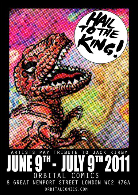
Taking a day trip to Orbital Comics I found the exhibit to be small but densely packed with a variety of work in tribute; all interesting, colourful and intriguing with a host of familiar faces shown in some unexpected ways. Still, while there was plenty to enjoy at face value, reading about Kirby’s career afterwards gave me valuable insight into the inspiration behind these homages. Considering his artistic development during the longterm collaboration with Marvel and Stan Lee (1958-1970), Gold writes:

 ‘As Kirby’s imagination exploded, so did the storytelling. The “camera” moved closer, the characters’ expressions grew more vivid, the machines more complex, the violence more brutal. His forms became more geometric and stylised. Every surface, including human skin, gleamed like chrome. Every starscape exploded with mysterious dots and “Kirby Krackle.” Fight scenes, which had already looked sweaty, and punches, which had already resonated with the crack of bone on bone, found extra volume; they went up to eleven. When pencil wouldn’t cut it, Kirby got out the scissors and paste and made collages.’

(Gold, 2005, p261)

The energetic qualities described were present in spades for much of the art there with bright colours and packed compositions dominating the space, a particularly obvious acknowledgment to the ‘Kirby Krackle’ being Vlad Quigley’s series of Kirby Kosmic Kollage prints; psychedelic dreamscapes capturing much of the classic Kirby style while also curiously resembling something Moebius/Jean Giraud might have drawn – a favourable comparison to my mind and strangely fitting given his own collaboration with Stan Lee in the 80’s.

Oddly enough another piece I felt strongly resonated with this aesthetic – The Neon City (below) – was actually made by my tutor Mark Wigan; painted in his own signature style but capturing the often dense imagery of Kirby’s own landscapes along with its sense of scale and vibrancy.

(Please note that the exhibition images are ‘borrowed’ from elsewhere as judging by the disapproving look my camera got photography was disallowed at the exhibit ).

Along these lines much of the work is seemingly in pure celebration of the late master’s accomplishments, but at the same time much of it adopted a considerably darker tone perhaps in exploration of the subdued discord which ran throughout his career. Stan Lee wrote of Kirby in his autobiography “There have always been artists who concentrate more on producing impressive illustrations than on visually telling a story in a clear, compelling way. Jack wasn’t one of them. As amazing as his artwork was, he also depicted a story that you could almost follow without reading the words.” which might be seen as unfettered praise, however Gold’s thoughts suggest something of an implication:

‘there is very little pure Kirby in the world. Mostly, he penciled, meaning he was at the mercy of inkers’ interpretations. And Kirby is famous mostly as co-creator. He worked with Joe Simon first, and then with Stan Lee, who wrote (…) some of Kirby’s most memorable stories at Marvel comics. On his own, Kirby’s dialogue betrayed a tin ear, a hipster techno-pastiche something like Thomas Pynchon’s, groaning with the cargo-ship-tonnage conveying of theme.’

(Gold, 2005, p261)

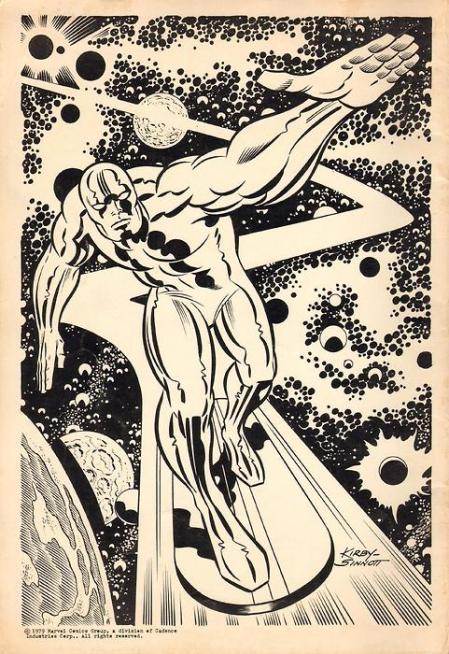
Perhaps it was this reliance upon collaboration in the creation of his most famous works that caused Jack Kirby to feel underappreciated and leave Marvel in the late 1960’s. Only vague details are known as to the exact nature of the disagreement and it wouldn’t be the first (or last time) he changed employer, but a particularly telling incident occurred when Lee launched a standalone Silver Surfer comic (One of the characters they co-created no less) without Kirby’s involvement:

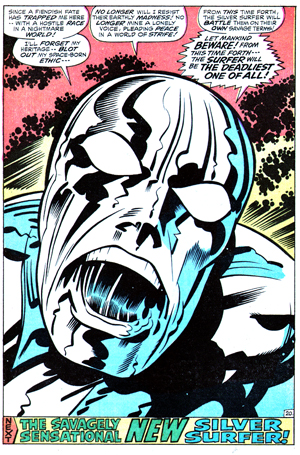
‘The 1968 ‘Silver Surfer’ comic book – made without Kirby’s involvement – failed. In 1970, Lee (somewhat insultingly) called Kirby to do a fill-in issue. It ended up being the last, or almost last, work Jack did for Marvel before leaving. And for eighteen of its twenty pages, it’s uninspired. Fight, fight, fight. Misunderstandings lead to more fights. But then on page nineteen, depriving readers and management of the final confrontation they wanted to see, the Surfer streaks away. It’s hard not to read this as driven by Kirby taking his toys and declaring ownership one last time of a defeated, embittered Silver Surfer.’

(Gold, 2005, p267) 

The final page of the aforementioned issue (above) is almost certainly Kirby projecting his own frustration onto the Surfer in a surprisingly personal move; an artist fed up with being constrained and misused. It foreshadows his imminent departure back to DC (then known as National) Comics but also suggests an unexpectedly emotional involvement with his creations rather than the business like attitude some have suggested.

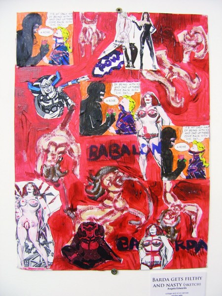
It’s a frustration which was blatantly emphasised in exhibit pieces such as the Feroze Alam’s Kirby-Hulk want Stan Lee Dead (the title says it all really) and Angela Edwards’ violent mutilations of classic Kirby imagery such as Barda Gets Filthy and Nasty (below). These are tributes loaded with as much resentment as they are appreciation.

Following his departure from Marvel Kirby’s work pushed into experimental territory seemingly in an attempt to cast aside his former restrictions and push his work in a new direction. Again it’s a development I might compare to that of Jean Giraud when he assumed the mantle of Moebius for his more controversial output, however while Giraud thrived under his new found freedom Kirby wasn’t so fortunate. Of his departure from Marvel Gold writes:

‘he withheld his most interesting ideas, and in 1970 took them (and himself) to rival publisher DC. There he launched New Gods, Forever People, and Mister Miracle, actually one incredibly complex saga that became known as the “Fourth World” (…) His characters were fantastically colorful, flawed, Shakespearean in their triumphs or dooms. Each plotline became not just a series of fight scenes but an allegory about Vietnam, religious fervor, poverty, the nature of aggression and evil. The panels got bigger again, and doublesplashes became a normal part of each issue. And yet it wasn’t popular. You had the sense as reader that you were grabbing on to a train thundering down a mountainside at a dangerous clip, the scenery a blur. In part, Kirby was learning about his dreamworlds as he wrote; in part it was hard to keep track of everything. None of the series lasted past eighteen issues. The remainder of his work is generally that of a man tired of having the rug yanked out from under him.’

 (Gold, 2005, p262, 266)

While in recent decades this work has received more critical acclaim, even now it remains more or less eclipsed by his contributions to Marvel. All the same it’s nice to see his somewhat edgier side being represented by a portion of the exhibit; Jason Atomic’s ‘Non Submissive Female’ below embodies an aggressive image of the empowered woman while another series of Vlad Quigley prints show some of Kirby’s black characters dressed in provocative attire – it’s worth noting in this regard that his character Black Panther was comics’ first black superhero.   


By his death in 1994 Jack Kirby may have been far from his highest point, but the legacy speaks for itself. Going full circle – back to the flyer image at the start – I’ll finish with two pieces of Kirby’s Devil Dinosaur (the original and the homage) and a particularly interesting final quote from Glen David Gold:

‘At age sixty, he was still producing art like the Devil Dinosaur doublesplash, which illustrates an ancient myth about a dragon that eats the moon. At a glance, it’s abstract, but, like his fantastic machinery, each element resolves into something entirely functional. Freud, who was onto myths like a hawk on field mice, suggested that myths were sacred because they were, by avenues not yet understood, public dreams. So sidestepping that “genius” epithet, here’s a title we might agree upon: Jack Kirby, public dreamer.’

(Gold, 2005, p266, 267) 

Between the faceless comics ‘genius‘ I knew of before and the flawed ‘public dreamer’ I definitely know which I prefer.


40’s Fashion: The Complete Fashion Sourcebook

June 17, 2011

Having talked a lot about embracing the noir influence on cyberpunk and connecting with some of the modernist values echoed in my own setting, it seems appropriate that I take a moment out from cyborgs and scribbling to have a specific look at the era’s fashions.

My intention has been to flavour rather than saturate the dress of my characters with the aforementioned style for fear of pushing too hard in a steam/retro-punk direction. However, thus far most of my references have been skimmed directly from film noir and other non-specific sources; an approach which has proved adequate but honestly slightly lazy, missing the finer details and a broader overall view. With crowds of Branch’s inhabitants likely to appear on the graphic’s forthcoming pages it seems more important than ever that I have unifying influence on their clothing and general style.

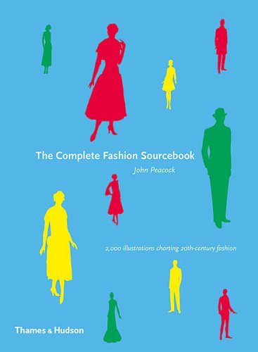
Following my recent module presentation in which I expressed this concern, a fellow student (thanks Lucy!) kindly lent me The Complete Fashion Sourcebook (2005) by John Peacock. Charting the development of fashion through the majority of the 20th century, the book predominantly uses illustration to show rather than tell which – given my own chosen medium – is quite fitting. It was particularly pleasing to find that the introductory write-up for the 1940’s section struck an immediate chord with my aims:

‘Women’s fashion in the 1940’s divides into two separate parts: from 1940 to 1946, and from early 1947 to the end of the decade. The first part was dominated by the Second World War. Dress, echoing military, was consciously and almost wholly utilitarian. In the United Kingdom, rationing came into effect in the summer of 1941 and the following year saw the introduction of the Utility Clothing Scheme which restricted among other things the amount of cloth that could be used in garments, the maximum length and width of a skirt, and the number of pleats, buttons and trimmings.’

(Peacock, 2005, p119)

‘Utilitarian’; a word I’ve formerly used in relation to my character designs. Indeed, with the ‘make do’ basis for my setting and general ‘used future’ vibe I have in mind it’s remarkable how well the rationing behind late WW2 clothing meshes with the context of my graphic. Being a time discouraging frivolity in design and a general less-is-more approach I feel it fits in with Branch’s inherent desperation and the largely closed economy of a space station.

Contrary to this I’d originally considered studying fashions of the 1940’s and 50’s, taking inspiration from throughout noir’s golden era but was made to reconsider as the text offers some interesting insight into the changing attitudes following the war:

‘Paris, traditionally the world’s most powerful force in fashion, lost much of its influence due to wartime isolation. But in 1947 it came back with a bang. On 12 February of that year the French couturier Christian Dior launched his ‘Corolle line’, instantly nicknamed ‘The New Look’ – the most famous and controversial collection any designer has ever produced (…) it was ultra-feminine and grandly extravagant, and arriving as it did so soon after the war, when some rationing and restrictions were still in force, it caused a sensation. The old pre-1947 lines were demolished at a stroke.’

(Peacock, 2005, p119)

With ‘The New Look’ moving away from the restrained designs of old into more luxurious territory the motivation behind late 40’s and 50’s fashion seems ill fitted to the context of the graphic while this clear divide suggests I’d benefit from an exclusive focus on WW2 wear. 

As stated this is specifically considering female wear, with men’s fashion of the time being abruptly dismissed as ‘relatively stationary and somewhat dull, dominated as they were by military uniform’ (p120). It’s a harsh judgement perhaps but looking across the decade there are only slight variations on the typical suits and trench coats – this isn’t exactly problematic to me as it provides a more stable template to work from and use artistic licence with, while I confess that I know far less about women’s clothing during the decade anyway.

Moving on to the actual illustrations I’ve collected a small cross-section, specifically selecting the most eye-catching designs as potential inspirations – forgive the slight distortions, hardbacks can be a nightmare to scan:


Considering the female outfits from the above 1941 day wear page, there’s a notable focus on pulled in waists specifically the prominence of belts – likely a reflection of the times aforementioned military influence – while skirts are typically cut to knee level; saving fabric while remaining modest. Meanwhile the male garb here is a fairly typical three-piece suit with wide lapels, waistcoat beneath and requisite Trilby, not too dissimilar perhaps to my last design for Baby Face.   


Moving away from formal wear I find it interesting that we see women’s leisure outfits sporting trousers alongside the skirts; a sign perhaps of the gender’s increased emancipation as the formerly male dominated jobs were offered to them during wartime. This time around the male example is slightly reminiscent of Baldo, the more elaborate collar and double-breasted pockets being something I may incorporate into my own design.

Moving on to the day wear of 1943 there’s a notable increase in the amount of fabric being used for both men and women, possibly as a result of the war approaching its end. The padded shoulders also appear to be more prominent while the military influence is especially strong in terms of the hat and coat designs.

Finally, I grabbed this page of 1940’s evening wear just to throw in something a little different for my references. While Branch is intended to be rife with poverty there will be a select few who benefit from or even excel under the circumstances. Drawing upon designs such as the above could provide an interesting variation on the general style to keep things diverse, while emphasising difference in wealth on an immediate visual basis.

As the graphic progresses I should be returning to these pages on a regular basis for design ideas and general inspiration, though if I get the time I’d like to research a few more sources to ensure the aesthetic is soundly developed. At the very least the influence should feel more informed now.


Tomorrow was another day: Terry Gilliam’s Brazil

May 17, 2011

There are some things I find it near impossible to be objective about.

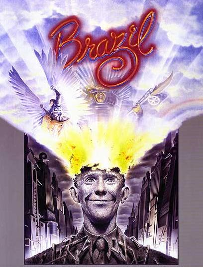
Some years ago during a film night with a friend I stuck on Terry Gilliam’s Brazil on the off chance she might like it. Not only did she not like it, but she refused to sit through more than thirty minutes and then went on to berate me the following week about how I was only into “cheesy 70’s B-movies” (for the record it was made in 1985). She’s not alone in her low opinion of it either it seems: Roger Ebert gave the movie two stars commenting that it was “hard to follow” and that there seemed to be “no sure hand at the controls”, while my copy of Halliwell’s Film, DVD & Video Guide gives it only one star condemning it as “expensive, wild” and “overlong”.

Perhaps the unrestrained outrage I feel towards these opinions says something about just how much I adore Brazil. Gilliam’s more recent efforts are often considered to be packed with original ideas at the cost of coherence, but for me this was always the one where everything really worked and delivered his unique oddity with a powerful punch.

Being genuinely objective though this wasn’t a film which immediately stood out to me as appropriate research material, there’s nothing obviously cyberpunk about the quirky retro-future it presents while some of it has more resemblance to fantasy than sci-fi. However, when I recently re-watched it with a friend who did like it, he pointed out that there may actually be more in common with my project than I initially thought.

Set in a dystopian society obsessed with mindless bureaucracy, there are obvious echoes of 1984 but what immediately makes it stand out from a torrent of other fascistic futures is the streak of dark humour which runs throughout it. The clumsy hybrids of computer/typewriters and ridiculous messaging tubes seem purposefully impractical, while constant paperwork requirements accompany even the most menial of tasks. Anti government bombings are brushed off by the media as being down to “beginners’ luck” while the majority of the populace appears preoccupied with endless shopping.

Even the main plot is bizzarely funny: largely revolving around the pursuit of a terrorist suspect Harry Tuttle, who through a bug related printing incident is mistaken as ‘Buttle’ a harmless family man consequently arrested, with the only comfort offered to his wife being a “receipt for her husband”. It’s from such sheer absurdity that the comedy arises, but the laughs are never entirely comfortable. Ridiculous as it may be the satire remains razor-sharp and more unsettling on reflection.

Were you to substitute the paperwork with more typical sci-fi computers, perhaps the film wouldn’t be too far off from cyberpunk after all. However, what really made me reconsider its relevance is the connection to classic Noir and by extension my subject genre. This is not to say there are venetian blind shadows cast at every turn or continual crooked angles, but the fashion and general aesthetic of the setting seems to draw primarily from a 1940-50’s vision of the future, albeit with extra piping. There are sensibilities here which approach those of steam rather than cyberpunk, but the post-modern fusion of aesthetics isn’t too far off from my own aims to infuse my design with something of the parent detective/noir genres.

Perhaps the protagonist Sam Lowry also has a little in common with the central characters from both genres as well; being heavily alienated by this society and in pursuit of an elusive love interest – dangerous enough to be considered a femme fatale – continually kept out of reach by the barrage of red tape. He makes for an inept, bumbling detective figure but he just about qualifies all the same. As a government employee in an unremarkable position, Sam takes a curious middle ground as someone clearly frustrated and out of step with this world who is simultaneously a part of the machine, his own enemy you might say.

In contrast to this continual bureaucratic drone we are intermittently shown vivid snatches of Sam’s dreams, depicting him as a winged warrior in pursuit of beautiful flying woman. These more typically Gilliam setpieces start out as an escapist fantasy offering insight into his suppressed desires, but after spotting his dreamed love in reality as the considerably more boisterous truck driver ‘Jill Layton’ he begins a hectic pursuit of her and the parallels quickly become more prominent and disturbing.

Possibly the most striking of these visions and allegorically most relevant to my own themes is a gigantic samurai who confronts him wearing armour decorated with electrical components – a representation of the bureaucratic machine as well as the literal one – a monstrous fire bleeding antagonist who when defeated is revealed to have Sam’s face under the armour, lending further weight to the idea of him being his own worst enemy.

Also, while it may only be a subplot the constant cosmetic surgery Sam’s mother and her friend receive throughout the film perhaps bears some connection to my own themes of human body modification. As with much of the film it’s played to darkly comedic effect but this is certainly humour which occupies an uneasy middle ground; the idea of unpleasant truths being concealed beneath a surface of outward prettiness as a layer of formalised documentation euphemises torture and the Gestapo like activities of the government.

This is where I get to the spoilers…

Much as I observed the rising clash between real and the wired in Lain, here a comparable crescendo takes place as the film progresses with an inevitable conflict set to occur when dreams collide with reality. As Sam attempts to subvert the sinister attentions of ‘information retrieval’ away from Jill his unattended paperwork and disregard for the authorities around him finally catches up.

Arrested and taken into a brutal interrogation by a man he formerly considered a friend, everything looks set to end horrifically when he’s abruptly sprung from torture by Harry Tuttle in a dashing rescue. Fleeing the government complex and demolishing it behind him everything looks set for an idyllic happy ending after a reunion with Jill and an escape to countryside.

It’s here that the film’s bittersweet masterstroke is delivered as we are returned to reality, revealing that Sam never left the chair he was strapped in having simply gone mad during the torture and retreated into his imagination, along with the additional implication that Jill was killed by information retrieval after all. It’s an ending which I find still ducks under my defences and hits where it hurts.

More than a valuable example of an aesthetic fusion, I suppose what really compelled me to include Brazil in my research is its sheer brilliance as piece of emotionally engaging science fiction. It’s packed with ideas, humour and satirical charge but not at the expense of cogency (well for me at least) surprising the viewer in its final moments with a conclusion which may well be sadistic but far from heartless.

It’s unfortunate that an altogether less satisfying conclusion awaits my Halliwell’s Film Guide now at the bottom of a recycling bin. Sorry Mr Ebert, but I think I’ll stick to Empire from now on…