MA Exhibition: Setup Complete!

August 9, 2012

I can breathe again!

After some frantic moments, compromises and general panic on my part the display’s finally come together with only placards left to be stuck on. It’s even fairly close on to what I envisioned in my final plan with only a few small changes in response to practical concerns.

I’ve had to stagger my pieces a little to avoid making them look cramped alongside the TV display, which does unfortunately leave them running over wall joins rather than sitting neatly between them but it’s hardly a show stopping error and I couldn’t help feeling drastic eleventh hour reorganisation or fixes weren’t worth the risk. The initial section of the wall is also one segment longer than expected so all my concept work is now on the same plane – no bad thing – with the ‘L’ shape at the beginning simply being for support.

Plus, I finally got some business cards done!

Not exactly a mind-blowing design I realise but I figured that keeping them nice and simple – not to mention affordable on my limited finances – would be a good move for now. I’ve been meaning to get some together since the MCM Expo and having acquired a sizable stockpile I should be set for the exhibition and foreseeable future; it’s certainly an improvement over scrawling my e-mail on the back of crumpled leaflets at least…

Anyhow, with the physical setup out of the way all that remains to be done now is organising my folders and having a thorough written evaluation ready for submission by Monday. A special thankyou to HSAD’s amiable technicians Steve and Phil for their indispensible assistance mounting, framing and lifting during preparation.

Expect sentimental reminiscence and manly tears next week as I bid the masters farewell and reflect on Branch’s past and future developments ;)


MA Exhibition: Final Plan

July 25, 2012

With time pressing on and next month’s setup for the Masters Exhibition looming large – eek! – I felt it was time to make some concrete decisions on exactly which pieces will be going display, while becoming specific on a few other vague areas.

I’m still planning to use eight 800 x 600mm frames for this; however after some thought and discussion with others I’ve changed my mind on a few critical details as pictured and explained below:

For one, considering that half these frames will be holding A4 landscape concepts (eight pieces with two to a frame) it logically followed that the first four frames should all be hung in portrait to make the pieces fit neatly at the correct orientation. Meanwhile the one frame in the second half required to hang as a portrait (due to the positioning of the DVD player and TV) will contain my two complete covers as an introduction to the finished pages, with their landscape format making them more or less the perfect fit.

The next two frames will be – as I previously planned – hung in landscape with two A4 pages set within each in their native portrait format, the last frame though I’ve decided warrants something slightly different. During the planning presentation a couple of weeks ago, I was advised to include at least one larger format piece and on admitting I didn’t have much I could blow up beyond A4 the suggestion arose that I construct an A3 collage from my existing art.

Besides the fact that reworking art rather than working from scratch should be quite feasible in the time remaining, it strikes me this should be an effective way to conclude my exhibit and break up the regular page work a little. I’m still making this – hence the no show – but as such I’ll just consider that last frame (15) to be reserved.

So, what of my other eight concept pieces and six finished artworks? What follows is a numerical rundown – relating to the above diagram – with attached reasoning for my choices:

1.  ‘Branch’ Station Concept

This seems as good a starting point as any. Besides being the titular setting for the comic, it can also be seen directly in the second page of the first issue, firmly anchoring the concepts to my finished work.

2.  Scratch Pose/coat concepts

While these sketches are somewhat crude and Scratch’s design has since seen a complete overhaul they do illustrate an early stage of development and emphasise how much has changed since preproduction, that and I feel they draw attention to her physicality and weary attitude as a character.

3.  Sasaki’s Den

Another character design which has seen a lot of changes since this concept, regardless it remains one of my more accomplished preproduction pieces. What I like in particular about it is the use of an environment to mirror the personality of the subject; essentially technical astuteness offset by a lack of hygiene or care in day to day life. I went with B&W version here and with image ‘7’ since the colour work unfortunately ended up being a bit substandard.

4.  Scratch Concept Sheet 7

A tweaked version of my final concept sheet for Scratch, it more or less shows her finished look and compared to the earlier sketches demonstrates the overall development of the design particularly in areas such as the arms and clothing.

5.  Baby Face Concept Sheet 3

Probably my favourite of all Branch’s character designs. Earlier drafts for Baby Face were problematic to say the least but the final concept turned out rather well; on the one hand the 1940’s style formal attire reflects the characters overblown sense of superiority and sophistication, while the alarmingly rough, angular prostheses emphasise his unrestrained brutality.

6.  ‘Baer’ Concept Sheet

Another of my better concepts, what I like about Baer is the way he balances ruggedly human qualities with those of a machine. It might seem like an odd choice given that he hasn’t appeared in the comic itself yet, but he’s a character who embodies a great deal of Branch’s human-machine symbiosis themes, with an old school attitude in conflict with the world around him and even his own clunky prosthetic “grabber”.

7.  Branch Street Concept

Not my favourite setting piece but a good one to show some of the earlier word building, while it also forms the basis for my first cover. Furthermore, the inclusion of both Scratch and Curt here hints at the central relationship which the story revolves around.

8.  Character Line up

Technically a collection of concepts rather than a fresh set, still this line up shows my entire cast at the point I started production making a good conclusion to my concept work in the exhibit. The height comparison is a nice touch too as it gives a greater sense of context to each and how they relate to one another.

910. Covers

As previously mentioned these frames will hold my two issue covers; not just because their full landscape format fits a portrait frame better than a regular page, but also because they are naturally intended as an introduction to the comic when it’s read. Having them come before the actual pages seems like good sense to me, even though they were admittedly made quite late on in production.

11.  Issue 1, Page 2

As mentioned earlier with my design for the space station, I felt that this one was an important inclusion to set the scene and tie production to preproduction as explicitly as possible. Even out of context it feels suitably introductory.

12.  Issue 1, Page 7

Besides being easily my most positively received page, this one makes a good companion piece to page 2 in the same frame featuring another establisher only this time inside the station. It also sets out a few key features of the setting such as the 360˚ curve of gravity and crumbling favela style setting.

13.  Issue 1, Page 16

Being one of my more atmospheric additions this one was something of a no-brainer , importantly demonstrating the influence of noir stylings on my work and showing Baby Face within the comic.

14.  Issue 1, Page 20

There were plenty of options to choose from for my last actual displayed page but this one seemed like a good bet. It has a sort of introduction from Scratch and begins to show the uneasy dynamic between her and Curt, while additionally featuring what may be my most ambitious perspective drawing in the bottom panel.    

I realise this seems like a relatively small selection considering the number of pages I’ve produced but bear in mind that there will also be a TV/DVD player running a slideshow of all my work to date should anyone want a more extensive look, while I’m also considering leaving a few printed copies out for people to flick through.

I should also take this opportunity to underline my decision not to use the acetate layering idea I mentioned in my ‘Development’ post. This isn’t to say I didn’t like the concept but after talking it through with our resident technician again it seems like there are just too many problems involved; I wouldn’t be able to hang them up for health and safety reasons, while keeping them in shape without becoming distorted would require rods to hold the sheets in place – not to mention a spare surface for it all to be fixed upon.

I could alternatively have done the same thing on a smaller scale with a booklet or folder but I feel that would lack the same impact, break up the overall cohesiveness of the exhibit and really be far more trouble to prepare than it’s worth. I’d much rather spend my remaining time on other areas of the display and I can always do something similar with my DVD, creating a time-lapse of the layering alongside the main slideshow to reveal more of the process.

So, with all that sorted out all I have to do now is prepare business cards, put together that A3 collage and I should be ready to visit the printers before the end of the month!


MA Exhibition: Development

July 12, 2012

Following on from my last post I’ve spent the past week or so confirming availability and costs for what I’ll need in the construction of my MA exhibit on the 6th of August, along with refinements to the design of the setup itself shown below in my new plan:

I realise it’s a little crude but hopefully it gives a clear indication of what I have in mind. With much of the setup being provided by the college the remaining printing, mounting materials and business cards currently work out at around £56 – hardly a bad deal.

There are however some aspects I’m still giving thought to, such as exactly which pieces will occupy the frames and how they will be mounted. I’m also playing with a few other ideas for expansions and additional displays; yesterday I met with the rest of the MA group to discuss arrangement of the exhibition as a whole while I also presented the above plan to our tutors and first year students. Thankfully the response was very positive while I also received a lot of good recommendations on how I might improve the exhibit.

Some were fairly basic thoughts on things like the colour of the card mounts – white is apparently the way to go – or the possibility of creating a large-scale collage from my comic art – a very good idea – but one proposal in particular struck me as a great opportunity to do something genuinely interesting.

While discussing how I’d be showing my work process I inadvertently mentioned the breakdown I did of a comic page sometime ago, splitting up pencil plan, linework and colour; the proposal which arose from this suggested I do a similar breakdown of layers on hanging acetate sheets creating the composite image when viewed from directly in front while showing the individual stages when viewed from the side. Not only would this be an effective demonstration of work process, but it would also add more substance to my area, filling the empty void within the L-shape.

Feasibility remains to be seen – in regards to both printing and hanging – but since I’ll be meeting our resident technician Steve Moore again tomorrow to finalize most of the details I can run it by him to see if it’s possible and quiz a few print shops on whether they could manage acetate printing in my price range.


MA Exhibition: Preparation

July 4, 2012

Today I had a meeting with the college’s recommended technician – Steve Moore – and fellow ‘MAer’ Laura to begin sorting out the specifics of the year’s Masters exhibition. It’s been more than a little intimidating given that we’re being assessed both on an individual and group basis, making it all the more important our display is as professional and well prepared as possible; however things are thankfully beginning to fall into place giving me a clear direction for the next month or so.

Initially, I’d loosely planned a kind of display block to have my work mounted around along with computer/TV screen to run a slideshow of comic pages:

This fell through almost immediately when I ran it by Steve as it would require more corner joining boards than he has to spare and cutting a hole in one for a screen is apparently out of the question; the only way I could realize it would be if I supplied and prepared ALL materials myself, something I’ve neither the time or money for.

So it is that I’ve settled on a compromise where my work will be displayed in a sort of ‘L’ shape in front of the College’s reception desk with the slide show running from a DVD player on a plinth. It will essentially be a 32ft length of wall space comprised of eight 600 x 800mm frames, the majority containing two A4 pieces ranging from concept work to finished art. Not what I originally had in mind but no worse for it.

With this cleared up, I’ve set out a list of to-do’s for myself to keep on top of preparing and make sure everything is ready for our assessment on the 13th of August:

Select final pieces for display and plan arrangement: I’ll need to put some thought into this one and justify each piece in relation to my overall practice.

Purchase and prepare mounting card: This needs to be done before the end of next week, I have fortunately been tipped off on a place where I can get it fairly cheap.

Prepare business cards: One of my biggest noted failings at the MCM Expo, I need to design and order some before the end of the month.

Arrange to print work: Again, I should have this sorted out by the end of the month to be safe. I’ll look into other options but currently, reusing the place that printed my first issue – Kallkwik – seems like a good bet.

Make a DVD: Simple enough, just a functional DVD cycling through a slide show of comic pages in an aesthetically pleasing manner.

Acquire a TV and DVD player: All being well I should have this sorted out by tomorrow.

Finalise arrangements: This will be on Friday the 13th – oooooh!  – I’ll need to have pretty much everything figured out and prepared by this point for setting up from the 6th of August.

Organise folders: Besides adding unprinted work and writeups, it wouldn’t exactly hurt to ensure they’re in order generally and are easy to navigate.

– Continue developing comic: Obvious really but it’s been far too long since my last comic page and squeezing in some extra research wouldn’t hurt either.

– Final Evaluation: As I understand it this should be a 2000 word evaluation of the work done, justifying the decision-making, research and development which has taken place over the course of the MA, aswell as where I intend to take my practice next.

As always, a plethora of things to be doing in a relatively short amount of time. The grindstone beckons…


Science as Art?: The Power of Making

January 14, 2012

Having been in London over the new year, on a whim I visited an exhibition ‘Power of Making’ on its last day at the V&A. Featuring an eclectic array of modern objects including traditional craft, robots, designer lingerie and – most notably in my case – prosthetics, initially I felt so enthused by what I’d seen I’d intended to write about it fresh off the train. That was until the work in waiting collapsed on me when I got home…

Fortunately however I took some detailed notes, so even while my inspiration may have lost some steam in the past few weeks, I only had to open my pad to find it again.

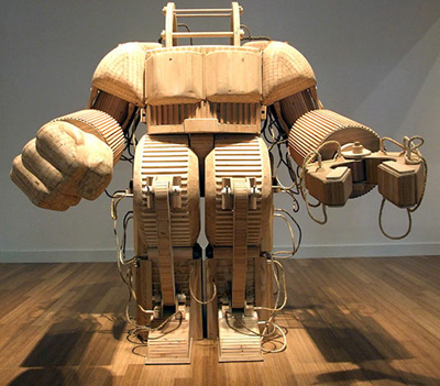
Entering, the eye is immediately drawn to Michael T Rea’s A prosthetic Suit for Stephen Hawking with Japanese Steel (below) a fittingly bizarre construction for a bizarre title. In terms of design it bears resemblance to the power loader from Aliens or an anime style mecha but what really stands out is the fact it’s made of wood. The sort of object we would normally expect to have a metallic production line sheen suddenly adopts an unexpectedly DIY quality, a garden chair dimension that makes it feel more ornamental than it would have in steel or iron.

Following this line of thought, perhaps the intention in using such unexpected building materials was  to make an otherwise impressive creation obviously ridiculous. The title suggestion of Stephen Hawking using this suit in place of his wheelchair is amusingly extreme but also appears to be pointing a finger at the excesses of science fiction, emphasising the gap between the realities of modern machinery and the romanticism of its fictional counterparts. In spite of the obvious lavish care that has gone into its construction, I suspect the motives behind ‘suit’ could be more pessimistic than they seem; expressing disappointment rather enthrallment over the development of technology to date. In other words: where the hell are the androids and flying cars we were promised?!

Contrastingly though there was also a great deal of very real technology on display. Strolling by the unsettling gaze of some artificial eyes I stumbled upon a familiar object:

I wrote about the i-Limb Pulse prosthetic in a previous post and indeed, it was an unexpected delight to see a real one in the gallery. With each finger visibly powered by a separate motor and the apparent dexterity to do up a belt or shoelaces, its marvel is made all the more impressive in light of how recent such developments are; according to the accompanying information (and my own research) prior to 2007 prosthetic hands were typically three-fingered claws, with the same basic pinching action for every task. To have such massive breakthrough’s in the field from this and the Deka ‘Luke arm’ promises much for the future, with the advanced cyborgs of SF not being so far off after all.

Beyond practical and humanitarian prospects though, the i-limb’s presence in the exhibition sparked another interesting thought: can science and its connected technologies be considered art?

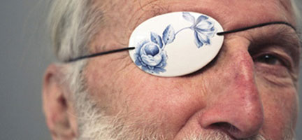
The porcelain eye patch above from ProAesthetics designed by Damian O’Sullivan was on display along with a crutch of similarly decorative design. As the name and image implies this was originally intended to make typically sterile prosthetics and assists more aesthetically pleasing by introducing decorative qualities, however the accompanying notation explained they were never put into production being deemed too impractical and having outgrown their function.

From my perspective these objects did seem ostentatious, but why is that the case? Why exactly are more artistic or culturally refined qualities deemed inappropriate in the supplementation of injury or disability? Are we simply conditioned to expect utilitarian design in such areas or does it arise from some deeper psychological impulse relating to the context of damage or dysfunction? Why does it seem strange to decorate an eye patch but not a tea set?

Their presence in the exhibition solidifies their status as art but seemingly moves them away from serious use enforcing the idea of a divide between application and decoration, but there are other ways the matter might be approached.

The ‘Hexapod’ robots (above) from Micromagic Systems were busy shuffling around a corner of exhibition in their distinctly eccentric manner, their Johnny 5 eyes creating a sense of amusement rather than Terminatoresque foreboding. Regardless, they have impressive applications that could potentially change much in the near future; fitted with interchangeable toolheads and capable of repair or fabrication tasks in awkward places, as the placard put it they ‘promise a world in which factory-style production roams the earth’.

Continuing in this vein, nearby there was also a row of advanced 3D printers; technology which may well become readily available to the common household in years to come with the idealised vision being ‘a machine with the potential to make itself’. If the Hexapods promise a world of roaming factory production, what if these printers promised an industrial revolution within the household? What’s more, suppose such printers came into widespread use of artists in construction of their work? Even if there is a firm divide between technology and art, couldn’t we say that they are interlinked regardless? Sewing machines, pencils, brushes and camera’s may not be appearing on pedestals but they still play an important part in the creation of art. Perhaps this is the ‘power of making’ that the exhibition title itself speaks of.

The lines are ultimately pretty blurry on which of our creations qualify as art and which don’t, which are a boon to human causes and which are a blight but I firmly believe that it is this inherent duality, this sense of contradiction which fascinates and compels so many of us to pursue and develop these inventions. Perhaps it was the show’s most startling juxtaposition which spoke loudest and most clearly of this;  a glass case containing a pair of objects, both beautifully hand crafted, both of similar size, both a similar composition of metal piping with completely polarised applications.

A flute and a shotgun.