With time pressing on and next month’s setup for the Masters Exhibition looming large – eek! – I felt it was time to make some concrete decisions on exactly which pieces will be going display, while becoming specific on a few other vague areas.
I’m still planning to use eight 800 x 600mm frames for this; however after some thought and discussion with others I’ve changed my mind on a few critical details as pictured and explained below:

For one, considering that half these frames will be holding A4 landscape concepts (eight pieces with two to a frame) it logically followed that the first four frames should all be hung in portrait to make the pieces fit neatly at the correct orientation. Meanwhile the one frame in the second half required to hang as a portrait (due to the positioning of the DVD player and TV) will contain my two complete covers as an introduction to the finished pages, with their landscape format making them more or less the perfect fit.
The next two frames will be – as I previously planned – hung in landscape with two A4 pages set within each in their native portrait format, the last frame though I’ve decided warrants something slightly different. During the planning presentation a couple of weeks ago, I was advised to include at least one larger format piece and on admitting I didn’t have much I could blow up beyond A4 the suggestion arose that I construct an A3 collage from my existing art.
Besides the fact that reworking art rather than working from scratch should be quite feasible in the time remaining, it strikes me this should be an effective way to conclude my exhibit and break up the regular page work a little. I’m still making this – hence the no show – but as such I’ll just consider that last frame (15) to be reserved.
So, what of my other eight concept pieces and six finished artworks? What follows is a numerical rundown – relating to the above diagram – with attached reasoning for my choices:
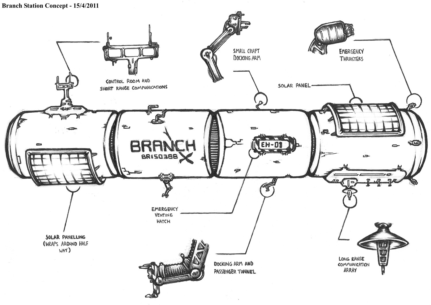
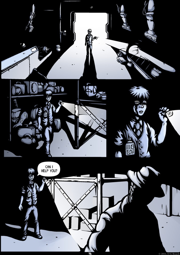
This seems as good a starting point as any. Besides being the titular setting for the comic, it can also be seen directly in the second page of the first issue, firmly anchoring the concepts to my finished work.
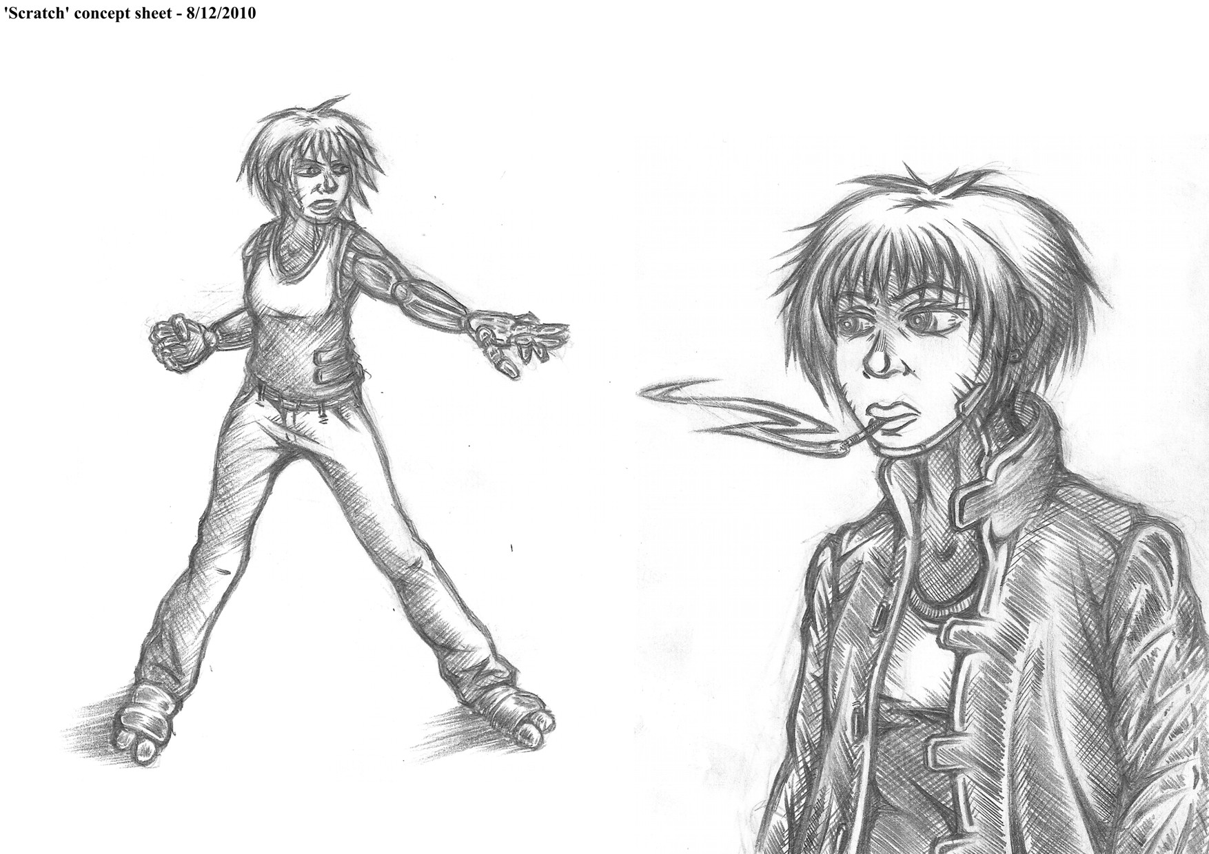
While these sketches are somewhat crude and Scratch’s design has since seen a complete overhaul they do illustrate an early stage of development and emphasise how much has changed since preproduction, that and I feel they draw attention to her physicality and weary attitude as a character.
3. Sasaki’s Den
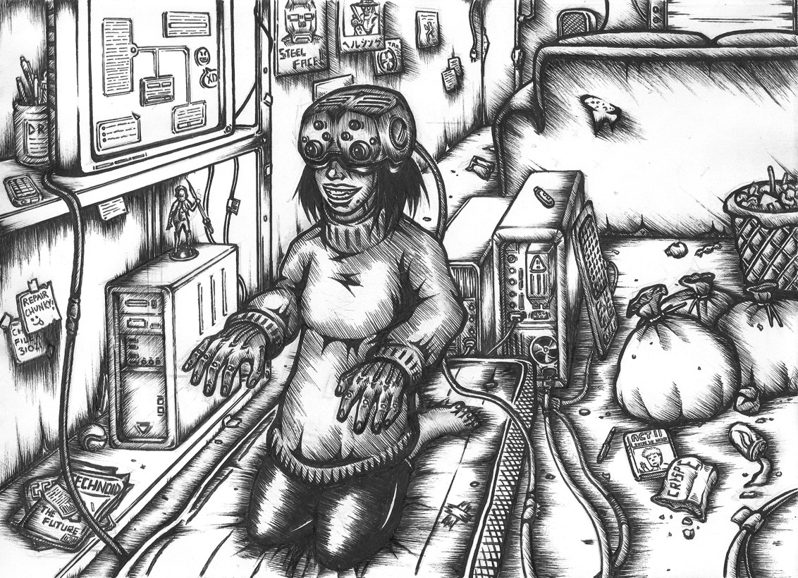
Another character design which has seen a lot of changes since this concept, regardless it remains one of my more accomplished preproduction pieces. What I like in particular about it is the use of an environment to mirror the personality of the subject; essentially technical astuteness offset by a lack of hygiene or care in day to day life. I went with B&W version here and with image ‘7’ since the colour work unfortunately ended up being a bit substandard.
A tweaked version of my final concept sheet for Scratch, it more or less shows her finished look and compared to the earlier sketches demonstrates the overall development of the design particularly in areas such as the arms and clothing.
Probably my favourite of all Branch’s character designs. Earlier drafts for Baby Face were problematic to say the least but the final concept turned out rather well; on the one hand the 1940’s style formal attire reflects the characters overblown sense of superiority and sophistication, while the alarmingly rough, angular prostheses emphasise his unrestrained brutality.
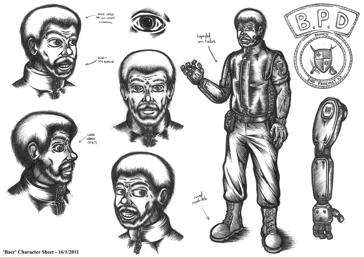
Another of my better concepts, what I like about Baer is the way he balances ruggedly human qualities with those of a machine. It might seem like an odd choice given that he hasn’t appeared in the comic itself yet, but he’s a character who embodies a great deal of Branch’s human-machine symbiosis themes, with an old school attitude in conflict with the world around him and even his own clunky prosthetic “grabber”.
Not my favourite setting piece but a good one to show some of the earlier word building, while it also forms the basis for my first cover. Furthermore, the inclusion of both Scratch and Curt here hints at the central relationship which the story revolves around.
Technically a collection of concepts rather than a fresh set, still this line up shows my entire cast at the point I started production making a good conclusion to my concept work in the exhibit. The height comparison is a nice touch too as it gives a greater sense of context to each and how they relate to one another.
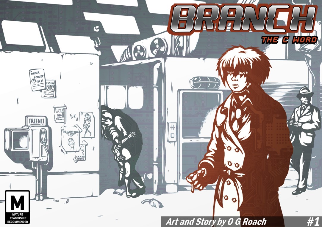
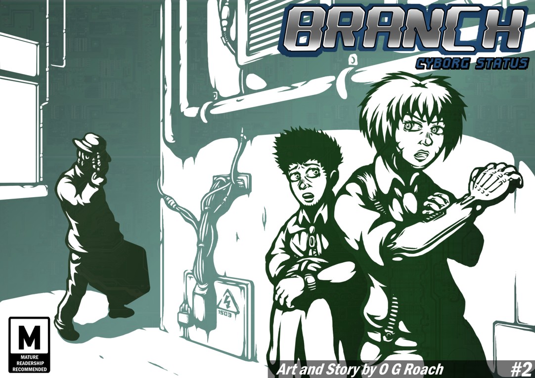
9 – 10. Covers
As previously mentioned these frames will hold my two issue covers; not just because their full landscape format fits a portrait frame better than a regular page, but also because they are naturally intended as an introduction to the comic when it’s read. Having them come before the actual pages seems like good sense to me, even though they were admittedly made quite late on in production.
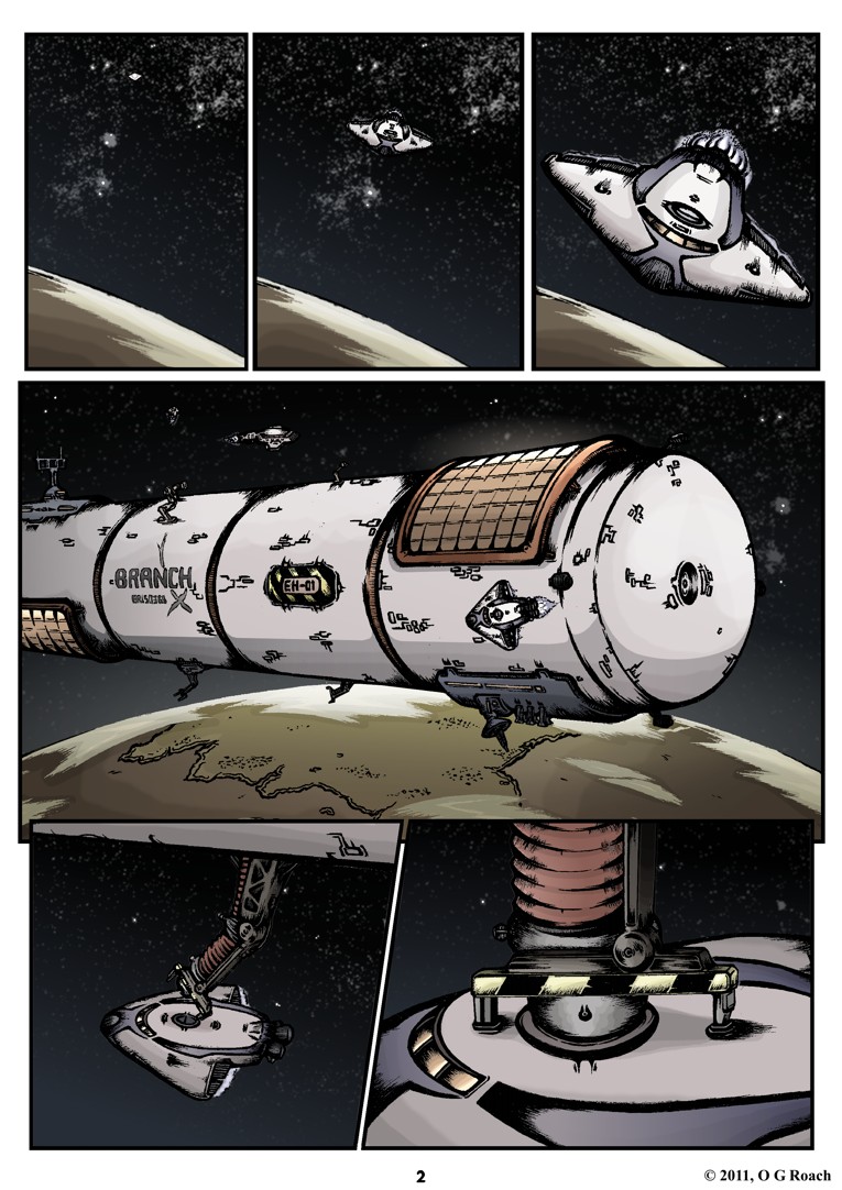
11. Issue 1, Page 2
As mentioned earlier with my design for the space station, I felt that this one was an important inclusion to set the scene and tie production to preproduction as explicitly as possible. Even out of context it feels suitably introductory.
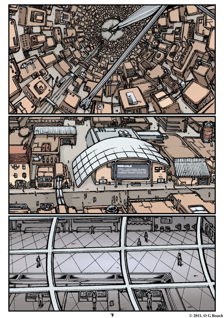
12. Issue 1, Page 7
Besides being easily my most positively received page, this one makes a good companion piece to page 2 in the same frame featuring another establisher only this time inside the station. It also sets out a few key features of the setting such as the 360˚ curve of gravity and crumbling favela style setting.
13. Issue 1, Page 16
Being one of my more atmospheric additions this one was something of a no-brainer , importantly demonstrating the influence of noir stylings on my work and showing Baby Face within the comic.
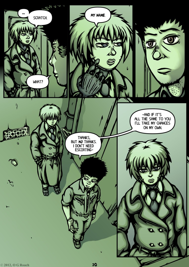
14. Issue 1, Page 20
There were plenty of options to choose from for my last actual displayed page but this one seemed like a good bet. It has a sort of introduction from Scratch and begins to show the uneasy dynamic between her and Curt, while additionally featuring what may be my most ambitious perspective drawing in the bottom panel.
…
I realise this seems like a relatively small selection considering the number of pages I’ve produced but bear in mind that there will also be a TV/DVD player running a slideshow of all my work to date should anyone want a more extensive look, while I’m also considering leaving a few printed copies out for people to flick through.
I should also take this opportunity to underline my decision not to use the acetate layering idea I mentioned in my ‘Development’ post. This isn’t to say I didn’t like the concept but after talking it through with our resident technician again it seems like there are just too many problems involved; I wouldn’t be able to hang them up for health and safety reasons, while keeping them in shape without becoming distorted would require rods to hold the sheets in place – not to mention a spare surface for it all to be fixed upon.
I could alternatively have done the same thing on a smaller scale with a booklet or folder but I feel that would lack the same impact, break up the overall cohesiveness of the exhibit and really be far more trouble to prepare than it’s worth. I’d much rather spend my remaining time on other areas of the display and I can always do something similar with my DVD, creating a time-lapse of the layering alongside the main slideshow to reveal more of the process.
So, with all that sorted out all I have to do now is prepare business cards, put together that A3 collage and I should be ready to visit the printers before the end of the month!


 Posted by Ozy

