Apothecary Supreme – Issue 1 Cover

June 2, 2017

Coloured in cover and a version with the text/logo. Took a while to get this one right, but it feels like one of the biggest hurdles on the road to print is clear.

As anticipated the snake heads didn’t make the cut thanks to the title (that’ll teach me to think out my compositions more carefully!) but perhaps I’ll work them into the back cover somehow.


The Apothecary is in!

April 1, 2015

Well here it is, my new comic Apothecary Supreme has begun going online today on The Duck and ComicFury.

ApothIssue1CoverTEMPj

I’ve been at it a while since as mentioned in the last post I really wanted to have something this time before sharing it.  I’ve got a decent backlog to ensure regular updates (Wednesdays) for a while, no telling if I’ll be able to keep the pace up but at least sharing will spur me on to work a little harder.

It’s essentially an episodic fantasy comic centring on Greta – a small eccentric apothecary sporting a bit of a mean streak.

GretaFigureConcept1jThere will be monsters and horror aplenty but I’ve also tried to imbue it with a darkly humorous edge to offset the more ridiculous/obscene elements.

As of the moment I’m focusing on finishing the first issue as a bit of an experiment to see how well it turns out. Assuming I’m successful I’ll most likely work on more issues, however for now I don’t want to repeat my old mistakes and bite off more than I can chew; my initial goal is to simply tell a satisfying self contained story in around 30 pages.

So here goes, my 1st comic to appear online in almost two years, onwards!


Issue 3 Cover + MCM London ComicCon (October)

June 26, 2013

It’s the boys in blue!

BranchIssue3coverver2j

Ahem, that is to say that with the appearance of a notable police lieutenant in this issue it seemed fitting to adopt a bluish tone for my cover this time around.

This one proved rather tricky for a number of reasons; excluding cleanup, colour and text – and unlike its predecessors – I drew it up by traditional means rather than digital, naturally resulting in much head banging – not the rock ‘n’ roll kind – and some copious use of Tipp-Ex along the way. I also learned what a potential nightmare drawing someone holding a submachine gun can be and do not get me started on that bloody monorail train.

Still for the most part it seems like the ambition paid off, the finished composition is suitably striking and different to the previous covers while staying within the same stylistic boundaries. Finishing, annoyingly I realised Scratch and Curt aren’t casting a shadow on the floor thanks to neglecting it in my original draft where their feet go out of frame, but hopefully it’s not too jarring being disguised by the colour-contrast between subjects and backgrounds. If anyone asks I’ll just say there’s a high-power directional spotlight behind them…

Anyhow, as usual I’ve been way too quiet for way too long but my work gears have been a-turning and all being well I should be posting a stream of exciting new stuff in the more immediate future – or rather I’d better because I recently confirmed I’ll be on a table at the London MCM Comic Con again this October! Can’t say I’ve attended two cons in a year before and naturally I went through a signature phase of nail gnashing indecision but it seems like a good move. A year is a long time to hide in a hole by comic standards and even if my promised next UBER issue isn’t realised by then at least I’ll be making some kind of appearance.

Also as usual I’ve completely failed to keep up with other people’s blogs/comics, rest assured I’ll be dropping in soon for my usual rounds of praise/harassment ;)


Issue 2 Cover

June 7, 2012

Branch: Mint edition!

Given the generally positive feedback I received on the last issue’s cover this one follows on from its template in most regards; I’ve been trying to establishing a running style and the mix of noir shadowing with circuit patterning seems like a solid representation of Branch’s mood and themes.

While I want to create a sense of visual continuity between installments though I was also conscious here of the need to differentiate them in some fundamental way. One of my customers at the MCM Expo talked with me about how they often forgot which purchases of a series or a particular author’s work they’d made between conventions, consequently putting them off the follow ups. In recognition of this problem I completely overhauled the colour scheme for this issue, maintaining what I hope to be recognisable stylings in a radically different flavour.

The orange-reds off grey-blues in my last cover were meant to emphasise the clash between human and machine – while also being a complimentary arrangement to catch the eye – here I reprised the greens in an echo of Scratch and Curt’s initial meeting to continue enforcing a sense of queasy unease as things become progressively worse for our downtrodden delivery man. The formerly red title also felt a little too extreme against these colours so I changed it to cooler looking blue to create a stronger sense of cohesion in the design.

On the content: I’ve been getting some feedback from people eager to see action and indeed this issue will be trading much of the last one’s intrigue for more in the way of excitement. I never specifically intended Branch to be an action comic but Scratch is a character of few words prone to expressing herself physically rather than verbally – she’s not a murderer but she’ll quite happily resort to violence, making full use of her prosthetics and the advantages they allow.

Perhaps it sounds like I’m getting a bit ahead of myself, but I’ve opted to loosely base Scratch’s fighting on kung-fu styles; I’ll save the exact details for another post, but along these lines I’ve been giving some thought to exactly how Scratch might fight. The idea of her being a trained thug of considerable self-confidence would suggest a refined level of skill – namely martial arts – and while I’m not planning to devote huge amounts of research to it (as fighting isn’t the story’s focus) I feel a reference model would lend greater credibility than clumsy abstractions. Besides the fact that Kung fu is the only martial art I have any hands on experience of, the directness of it strikes me as a good fit for a hyper efficient cyborg.

Hence the basis for the feisty pose. I toyed with the idea of her and Baby Face grappling as a cover image but felt compelled to include Curt given his role as co-protagonist and as a distinctly human counterbalance to Scratch’s OTT bravado. I want to avoid the heroic/badass stereotypes as much as possible and having Curt pathetically tailing Scratch with her coat hopefully takes the edge off the dramatic pose a little.

Anyhow that’s enough blabbing for now, I need to get back to work on what’s going inside this thing…


Cover Complete

May 9, 2012

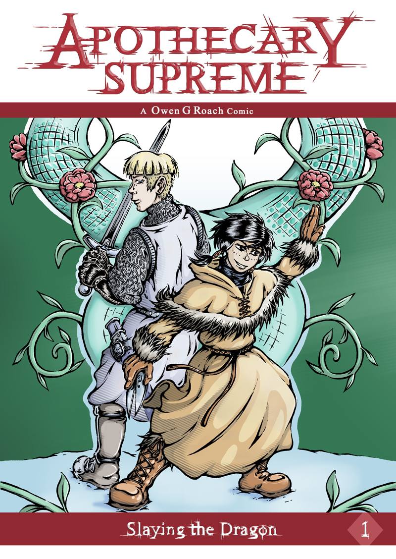
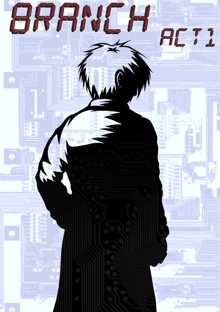
Like most things this took longer than I would have liked, but as I mentioned previously people are more likely than not to judge a book by its cover and I really wanted to make sure that even a glance will leave an impression. As usual there are the perennial gripes over the details, anatomy and rendering, however this may well be the best cover I’ve ever made.

That’s not really as big an achievement as it sounds, all my past efforts have been single sided, ramshackle affairs, typically rushed out as something quick between story pages; the difference here was making an investment of time, thought and care that the former desperately lacked. It’s a long way off perfect, but it stands head and shoulders above my initial effort

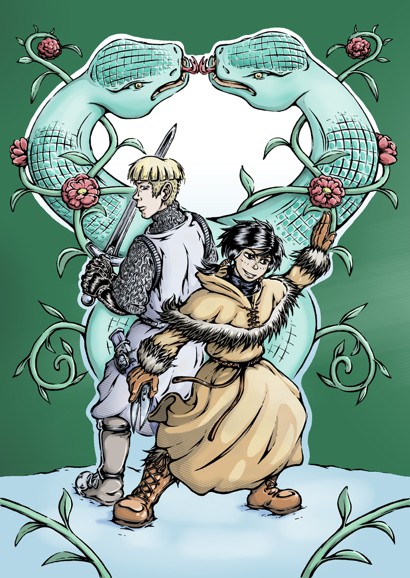
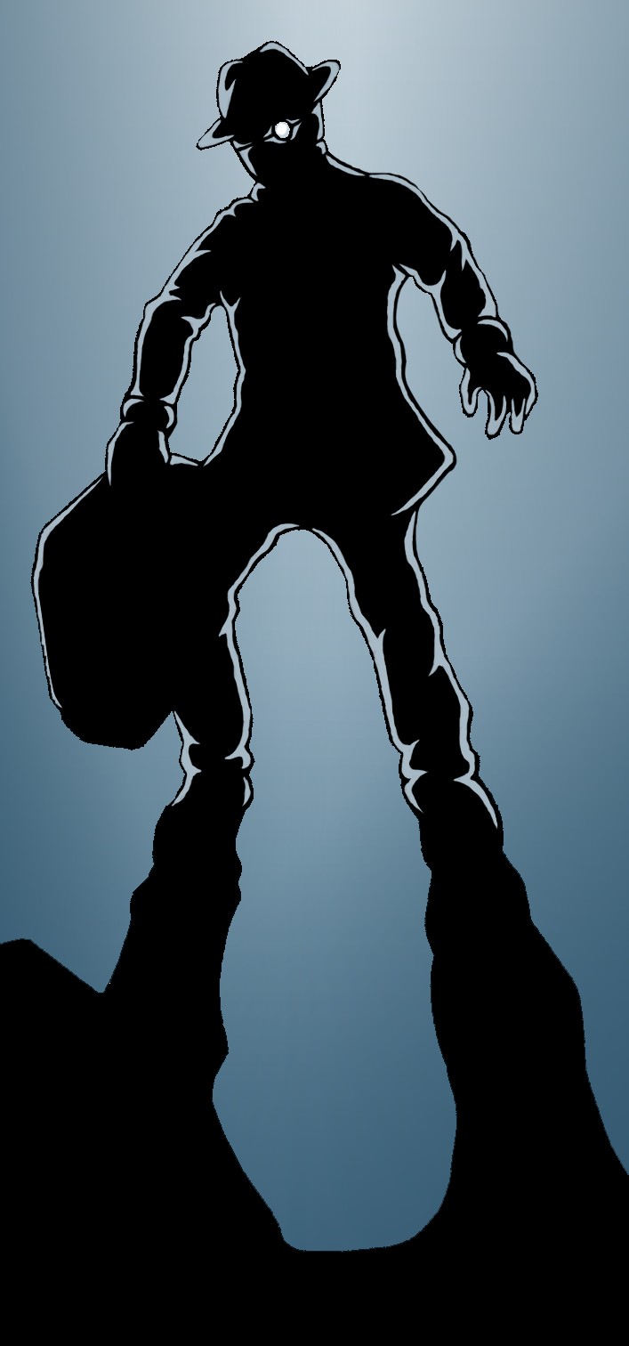
The above version of the cover is intended to wrap around the printed issue I’ll be peddling at the MCM Expo, though it can just as easily be halved for a web version. I already showed the black and white drawing of Scratch, the background meanwhile is loosely based on an old bit of concept art with the original figures removed – they were wonky – and the setting itself re-rendered to fit with the heavily shadowed noir vibe style.

I kept the colour palette down to oranges playing off blues and greys as I felt it would create a stronger impact than the alternative. Personally speaking my best pages thus far appear to be those with a simplified scheme, creating a more intense atmosphere and more striking imagery. As I’ve mentioned on several occasions, much of Branch’s colour schemes is based out of oranges of blues with the intention of portraying the symbiosis between humans (warmth) and machines (cold), here I wanted to boil that theme and aesthetic down to its essence, making it as overtly obvious as possible.

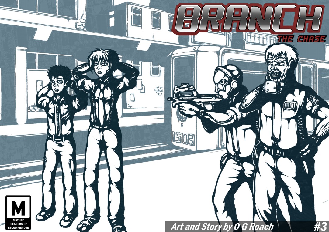
Besides the titles though, Scratch is the only element of the cover in orange; it could be taken as being symbolic of her ultimately human qualities beneath the cold exterior, in truth though I was more interested in emphasising her alienation – cyberpunk protagonists are typically such, but without giving away too much it does become a key part of her character development later. On a visceral level, it also ensures she pops out from the setting being the immediate focus of the viewer.

On the translucent circuit textures; they were largely to create a more intriguing and surreal image but again, thematically support the themes of human-machine symbiosis, with technology seemingly lurking beneath every shadow – I should credit Lain with sparking this idea through its similar use of red splatter in the shade – the Branch station is built out of technology, though more pertinently it has literally become a part of people.

The specific background features should tell people things about the story as well; the curving cityscape is shown in the background establishing an important aspect of the setting, there is notable wear, tear and grime indicating it to be a used future along with other decidedly unsettling aspects.

With an initial version of the cover I showed a friend which had Scratch on her own he told me it looked a little too barren and that I ought to capitalise on the sense sleaziness indicated by the posters next to the Treenet booth and have a couple in the back alley. Given my intention to disturb rather than titillate with this I may have pushed a little further than intended, it started out as a kiss/embrace but now looks somewhat more explicit.

Still, the potential shock value isn’t necessarily a bad thing as controversy and sex do tend to draw interest, as an Expo newbie it may well work to my advantage catching attention and given the places the storyline will eventually go a darker cover is perhaps a fairer indication of content. Also, yet again in line relation to my theme a fusion of very human sexuality juxtaposed with freakish cyborg appendages seems quite appropriate.

Finally, the titles. The main one proved quite a headache, with several scrapped attempts before I made something I was happy with. My original alphanumeric title appeared too spindly for the most part and either sunk into or jarred horribly with the rest of the cover. The final redesign (which I’m quietly proud of) is essentially a heavily mutated version of my original title font, fleshed out with extra bordering and a chrome style finish. It may be a touch too forceful for my liking but its bold and ideally grabs your attention.

Following on from my point about shock value, the new issue/act subtitle is an addition I added feeling it had an amusing double meaning. The immediate assumption that it’s one of English’s foulest swear words is offset by the reveal on page 6 and the alternative connotations in relation to the story’s context. As a way to intrigue and sneakily build immersion I think there could be something in it, regardless it’s more interesting than some bland ‘ACT 1‘ caption.

There’s always more that could be done, but I’m hoping that as an advertisement of content this does the job. A blurb felt unnecessary on the basis that it’s going to be relatively short and I’m hoping the image will be enough to get people reading, what I need to put all my energies into now is getting a few more pages out of the door before printing so I can deliver a satisfactory ‘to be continued’ and not some vague dropped-off-a-cliff cutoff.