Issue 3 Cover + MCM London ComicCon (October)

June 26, 2013

It’s the boys in blue!

BranchIssue3coverver2j

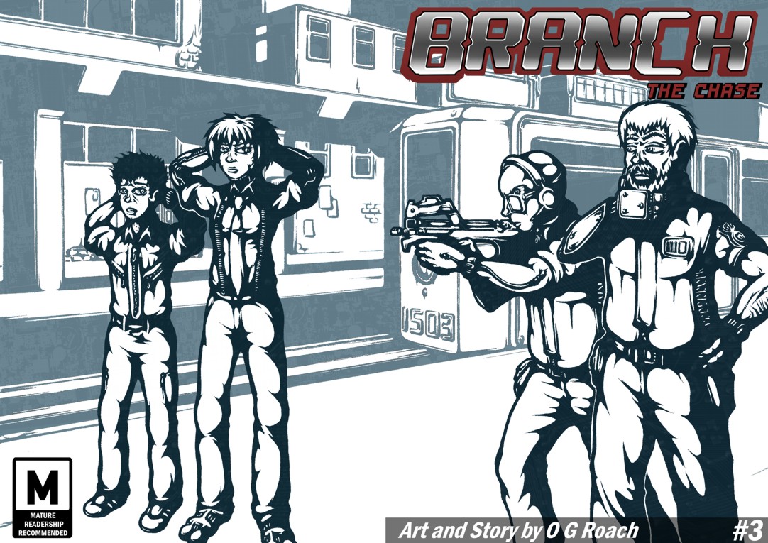
Ahem, that is to say that with the appearance of a notable police lieutenant in this issue it seemed fitting to adopt a bluish tone for my cover this time around.

This one proved rather tricky for a number of reasons; excluding cleanup, colour and text – and unlike its predecessors – I drew it up by traditional means rather than digital, naturally resulting in much head banging – not the rock ‘n’ roll kind – and some copious use of Tipp-Ex along the way. I also learned what a potential nightmare drawing someone holding a submachine gun can be and do not get me started on that bloody monorail train.

Still for the most part it seems like the ambition paid off, the finished composition is suitably striking and different to the previous covers while staying within the same stylistic boundaries. Finishing, annoyingly I realised Scratch and Curt aren’t casting a shadow on the floor thanks to neglecting it in my original draft where their feet go out of frame, but hopefully it’s not too jarring being disguised by the colour-contrast between subjects and backgrounds. If anyone asks I’ll just say there’s a high-power directional spotlight behind them…

Anyhow, as usual I’ve been way too quiet for way too long but my work gears have been a-turning and all being well I should be posting a stream of exciting new stuff in the more immediate future – or rather I’d better because I recently confirmed I’ll be on a table at the London MCM Comic Con again this October! Can’t say I’ve attended two cons in a year before and naturally I went through a signature phase of nail gnashing indecision but it seems like a good move. A year is a long time to hide in a hole by comic standards and even if my promised next UBER issue isn’t realised by then at least I’ll be making some kind of appearance.

Also as usual I’ve completely failed to keep up with other people’s blogs/comics, rest assured I’ll be dropping in soon for my usual rounds of praise/harassment ;)


Issue 2 Cover

June 7, 2012

Branch: Mint edition!

Given the generally positive feedback I received on the last issue’s cover this one follows on from its template in most regards; I’ve been trying to establishing a running style and the mix of noir shadowing with circuit patterning seems like a solid representation of Branch’s mood and themes.

While I want to create a sense of visual continuity between installments though I was also conscious here of the need to differentiate them in some fundamental way. One of my customers at the MCM Expo talked with me about how they often forgot which purchases of a series or a particular author’s work they’d made between conventions, consequently putting them off the follow ups. In recognition of this problem I completely overhauled the colour scheme for this issue, maintaining what I hope to be recognisable stylings in a radically different flavour.

The orange-reds off grey-blues in my last cover were meant to emphasise the clash between human and machine – while also being a complimentary arrangement to catch the eye – here I reprised the greens in an echo of Scratch and Curt’s initial meeting to continue enforcing a sense of queasy unease as things become progressively worse for our downtrodden delivery man. The formerly red title also felt a little too extreme against these colours so I changed it to cooler looking blue to create a stronger sense of cohesion in the design.

On the content: I’ve been getting some feedback from people eager to see action and indeed this issue will be trading much of the last one’s intrigue for more in the way of excitement. I never specifically intended Branch to be an action comic but Scratch is a character of few words prone to expressing herself physically rather than verbally – she’s not a murderer but she’ll quite happily resort to violence, making full use of her prosthetics and the advantages they allow.

Perhaps it sounds like I’m getting a bit ahead of myself, but I’ve opted to loosely base Scratch’s fighting on kung-fu styles; I’ll save the exact details for another post, but along these lines I’ve been giving some thought to exactly how Scratch might fight. The idea of her being a trained thug of considerable self-confidence would suggest a refined level of skill – namely martial arts – and while I’m not planning to devote huge amounts of research to it (as fighting isn’t the story’s focus) I feel a reference model would lend greater credibility than clumsy abstractions. Besides the fact that Kung fu is the only martial art I have any hands on experience of, the directness of it strikes me as a good fit for a hyper efficient cyborg.

Hence the basis for the feisty pose. I toyed with the idea of her and Baby Face grappling as a cover image but felt compelled to include Curt given his role as co-protagonist and as a distinctly human counterbalance to Scratch’s OTT bravado. I want to avoid the heroic/badass stereotypes as much as possible and having Curt pathetically tailing Scratch with her coat hopefully takes the edge off the dramatic pose a little.

Anyhow that’s enough blabbing for now, I need to get back to work on what’s going inside this thing…


Page 22 + Printing for the Expo

May 22, 2012

Well here it is, the conclusion to Branch issue 1…

This may not be my best page but at least it gives some sense of the issue/chapter going somewhere as the threads mesh together. Curt realising his delivery has being stolen more or less concludes the introductory section and marks an important shift towards the main plot.

On the downside I haven’t covered anywhere near as much of the story as I would’ve liked though. The first third of my script was written with the intention of setting everything up and giving readers a balanced cocktail of excitement, drama, intrigue and dark humour; as it is I manage about half of that first act here, with the majority of my favourite moments infuriatingly just around the corner. There’s no use in dodging it, I need to work faster.

Not that I haven’t been working hard. I doubt it shows in the finished piece but I seriously short-changed Mr. Sandman this weekend finishing this last page for the printers. I’ve still got red roadmaps all over my eyes and the kind of complexion which has people barricading doors and brandishing crucifixes…

Still, I guess it was a valuable lesson in working economically, I didn’t get time to do everything I wanted to with this page though maybe that was the point. While the backgrounds are a little sparser than usual and the shading less detailed the flow appears reasonably clear. I could quite easily have spent another four-five days polishing this up and adding things in but would it have been worth the additional wait? Maybe having an unbreakable submission deadline yesterday demonstrated the kind of discipline I’ve been lacking till now.

Anyway on that note it’s at the printers now and will be ready just in time as I leave for the MCM Expo. As planned I’m going with an A5 colour format going for a suitably modest price of £4-5 – I’ll see how it sells :p Given that it’s the first time I’ve done something like this I’m naturally terrified, but like everything on this project I’m sure it will be a useful experience even if it isn’t a massive success. I’ve had various people telling me to get my work out there in physical form so I can at least say I’ve finally given it a shot – that and seeing other folks at the comic village should also be a lot of fun!

I’ll post again before I set out to London, in the meantime I just need to make sure I’m prepared. Stay tuned.


Page 9

September 15, 2011

Ack, feel like I’m sneaking into class late here…

It goes without saying that this is another embarrassingly late post as for one reason or another I just couldn’t get the page done until now. I suppose this is especially disappointing given that I’d intended to work for weekly updates now I’m posting elsewhere but it ultimately came down to either rushing out something severely dissatisfactory or delivering a more accomplished page at a later date. I could rave on about how I’m justified by the quality over quantity argument, but I’ll stick with a summary: I suck, I’ll try harder.

Unfortunately things will almost certainly be stalled again in the immediate future as my impending Practice in Context deadline means I’ll have to prioritize my essay till the deadline on the 26th. It’s another area that’s been a little neglected lately and a timely reminder not to lose focus on the goals of the MA, I’ll attempt to squeeze in drawing but I think the next page is liable to appear around the end of the month rather than next week. Sorry but consistent releases will have to wait :(

The page itself is a bit of a mixed bag. I’m getting to some of the more interesting story material now as Curt runs into cyborgs for the first time and begins to develop a phobia which plays a prominent role in the ensuing narrative.

I tried to make his growing discomfort with what he’s seeing apparent in the artwork by emphasising the attendant and guard’s grotesque enhancements; the second and third panels reflect composition and posture between Curt and the man on desk drawing attention to their similarities (both being in fairly low-level jobs) while also stressing the startling difference. The last panel meanwhile marks the rising tension with hard lines around the implants, aggravating their unsettling presence and bringing the guard who was formerly in the background to the centre of the reader’s attention.

While these parts turned out as I’d hoped the effect is unfortunately marred by the weaker first and fourth panels  which suffer from unrealistic anatomy and perspective issues – they’re acceptable perhaps but someway off from my best. The colour too could have been much stronger; I’m aiming for a washed out, overexposed sort of look in this setting but the tones feel a little off balance to me. I’ve likely said it before but colouring is something I’m still adjusting to, with the necessary experimentation naturally leaving some casualties along the way – this page is one of them.

Outside of scrutiny on single panels/aspects though there is a stronger sense of flow than earlier pages, with more continuity and less of the disjointed progression formerly criticised by Paul Gravett. It’s a small thing but progression in anything is good news to me, the sense of imbalance is still pervasive but I’m starting to get a foothold on the problems.

Anyhow, I’ll try to get another page out as soon as I can but for now it’s time to hit the books and get writing.


Page 8

August 23, 2011

A little later than planned here’s page 8!

I drew up the linework on holiday to avoid a complete hiatus, though drawing in the face of strong winds at the beach wasn’t the best of ideas, nor was trying to draw straight lines in a moving car…

Anyway, with this one I wanted to change the atmosphere giving the sense of breathing room after the claustrophobic tunnel and airlock. I was advised to pull back more by Paul Gravett so I’ve done just that with the middle panel, emphasising Alexa’s departure (for now) and the new spaceport setting.

In relation to this I cranked up the brightness of the colours aswell, going for more in the way of  antiseptic whites and light blues while intensifying the characters. This may seem counter logical given the used future setting and noir influence, but I feel this is a good point to visually emphasise the ‘calm before the storm’; the story is destined to head into gloomy murk soon enough and a little contrast seemed like a good idea. Besides this, in reality airports frequently have whitish colour schemes and if anywhere on the station were likely to be well maintained it would be here.

I should also mention I made a notable alteration from the script here with Curt’s reaction. Originally he didn’t say anything after Alexa walks off, but it occurred to me how odd it seems they didn’t introduce themselves at all. As such I felt an acknowledgement in the dialogue might be a good idea, while lending a bit more colour to Curt’s personality in the process. Alexa also developed to be more flirtatious than scripted in drawn form so the suggestive response seems believable enough.

On the negatives: I can’t help feeling I could have done more with the space, especially that middle panel. Maybe a few passers-by or more scenery would have improved it. I dunno, but a bit more care in future compositions wouldn’t go amiss. That and a few instances of dodgy anatomy continue to irritate as usual.

Not a great page then, but at least an adequate one and a reminder of where I need to work harder.