A couple of weeks ago I visited London for two things; the possibility of a job interview and Somerset House’s Pick Me Up graphic arts fair. With the former opportunity falling through at the last minute – special thanks to those guys – I can’t deny being more than a little disheartened, fortunately though the fair proved to be more than worthwhile.
Before even entering the exhibition space I caught an informative talk by Derek Brazell – an illustrator perhaps best known for his children’s book covers – covering practical matters those looking to enter the business should take into account. Some of this overlapped with what I’d heard from or been told by other professionals but a great deal of it was fresh advice which I’d do well to heed as I begin looking for work.
In particular, he emphasised the importance of running an illustration career like a business even if you’re freelance, taking finance, image and work resources as seriously as possible. In line with this I need to start organising both a physical and online portfolio of my work before I graduate, considering exactly who my work might appeal to and how best to interest them. Covering legal matters as well – always something I struggle to get my head around – he managed to explain in a surprisingly headache free way the distinctions between copyright and licensing, common pitfalls with commissions and plagiarism grey areas. Forewarned is forearmed as they say.
Moving onto the fair itself, the main exhibition consisted of 20 international artists; all distinct and impressive with a notable lean towards psychedelic imagery, with a few in particular bearing noteworthy relevance to my own work and themes:
Appearing under the title ‘Back to Basics’ the colourful selection of papercraft oddities pictured above from French studio Zim & Zou (Lucie Thomas and Thibault Zimmermann) was the first thing to catch my eye. Beyond a general affection for retro and redundant technologies, I was frankly gobsmacked at the level of detail and care which had gone into the paper renderings of walkmans, gameboys and old camera’s.
Maybe I’m digging too deep looking for a commentary on outdated technologies, but I felt like the medium and choice of bright, unexpected colours said something of the charm that these items take on in retrospect. Alternatively though, it could be that their fragile paper construction speaks of the fragility in the cutting edge; all these things were at one time the best money could buy, a few decades on their simply left in the dust, relics of a bygone age with more value as curiosities than functional tools.
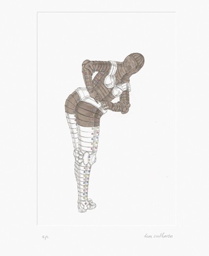
The work of Dutch artist Tim Enthoven caught my attention because of its bizarre balance between humour and perversity, with etchings such as the one above picturing suits of armour in inappropriate poses. The sight of a metal behemoth pole dancing is funny enough in its own right, but what really struck a chord with me was how it tapped into one of my core themes regarding technology being humanised through human applications. If you’ll forgive the pun, I liked how the normally intimidating presence such armour would have was disarmed by the ridiculous context.
More than anyone else though, it was the work of Paul X Johnson which really stole the show for me:
As illustrated by Behold a Pale Horse (above) there’s an immediately evident Noir feel to his work. Here, between the sunglasses, era haircut and muted chrome palette I automatically find myself thinking femme fatale. Of even greater relevance are the little hints of Sci-fi embedded in the prints; the chimneys add an intriguing industrial touch but what are the crystal like objects in the middle ground? And that horse is a bit familiar eh? Reminds me of a certain neo-noir/SF movie scene… speaking of which:
If that isn’t the ‘Rachael’ and synthetic owl from Blade Runner then I’m a replicant. Besides making a clear point of his inspirations, there’s more to this piece than straight up homage; the face and haircut aspire towards photo realism and yet we have a completely angular, hard-edged body bellow with what I’ll take a guess are strings rising from the shoulders – perhaps suggesting marionette like control from a certain someone…
Intentional or otherwise the prints exude a distinctly cyberpunk vibe, while having a gorgeous aesthetic to boot. Being apparently made through a mixture of traditional and contemporary media it also seems fitting I should write about them now in light of my decision to do the same with Branch.
So yeah; another nice turn around for what could have been a botched trip to London and a fine opportunity to recharge my inspiration batteries!


All great artists!
Also, the new header is nice
Thanks, figured it was time to change things up a bit!