Just a little something to keep things moving here:
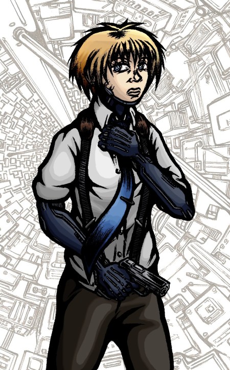
Despite suffering a particularly malignant ‘hands won’t draw’ day earlier this week I eventually got this small concept together. Nothing particularly new or adventurous content wise I’m afraid but it did give me an opportunity to experiment with my colouring technique a little more and to consider Scratch’s general look without the coat on.
In my recent concepts I’d been reliant on layers of colour filters and brush strokes, here however I made stronger use of the dodge and burn tools to create highlights and shadow resulting in an altogether different appearance to the character. As before I can’t shake the feeling it came out a little too bright, but I’m otherwise pleased how the colour scheme fits together with the sharp blues playing off the more muted greys and browns in a distinct arrangement.
And yes, I finally succumbed to the cliché and included a gun in a concept. Forgive me D:

I like the fact that you made her arms navy blue. The color makes it a lil different than usual black/grey, without beeing too extravagant. I also like the superposition of the background. The only critiscm I’d have is that the silhouette could be clearer, especially around the gun since that part is a little hard to distinguish.
And I know you changed the banner a lil while ago, but I like it as well. :P
@demontales: Cheers :) I wanted to emphasise a sort of rubbery, flexible quality to the cybernetic prostheses so I intentionally eschewed typical metallic greys. I felt using blues resulted in a more eyecatching design while enhancing the sense of a cold character.
I get what you mean about the outline being rough though; the drawing started life as a pencil sketch which I cleaned up in Corel. Still, it maintains a rougher edge than an inked picture as a result and indeed makes it harder to distinguish details. Consider it a one off in that regard ;)
Oh, and I appreciate you taking note of the banner change, thanks!