As the title summarises I received my folders back today along with a satisfactory grade. My research and engagement with subject matter were cited as the strongest areas of the project, though naturally there were some criticisms made.
Of these the one I really can’t argue with was a recommendation from my tutor to do more life studies in order to improve my drawing skills. I’d never claim the style of my drawings is particularly set on realism – leaning more towards a stylised look – but then again my figures are often rigid and slightly wonky in proportion, while my clothing tends to look stiff and unnatural. In other words more practice wouldn’t hurt, and while the sessions I formerly attended have long since finished for summer at the very least I could find photos or non-nudes who’ll pose for me.
I’ll admit that the other criticisms didn’t sit quite so well with me initially, though following a discussion with the tutors involved I did see their reasoning. The main one was over my failure to take enough creative risks with my art, feeding in more experimental influences along with the noir stylings I promised. This is true, I haven’t thus far but I have some thought behind it.
Scott McCloud spoke of the balance between clarity and intensity in Making Comics (2006) writing that ‘sometimes just telling straight, with clarity as your guide, is the best way for stories to gather steam and then strike like lightning when it counts.’ (p51) This is advice I took to heart, along with a general intention to follow the noir template of a descent into darkness; with more exaggerated features such as high contrast lighting and expressive shadows appearing as the story progresses. In other words, a visual crescendo to match the narrative one.
As a result of this my pages so far have been slightly bland and straightforward by design. Had I cloaked everything in angular shadowing from the off I imagine it would not only dull the dramatic effect of later scenes, but would have also made my start appear pretentious and heavy-handed; forcing in stylised elements for the sake of it rather than for a reason.
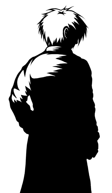
That said, if I suddenly introduce these more intense visuals twenty pages down the line there is a danger it will seem like a complete change in style rather than mood. Hopefully the image I used for the act cover (below) foreshadows their introduction to some degree but perhaps it would be worth bringing them in sooner and taking a risk with the art rather than playing it safe for too long.
Finally, there was also criticism of the project’s scope with the length of my script and the projected 100 pages considered likely to inhibit my creativity in the drive for completion. This isn’t an unreasonable point as I have set myself an ambitious task, however it seems a shame to squander this opportunity creating another short when I have the chance to push myself and create something more substantial. The idea of chopping away significant portions of the script doesn’t sit well with me since they would severely detract from overall narrative, while I also don’t think it’s unreasonable to say I’m treating each page with appropriate care and thought.
Fortunately they did suggest a compromise I can live with; treating the graphic as something closer to issues than a complete volume. Besides giving more room for experimentation and alteration it would also mean that I don’t have to sweat over delivering a finished article by the end of the MA – should worst come to worst letting me deliver a few issues and the remainder of the script as evidence. Obviously I hope it doesn’t come to this, but it’s stopped me worrying quite so much and at least means I won’t be rushing something sub par to a forcible conclusion.
So, overall not exactly horrifying feedback but plenty of food for thought all the same and as ever lots to be getting on with.


I don’t know if you know the comic artist/creator Jaime Hernandez, but he pulls off the “dramatic lighting/effects in dramatic” scenes pretty well while the rest is more “realist”. He’s got a particular style different than yours tho.
Animated movies do it all the times though.
@demontales:Just had a quick look at his stuff and it does indeed seem worth a look as a potential reference. Cheers for that :)
In terms of animated movies I’ve seen a few use the high contrast style to powerful effect, most recently the short lived ‘Amazing Screw-On head’ being particularly impressive:
This short took an unexpected turn XD It visusally made me think a little bit of Cybersix, I don’t know if you watched this show.
When I was talking about animation movies “doing it all the times” I was more talking about taking a drastic dramatic visual shift/intensity in scenes that are as emotionally intense.
@demontales: Haven’t seen Cybersix but will keep an eye out for it. And yes, unexpected to say the least!
And yeah, like animated movies take shifts in visual intensity for appropriate scenes I’m aiming for similar effect myself.