Everyone is Connected: 100 Bullets

March 31, 2011

Much as I did with Sin City (1991) I’ve made mention of Brian Azzarello and Eduardo Risso’s comic 100 Bullets more than once now in connection to my research and artwork, so it’s high time I did a proper write up on it in recognition of this. I’ve previously read several books in the series (of which there are 100 issues across 13 volumes) but for the sake of keeping things succinct and relevant here I will be focusing on the debut book First Shot, Last Call (2000) as a sample of its storytelling approach and style.

The story’s opening chapters centre around a simple but compelling premise: a man referring to himself only as ‘Agent Graves’ visits the victim of some grievous wrong doing and informs them who is responsible, giving them a briefcase containing supporting evidence, a pistol and 100 untraceable bullets along with immunity to any ensuing investigation – essentially a chance to have revenge and to get away with murder. It’s a setup which inherently challenges the characters’ morality and affirms its place as a neo-noir take of the bygone pulp genre.

What’s perhaps most clever about this basis though is its dual function. Considered in a standalone capacity this volume offers one-off stories of revenge centring around differing protagonists and reasons for retribution. Taken as part of a larger whole however there are enough clues towards an overarching plot to maintain readership for future instalments. It is thus that it captures the attentions of the casual reader in the short term while ensuring long term interest is retained to facilitate the series survival and success; the immediate emphatic appeal of downtrodden people given a chance to settle a wrong in their lives is counterbalanced by the mystery surrounding Graves and his ‘game’.

In this book for example, we are initially treated to the story of Dizzy Cordova; a former gang member mourning the shooting of her husband and child, freshly released from prison. The second character story meanwhile focuses on a bartender Lee Dolan; a man whose life was effectively destroyed by false charges of child pornography. Both these stories begin with Graves handing over the briefcase as a catalyst and yet both could be taken out of context and still function as satisfying pulp style shorts. It’s remarkable just how much they differ in execution and resolution too, with Dizzy getting her revenge and closure while Lee backing down results in bitter tragedy.

Graves and initial hints towards a sinister organisation ‘The Trust’ also serve as a running thread through these two narratives, maintaining a structure around the shorts while a coda chapter at the end alludes to the scale of ‘the game’ by linking a series of seemingly unconnected people – something which gives rise to one of 100 Bullets’ driving themes, that “everyone is connected” (p55).

To the series’ credit, in spite of the fairly outlandish premise the situations often possess a high degree of realism most notably in terms of character behaviour and development. That so many of the cast are flawed and prone to immoral behaviour potentially makes it sound nihilistic, but it would be more accurate to say this roots the narratives in a tangible sense of reality with death seemingly a hairsbreadth away and sustained tension being used to maximum effect before each story’s climax. It’s a subjective point, but in my case at least the character faults drew my sympathy. The convincing use of accent and dialect in the speech adds a great deal too; it takes some getting used to but again enforces a sense of credibility while also creating a powerful sense of place within each narrative, being filled with the sort of language you might very well hear around the real location.

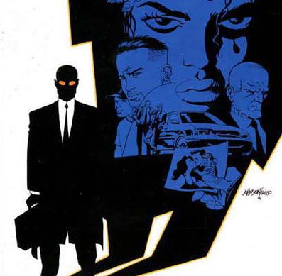
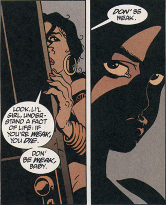
Considering Risso’s art 100 Bullets perhaps isn’t obviously impressive. Viewed in the wrong light its drawings might be considered overly simplistic and half finished. What ultimately betrays the skill with which they are made though is the realisation that they are not simple for the sake of cutting corners, rather they are economical to enforce an image on the reader that is both powerful and memorable. Similar to (perhaps directly inspired by) Frank Miller’s Sin City the style appropriately pays homage to the high contrast depictions of film noir with large areas of shadow obscuring characters and backgrounds, while including surreal touches of illumination such as the teeth and eyes. These compositions and their capture of form are incredibly effective, managing to convey atmospheric scenes without resorting to slavish amounts of detail.

As I’ve formerly mentioned in other writing, the colour palette does an outstanding job of complimenting these stark depictions too: a specific scheme being used for each story giving them all a distinct visual flavour and tone, making it possible to differentiate them at a glance and once again keeping them memorable.

Dizzy’s portion of the book begins saturated in sun washed oranges and browns before giving way to greys and blues for the night storm at the end, something which connects with film noir’s tendency of gradually descending into night as the metaphorical ‘heart of darkness’ is reached. Lee’s story on the other hand is differentiated by deep reds and lurid yellow highlights, depicting the neon sleaze of his downtown bar job and frequent visits to an exotic dancer. It’s a method which gives the stories a distinct visual personality by reflecting some of the subject character and their situation in the colour scheme, emphasising the shift in perspective on an almost subconscious level.

It takes some adjustment but 100 Bullets is to my mind a defining example of modern comic book noir; staying true to the genre tropes of moral ambiguity, pervasive mystery and heavily stylised visuals while placing a modern and distinctly gritty twist on the formula. Like the artwork it never does more than it needs to, telling streamlined tales of greed and revenge with just enough intrigue to keep you reading.
Sin City: The Hard Goodbye

March 10, 2011

It occurs to me that I’ve made mention of Frank Miller’s Sin City a few times now in relation to my concept work without including a specific write up about it on this blog. Having read the first instalment The Hard Goodbye (1991) and included an entry in my folder I figured one was in order here.

Prior to reading, I was already something of a Miller enthusiast thanks to The Dark Knight Returns (1986) but had little knowledge of Sin City beyond a few glimpsed pages and the Robert Rodriguez movie adaption. His art here remains identifiable largely through the grizzled protagonist ‘Marv’ resembling TDKR’s aging Batman, poses featuring his billowing trench coat recalling the latter’s cape. At the same time though the approach remains quite different.  Style and technique here are minimal, eschewing colour in favour of stark black and white compositions; an approach which sets the graphic apart from the author’s preceding work.

The titular setting of Sin City is probably most notable for never specifying its location or exact period. References are made to everything from war torn Baghdad to 1950’s fashion trends. While this is only my take on the reason behind this ambiguity, I feel perhaps the intention was to free the story from restrictions of an exact backdrop, allowing the purest homage possible to the collective film noir and pulp fiction of the 20th century; a mish-mash of cherry picked influences you might say.

Though the influences may be worn on its sleeves, the story quickly sets itself apart from a plethora of similar works with some distinctly unconventional elements. Take the love interest Goldie for example – rather than being developed through a gradual romance she is introduced at the start in an opening sex scene before being abruptly murdered; a swift entrance and departure certainly but one which provides a genuinely compelling motive for Marv’s ensuing revenge. Elsewhere I think it’s fair to say most hardboiled detectives wouldn’t be caught dead visiting their mother’s house to collect a gun and yet it’s a moment which pushes past the established clichés and injects a sense of reality into the melodrama. The formula is pushed and warped in unexpected ways but remains uncompromised, for all its idiosyncrasy Sin City keeps a foot firmly in its subject genre.

Marv himself makes for an unlikely detective figure too: self described as dim witted and ugly he never hesitates in resorting to violence while an unspecified mental condition causes him to imagine things or become “confused”. He’s an anti-hero certainly but frequently appears alarmingly monstrous even by this measure. Besides inflicting injury and torture upon his enemies comparable to even the story’s worst villains, the inhuman amount of damage he takes from guns, cars and weapons throughout furthers the image of him being a sort of abomination.

I formerly mentioned how the opening murder provides a genuine motive for Marv’s actions later but at the same time the constant introspective narration seems to challenge this idea.  While he does have a personal stake in avenging Goldie there’s something oddly wanton to the glee Marv takes in the carnage, as he puts it to his parole officer “This is big and I’m right in the middle of it and there’s no place I’d rather be.” Perhaps in this sense the character is intended as a comment upon the audiences’ insatiable thirst for violence and tales of revenge, these moments of excess hinting at a metaphysical purpose for his existence and the carnage: to entertain the readership’s own dark desires.

Alternatively, I may be over thinking what is in essence a guilty pleasure. There’s a near continuous deluge of fighting, sex, murder, prostitutes, torture and cannibalism across the pages with few punches being pulled in the depiction of brutality. The violence isn’t mindless but nor is it particularly subtle either. Were I asked to consider which it has more of between style and substance, I wouldn’t hesitate to say style.

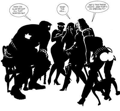
Fortunately it is in style that Sin City really excels. At times it can seem deceptively minimal for a graphic novel, characters and frames often lacking the firm outlines so commonly associated with comic books, but these economical black and white inks are ultimately all the more impressive for so clearly suggesting characters and scenery with so little. Patterns of light and shadow result in truly striking poses and expressions while bringing the stark contrasts of classic era noir to mind.  More outlandish touches often add a surreal element to the atmosphere too, something which seems all the more fitting in light of the protagonist’s deranged mind state. The classic noir silhouette is often inversed presenting light ghostly figures against a dark background as opposed to visa-versa, while the plasters on Marv’s battered face are occasionally highlighted as well covering him in tiny neon crucifixes – perhaps in reference of having the Cardinal Roark as a villain or alternatively portraying Marv as some twisted form of Martyr for Goldie; punishing the wicked only to take the fall for everything at the cost of his life.

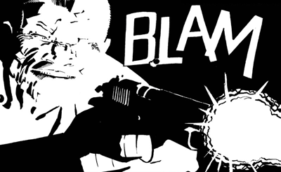
Given the smaller page size, emphasis on mood and large amount of action Miller fittingly opts for less panels of a larger size, allowing the artwork to take centre stage and really shine as a result. Occasionally the layouts can seem quite bizarre in this regard with a drawing only taking up a small portion of the page, but I suppose this only serves to draw focus on the moments in question, setting them apart from other sequences and giving them breathing room. Special mention should also be made of text such as onomatopoeias, with sound effects and exclamations often being a seamless and integral part of the art – the famous “BLAM! BLAM! BLAM!” page being a strong example of this.

Looking at the similarities Sin City bears to other works, beyond the obvious film noir inspiration I can see elements of Eisner’s The Spirit in the art – which Miller coincidentally directed the unfortunate film adaption of – while it doesn’t seem a stretch to suggest that more recent works such as 100 Bullets may have taken note of the economical style and technique used here too. If I were to take one thing from the book it would be that sometimes less is more, the suggestion of an object rather than a clear cut depiction being enough in itself, while often being far more interesting and atmospheric. Detail and realistic depiction isn’t everything.