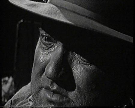
40’s Fashion: The Complete Fashion Sourcebook

June 17, 2011

Having talked a lot about embracing the noir influence on cyberpunk and connecting with some of the modernist values echoed in my own setting, it seems appropriate that I take a moment out from cyborgs and scribbling to have a specific look at the era’s fashions.

My intention has been to flavour rather than saturate the dress of my characters with the aforementioned style for fear of pushing too hard in a steam/retro-punk direction. However, thus far most of my references have been skimmed directly from film noir and other non-specific sources; an approach which has proved adequate but honestly slightly lazy, missing the finer details and a broader overall view. With crowds of Branch’s inhabitants likely to appear on the graphic’s forthcoming pages it seems more important than ever that I have unifying influence on their clothing and general style.

Following my recent module presentation in which I expressed this concern, a fellow student (thanks Lucy!) kindly lent me The Complete Fashion Sourcebook (2005) by John Peacock. Charting the development of fashion through the majority of the 20th century, the book predominantly uses illustration to show rather than tell which – given my own chosen medium – is quite fitting. It was particularly pleasing to find that the introductory write-up for the 1940’s section struck an immediate chord with my aims:

‘Women’s fashion in the 1940’s divides into two separate parts: from 1940 to 1946, and from early 1947 to the end of the decade. The first part was dominated by the Second World War. Dress, echoing military, was consciously and almost wholly utilitarian. In the United Kingdom, rationing came into effect in the summer of 1941 and the following year saw the introduction of the Utility Clothing Scheme which restricted among other things the amount of cloth that could be used in garments, the maximum length and width of a skirt, and the number of pleats, buttons and trimmings.’

(Peacock, 2005, p119)

‘Utilitarian’; a word I’ve formerly used in relation to my character designs. Indeed, with the ‘make do’ basis for my setting and general ‘used future’ vibe I have in mind it’s remarkable how well the rationing behind late WW2 clothing meshes with the context of my graphic. Being a time discouraging frivolity in design and a general less-is-more approach I feel it fits in with Branch’s inherent desperation and the largely closed economy of a space station.

Contrary to this I’d originally considered studying fashions of the 1940’s and 50’s, taking inspiration from throughout noir’s golden era but was made to reconsider as the text offers some interesting insight into the changing attitudes following the war:

‘Paris, traditionally the world’s most powerful force in fashion, lost much of its influence due to wartime isolation. But in 1947 it came back with a bang. On 12 February of that year the French couturier Christian Dior launched his ‘Corolle line’, instantly nicknamed ‘The New Look’ – the most famous and controversial collection any designer has ever produced (…) it was ultra-feminine and grandly extravagant, and arriving as it did so soon after the war, when some rationing and restrictions were still in force, it caused a sensation. The old pre-1947 lines were demolished at a stroke.’

(Peacock, 2005, p119)

With ‘The New Look’ moving away from the restrained designs of old into more luxurious territory the motivation behind late 40’s and 50’s fashion seems ill fitted to the context of the graphic while this clear divide suggests I’d benefit from an exclusive focus on WW2 wear. 

As stated this is specifically considering female wear, with men’s fashion of the time being abruptly dismissed as ‘relatively stationary and somewhat dull, dominated as they were by military uniform’ (p120). It’s a harsh judgement perhaps but looking across the decade there are only slight variations on the typical suits and trench coats – this isn’t exactly problematic to me as it provides a more stable template to work from and use artistic licence with, while I confess that I know far less about women’s clothing during the decade anyway.

Moving on to the actual illustrations I’ve collected a small cross-section, specifically selecting the most eye-catching designs as potential inspirations – forgive the slight distortions, hardbacks can be a nightmare to scan:


Considering the female outfits from the above 1941 day wear page, there’s a notable focus on pulled in waists specifically the prominence of belts – likely a reflection of the times aforementioned military influence – while skirts are typically cut to knee level; saving fabric while remaining modest. Meanwhile the male garb here is a fairly typical three-piece suit with wide lapels, waistcoat beneath and requisite Trilby, not too dissimilar perhaps to my last design for Baby Face.   


Moving away from formal wear I find it interesting that we see women’s leisure outfits sporting trousers alongside the skirts; a sign perhaps of the gender’s increased emancipation as the formerly male dominated jobs were offered to them during wartime. This time around the male example is slightly reminiscent of Baldo, the more elaborate collar and double-breasted pockets being something I may incorporate into my own design.

Moving on to the day wear of 1943 there’s a notable increase in the amount of fabric being used for both men and women, possibly as a result of the war approaching its end. The padded shoulders also appear to be more prominent while the military influence is especially strong in terms of the hat and coat designs.

Finally, I grabbed this page of 1940’s evening wear just to throw in something a little different for my references. While Branch is intended to be rife with poverty there will be a select few who benefit from or even excel under the circumstances. Drawing upon designs such as the above could provide an interesting variation on the general style to keep things diverse, while emphasising difference in wealth on an immediate visual basis.

As the graphic progresses I should be returning to these pages on a regular basis for design ideas and general inspiration, though if I get the time I’d like to research a few more sources to ensure the aesthetic is soundly developed. At the very least the influence should feel more informed now.


Game Over: Tetsuo the Iron Man

June 10, 2011

Once again Japan has delivered something which forces me to reassess my threshold for the bizarre.

Not so long ago I wrote about how strange Serial Experiments Lain was, but I think its safe to say that Shinya Tsukamoto’s Tetsuo: The Iron Man (1989) blows it out of the water in that regard. Taken at face value it’s somewhat tempting to dismiss this low-budget oddity as another disposable 80’s ‘video nasty’ and indeed at a glance there’s certainly plenty of violence and horror on display to support this conclusion. However, extreme as much of it is there’s a pertinent and genuinely unsettling message to accompany the excess.

All the same, it’s still difficult knowing where to begin describing a film with such a completely outlandish style of storytelling; while its themes firmly root it in cyberpunk territory this is not the sort of cold, methodical approach I’ve become accustomed to within the genre. Ghost in the Shell approached the issues of the human-machine symbiosis with a calculated sense of detachment, but in contrast Tetsuo portrays its subject matter in a hyperactive frenzy of sexuality and aggression.

The opening credit sequence immediately sets this tone with the Salaryman character (possibly Tetsuo, no one’s directly named) launching into a frantic dance juxtaposed against industrial machinery and a suitably thumping industrial soundtrack. It’s a surreal start which establishes the theme and mood for what’s to follow, being equal parts cool and ridiculous in the process:

The story itself begins with a gruesome scene of the man known only as the “Metal Fetishist” compulsively inserting a rusty bolt into his leg. Following the discovery of maggots in this festering wound he staggers out onto the streets in agony only to be run down by the hapless Salaryman and his girlfriend who – presuming they have killed him – proceed to dump the body to avoid blame.

This is just the start though; as the guilt ridden Salaryman is shaving for work the following day he discovers a small steel spike embedded in his cheek which on closer inspection appears to be sprouting from within. Attempting to ignore this he begins his commute anyway only to be accosted by another office worker who abruptly grows grotesque mechanical features of their own and begins a murderous pursuit.

From here on the film heads in an increasingly surreal direction justifying its reputation as a ‘cyber-fantasy’ with the Salaryman uncontrollably mutating into machinery. As his condition gets increasingly out of hand the tone swings between gross out horror over to pitch black humour. It’s difficult not to be amused by the outright absurdity of a drill erupting from a suggestive location, but then again his application of this new appendage quickly stifles the laughter.

The connection to human-machine symbiosis is pretty obvious, while the connotations to people being consumed by their dependence on technology bears strong comparison to the themes of my own project. Where it deviates from this formula is in its offbeat representation of civilisation’s lust for technological advancement being represented as a very literal lust and sexual drive within the film.

Rather than being a methodically applied upgrade, the cyborg alterations the characters suffer hold more in common with disease; seemingly passed from one person to another and being uncontrollable in their development. Also, as noted the continual sexual references and naming of the outbreak’s source pushes matters into more fetishistic territory. It’s a shocking touch which will likely put off most casual viewers but it certainly gives the message a distinctly unsettling bite.

Shot in black & white on 16mm and made on what was likely a shoestring budget, one of Tetsuo’s most impressive features may actually be how well it fares in the visuals department, turning its limitations into stylistic strengths. The greyscale appearance provokes a grim atmosphere throughout in its reflection of metallic tones, while the absence of colour also lends a strange sense of credibility to many of the props and effects that might otherwise have seemed tacky and disbelievable – the cyborg growths themselves meanwhile bare strong resemblance to typical electrical waste being startlingly chaotic in their arrangement and perhaps making a point of the throwaway society we live in, again connecting with the underlying theme of technology consuming us and our environment.

With CG being in its infancy during the 1980’s and animatronics likely being too costly, the majority of the transformation effects are created with stop frame animation; cheap but so labour intensive it makes you wonder how much time and effort was poured into its more extensive sequences. Again, these mesh with the tone of the film perfectly as the slightly jittery quality of stop frame has an appropriately machine-like quality. Special mention should also go to the high speed chase sequences in which entire streets are utilised in the process to dizzying effect.

Given the pessimistic message underpinning the plot, it’s probably not a surprise that there’s no happy ending for the Salaryman. With the Metal Fetishist revealed to be alive and seemingly channeling much of his misfortune a final showdown see’s them merge together into a colossal abomination: namely a giant cybernetic penis.

Yes. Really.

In effect, it’s the summation of the films sexual overtones, a monument to humankind’s excess in technology and the perpetual need to supplement inadequacies. On the other hand, I can’t see those of the “ban this sick filth” mentality being so easily convinced, others may just have a long hard laugh at adolescent immaturity of it all. Whatever viewpoint is taken, it’s a surprising and genuinely memorable ending that from a thematic standpoint wraps everything up neatly.

For better or worse Tetsuo is pretty unique, with the nearest comparison I can I think of being Richard Stanley’s Hardware (1990) sharing similar messages and sexual imagery. Like Hardware though, there is perhaps some criticism to be made of the basic narrative and inherent style-over-substance approach taken which will be the factor for most making them either love or hate it.

Either way, it made for a refreshing change from the usual cyberpunk fare (if there indeed is such a thing) and I doubt I’ll ever look at power drills the same way again…


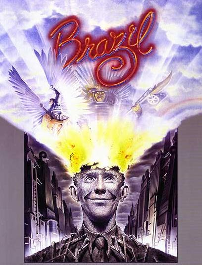
Tomorrow was another day: Terry Gilliam’s Brazil

May 17, 2011

There are some things I find it near impossible to be objective about.

Some years ago during a film night with a friend I stuck on Terry Gilliam’s Brazil on the off chance she might like it. Not only did she not like it, but she refused to sit through more than thirty minutes and then went on to berate me the following week about how I was only into “cheesy 70’s B-movies” (for the record it was made in 1985). She’s not alone in her low opinion of it either it seems: Roger Ebert gave the movie two stars commenting that it was “hard to follow” and that there seemed to be “no sure hand at the controls”, while my copy of Halliwell’s Film, DVD & Video Guide gives it only one star condemning it as “expensive, wild” and “overlong”.

Perhaps the unrestrained outrage I feel towards these opinions says something about just how much I adore Brazil. Gilliam’s more recent efforts are often considered to be packed with original ideas at the cost of coherence, but for me this was always the one where everything really worked and delivered his unique oddity with a powerful punch.

Being genuinely objective though this wasn’t a film which immediately stood out to me as appropriate research material, there’s nothing obviously cyberpunk about the quirky retro-future it presents while some of it has more resemblance to fantasy than sci-fi. However, when I recently re-watched it with a friend who did like it, he pointed out that there may actually be more in common with my project than I initially thought.

Set in a dystopian society obsessed with mindless bureaucracy, there are obvious echoes of 1984 but what immediately makes it stand out from a torrent of other fascistic futures is the streak of dark humour which runs throughout it. The clumsy hybrids of computer/typewriters and ridiculous messaging tubes seem purposefully impractical, while constant paperwork requirements accompany even the most menial of tasks. Anti government bombings are brushed off by the media as being down to “beginners’ luck” while the majority of the populace appears preoccupied with endless shopping.

Even the main plot is bizzarely funny: largely revolving around the pursuit of a terrorist suspect Harry Tuttle, who through a bug related printing incident is mistaken as ‘Buttle’ a harmless family man consequently arrested, with the only comfort offered to his wife being a “receipt for her husband”. It’s from such sheer absurdity that the comedy arises, but the laughs are never entirely comfortable. Ridiculous as it may be the satire remains razor-sharp and more unsettling on reflection.

Were you to substitute the paperwork with more typical sci-fi computers, perhaps the film wouldn’t be too far off from cyberpunk after all. However, what really made me reconsider its relevance is the connection to classic Noir and by extension my subject genre. This is not to say there are venetian blind shadows cast at every turn or continual crooked angles, but the fashion and general aesthetic of the setting seems to draw primarily from a 1940-50’s vision of the future, albeit with extra piping. There are sensibilities here which approach those of steam rather than cyberpunk, but the post-modern fusion of aesthetics isn’t too far off from my own aims to infuse my design with something of the parent detective/noir genres.

Perhaps the protagonist Sam Lowry also has a little in common with the central characters from both genres as well; being heavily alienated by this society and in pursuit of an elusive love interest – dangerous enough to be considered a femme fatale – continually kept out of reach by the barrage of red tape. He makes for an inept, bumbling detective figure but he just about qualifies all the same. As a government employee in an unremarkable position, Sam takes a curious middle ground as someone clearly frustrated and out of step with this world who is simultaneously a part of the machine, his own enemy you might say.

In contrast to this continual bureaucratic drone we are intermittently shown vivid snatches of Sam’s dreams, depicting him as a winged warrior in pursuit of beautiful flying woman. These more typically Gilliam setpieces start out as an escapist fantasy offering insight into his suppressed desires, but after spotting his dreamed love in reality as the considerably more boisterous truck driver ‘Jill Layton’ he begins a hectic pursuit of her and the parallels quickly become more prominent and disturbing.

Possibly the most striking of these visions and allegorically most relevant to my own themes is a gigantic samurai who confronts him wearing armour decorated with electrical components – a representation of the bureaucratic machine as well as the literal one – a monstrous fire bleeding antagonist who when defeated is revealed to have Sam’s face under the armour, lending further weight to the idea of him being his own worst enemy.

Also, while it may only be a subplot the constant cosmetic surgery Sam’s mother and her friend receive throughout the film perhaps bears some connection to my own themes of human body modification. As with much of the film it’s played to darkly comedic effect but this is certainly humour which occupies an uneasy middle ground; the idea of unpleasant truths being concealed beneath a surface of outward prettiness as a layer of formalised documentation euphemises torture and the Gestapo like activities of the government.

This is where I get to the spoilers…

Much as I observed the rising clash between real and the wired in Lain, here a comparable crescendo takes place as the film progresses with an inevitable conflict set to occur when dreams collide with reality. As Sam attempts to subvert the sinister attentions of ‘information retrieval’ away from Jill his unattended paperwork and disregard for the authorities around him finally catches up.

Arrested and taken into a brutal interrogation by a man he formerly considered a friend, everything looks set to end horrifically when he’s abruptly sprung from torture by Harry Tuttle in a dashing rescue. Fleeing the government complex and demolishing it behind him everything looks set for an idyllic happy ending after a reunion with Jill and an escape to countryside.

It’s here that the film’s bittersweet masterstroke is delivered as we are returned to reality, revealing that Sam never left the chair he was strapped in having simply gone mad during the torture and retreated into his imagination, along with the additional implication that Jill was killed by information retrieval after all. It’s an ending which I find still ducks under my defences and hits where it hurts.

More than a valuable example of an aesthetic fusion, I suppose what really compelled me to include Brazil in my research is its sheer brilliance as piece of emotionally engaging science fiction. It’s packed with ideas, humour and satirical charge but not at the expense of cogency (well for me at least) surprising the viewer in its final moments with a conclusion which may well be sadistic but far from heartless.

It’s unfortunate that an altogether less satisfying conclusion awaits my Halliwell’s Film Guide now at the bottom of a recycling bin. Sorry Mr Ebert, but I think I’ll stick to Empire from now on…


What isn’t remembered never happened: Serial Experiments Lain

May 5, 2011

Serial Experiments Lain is a strange series; take that from a strange man with strange tastes. It’s an experience which is intriguing, disturbing, frustrating and depressing in equal parts but ultimately rewarding providing you can see it through to the end.

It’s true that the cyberpunk is often plundered by anime for its sci-fi aesthetic and dystopian themes, but what sets Lain apart from these neighbours is the thought with which it addresses the genre’s ideas. Rather than using it as a mere dressing for action and entertainment it concerns itself heavily with the underlying technological and social concepts along with a dose of existential philosophy and theology. There’s an almost novelistic feel to its approach reminiscent of something William Gibson might write, never being afraid to challenge the viewer or experiment in ambiguous territory.

At the same time, this makes it so obtuse and idiosyncratic in places that many will be put off by its sheer lack of accessibility; Lain demands your full attention and reflection to make any real sense of it. I still find parts of the story infuriatingly oblique even after a second viewing and yet in spite of this I still find something about it utterly compelling. Like I said: strange.

Based in a world with an alternative take on the internet known as ‘the Wired’ what’s perhaps most startling about this setting is its uncanny resemblance to the network society of today. Aspects of it remain intentionally outlandish, but the base depiction of its pervasive social importance is more relevant today than when series originally aired in 1998. Even the wired enabled phones aren’t too far off our own modern equivalent.

In contrast to this, Lain herself initially has little understanding or interest in “connecting” with others over the wired or in reality for that matter. I’m sure mention of having a 14 year old schoolgirl as a protagonist is likely to provoke eye rolling from certain quarters, but our central character here is somewhat removed from the usual cookie cutter pubescent. Alienated and unresponsive to the point of appearing autistic; Lain’s initially vacuous nature makes her perfect to introduce the details of the setting through while her social ineptitude and distant family quickly draws viewer sympathy. In essence, she has more in common with the anti-hero detective figures of cyberpunk literature than most anime heroines.

The style of the animation is also distinctly offbeat. The character designs are closer to realism than the medium usually offers with a colour palette which is more often restrained to drab browns and greys than colourful alternatives. At the same time an atmosphere of discomfort is nurtured by an overpowering sense of the mundane, while elsewhere surreal little touches hint at something unpleasant lurking beneath this everyday veneer. Shadows are speckled with red blotches perhaps in reference to blood, while the seemingly omnipresent dark cabling of the wired fractures and webs scenery with its humming menace.

The story is kick started when e-mails are sent around Lain’s class allegedly from a girl Chisa who committed suicide just a week before. The rest of her classmates take it to be a distasteful prank however Lain, intrigued by what she’s heard dusts of her neglected Navi (their equivalent to a PC, not a blue cat alien :p) and investigates. Discovering a similar e-mail she questions the departed as to why they died, the ominous reply being that “god is here”.


Throughout the following episodes Lain gradually becomes drawn into a mystery involving a group of hackers known as the ‘Knights’ in worship of this internet god and the ruthless ‘Tachibana Labs’ who are seemingly set on thwarting them. Vague hints at the underlying plot and dark machinations are thrown up in a manner typical of a techno-conspiracy thriller, however far more interesting than this – though ultimately tied to it – is the development of Lain herself.

As she delves deeper into matters her computer skills rapidly develop, visually represented as her outdated Navi is replaced with a top of the line model which in turn is progressively modified; growing from a desktop device to a formidable setup which fills the entire room. Her personality also quickly develops as she becomes bolder and more assertive,  managing to befriend a classmate Alice and beginning to behave more sociably.

All this could be seen as puberty cyberpunk style, but at the same time stranger things accompany it. Rumours filter back to Lain about her appearing in places she’s never been behaving wildly out of character, while her reputation on the wired starts to take on an inexplicably legendary quality she never seems to have earned. Worse still, she is plagued by increasingly nightmarish hallucinations of phantom figures in reality, appearing to originate from the wired itself.

Things come to a head as stories of “the other” Lain suggest she spread scandalous rumours about Alice, while the hallucinations begin to manifest for other people besides herself. It’s also the point at which the series seemingly starts to unravel, buckling under the weight of its own mystery poised to irrepairably fall apart into pretention, when something even stranger happens:

It starts to make sense.

Just as I’d convinced myself the series no longer had any idea where it was going the seemingly unrelated threads mesh together with a coherency which pulled the proverbial rug out from beneath me. The central idea – that ‘god’s’ plan is to break down the barrier between the wired and reality – admittedly pushes credibility even under the banner of ‘cyber-fantasy’ but is presented with such immersive conviction that it’s rendered wholly believable from a dramatic standpoint. It also makes for a worryingly relevant allegory of our current society in which the internet is of increasing importance in day to day life, as Lain herself eerily phrases it: “no matter where you go, everyone’s connected.”

As reality begins to crumble the self appointed ‘god’ finally reveals himself to her as Masami Eiri; a deceased scientist responsible for the wired upgrade causing the bizarre incidents. Formerly believed to have killed himself under a train, he now resides as a consciousness in the wired – a sinister figure of assured control and near unlimited arrogance with the goal of making the world cast off flesh in favour of a supposedly limitless existence over the network.       


More importantly though, light is finally cast on Lain’s role in these events. Isolated once again through the destructive rumours regarding her alter ego, she questions Masami as to who or what she really is, with the response being that she is “software”. Created by him to help implement the breakdown between wired and reality, Lain is a sort of physical embodiment of the process; something which explains the abnormal development of her technical proficiency and initial alienation. We’re never offered a clear-cut explanation as to whether she’s a GM construct, a machine or some form of shared hallucination originating from the wired though it’s a vagueness which I feel actually preserves much of the series’ credibility; keeping the details ambiguous and leaving the viewer to decide, while also making the whole internet god/reshaping reality plot line easier to swallow.

With Masami set on using Lain to implement his plan, he initially tries to coax her into cooperation but failing this resorts to threats and force – Lain’s defence and crushing blow to his networked ego being that his assurance as an omnipotent being is undermined by reliance on ideas and physical hardware created in the real world, which he is now fatally powerless to interact with minus a body. Thus it is that ‘god’ implodes in a startlingly violent puff of logic.

Far from resolving matters though, this climax only serves to create a larger dilemma for our central character as she is effectively left in charge of the wired and by extension (thanks to Masami’s tinkering) reality. Assuming the responsibilities of a god she is offered the chance of reshaping reality to suit her own desires, but ultimately rejects it in order to fix the lives of her friends and family which have been left largely in tatters at this point thanks to bizarre events surrounding the wired – the unfortunate implication being that she herself won’t be remembered and “what isn’t remembered never happened.”


Perhaps more than any other element in the series, the ending is left open to personal interpretation – inevitably garnering a few aggressive internet forums in the process – but my own feeling is that Lain herself is intended as a metaphysical representation of the network society, her different egos paralleling those of the internet: some wise, some unpleasant some insightful and some disturbing. Considered as an embodiment of this, Lain represents the near unlimited potential of the net counterbalanced by the inevitable faults inherited from its creators.

Serial Experiments doesn’t always hit the mark, often being strange for the sake of strangeness but it’s a negligible footnote when the series achieves so much along the way. Comparable with everything from Neuromancer to The Matrix perhaps its greatest triumph is that it maintains such an original voice amongst the genre while quietly worming its way under your skin. Uncompromising and fearlessly unconventional it’s definitely up there with cyberpunk’s finest.     


Your future’s all used up: Touch of Evil

May 1, 2011

Putting aside that Touch of Evil (1958) is a firm favourite of mine within the noir genre, it also makes for another fitting continuation to my roughly chronological progression of subject films. Not only does it seem to follow on from Strangers on a Train (1951) in terms of the genre’s rising focus on character driven narrative but it’s also considered by many to be one of the last examples of film noir’s golden era (expect spoilers). 

Given the respected reputation it possesses today it’s hard to believe the film was a B-movie, but this may also of been what allowed boundaries to pushed; dabbling in even darker subject matter and muddier morality than its predecessors. Orson Welles – who both directed and co-starred in the picture – is said to have predominantly shot at night to minimise studio interference, only to have the film forcibly recut by Universal against his wishes. All in all, there’s a lot of confusion regarding the different versions (of which there are three), aspect ratio and intended narrative – hardly helped by my viewing from an ancient VHS copy – but as far as I can tell it’s the 108 minute alternate version from 1976 which I’ve watched.

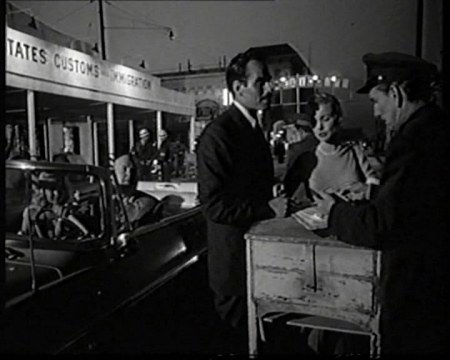
And what a movie it is. Opening with an extended crane shot tracking a car rigged with a bomb we are gripped from the first few seconds and sucked into a world of murder, corruption and deceit. I noted with my previous noir subjects that they typically begin during day light before later descending into the darkness as the climax approaches, however here by starting in darkness it’s as though the film acknowledges a darker tone and sense of foreboding within these opening minutes.

As the car in question explodes crossing the Mexico-US border, taking a powerful construction contractor with it the plot’s key players assemble at the scene of the crime: Miguel ‘Mike’ Vargas, an idealistic Mexican narcotics officer is torn away from his newlywed to investigate the bombing when American Police Captain Hank Quinlan (played by a heavily made up Welles) intervenes, aggressively taking charge of the matter.

For starters, the nationality of these two leading men introduces an uncomfortable element of racial tension to the proceedings. Though the choice of Charlton Heston made up as a Mexican for Vargas suggests pressure from Hollywood to ‘play it safe’, the handling of the racial undertones is far from immature or one sided. Quinlan’s intolerance is highlighted in his objections to Vargas speaking Spanish in his presence, while even Vargas’s American wife ‘Susan’ displays a tendency to racially stereotype, condescendingly referring to a gang youth as “Poncho”.

As we enter the day again and the two reluctantly cooperate in the interrogation of a Mexican suspect things take a critical turn when Quinlan claims to have discovered dynamite in the home of the accused. Identifying the box it was found within as an empty one he previously overturned, Vargas accuses Quinlan of framing their suspect marking a key change in direction for the narrative. To some extent both are detective figures attempting to solve the initial bombing, but as matters develop and the conflict between them escalates, their interests gradually shift from the crime itself over to smearing each other’s reputations.  Soon it becomes clear that the bomb was merely a catalyst for something far more sinister.

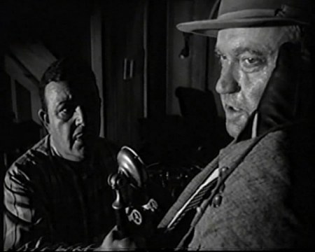
As Vargas sets about searching for incriminating evidence of his opposite number’s corruption in the police records, Quinlan is approached by ‘Uncle’ Joe Grandi – local crime lord and target of the ongoing dope crackdown – with a mutually beneficial scheme to incriminate Susan in a drug scandal and ruin Vargas in the process, an offer which proves just too tempting. There’s never much doubt that Quinlan is the real villain of the piece and that Vargas is our hero, but at the same time Welles’s antagonist has a level of character complexity that isn’t often seen in the medium making things less clear cut than they might first seem. As villainous as he may initially appear with his abrasive manner, ruthless scheming and grotesque obesity it’s hard to find Quinlan entirely unsympathetic.

As matters begin to spiral out of control we hear more about him from Pete Menzies; his long time partner on the force; Depicting him as role model for his own career, Menzies enthusiastically tells Susan at one point how Quinlan got his “game leg” taking a bullet meant for him along with several other mentions of him overcoming alcoholism. Being treated to a glass of Bourbon by Grandi in spite of repeated claims that he no longer drinks, we witness the start of a steep decline that is ironically as likely to draw empathy from viewers as it does horror.

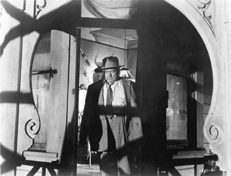
Alan Silver and James Ursini’s The Noir Style (1999) offers a particularly insightful take on how this duality is represented within the visuals in relation to the image above:

 ‘Bulk also adds vulnerability to Detective Hank Quinlan (Orson Welles) in Touch of Evil (1958). Quinlan is a man trapped by the web of violence and deceit he has woven around himself. While his massive figure seems about to explode from an excess of poisonous fluid springing from his corrupt nature, his face sags as he realizes his plans have back fired and he is now caught in his own web. The frame exhibits several layers of metaphorical traps. In the foreground he is framed by the arch of the porch with its curving designs resembling the jaws of a monstrous animal. Further within the shot the door frame acts as a tighter trap, enclosing his formidable figure. And finally, two shadows cut across his body, one horizontally over his midriff and one diagonally at his knees. These foreshadow his imminent doom. In the background Welles the director places a pair of horns, strategically positioned to give the impression that they are growing out of his head, a none too subtle demonic reference.’  

(Silver, Ursini, 1999, p71)

Indeed; while the film embodies most of the crooked camera angles, heavy shadowing and symbolism which had become a genre standard by this point Touch of Evil has its own distinct look, perhaps thanks to the offbeat setting or Welles’s directorial eye resulting in striking often disturbing imagery which complements the story’s tone perfectly.

As night descends once again and Grandi’s gang forcibly intoxicates Susan, the shift back to a darker tone is once again emphasised as Quinlan takes things a step further. No longer content with a pinning a mere drug charge on his foe, consumed by alcohol and anger he strangles his accomplice in order to frame Vargas’s wife for murder – something which in turn echoes the alleged murder of Quinlan’s own spouse by the same method.

Again, this draws viewer sympathy alongside their disgust, but more disturbingly it also draws comparisons between our hero and antagonist with the suggestion that Quinlan may once have shared a similar outlook on law enforcement as his enemy – something lent further weight as Vargas descends into a bar brawl in search of his own missing wife. His fall isn’t so great certainly, but the parallel is definitely there; for all their differences Vargas and Quinlan have a worrying amount in common by the end of the film.

The finale is slightly reminiscent to that of The Third Man (1949) in the way that Menzies – finding irrefutable evidence of his partner’s corruption and murderous behaviour – is forced to confront his idol with lethal consequences. However, while Harry Lime was portrayed as an unrepentant villain, it’s hard not to feel sorry for Hank Quinlan in his dying moments. In what may well be the film’s most powerful moment, Quinlan hears the wire recording of him shooting Menzies in panic, forcing him to face up to what he’s done for the first time, and finally acknowledge his downfall.

All this would have made for a traditionally satisfying Hollywood ending seeing evil punished and bravery rewarded, however Welles makes a bold move by denying us this in the final moments of dialogue.  Arriving on the scene following Quinlan’s death, the assistant district attorney explains how the original suspect has confessed to the bombing, that in spite of everything “Quinlan was right after all”. It’s a final twist which throws former conceptions of good and evil into uncertainty, making an already hazy depiction of morality into a mire.

This is perhaps the essence of what makes Touch of Evil such an admirable piece of enduring film; it presents compelling, complex characters casting aside the traditional ‘crime and solution’ formula in favour of a personal descent into chaos that leaves no one entirely blameless or clearly to blame for that matter. It’s a movie more concerned with where things go wrong rather than how they are solved, which seeks to overturn polarised notions of good and evil.

Who really has the ‘touch of evil’? Anyone who’s desperate enough it would seem.