Script: 1st Draft Complete

April 26, 2011

Forgive the lack of updates over the past week or so, while I haven’t been posting I have kept myself busy…

With the intention being to start planning and drawing pages next month, I decided to prioritize and focus on completing the script I’d formerly been piecing together alongside my concepts and research. As important as all other aspects of the project are, without a script none of it would count for much. Perhaps referring to it as ‘1st Draft’ is a little misleading since I reworked a lot of the material before I wrapping it up. In many ways this might be considered script version 1.5 given the number of rewrites the earlier sections have seen, though being completely honest a few of the later scenes and their dialogue could still use a little more polish before I take it into production.

What I am confident of though is that structurally speaking the script is sound, following a satisfying arc of developments up to the climax and conclusion. It’s still got a few problems but the story feels like it’s firmly in place now with the issues being in the surface details rather than its thematic DNA so to speak.

As you can likely see with the sample above the format is relatively loose compared to a typical film script but this didn’t strike me as an issue. While I have written more rigidly organised scripts in the past, since this is primarily for myself with a comic in mind instead of a film I felt like something closer to prose would be more fitting, while generally being easier to write.

My biggest worry right now is the length, as running around 83 pages it’s somewhat bigger than I’d planned; it’s all well and good planning to write a 50-60 page script, but once you find a flow it’s difficult to suddenly put the brakes on. That’s not to say I believe it’s unmanageable with over a year set aside for production, but it will require discipline on my part. I’m taking a risk, but I’d rather that than playing it safe with a more modest script I’m dissatisfied with.

It’s also worth baring in mind that much of the content is description (something I’m often guilty of overdoing) while should my schedule go awry there’s a fair amount of content I could afford to cut away without impacting the larger story much. It remains shorter than your typical feature film at least and changes are pretty much guaranteed when it comes to the drawing.

For now I’m focusing on refining a second draft for next week to make sure it’s as solid as possible when I start the actual pages. At the very least I’ve organised my ideas into something coherent now, bringing me significantly closer to realising this thing :)


There are No Rules: Scott McCloud’s ‘Making Comics’

April 19, 2011

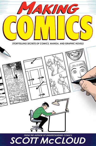
As production draws near and my fingernails get reduced to nibbled down stumps I’ve made an effort to read more in the way of instructional texts in order to address  some of the project’s more practical concerns. Having been recommended Scott McCloud’s Making Comics on several occasions I sought it out and gave it a read, only to be surprised at how little instruction it actually contains.

Before you jump to conclusions and assume this is a spiteful condemnation, let me set things straight: it’s not, at the same time though I will stress that this is not a do or die rule book. Refreshingly, McCloud is more concerned with channeling his readers efforts and giving them pointers on what to look out for than telling them exactly what to do. To use his own words ‘There are no rules’. Which is not to say he doesn’t lay out some specific dont’s and principles to work by, but the text offers an open minded view on the medium remaining considerate of the diverse approaches and working methods it encompasses.

There’s a substantial amount of depth to these considerations too, with each chapter breaking down an area of the comic making process before exploring further subdivisions of each. I’d previously been reading Will Eisner’s Graphic Storytelling and Visual Narrative which I will not devalue in any way – Eisner’s reputation speaks for itself after all – but was more concerned with the general approach taken than the details of graphic production. By comparison Making Comics carefully addressed  these aspects, forcing me to rethink most areas of my project while also alerting me to some I hadn’t even considered (the height chart from a few posts back was a near direct result of this).

It’s also a genuine pleasure to read thanks to the comic presentation McCloud uses. For this type of book there’s a remarkable amount of entertainment and humour along the way; it’s never dull or preachy while the author isn’t afraid to poke fun at himself or the contrivances of the medium – in a sense it’s less an instructional book and more an instructional graphic novel. The images serve a more important purpose though of illustrating the concepts discussed, not just telling you how something might be done but showing it as well. There’s no confusion or real difficulty involved in reading, everything is always clearly explained and demonstrated.

It has certainly been a valuable addition to my research and given me greater confidence and understanding as to how I’ll go about the terrifying prospect of production. Just about anyone starting out in comics or graphic novels would do well to give it a look: it’s more enjoyable than a ‘how to‘ book should have any right to be and may just surprise you in what it makes you realise about your own work.


Font and the Evils of Trialware

April 18, 2011

I’ve spent a lot of time worrying about my artwork, writing and general research up to date however until I a month ago I’d given very little thought to one other integral aspect of the project: typography.

In the past I’ve gotten by using free fonts such as A.C.M.E. Secret Agent and Digital Strip from Blambot.com, which were all well and good for smaller efforts. Now however, it strikes me that it would be a shame to slap on ready-made text when I’m putting so much work into all other areas of the graphic. Indeed, in the professional world of comics where people are hired specifically for lettering I doubt any of them would be caught dead using something grabbed off the internet. So it was that I set about trying to create my own font.

This task proved more difficult than it initially seemed. I began by raiding Google in the hope of finding freeware suitable for converting hand written lettering to a digital font. Settling on Fontographer I figured the trial version might be good enough for what I had in mind. Not so. Rather than giving you a restricted period to try all the features, or removing some of the more advanced options the trialware version watermarks half of the font created making it more or less useless in itself. Trying again, I tested FontCreator, Fontforge and Typelight all with similar (or worse) results.

I can’t exactly complain, the internet has pretty much conditioned most of us to expect free content (legally or otherwise) and while it’s my knee jerk reaction to feel outrage in situations like this it’s ultimately only fair when I’m being a cheap skate. All the same, I can neither afford nor justify a price tag of over £100 for something I’ll only use a handful of times.

As a result of these issues I’ve arrived at this stop gap solution: rather than having my font mapped to key bindings, I’ve scanned in a basic set of characters and – having refined them a little in Corel  – collected them in a bitmap (below) to cut and paste as required:

Yes, pretty crude I know but it’s no worse than what letterers would have done before computers  at least. Even if I don’t find an alternative it’s hardly a back-breaking method, just a minor inconvenience. In terms of the style it vaguely resembles my own scrawl with a slightly beefed up look to give it more impact; I intentionally kept it rough and ready looking in line with typical comic text and to prevent it from appearing cold and overly formal though.

I also created a basic mock panel (below) to give a sense of how it looks in action:

Ignoring the rushed art, colours and bubble – sorry I realise they could have been better – the font works pretty well though it should perhaps be a touch slimmer. Either way, expect tweaking in preparation for production; its got some way to go maybe but at least I won’t be resorting to comic sans anytime soon…


Concept: Branch (external)

April 16, 2011

Here’s an odd addition to my concept work: the outside of the titular ‘Branch’ space station, the setting for my story.

I say it’s odd because this is an uncommon viewpoint, likely to only occur maybe once or twice in the narrative while the rest of the action takes place within – as you may recall I uploaded a concept of the internal cityscape some time ago – all the same, I still felt compelled to draw the outside in order to create a stronger sense of the space within and firmly acknowledge the orbital setting.

Much like the buildings inside it’s intended to be a poorly maintained ramshackle structure; an installation which started life as a shipyard before the original owners were crushed under debt and forced to appropriate it as improvised real estate. Much like the cyborgs who populate it, the setting  is an uncomfortable hybrid of old and new that was repurposed out of necessity rather than some shining conviction. An unglamorous stop-gap that’s acquired a population it can’t shake; part corporate venture, part ghetto and part prison.

While the general shape and design of the structure are more or less as I initially envisioned I will admit that I scaled it down considerably to meet both artistic and practical considerations. Originally I had written that Branch would have a diameter of three kilometers by over a dozen in length, but as you may guess looking at the internal view for comparison it ended up as less than half of that. That isn’t necessarily a bad thing as it enhances the atmosphere of claustrophobia and tension while still providing a sizable setting to work with – that, and it gives me much less to draw :p

Being serious though, I tried to be sensible with the design to give the impression of a rugged but ultimately sturdy structure which could sustain itself to some degree. The enormous solar panels wrap around the hull on either side ensuring the maximum amount of sunlight is caught for power, while the multiple docking arms allow arrivals and departures to be handled en mass. It’s not the most attractive design in some respects, but then I couldn’t imagine such a structure realistically would be.


All Systems Go?

April 14, 2011

I’ve been doing a lot of careful thinking about the longterm development of this project recently, while today I had an in depth discussion with my tutor Mark regarding work plans for the coming weeks.

Were you to ask me whether I felt ready to begin production of the graphic right now, being honest the answer would have to be “no”. It would be “no” now. It would be “no” in a month. It could well be “no” in a decade for all I know. I don’t consider myself to be a perfectionist (I doubt I could create something that is perfect in the first place) but I often have difficulty shaking the feeling I could do more to improve; the niggling doubt of that one book I forgot to read, the design that isn’t quite right or the line of scripted dialogue which I can’t decide on.

Considering my remaining time on the MA rationally against the projected length of the work itself, its gotten to the point where I need to count my hypothetical chickens and start contemplating production as an immediate objective rather than some distant lofty goal. If I want to stand a realistic chance of completing Branch before the end of the course then I need to be strict about my management of time, which means setting myself – yikes! – deadlines.

So it is, that I’ve tasked myself with wrapping up the majority of my planning and studies by the end of the month  with the intention of beginning work on pages by the start of the next. There are about a dozen other sources I want to research, more than a few conceptual designs I’m yet to draw up and a script that needs finalising, but schedules and time constraints are a fact of life. If I don’t start setting realistic targets now then the consequence will be compromise on the final graphic – which is the last thing I want.

Do I feel ready? Not really, but one way or another I’ll be seeing to it that it’s all systems go this May.