Workshop Week

June 29, 2012

It can’t be denied, the blog and progress on Branch have not been forthcoming recently. The final part of my Marvel study is yet to materialise and I’m overdue by a long way on that next comic page, still I haven’t been sitting around in their absence.

This week I’ve been voluntarily helping out with a kids’ workshop themed around Andy Warhol with activities taking place between the local Ferens Gallery – which is hosting an exhibition of his work – and Hull College. I realise this is someway off the topic of my usual posts and might seem a little strange, but I’d like to briefly share a few thoughts on the experience.

See the thing is, I had it in my mind that I couldn’t deal with children. Hearing that I’d be assisting with a group of 12-13 year olds brought back memories of myself at the equivalent age along with my less than exemplary behaviour; I wasn’t the worst pupil in my class but a good long way off the best. More than anything, I felt like I was returning to my dreaded secondary school years; an era I doubt I’ll ever recall fondly thanks to my then crippling social ineptitude and distinctly unmotivated attitude. However, at the end of the first day on the workshop I made a surprising discovery: I don’t actually hate kids.

Maybe we lucked out getting a more studious group or perhaps I was just unrealistically pessimistic but I was actually impressed by their unfettered enthusiasm and creativity. Rather than being simply ‘bearable’ as I hoped I genuinely enjoyed working with them and helping them out. Given their seemingly inexhaustible energy it’s certainly been a draining week but it was also a breath of fresh air that I may well have needed to clear out my psychological cobwebs.

On a more project relevant note I was particularly fascinated by how technically savvy they were; I may have grown up as the internet went mainstream and mobile phones went from clunky oddity to essential accessory, but this is a generation coming of age in a media saturated world of YouTube, smart phones and increasingly miniaturised computing. At an age when I was being given patronising run downs on the correct meaning of ‘ICT’ and word processing, these guys are using Photoshop – many for the first time – and getting to grips with complicated techniques and effects within the space of two afternoons.

Indeed, sitting down to talk informally with a group of them during lunch break I was astonished by their understanding of networking and computers – which is not to suggest they don’t have a lot to learn but compared to what I knew at their age it marks out just how much has changed. For better or worse the times they are achangin’ and what we’re seeing now marks out a trajectory of our increasingly symbiotic relationship with the ever advancing march of technology. Frankly I’m torn between feeling exhilarated and terrified when I think what kids like these will be capable of in a decade or two.

Call it corny if you will, but all in all this week has been an unexpectedly uplifting, inspiring experience. I often feel that adulthood is accompanied by a wave of cynicism, which – while largely being inevitable and frequently prominent in my case – can feel suffocating from time to time. I’m not saying I’ll run out and adopt orphans or anything, but stepping out of my own life for a week and seeing things from a truly youthful perspective has been a veritable lightning bolt to my creative batteries.

So, without further ado I’ll stop prattling on now and start putting my money where my mouth is…


Website

June 24, 2012

Since there’s still no new page for Branch – sorry – I figured I’d offer some evidence as to where my time’s been going by posting my new website.

Basically it’s a more tidy place I can direct folks to when a concise portfolio or CV is required rather than my rambling heavy blog, while it also shows some of my film and animation work for anyone who’s interested. It’s a little daunting given that much of this material has never seen the light of the web before and for every moment I’m proud of I find myself nitpicking at all the other faults that have become apparent over the years. As ever I really am my own worst critic.

Still, with the MA drawing to a close it seems increasingly important that I establish myself professionally in some way, offering a suitably professional image rather than just my current ramshackle setup; my wordpress and its charming informality won’t be going anywhere but this way I can please both sides without having to compromise.

For anyone wanting to take a closer look at the site to praise/laugh at/shun me, you can access it by clicking here or going through my main links page and hey, let me know what you think!


Marvel and Me (Part 2)

June 20, 2012

Picking up where we left off with my study of Marvel’s production process, the next four chapters on detailed figure drawings, poses and heads largely deliver more of the same; general tips on drawing construction interspersed with more superhero specific touches. As before I’ll be taking note of advice applicable to my own work, while examining where our approaches conflict and why.

Anyway, I formerly mentioned how the book’s suggested figure planning method of cylinders and cubes differed from my own approach of loosely sketching ovals and shapes to build up form, being perhaps too stiff for my liking. As it turns out, it isn’t entirely dismissive of alternatives:

This ‘scribbling’ method is described as being suitable for ‘a more advanced student’ (p56) which feels like a slightly arrogant assumption to make of myself – my anatomy still has problems – however, it’s more or less how I do things already while also it feels far more natural and effective to me than a forced collection of rigid polygons. Lee’s explanation of the process closely resembles my own reasons for using it:

‘As John explains it, it’s like being a sculptor and building a figure with clay. You just keep adding these loose little lines until the figure starts taking shape. Another important thing about scribbling is that it helps you to loosen up and get a feeling of movement and action. Do your scribbling lightly, and try to train your eye to spot the lines that are correct and to reject the ones that aren’t. Then, as you continue to mold the figure with your pencil, you emphasize the important lines and eventually lose the others.’

(Lee, Buscema, 1978, p56)

Naturally this is built up over a stick skeleton to set out the basic pose, but the whole idea of flexibly shaping up the figure and garb does more for my style than their former suggestion. As demonstrated with Thor’s cape in the example, loose clothing is easier to figure out and draw satisfactorily this way; superheroes are known for their skin tight preferences but my cast’s looser clothing typically favours a looser method of drafting.

Fitting too that ‘movement and action’ should figure into this method so heavily as I feel they’re an area of inexperience for me, presenting a daunting hurdle with their imminent arrival in Branch. As such, the next example is of particular importance:

No matter how much they might try to hide it, comics – excluding the motion variety – are ultimately a static medium where movements are implied rather than shown; reader imagination fills the gap, usually helped along with little nudges such as speed lines or an onomatopoeia. As demonstrated here though, the extremity of a pose can do a lot for the impact of an action creating a tangible sense of motion and excitement.

Indeed, it’s an idea which remains applicable across any genre of the medium aiming to do so, on the other hand it can be overdone:

‘Even when characters are just standing, the same rules apply. Notice the figures on the facing page. In each case, the smaller figure is okay. But just okay. Not particularly dramatic, not overly heroic, and certainly not very interesting. Now then, see the larger figures, which illustrate the same poses, have more drama to them, more heroism, and far more interest (…) Basically, the smaller figures are perfectly adequate drawings; but the larger ones are Marvel-style drawings!’

(Lee, Buscema, 1978, p66)

I barely need to expand upon the point since Lee pretty much says it anyway, but this is clearly Marvel-specific direction. Showing characters striking a pose between action is all well and good for those “I CHALLENGE YOU GALACTUS!” moments, however considered in a cyberpunk context it would end up being unintentionally ridiculous.

The key problem is that it’s once again intended to draw attention to heroic qualities, however, when the characters are anti-heroes – as both Scratch and Curt most definitely are – having them strutting and waving their arms around like speed infused ravers all the time is liable to destroy any accumulating tension, while also undermining credibility. Marvel isn’t often admired for its subtlety, being mostly straight to the point with action and thrills whereas I’ve purposefully delayed my own in favour of atmosphere and plot development. In my case there will be moments of violence but I’d rather play everything in between down to ensure they retain as much impact and shock as possible.

Moving on to heads; I noted in my previous post that their basic construction was roughly the same as my own. When it comes to the details though we differ on just about everything:

Once again the focus is squarely on heroic qualities with all the friction that entails between our approaches, though the main issues are a little more deep-seated.

When I’m roughing a face I always draw up guidelines for eye/ear level, along with the mouth, brow and chin but in this case everything has a near mathematical precision which honestly doesn’t appeal to me. As shown on the right head above an equilateral triangle with its tip at eye level allows mouth and chin width to be calculated precisely, but supposing I don’t want them to be precise? Supposing I want to exaggerate these features for a certain character or expression? What if they have an abnormally small mouth? A weak chin? Mad eyes?

Call it ignorance but figuring out these features for each character by my own means and making them distinct is one of my savoured little joys when I’m drawing. Take that away and it’s just an equation.

Also worth noting is the greater adherence to anatomical realism here whereas my own style is purposefully exaggerated or offbeat in certain areas; I tend to draw eyes larger to amplify specific characteristics such as Scratch’s expressions of faint irritation or Curt’s eyes-popping-from-the-head panicking, while elsewhere I deliberately draw noses in a slightly weird fashion as a stylistic trademark to give my work an identifiable feature.

Specific tips on drawing female faces also run somewhat afoul of my intentions. Much of it is fairly obvious stuff which I can’t argue with such as giving them a smaller chin and nose, however this is once again a case of 1970’s Marvel and their slightly narrow minded view on superwomen – almost all the emphasis is on making them ‘adorable(p98) which is all well and good for comics targeted specifically towards those of the XY chromosome but disappointingly limits the scope for character depth.

Take this advice:

‘Keep your female faces simple. Use no extra expression lines on the forehead, or around the mouth and nose. We repeat, you don’t need a lot of lines to show expression. Keep it clean and open.’

(Lee, Buscema, 1978, p100)

There is some value in this point as I used to completely overcook expressions (and still do to some degree) making characters appear unintentionally manic, still, reading between the lines the disproportionate emphasis on not using expression lines betrays a fear of undermining beauty or making their heroines appear – god forbid – older. Their example page at the end of the chapter featuring a collection of sobbing, kidnapped, seduced, devious or insecure women doesn’t help much in this regard either.

All this is not to say I didn’t design my women (and men for that matter) to be aesthetically appealing in some regard, while I can already imagine events later in Branch’s plot could be perceived as exploitative in the wrong light – no doubt I’ll be on the receiving end of the criticism someday – Still, for the most part I didn’t want any stunners; not ugly maybe and interesting in their own right but away from the realms of shallow fantasy fulfilment, just regular old cyborgs going about their day…

To close this segment on a more positive note I’d like to include one quick tip which is worth taking onboard.

Lips align with the nose in a diagonal line outward while nose bridge, nostril and mouth corner do the same. Since I often struggle with profiles this is a pointer that I should permanently burn into my brain. Even with my usual facial exaggerations it’s a solid way of avoiding simian jaws and splodge noses without being especially restrictive on style.

That’s all for now folks! All being well I’ll conclude things with part 3 next week ;)


MA Display

June 14, 2012

I was talking with a tutor yesterday and was reminded of a matter I’ve largely neglected until now. It’s an odd thing that with all the work I’ve put into this project I haven’t given much thought as to how I’ll display it at the end of my masters; obviously I always intended some kind of print iteration for the comic itself but displaying at my college is another matter.

A printed issue is all well and good for an expo, in this I case though the emphasis will be as much on work process as the finished product and I need to start giving serious thought as to how I might summarise this on a wall for August. I need to sort out exactly where I’m showing and how much space I’ll have before sorting out the specifics, still in the meantime I’ve been considering what pieces to show; which concepts and panels to put up and how to arrange them.

So on that note; what pages and designs do you folks think represent Branch best?


Marvel and Me (Part 1)

June 12, 2012

Let’s get it out of the way: I’ve got something of a love-hate relationship with Marvel.

I’ve read plenty of their comics, know their history, will fiercely debate the legitimacy of their various film adaption’s in unreasonable depth and yet I wouldn’t consider myself much of a fan. For all their great characters and striking artwork, I often feel the storylines are repetitive and shallow with an increasing sense that the Marvel universe does more as a brand than an immersive setting.

So when I say I’m doing a write-up on Stan Lee and John Buscema’s How to Draw Comics The Marvel Way (1978) I should firmly emphasise that I have no intention to follow this instruction directly. Not to disrespect either them or the company, but since very early on I’ve been determined to follow my own path, develop my own style and stay true to my own feelings. I am however, not adverse to learning things and feeding them into my own practice; while I may not be following the advice within word for word, I felt an analysis of the book might have other merits.

What I want to do here is take a look at the Marvel approach and compare it to my own, taking lessons onboard where they’re relevant but also considering exactly where we differ and why. Superhero gallantry stands in stark contrast to the grey morality and grittiness of cyberpunk but the contextual awareness offered by such a comparison may be just what I need to define my own practice more sharply. Like it or not comics are a medium dominated by the superhero genre and Marvel has emerged as one of the most successful companies in this field, I don’t want to follow in such well trodden footsteps if I can help it but examining their tracks could teach me something all the same.

As indicated by the ‘part 1’ I’ll be splitting this study up since I have a feeling I’ll have a lot to talk about and  the consequent article might be a touch unwieldy (although it ended up enormous anyway – sorry). This way I can keep everything manageable and get on with other things between posts.

Let’s start with the preface’s opening paragraphs:

‘while there’s a plethora of “How to Draw” manuals gallantly glorifying any bookseller’s shelves, up to now there’s been no book available to tell a budding young Buscema, or Kirby, Colan or Kane how to draw comicbook superheroes, and –most importantly – how to do it in the mildly magnificent Marvel style.’

(Lee, Buscema, 1978, p8)

Right from the off no pretence is made, this is an unapologetic step-by-step on how to draw superheroes like Marvel. When I looked at Scott McCloud’s Making Comics I noted his more contemporary open minded approach, which refreshingly didn’t tell you what to do but rather indicated how you should approach it. This on the other hand is a straight up ‘how to’.     

Having been written in 1978 I’m sure the novelty of such a comparatively rigid guide was still fresh before they completely flooded the market in more recent decades. Still, coming from the ‘bronze age’ of comics – after seeing a steady evolution through the silver and golden ages – from a man at the medium’s forefront it doesn’t seem like such a bad place to start examining Marvel’s methods.

Moving on past all the rudimentary sections on equipment and terminology (both of which I’ve seen reiterated similarly in dozens of books) things get a little more interesting around the object building exercises.

At this stage the lessons are still fairly fundamental so this one and a few like it are worth taking onboard.

The way I construct faces is similar to the example here but I tend to rough out figures with ovals and spheres rather than cylinders and cubes, attempting to roughly chart musculature of limbs and the chest over lines which form the bones. It would be tempting to dismiss the building method here as stiff and robotic but on the other hand it offers a more careful assessment of depth and proportion at an early stage in planning – at very least it might be worth a try.

The basic instructions on 1, 2 and 3 point perspective are all pretty straight forward; however there are a pair of tricks which I wish I’d know of earlier:

The first method for dividing walls is incredibly useful not only in order to figure out wall or surface divisions but also as a way to judge distance and level of foreshortening required for surrounding objects. Up till now I’ve guessed these, winging it on instinct with frankly mixed results. Having a rule to work out distance and scale with so simply is a massive help.

Being able to figure out checkerboard flooring on the other hand is invaluable. My recent spaceport scenes had me using this effect and tearing my hair out over whether I was doing it right; I did eventually devise an adequate method (along with a sort of shortcut) but the one above is pleasingly stress free by comparison and ensures the individual tiles are evenly sized at any perspective.

Moving on we start to get more Marvel-specific tips which aren’t so universally applicable. Take Lee’s thoughts regarding how male superheroes are drawn up:

‘Most average guys are about six-and-a-half heads tall. But take a look at this sketch of Reed Richards. Notice that he’s eight and three quarter heads tall. If we draw a hero he’s got to look like a hero – he should be of heroic proportions. Unfortunately, the normal six-and-a-half-head-tall proportions would make him seem somewhat dumpy when drawn in a Marvel mag.’

 (Lee, Buscema, 1978, p42)

As stated and shown, the emphasis is on making characters appear physically heroic to the degree where basic anatomical rules are exaggerated in the process; a point expanded upon further into the book. Of the comparison below between Captain America and a normal male he writes:

‘Note that the superhero is larger, with broader shoulders, more muscular arms and legs, a heavier chest, and even a more impressive stance. There’s nothing weak looking about the fella next to Captain America, but a superhero simply has to look more impressive, more dramatic, more imposing than an average guy. Perhaps the most important single point to remember is that you should always slightly exaggerate the heroic qualities of your hero, and attempt to ignore or omit any negative, undramatic qualities.’

 (Lee, Buscema, 1978, p46)

Hmmm, now while I won’t say there’s anything wrong with making superheroes appear super the ‘ignore or omit any negative, undramatic qualities’ part doesn’t sit so well with me. This was written before Watchmen and the like turned the genre upside-down in the 80’s and really took the idea of flawed heroes somewhere, but quite frankly the whole concept of perfect super human saviours does little for me. In fairness, the visual intentions are almost entirely aesthetic and this is a How to Draw and not How to Write but for me this marks out a great deal of what I’m glad comics have largely progressed beyond or at least provided decent alternatives to.

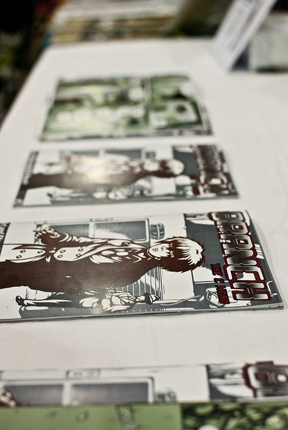
In my case the intent was quite the opposite; my co-protagonist Curt is someone I deliberately imbued with negative and largely undramatic features on the basis I wanted him to be a credible, distinctly human window into Branch’s world: he’s short, scrawny with a rash of stubble and a decidedly sickly look around the eyes. He’s not there to wow anyone, but rather to make a sympathisable connection with the readers as a convincingly flawed character.

On female character drawings too, Lee states that women should be less ‘angular’ (p43) and that muscles should not be emphasized, ideally appearing ‘smooth and soft’ (p44). As a heterosexual man and someone reasonably well educated on gender differences in anatomy I’m not going clamour for muscle women on par with their male counterparts – still this outline strikes me as slightly narrow minded, harking from an age when female superheroes were mainly present to provide sex appeal for a mostly male demographic (although there’s still plenty of that lurking around).

In contrast to this idea, Scratch is a great deal more angular than Curt and a great deal tougher too. I have bent the rules a little on this one given that she’s a cyborg and the technology naturally tends to bring a hard edge into the design; still I really wanted that quality in the face of gender stereotypes and an exploration of someone who has had their entire life reconfigured with their body. 

Before I get branded a hypocrite when someone checks out my Sasaki redesign and spitefully notes the increased exposure of leg I should clarify that I don’t think there’s anything wrong with sexy qualities in a character – of either gender – providing they have a basis in their personality, the setting and they aren’t the only quality a character possesses; put simply, they exist for the character and story, rather than purely the gratification of the audience.

Even pornographic/erotic material doesn’t necessarily strike me as horrendous when it has honest intent.  The only thing that truly bothers me is the stuff which pushes its characters under a banner of empowerment, concealing its objectifying intent beneath a layer of sleazy dishonesty. Marvel may have cleaned up its act somewhat in recent decades along with almost all of our media, but there’s no denying that comics have a pretty rough track record in this area.

So, I’ve emphasised difference in approach here but what of the why? To my mind the answer is that it comes down to genre differences and the way reader enjoyment is administered in each.

Take Marvel’s superhero comics; the appeal is pretty straightforward from the moment you look at their covers, incredible people doing incredible things. Psychologically this most likely taps into reader wish fulfilment, the desire to be more than we are, be important, admired and powerful. That much is basically promised upfront – straight up fantasy.

Of course that would be pretty boring without plot complications and in most cases there will tend to be a dilemma coupled with a character flaw. The hero/heroine will be tasked with overcoming this hurdle and –assuming it’s not Watchmen or Kick-Ass – eventually do just that. Tony Stark will have heart/reactor problems, Spider Man will struggle to balance his love life with crime fighting, Hulk will have an angry spell and Wolverine will be Wolverine.

Cyberpunk on the other hand is a masochistic genre.

The appeal is not so straightforward nor so broad as a superhero fantasy; characters don’t start on a high before hitting a low and triumphing on an even greater high point, rather they start on a low, go lower somewhere around the midpoint before finally finding a resolution at the end which will almost certainly be bitter sweet. Even as a fan I’d struggle to explain exactly why these stories work for me but I have feeling it falls between technological fascination, morbid curiosity and the recognition of irrepressible humanity amongst typically adverse conditions.

The genre’s protagonists in particular are almost always anti-heroes. Looping back to my earlier point about how superhero comics tend to avoid obviously negative attributes, what I love about cyberpunk is how it embraces them whole heartedly. True, these characters will rarely be evil to core and moments of redemption tend to occur sooner or later, but it’s hard won and practically never unconditional. In Strange Days Lenny Nero starts out as desperate sleaze merchant, Neuromancer’s ‘Case’ begins as a drug dealer with a failing liver and handful of ruthless murders, Spider’s behaviour in Transmetropolitan mostly appears crass and borderline psychotic while Blade Runner’s miserable Deckard takes on a job “retiring” replicants.

I’ve set myself an uphill struggle perhaps, and I certainly felt it at the expo. Neither Scratch nor Curt are presently particularly likable and frankly they shouldn’t be, emanating sub-zero temperament and phobic cowardliness respectively. Marvel comic characters are designed to be immediately likeable and aesthetically attractive, delivering reader enjoyment almost immediately. In my case I’ve followed a cyberpunk aesthetic where ferocious attributes are concealed beneath trench coats and shadow rather than bared in tights, while acts of bravery and compassion are the exception rather than the rule.

When a character is unpleasant from the start you need to work harder to find the qualities which really shine, but it’s for that very reason that I believe they shine all the brighter in the end. I like to dip into a super story from time to time, but the characters who stay with me will always be the ones who worked for my respect and surprised me.