Digital Love?

April 25, 2012

Argh, this is awkward.

First I settled on digital linework praising its speed and precision over pen and paper, before pining for ink once again under the oppressive glare of my monitor. Big surprise, I’ve changed my mind yet again. I hate being so fickle all the time but I’m increasingly finding it’s better to go with  the project’s flow than continue in ill-suited vein out of sheer embarrassment.

My issues with Corel and Photoshop haven’t vanished but almost as soon as I began drawing up the current page with my former methods I felt something was wrong.

When I say ‘wrong’ I don’t mean in terms of my enjoyment of drawing by hand – that’s unlikely to fade anytime soon – rather how the work fitted with its predecessors; I couldn’t shake the sense that I was wrenching open a chasm in the midst of the comic. While its been a cumbersome improvised evolution, there has been a progression of style throughout the twenty current pages which I think has been for the better.

The art’s become crisper and more cohesive in appearance, with a far greater consistency than the initial pages too. The specifically hand drawn touches I used to apply such as heavy hatching weren’t bad in and of themselves but they seemed an increasingly poor fit given Branch’s tone. Cyberpunk is a typically cold genre and while the warmth of traditional art might benefit a different story or look, here it seemed to be working against what I’ve been trying to establish.

As I’ve explained extensively before, I may have some issues with making art digitally but the end results are far more satisfactory to me than their hand drawn equivalent and in the end that seems to be a greater priority. There’s nothing stopping me from drawing for recreational purposes outside of the project and I’ll still be sketching the rough pages no matter what; occasionally digital methods can be a drag but no one ever said this would be easy (least of all me).

More than anything else though, the sensation which plagued me reverting back to my fineliners was of taking a step backwards, losing progress and a danger of alienating readers. I’m hoping most will be able to overlook the slight tweaks to the art style early on as the quirks of an artist in development, however, if I begin jumping back and forth between methods I’m worried the effect created will be a great deal more irritating; fracturing the comic’s sense of continuity and the credibility of its story world.

Digital love? Not quite, there are still areas of  production which have me tearing my hair out but overall it seems my initial hunches were right; digital colour AND linework is the way to go and in the long run I feel certain Branch will be bettered by it.

And yes, to back up all that ranting the next page is almost done. If it isn’t finished before the weekend I then I personally give you permission to tar, feather and run me out of town!*

*Please don’t


Final Life Drawing Class

April 25, 2012

‘Final’ probably makes it sound too extreme – like I’m going to the moon – either way, today’s session will be my last at the college.

I couldn’t say exactly what kind of impact these classes have had on the quality of my work, but it seems a fair bet they’ve been a positive influence on some level. If nothing else I thoroughly enjoyed them and it seems only fair that I thank our tutor Melodie for keeping them varied and challenging along with our model Cherie for being so incredibly patient with those poses.

I’d definitely like to keep doing life drawing in future if at all possible but with the MCM Expo bearing down upon me at terrifying speed and the end of MA within sight it seems likely the it won’t be happening for a good few months…


Pick Me Up Graphic Arts Fair

April 9, 2012

A couple of weeks ago I visited London for two things; the possibility of a job interview and Somerset House’s Pick Me Up graphic arts fair. With the former opportunity falling through at the last minute – special thanks to those guys – I can’t deny being more than a little disheartened, fortunately though the fair proved to be more than worthwhile.

Before even entering the exhibition space I caught an informative talk by Derek Brazell – an illustrator perhaps best known for his children’s book covers – covering practical matters those looking to enter the business should take into account. Some of this overlapped with what I’d heard from or been told by other professionals but a great deal of it was fresh advice which I’d do well to heed as I begin looking for work.

In particular, he emphasised the importance of running an illustration career like a business even if you’re freelance, taking finance, image and work resources as seriously as possible. In line with this I need to start organising both a physical and online portfolio of my work before I graduate, considering exactly who my work might appeal to and how best to interest them. Covering legal matters as well – always something I struggle to get my head around – he managed to explain in a surprisingly headache free way the distinctions between copyright and licensing, common pitfalls with commissions and plagiarism grey areas. Forewarned is forearmed as they say.

Moving onto the fair itself, the main exhibition consisted of 20 international artists; all distinct and impressive with a notable lean towards psychedelic imagery, with a few in particular bearing noteworthy relevance to my own work and themes:

Appearing under the title ‘Back to Basics’ the colourful selection of papercraft oddities pictured above from French studio Zim & Zou (Lucie Thomas and Thibault Zimmermann) was the first thing to catch my eye. Beyond a general affection for retro and redundant technologies, I was frankly gobsmacked at the level of detail and care which had gone into the paper renderings of walkmans, gameboys and old camera’s.

Maybe I’m digging too deep looking for a commentary on outdated technologies, but I felt like the medium and choice of bright, unexpected colours said something of the charm that these items take on in retrospect. Alternatively though, it could be that their fragile paper construction speaks of the fragility in the cutting edge; all these things were at one time the best money could buy, a few decades on their simply left in the dust, relics of a bygone age with more value as curiosities than functional tools.

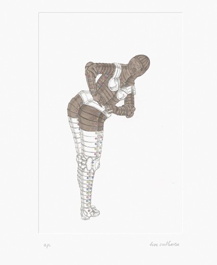
The work of Dutch artist Tim Enthoven caught my attention because of its bizarre balance between humour and perversity, with etchings such as the one above picturing suits of armour in inappropriate poses. The sight of a metal behemoth pole dancing is funny enough in its own right, but what really struck a chord with me was how it tapped into one of my core themes regarding technology being humanised through human applications. If you’ll forgive the pun, I liked how the normally intimidating presence such armour would have was disarmed by the ridiculous context.

More than anyone else though, it was the work of Paul X Johnson which really stole the show for me:

As illustrated by Behold a Pale Horse (above) there’s an immediately evident Noir feel to his work. Here, between the sunglasses, era haircut and muted chrome palette I automatically find myself thinking femme fatale. Of even greater relevance are the little hints of Sci-fi embedded in the prints; the chimneys add an intriguing industrial touch but what are the crystal like objects in the middle ground? And that horse is a bit familiar eh? Reminds me of a certain neo-noir/SF movie scene… speaking of which:

If that isn’t the ‘Rachael’ and synthetic owl from Blade Runner then I’m a replicant. Besides making a clear point of his inspirations, there’s more to this piece than straight up homage; the face and haircut aspire towards photo realism and yet we have a completely angular, hard-edged body bellow with what I’ll take a guess are strings rising from the shoulders – perhaps suggesting marionette like control from a certain someone

Intentional or otherwise the prints exude a distinctly cyberpunk vibe, while having a gorgeous aesthetic to boot. Being apparently made through a mixture of traditional and contemporary media it also seems fitting I should write about them now in light of my decision to do the same with Branch.

So yeah; another nice turn around for what could have been a botched trip to London and a fine opportunity to recharge my inspiration batteries!


Page 20

April 8, 2012

Since I already covered my recent production troubles and new course of action last post, I’ll keep this nice and simple by weighing up the finished page on its own merits/problems so I can get on with things and try to make up for my poor output.

The third panel is pretty much the most notable feature of this page, working as a background and being a more ambitious effort than my usual. Besides wanting to break up the monotony of flat closeups, as I’m bringing this scene to a close I thought a longshot would make a striking conclusion displaying full figures and emphasising the bizarre meeting location. I also thought that the raised angle looking down would make for a nice echo of the first panel in the toilets from page 12, while giving the atmosphere a warped edge in the buildup to the next major beat in the story.

On the downside even with a photographic reference and preliminary sketch to work from it was a small nightmare to draw,  forming a large bulk of the delay. It’s close but I’m not sure it quite pulls it off, the perspective on Curt feels on the money but I’m not so sure about Scratch. The fact it looks a bit fisheyed isn’t all bad given the intended tone but I definitely have a long way to go drawing this sort of viewpoint.

My favourite panels are the first and second, an odd thing given how bad they looked in the sketch but somehow they worked out as more than the sum of their parts. Scratch’s ‘don’t give a damn’ expression feels spot on and I was especially pleased with the way the light catches the edge of Curt’s face in the first image. The third and last panels meanwhile feel functional at least but at the same time didn’t quite capture what I wanted; Curt’s expression seems too understated while conversely Scratch’s brooding irritation is a little too overt maybe.

The colours are a continuation of the last two pages so there shouldn’t be any surprises there, however they emphasise my biggest issue with the overall page: wasted space. The top row is fine in this regard but the bottom panels have some embarrassingly barren spots I really should have filled. I coasted on abstraction for the last image but the left corner could have done with some extra clutter or a shift in focus maybe.

One final point; I deviated from my script’s dialogue someway here as it seemed a heavy-handed on review. Scratch said a lot more than she needed to at this stage while Curt’s behaviour seemed unrealistically bold under the circumstances, questioning her ‘name’ and getting a snarky response. It was kind of interesting in some respects but felt forced and unnecessary – a case of what’s left unsaid being more effective I suppose.

The bottom line? An adequate page but still a disappointing one, not so much because of the end result as the time invested. One way or another I must get faster at how I go about this. Hopefully my new approach between traditional and digital mediums will improve matters, I just hope the quality doesn’t suffer as a result.


Man versus Machine

April 3, 2012

I won’t lie, I’m struggling to get my next page done.

Considering the smaller issues there’s a fairly tricky perspective panel and I took time out last week to visit London again, however I think the problem is a more fundamental and somewhat uncomfortable point; the process of inking digitally is grinding me down.

I had a sizable rant before about how the move to digital line work (like the colour) would be for the better and I’ve stated several times that I’m much happier with the quality of the work I’m creating this way, unfortunately I’m not happy with the process itself. It certainly makes high contrast panels simpler to draw up but when it comes to complex images I find myself missing the pen.

I may have made a lot of mistakes and drawn a lot of wonky anatomy by hand but it was comparatively quick. Once a mark was made that was it, no erasing a redrawing, I just had to go with the flow and get on with it. I can draw almost as fast in Corel with what may be more control but the temptation to get precious over pointless little details is just too great; what should be a matter of making several considerate strokes for an eye or a nose becomes a convoluted affair of erasing redrawing, zooming and chiselling. I like what I end up with, but who honestly cares after an hour’s been spent on a fingernail.

Furthermore, I’ve come to realise that drawing by hand had therapeutic qualities which are simply not there when I stare into a monitor. I can happily sit down with pen and paper for an afternoon, whereas with a computer about 90 minutes in I’ve got a headache and bloodshot eyes. Something which should be a joy becomes a chore and I find myself becoming less motivated and inspired as a result.

I realise this is the second time I’ve changed up my work process in recent months and that it’s really too late in the day to still be so uncertain of my methods, nevertheless I feel I have to acknowledge where I’m going wrong and do something about it. The MA is supposed to be about experimenting and developing my skill set, thus forging ahead blindly as I am would be completely contrary to this notion.

Following completion of my 20th page I plan on returning to pencil and pen for the majority of my linework, however I shall still be using digital inking for high contrast scenes as with pages 12-17 or anywhere else it seems suitable for that matter. Additionally, to keep things stylistically consistent I won’t be returning to my excessive texturing of old, moving more towards clean edges with occasional light hatching. Put simply, I’ll be striking a firm balance between traditional and digital approaches which should hopefully yield the best results as a whole.

Appropriate once again I suppose given my theme, that both I and the machine are still trying to work the kinks out of our relationship and acknowledge respective strengths and weaknesses considerately. Perhaps as with my story it’s somewhere between the old and new that I’ll find my ideal path.