Meeting Paul Gravett

July 30, 2011

As you might recall, sometime ago I mentioned organising a face to face with Paul Gravett; author of more than one text in my research and a renowned figure in British comics publishing with three decades of experience. Given the relevance of his work and reputation I had no doubts how valuable such an opportunity would be but I’d be lying if I said I wasn’t extremely nervous. With the image of a formalised Q & A session in mind I prepared a concise set of questions and travelled to London’s Royal Festival Hall as arranged last Wednesday to meet at the Comica Social Club.

Thankfully my worries and unease were quickly dispelled on arrival as Paul turned out to be far more approachable than I’d guessed with the meeting being an informal discussion rather than a rigid interview. He spared a remarkably generous amount of time talking with me and while he was complimentary of my work he gave me frank criticism and advice as to how I might do better. Meanwhile my planned questions went largely neglected as I found it ironically more straightforward to improvise.

Initially – in line with aims for the Practice in Context module – I outlined the genesis of my graphic and the use of this blog, along with my plan to begin uploading to webcomic sites for greater publicity and broader feedback. He approved of all this a great deal and had plenty of suggestions as to how I might promote myself on the web; in particular emphasising the importance of interacting with other creators online and participating in group events, cross overs and other sociable activities. He also recommended work on presentation of the material and attached content, including page backdrops, summary and character profiles. Essentially considering interaction, polish and accessibility.

Moving on I explained my influences in depth, citing inspiration from regular cyberpunk sources along with my exploration and assimilation of the genre’s roots in detective fiction and film noir. Again Paul seemed to agree with the relevance of this to my main graphic with a few of his recommendations actually being ones I’d already looked at (though I’d do well to research the suggestions I haven’t.)

Here, he became curious about my planning and work methods so I explained that I have a complete (albeit still developing) script but he was most interested in how I roughed out the draft pages themselves. As an alternative to doing these one page at a time in detail, it was suggested that I consider the approach used by Alan Moore of drafting a work through to the end in basic thumbnails. This approach has the benefits of not being overly time consuming while providing a realistic overview of an entire project and how many pages will be required in total. As an inarguably superior way of managing my project compared to ploughing ahead blindly I’ll definitely set about using this technique once I’ve prepared my 3rd (and likely final) draft of the script.

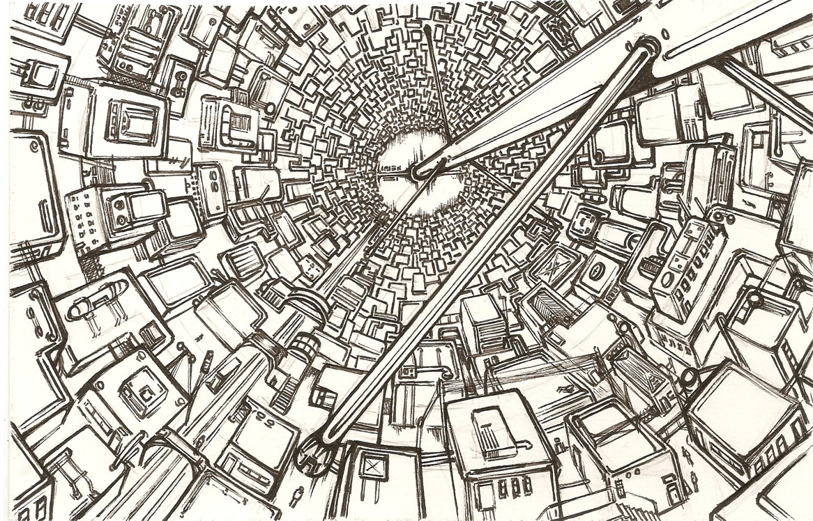
At this point I should mention that I’d cautiously brought printed versions of the Branch’s finished pages and some concept art with me, being somewhat uncertain whether it would be a good idea to show them prematurely. Ultimately it proved fortunate that I brought them along as they prompted some of the most important feedback I received.

On the positives; Paul approved of the chapter cover along with much of the general style and the dialogue, citing page 6 and the conversation about ‘the C word’ as being especially good. On the negatives; the largest criticisms concerned moments of uneven pacing and clunky scene changes, specifically page 7 – this page was something of knee jerk reaction my tutors’ call for more experimentation in the visuals and in this regard I consider it a success, on the other hand, as Paul highlighted it enters the station interior prematurely being more confusing than it is compelling.

Back in planning I wrote a lot about the importance of establishing a credible setting and a great deal of this could be a result of how its introduced. Looking at the progression of pages following Curt’s journey onto the station, it would make far more sense to follow the airlock scene with a grand reveal of Branch’s interior, rather than undermining it with a restricted back alley scene which adds little to the main narrative. Out of context I like the page a lot but I can hardly ignore a professional opinion or the bigger (and far more important) picture, after thinking hard about it I’ve decided to cut it from the main narrative and relegate it concept art in favour of a more suitable introduction.

On a related note, Paul also criticised the angles used suggesting more large scale panels; depicting views further back to create greater awareness of the setting and allow the scenes to breathe. This is a weakness I am reasonably aware of and have been attempting to address with more establishers, but I must admit I’m still falling back on face closeups and the like a little too often, creating more claustrophobia than warranted and resorting to what is ultimately an easy way out over more complex compositions. I’ll be sure to remedy this in future.

He made one last suggestion about the artwork, telling me I should be more adventurous in my use of colour. I’ve consciously been quite muted thus far, sticking to brown/grey, orange/blue palettes but again it’s a fair point. If I take risks and step out of my comfort zone I have a better chance of producing eye-catching pages which leap out at the viewer rather than simmer quietly. As with the other elements I hope to ramp the colour scheme up alongside the story, developing it in accordance with the narrative tension.

Finally, I concluded my questions by asking what sort of approach I might take towards publishing and distribution in the near future. His response to this was suggesting self publishing options; essentially setting up shop at comic conventions and selling print versions of my work from a table. In particular he emphasised the importance of selling complete works as opposed to fragments or issues as buyers will always find a complete narrative more appealing – its something which enforces my longterm decision to complete the graphic outside of the MA if necessary, delivering a prototype for my final assessment rather than rushing something fundamentally incomplete to a finish.

One last matter Paul covered was that of logos and general iconography, making memorable images and symbols readers will associate with my graphic. I have thought about this to a degree but I must admit some reluctance to forcibly pursue this in my work, I’m certainly aiming to form some reoccurring motifs – primarily relating to cyborg enhancements – but my hope is that they will emerge gradually rather than being heavy handedly emphasised. Still, it’s definitely something to keep in mind throughout production. In summary the goal of such activity would ultimately be catching attention and getting noticed by publishers; establishing oneself in the amateur scene before taking a shot at the professional one.

Anyway, that should cover all the major points. A massive thank you to Paul Gravett once again for taking the time to talk to a complete stranger, with any luck my project’s been nudged closer to the right track with a greater finished result and greater long-term prospects.


Page 7

July 25, 2011

Keeping in mind the criticisms I outlined in my last post I deviated from the script briefly to make the page you see above.

First and foremost I wanted to demonstrate some of the experimentation and noir stylings I promised in the planning stages. Scenes like this will feature more later in story but I felt that after the last module’s feedback providing an example of my intentions would be a good idea. There are other more substantial reasons for this addition aswell; I formerly spoke of a concern that introducing more heavily stylised elements later might seem jarring, appearing to be a complete change in style rather than a natural progression. Ideally this page will sooth the issue, easing such features in rather than snapping over at the drop of a hat.

In terms of narrative this also addresses a few minor concerns. Besides breaking up the scenes with Curt and providing a momentary change of pace, it also brings Scratch back to the reader’s attention after a short rather than long absence. The page is intended as a reminder she’s also on the way to the same spaceport for an as yet unknown purpose. Much like the stylistic elements it’s all foreshadowing for what’s to come.

As my research would suggest I borrowed art ideas from 100 bullets and Sin City most prominently here, taking a creative risk and using techniques I’m not so sure-footed with, eschewing detail in favour of stark light and shadow compositions. I wouldn’t say the lighting is exactly realistic, but it does remain plausible thanks to the tight alley – providing just enough credibility for heavy shadows in an artificially lit setting. Originally I’d planned to highlight more of Scratch’s face, but opted for an almost complete blackout as thematically it seemed more appropriate; with her motives as yet undetermined shadowing her features projects a disturbing sense of ambiguous menace, the only discernible parts being her prosthetic implants/replacements and a pair of determined eyes. Determination for what remaining to be seen.

While I’m happy with the overall impression the page gives I do have a few minor issues with it all the same. The figures themselves turned out pretty nicely but it feels as though too much space is wasted on the right side of the composition. Given the diagonal direction of the light it makes sense that the wall would be blacked out, but all the same if feels like more could have been done with that general area. I flipped parts of the panel layout and toyed with the idea of putting text bubbles in to the fill the space but ultimately there’s not much I can do to fix it. It does give the page a sort of stark intensity which I like but in future I should be more mindful of how I use the space.

Minor faults aside hopefully the page doesn’t do anything to upset the pacing of the main narrative and enriches rather than weakens the overall reading experience. I’ve got some way to go nailing down the exact style but at least now I’ve made a genuine stab at it.


Research Methods and Development: Feedback

July 21, 2011

As the title summarises I received my folders back today along with a satisfactory grade. My research and engagement with subject matter were cited as the strongest areas of the project, though naturally there were some criticisms made.

Of these the one I really can’t argue with was a recommendation from my tutor to do more life studies in order to improve my drawing skills. I’d never claim the style of my drawings is particularly set on realism – leaning more towards a stylised look – but then again my figures are often rigid and slightly wonky in proportion, while my clothing tends to look stiff and unnatural. In other words more practice wouldn’t hurt, and while the sessions I formerly attended have long since finished for summer at the very least I could find photos or non-nudes who’ll pose for me.

I’ll admit that the other criticisms didn’t sit quite so well with me initially, though following a discussion with the tutors involved I did see their reasoning. The main one was over my failure to take enough creative risks with my art, feeding in more experimental influences along with the noir stylings I promised. This is true, I haven’t thus far but I have some thought behind it.

Scott McCloud spoke of the balance between clarity and intensity in Making Comics (2006) writing that ‘sometimes just telling straight, with clarity as your guide, is the best way for stories to gather steam and then strike like lightning when it counts.’ (p51) This is advice I took to heart, along with a general intention to follow the noir template of a descent into darkness; with more exaggerated features such as high contrast lighting and expressive shadows appearing as the story progresses. In other words, a visual crescendo to match the narrative one.

As a result of this my pages so far have been slightly bland and straightforward by design. Had I cloaked everything in angular shadowing from the off I imagine it would not only dull the dramatic effect of later scenes, but would have also made my start appear pretentious and heavy-handed; forcing in stylised elements for the sake of it rather than for a reason.

That said, if I suddenly introduce these more intense visuals twenty pages down the line there is a danger it will seem like a complete change in style rather than mood. Hopefully the image I used for the act cover (below) foreshadows their introduction to some degree but perhaps it would be worth bringing them in sooner and taking a risk with the art rather than playing it safe for too long.

Finally, there was also criticism of the project’s scope with the length of my script and the projected 100 pages considered likely to inhibit my creativity in the drive for completion. This isn’t an unreasonable point as I have set myself an ambitious task, however it seems a shame to squander this opportunity creating another short when I have the chance to push myself and create something more substantial. The idea of chopping away significant portions of the script doesn’t sit well with me since they would severely detract from overall narrative, while I also don’t think it’s unreasonable to say I’m treating each page with appropriate care and thought.

Fortunately they did suggest a compromise I can live with; treating the graphic as something closer to issues than a complete volume. Besides giving more room for experimentation and alteration it would also mean that I don’t have to sweat over delivering a finished article by the end of the MA – should worst come to worst letting me deliver a few issues and the remainder of the script as evidence. Obviously I hope it doesn’t come to this, but it’s stopped me worrying quite so much and at least means I won’t be rushing something sub par to a forcible conclusion.

So, overall not exactly horrifying feedback but plenty of food for thought all the same and as ever lots to be getting on with.


Page 6

July 20, 2011

With this page hopefully we’re starting to get a bit more insight into Branch’s social workings. Besides an implicit suggestion that the cyborg population are confined to the station there’s also the matter of the word itself being taboo.

The main inspiration for this idea harks back to a college english lesson considering how formerly acceptable words gradually acquired negative connotations according to social conditions. For example, consider the word ‘spastic‘ and the negative connotations its garnered through continual misappropriation. Similarly the development of politically correct terms from ‘crippled’, ‘handicapped’ and ‘disabled’  to ‘having a disability’ might also be compared. It fascinates me that new wording designed to be acceptable nearly always accumulates the same unpleasant meanings given time.

An additional influence on this page was a story I heard from a foreign friend who – upon arriving in England for the first time – unwittingly used a racial slur deemed acceptable in their home country onboard a crowded train carriage. Similarly here, I wanted to highlight Curt’s ignorance of Branch’s customs by showing him put his foot in it a bit, while indicating troubled history behind the station and the cyborg itself; a sort of mass resentment and denial of the problems which surround them.

On the art side of things I’m quite pleased with the last panel depicting the camera/scanner view. The HUD was hand drawn like the rest of the linework (colours aside) but I inverted it to white in order to make it stand out and lend a believable sort of computerised quality. Besides that I’ll admit that the backgrounds are a little lacking this time around, though with more panels and pressure to speed up production it was pretty much inevitable. Much as I hate cutting corners I have to be realistic about what I can accomplish.


The truth no matter what: Transmetropolitan

July 16, 2011

During my recent trip to Orbital Comics for the Jack Kirby exhibit I had an inevitable moth-to-flame reaction seeing their generous shelves and was pretty much set on buying something. So it was that I spotted Transmetropolitan going cheap and – recalling Cyberpunk review’s praise of the series – decided to give its first two volumes Back on the Street and Lust for Life a go in the name of research and entertainment.

I must admit that I’m unfamiliar with the work of the writer Warren Ellis but right from the first issue a firmly satirical tone is established. Garth Ennis of Preacher fame writes the first book’s introduction, which along with his summation that ‘Warren doesn’t like “nice” things’ gives you a fair idea what to expect. This is a cyberpunk future which plays out less like Blade Runner and more like an ultra-violent version of Futurama – naturally those easily offended need not apply.

With the story beginning ‘up a goddamn mountain’ we’re introduced to Spider Jerusalem; Transmetropolitan’s protagonist of colourful name and even more colourful personality, in his fifth year of isolation sporting an Alan Moore haircut which would have Robinson Crusoe green with envy. It’s cyberpunk tradition to have alienated, offbeat characters at the heart of their stories however that might be something of an understatement here.

An infamous gonzo journalist forced out of his mountain refuge by unfulfilled book contracts, Spider makes for a fascinating contradiction as the living, beating, hateful heart of the comic. His profession and reputation inevitably suggest involvement in culture, politics and the media – the issue being that he hates all three with a vengeance. Seemingly a complete misanthrope, prone to substance abuse and short-tempered outbursts he’s unpredictable at the best of times with the welcome knock on effect being the unpredictable course taken by the narrative.

To my mind at least the other major character is the sprawling metropolis suggested by the title (assumedly an amalgam of major American cities), a place which begins to seem less like a setting and more like a collective antagonist thanks to the views of our warped anti-hero.  Thrown head first into this world much like Spider, the sense of chaotic over-saturation is palpable but the real accomplishment is seeing the diverse groups, technologies and icons start to become recognisable facets of the series. Like most good sci-fi a sense of underlying cohesion and inner workings are gradually established within the universe without resorting to blunt exposition at every turn. Darick Robertson’s art is fairly straightforward in style but accomplished and packed with background detail featuring lots of humorous little touches, each adding something or at least giving you an unexpected laugh.

Following some aggressive bartering for his old job and an accident with a shower/’physical cleaning unit’ which fixes his hair problem, Spider almost immediately sets out to report on a brewing catastrophe; a pocket of social unrest revolving around ‘transients’, humans who have partially adopted a template of alien DNA in a bid for sovereign rights. As expected it’s with a cynical sense of opportunism that he approaches the group, his unimpressed stance towards the minority emphasised during the interview as he labels them “body perverts”.

Up to this point I had some growing niggles over the underlying themes or rather, lack there of. With the city and its culture portrayed unsympathetically as crass and chaotic alongside an equally unsympathetic narrator there are certainly plenty of parallels to modern life and dark humour to accompany it, but without reasoning or any form of moral focus it looked like the series was fated to slide into crude nihilism. Thankfully matters take a U-turn as the story climaxes. With the police moving in to brutally crush the transients, Spider impulsively enters the war zone and – taking to the roof of a nearby strip club alongside its employees – begins to write.

It’s here that his true colours shine through as we see an altogether different side to Spider Jerusalem; a man passionately obsessed with the truth above all else and infuriated with the hypocrisy and lies which surround him. As his furious report is transmitted live across the city formerly unseen sympathy for the transients crops up while an insightful reveal of police corruption behind the riot suggests a sharper mind than we’ve been led to believe. To make an analogy of it, Transmetropolitan turns out to be much like Spider himself – seemingly crude and heartless at first glance belying the intelligence and care that runs beneath. For all his unpleasant habits, illegal acts and sudden outbursts of violence our journalist isn’t quite the monster we’re initially led to believe.

Considering the two volumes I read as a whole (the aforementioned scenario being just one of the stories) so far it’s typically been episodic with Spider doing everything from reports on religious conventions and an ill-advised day watching future television to dodging assassination attempts. There are however characters and subplots which extend throughout, with the most notable one surrounding his assistant Channon and the crumbling relationship with her boyfriend. Other threads at the moment appear to still be building to something with the payoff assumedly further down the line, either way it all helps construct an intriguing worldview and suggests more interesting developments ahead.

Considering relevance to my own work beyond the obvious cyberpunk connection, I’m aiming to keep the tone of my own graphic considerably more muted but there are some technological ideas worth taking note of; familiar science fiction clichés are presented then deconstructed in interesting or humorous ways with cryogenic revivals becoming the new unwanted immigrants of the future, adverts subliminally beamed into the mind for dream playback and household fabricators with a taste for hallucinogen’s.

One page in particular caught my attention during an explanation from Spider about the process of “downloading” where through nanotechnology people can be converted into a cloud “foglets” free of conventional human form and its attached concerns. As he outlines:

“If a guy has a prosthetic leg, is he still human? Sure. It still does the same job, does what you tell it to. So how about if he had two artificial arms? A plastic heart? Carbon-fibre bones? Artificial neurons? Where do you stop being human? (…) You could put a human mind into an entirely artificial body and that person would still be a person. You could download a mind from out of its — let’s face it — eminently crappy, badly designed human body and into a seriously useful and functionally immortal artificial form.”

It’s this line of thought which is pretty much the driving force behind my own narrative, contemplating the humanizing of machines instead of dehumanization through them while it’s also another fine example of how the comic offsets its absurdities with genuinely sound ideas.

I can only guess where it’s all going but Transmetropolitan’s first two volumes deliver a sound introduction to a universe packed with satire, humour and ideas. It has no time for sensitivity but is far from being mindless having things to say about the society of today many would rather not acknowledge. It isn’t “nice” but it may just be brilliant.

And hey, why take my word for it? Vertigo has put the first issue online to read for free :)