London MCM Expo May 2012: Reflections

May 28, 2012

Phew, that was quite the weekend! Besides last year’s Platform Expo in Hull this was my first real convention I’ve attended and certainly the first time I’ve ever sold any work. It’s been both exhilarating and daunting in equal measure, more than anything though it’s most definitely been worthwhile.

In the end I sold 10 copies of Branch, with the majority of purchases being made on Saturday – by far the busiest day – which going on other people’s tables and what I’ve been told is pretty decent for a first timer. Financially speaking this doesn’t even equate to me breaking even but quite honestly I’m happy enough that there was interest in Branch, that I got constructive feedback and met like-minded folks with the same passion for comics. As it is I can always sell my spare stock another time and recoup the costs in the longterm.

I could rave on about all the cool things I saw or the weird and wonderful cosplay in abundance but to keep things concise and critical it’s probably best that I reflect on what I did right, what I did wrong and what I can do better next time.

Obvious as it may sound I think the lower pricing helped convince more customers, giving them the extra nudge where they otherwise might not of purchased. At £4 and £3.50 where I discounted I was hardly raking it in but most people are fairly cautious of unknown quantities and if there’s less to gamble they’ll be more willing to take the plunge. Call it optimistic but if I can interest more readers now then perhaps I can raise the price slightly without driving them away.

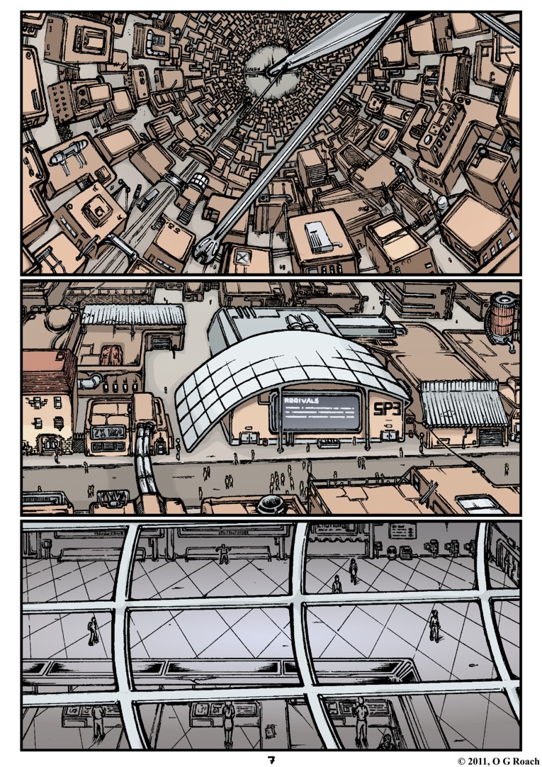
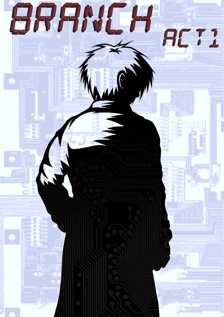
In terms of presentation meanwhile I was pretty humble but I think I made the most of what I had. During set up on Friday I met Chris/Ushio who I collaborated with on the Six anthology – we’ve been in contact for a few years but hadn’t previously met in person till now – anyway, besides being as nice a guy offline as on he gave me a few pointers, specifically suggesting I leave a copy or two of Branch open to read. This was definitely a good move as the contents seemed to go down better than the cover – too grim? – while later my friend/volunteer Nikita opened one on page 7’s cityscape which seemed to impress a few.

The direct feedback I received was largely positive, with most praising linework, use of colour and the general style. There was some understandable scepticism over the ‘to be continued’ conclusion but most who read through didn’t seem as bothered by the slow pacing and build up as I might have thought. I sincerely doubt anyone was blown away but it was uplifting that people urged me to continue and wanted to know when I’d back.

An additional offshoot of all this was getting a stronger sense of exactly who my niche audience is, I’ve only vaguely mentioned it to be  somewhere in the young adult SF crowd upwards before so it was interesting to see exactly who was buying. If you’ll forgive me generalizing slightly, most of my buyers were older men – likely no one under 20 – suggesting I am indeed on target.

It might sound a little condescending but I feel the content of the storyline rules out children for the most part while the majority of teenagers are likely to want something with more action, comedy and faster pacing. Maybe it sounds like I’m stereotyping, but I didn’t have much interest in film noir, detective fiction or cyberpunk until I was at least 17 and the readers are always welcome to prove me wrong :P

On the downside I felt that my chosen genre may be in a bit of a slump at the moment. Fantasy, superheroes and steampunk were all dominant at the Expo with the latter’s romanticism of technology being especially at odds with the cynical portrayal in cyberpunk. That’s not to say I don’t love these genres respectively but I did feel like it might be the wrong time and place for sci-fi dystopias; I got a palpable sense of people searching for fun and optimism rather than gloom and angst. It’s not like I’m going to change Branch into cheerful magic-adventure anytime soon, but it does present an obstacle I should give serious thought to in future.

There were exceptions to this formula such as Twisted Dark and Romantically Apocalyptic which seemed to do good business however they were well established with impressive displays to boot, which neatly brings me to my weakest area: presentation. Right from the off I knew I was outgunned since more than half the tables had banners, postcards, badges and stands; you literally couldn’t miss them. I meanwhile showed up with a table-cloth, my first issue and a modest A5 pricing sign. To make one of my stupid analogies, it was like being a mouse amongst elephants. Big elephants, wearing sparklers and wielding boom boxes playing loud “UNTZ” music…

Even in retrospect I know I wouldn’t have had the time or money to get something like an 8ft banner made for Branch but there are plenty of smaller things I could have done and certainly will do next time I attend a convention.

First and foremost I need to get some business cards, they’re a nice compromise for people who are unwilling to spend money on a comic but are still interested in your work and want to find out more. While I did write this blog down for plenty of people, having something to casually grab without a fuss is definitely preferable and likely to draw more attention in the long run, also peripherals such as badges and postcards could also give my table more substance and alternatives for hesitant customers. Even if I can’t get a banner, building a smaller display of some sort could help catch people’s eye and a stand to prop my comics up on would make them more visible at a distance as opposed to being flat on the table.

There are other matters too such as whether I should adopt a company name and what it might be, starting a proper website and sorting out a possible internet store but they’re really things I’ll need a while longer to mull over and talk about in other posts; right now I want to make good on the momentum and boost of inspiration the Expo has given me and get back to work.

My heartfelt thanks to everyone who bought a copy of Branch, talked with me, helped me out, offered me veteran advice or sold me their work at the Expo. I had a great time :)


Expo A GoGo

May 23, 2012

Well, looks like I’m all set for London’s MCM Expo this weekend!

Not that I didn’t get a few scares preparing. I received my 30 issues from the printer today seemingly without incident and checking the top batch found them to be satisfactory; I very nearly packed them on the assumption they would all be the same but fortunately my characteristic paranoia kicked in and I decided to do a thorough examination for peace of mind.

Ever seen one of those movies where someone gets a briefcase full of money and checks the top layer only to later discover the bottom notes are newspaper? Turns out the last 13 copies – of course it would be 13 – had been assembled in the wrong order with a repeated page to boot. Naturally I wasn’t too pleased discovering this and while I didn’t exactly launch into a gangster rampage I was dialling the printer within seconds.

I won’t stoop to naming and shaming them here however as they were more than reasonable about the problem; besides having reprints/rearrangements ready within a couple of hours they also threw in a couple of extra copies as an apology, not really a matter worth holding a grudge over, though an important lesson in being thorough – with print jobs and briefcases of money…

Anyway, this first issue may be a rather modest little booklet but it’s still thrilling to see Branch printed professionally for the first time and most of it has made the transfer from monitor to page rather nicely.

For anyone who happens to be at the Expo and wants to find me (and my work) I’ll be in Artists’ Alley at table F3, for all the rest of you who can’t make it: wish me luck ;)


Page 22 + Printing for the Expo

May 22, 2012

Well here it is, the conclusion to Branch issue 1…

This may not be my best page but at least it gives some sense of the issue/chapter going somewhere as the threads mesh together. Curt realising his delivery has being stolen more or less concludes the introductory section and marks an important shift towards the main plot.

On the downside I haven’t covered anywhere near as much of the story as I would’ve liked though. The first third of my script was written with the intention of setting everything up and giving readers a balanced cocktail of excitement, drama, intrigue and dark humour; as it is I manage about half of that first act here, with the majority of my favourite moments infuriatingly just around the corner. There’s no use in dodging it, I need to work faster.

Not that I haven’t been working hard. I doubt it shows in the finished piece but I seriously short-changed Mr. Sandman this weekend finishing this last page for the printers. I’ve still got red roadmaps all over my eyes and the kind of complexion which has people barricading doors and brandishing crucifixes…

Still, I guess it was a valuable lesson in working economically, I didn’t get time to do everything I wanted to with this page though maybe that was the point. While the backgrounds are a little sparser than usual and the shading less detailed the flow appears reasonably clear. I could quite easily have spent another four-five days polishing this up and adding things in but would it have been worth the additional wait? Maybe having an unbreakable submission deadline yesterday demonstrated the kind of discipline I’ve been lacking till now.

Anyway on that note it’s at the printers now and will be ready just in time as I leave for the MCM Expo. As planned I’m going with an A5 colour format going for a suitably modest price of £4-5 – I’ll see how it sells :p Given that it’s the first time I’ve done something like this I’m naturally terrified, but like everything on this project I’m sure it will be a useful experience even if it isn’t a massive success. I’ve had various people telling me to get my work out there in physical form so I can at least say I’ve finally given it a shot – that and seeing other folks at the comic village should also be a lot of fun!

I’ll post again before I set out to London, in the meantime I just need to make sure I’m prepared. Stay tuned.


Cover Complete

May 9, 2012

Like most things this took longer than I would have liked, but as I mentioned previously people are more likely than not to judge a book by its cover and I really wanted to make sure that even a glance will leave an impression. As usual there are the perennial gripes over the details, anatomy and rendering, however this may well be the best cover I’ve ever made.

That’s not really as big an achievement as it sounds, all my past efforts have been single sided, ramshackle affairs, typically rushed out as something quick between story pages; the difference here was making an investment of time, thought and care that the former desperately lacked. It’s a long way off perfect, but it stands head and shoulders above my initial effort

The above version of the cover is intended to wrap around the printed issue I’ll be peddling at the MCM Expo, though it can just as easily be halved for a web version. I already showed the black and white drawing of Scratch, the background meanwhile is loosely based on an old bit of concept art with the original figures removed – they were wonky – and the setting itself re-rendered to fit with the heavily shadowed noir vibe style.

I kept the colour palette down to oranges playing off blues and greys as I felt it would create a stronger impact than the alternative. Personally speaking my best pages thus far appear to be those with a simplified scheme, creating a more intense atmosphere and more striking imagery. As I’ve mentioned on several occasions, much of Branch’s colour schemes is based out of oranges of blues with the intention of portraying the symbiosis between humans (warmth) and machines (cold), here I wanted to boil that theme and aesthetic down to its essence, making it as overtly obvious as possible.

Besides the titles though, Scratch is the only element of the cover in orange; it could be taken as being symbolic of her ultimately human qualities beneath the cold exterior, in truth though I was more interested in emphasising her alienation – cyberpunk protagonists are typically such, but without giving away too much it does become a key part of her character development later. On a visceral level, it also ensures she pops out from the setting being the immediate focus of the viewer.

On the translucent circuit textures; they were largely to create a more intriguing and surreal image but again, thematically support the themes of human-machine symbiosis, with technology seemingly lurking beneath every shadow – I should credit Lain with sparking this idea through its similar use of red splatter in the shade – the Branch station is built out of technology, though more pertinently it has literally become a part of people.

The specific background features should tell people things about the story as well; the curving cityscape is shown in the background establishing an important aspect of the setting, there is notable wear, tear and grime indicating it to be a used future along with other decidedly unsettling aspects.

With an initial version of the cover I showed a friend which had Scratch on her own he told me it looked a little too barren and that I ought to capitalise on the sense sleaziness indicated by the posters next to the Treenet booth and have a couple in the back alley. Given my intention to disturb rather than titillate with this I may have pushed a little further than intended, it started out as a kiss/embrace but now looks somewhat more explicit.

Still, the potential shock value isn’t necessarily a bad thing as controversy and sex do tend to draw interest, as an Expo newbie it may well work to my advantage catching attention and given the places the storyline will eventually go a darker cover is perhaps a fairer indication of content. Also, yet again in line relation to my theme a fusion of very human sexuality juxtaposed with freakish cyborg appendages seems quite appropriate.

Finally, the titles. The main one proved quite a headache, with several scrapped attempts before I made something I was happy with. My original alphanumeric title appeared too spindly for the most part and either sunk into or jarred horribly with the rest of the cover. The final redesign (which I’m quietly proud of) is essentially a heavily mutated version of my original title font, fleshed out with extra bordering and a chrome style finish. It may be a touch too forceful for my liking but its bold and ideally grabs your attention.

Following on from my point about shock value, the new issue/act subtitle is an addition I added feeling it had an amusing double meaning. The immediate assumption that it’s one of English’s foulest swear words is offset by the reveal on page 6 and the alternative connotations in relation to the story’s context. As a way to intrigue and sneakily build immersion I think there could be something in it, regardless it’s more interesting than some bland ‘ACT 1‘ caption.

There’s always more that could be done, but I’m hoping that as an advertisement of content this does the job. A blurb felt unnecessary on the basis that it’s going to be relatively short and I’m hoping the image will be enough to get people reading, what I need to put all my energies into now is getting a few more pages out of the door before printing so I can deliver a satisfactory ‘to be continued’ and not some vague dropped-off-a-cliff cutoff.


Cover in Progress…

May 3, 2012

Just a little update on the cover I’m working on for my printed issue.

To my mind it’s an improvement over my previous ‘act’ cover, showing more of Scratch than her back and being of a much higher standard generally. At the same time, it retains the heavy shadowing and emphasis on noir stylings, ideally giving a fair indication of what to expect within – the pose itself is a homage to a certain noir icon

It still needs a backdrop to wrap around both covers, colour and text but as starts go I’m pretty pleased with this one.