Praise and affirmation, I’m sure most would agree are typically good things. They encourage us to persevere, remind us our efforts are worthwhile and give you that lovely little warm feeling inside. When someone’s worked hard on something, a pat on the back is only fair. A firm challenge or criticism however I would argue is important in its own right, we’re all only human and we all make mistakes or bad calls. When teetering on the edge of the ‘I can do no wrong!’ chasm, sometimes its really for the better that someone steps in, pulls the subject’s head out of their rear and tells them “wrong“.
Having met with the college’s fashion leader Lynn Benson today for advice on my characters’ dress and the general style of clothing in Branch I found myself at odds with many of her criticisms, but none of them were senseless or unfounded. I know a fair bit about comics but I’m just about as unfashionable as they come. So it is that while there was a great deal of disagreement in this meeting, I feel it was valuable in the sense that it provided a perspective I wouldn’t have considered and in disagreeing it made me give more thought to why certain design decisions should be defended in the first place.
Possibly the most severe criticism she gave was that besides the influence of film noir and early 1940’s fashion, I appeared to be inadvertently drawing upon clothing and hairstyles of 1980’s aswell. Considering many of my SF influences I can’t really deny this, but is it an inherently a bad thing?

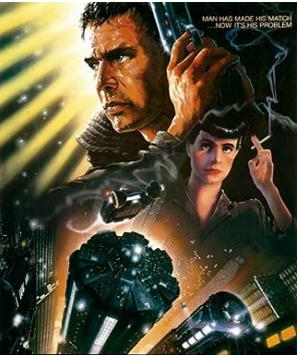
The 1980’s gave us Blade Runner, The Terminator, Tetsuo the Iron Man, Aliens, Robocop and Akira in films. Watchmen, The Dark Knight Returns, Ghost in the Shell, Arkham Asylum and Sandman in comics. Most pertinently of all though it’s the birth decade of cyberpunk in the form of Gibson’s Neuromancer.
Maybe the era’s style isn’t trendy by modern measure – and there will never be an excuse for all those mullets – but it’s where you’ll find the roots of my inspiration. Lynn’s side of the argument was that I wasn’t being relevant and failing the push things into ‘the 21st century’, but then again Branch is set in unspecified era in a fairly obviously constructed style. I can’t guess what the future will look like and I won’t pretend to; sci-fi creations will always be interpretations with their strengths and weaknesses arising from how they resonate with the story and themes. Trying to forcibly hitch onto what’s hot when they’re made just ensures that a decade down the line they appear outdated and silly.
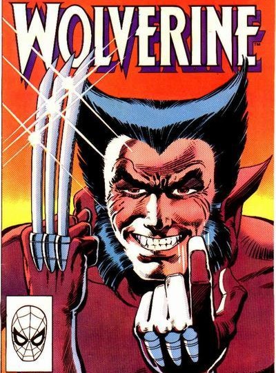
There were other issues raised over practicality aswell which struck me as quite comic specific. She mentioned that Scratch’s hairstyle was unrealistic for an unfrivolous character, being unlikely to hold in position without serious work. Were I making something in film there’d be no denying this point but in my defence I offer the following example:

Let’s consider the character of Wolverine; he’s a grumpy, unsentimental and often bloodthirsty anti-hero. Not someone you’d expect to spend hours in front of the mirror each morning messing with his bonce. But do you seriously know anyone whose hair naturally grows out like that?
I’m not trying to say comics can freely defy credibility as they like (although they often do) but there is a great deal more flexibility in their aesthetics than many other mediums, flexibility it’s only natural to take advantage of when you play to its strengths. Scratch’s hairstyle might not be especially realistic but then again the style itself is someway off from realism anyway. Would it really make the comic any better if I gave her a crew cut, sweat marks and pimples? Do I need to give every character crooked teeth and nostril hair in order to make the story immersive?
Lest I seem like too great a hypocrite I’ll say here and now that there are certainly problems in my designs, particularly my background cast and general sense of consistency. At the same time it seems like me and Lynn are on very different wavelengths. She’s not wrong by any means, but her approach to the matter of SF fashion and style is almost directly opposed to my own. I’m more concerned with how the look of a character reflects their personality and habits, whereas her interests were focused upon reflecting larger trends and aspects of a society. As I heard Ted Polhemus put it a while ago during a talk, fashion is “dictated” whereas style is something created more personally by individuals and small groups. Considering that my cast is largely quite an alienated and dysfunctional bunch, it seems contrary to their character and indeed, the spirit of the entire comic to pursue such a rigid notion of fashion and what’s ‘in’.
Anyhow to end on a positive note and avoid sounding like too much of arrogant sod I will say there were some useful points made which I do intend to pursue when time allows. Among them Lynn suggested several key recommendations including less obvious examples of 1940’s suits and specific designers, while also encouraging me to try magazines for ideas on haircuts and look around charity shops for inspiration regarding ‘make do’ clothing. I may not be able to go back and redraw my central cast at this point, but with a crowded station around them there are plenty of others chances to experiment.
Disagreement then but not demotivational. A healthy challenge helps enforce a healthy creative process and I’m all for that.
 I’ve updated everything on The Duck and ComicFury accordingly and have temporarily replaced the pages under my ‘Read it!’ page. Still, what I really need to be doing is getting onto ComicPress and setting up a more accessible archive there. It remains to be seen how well that will go as I’ve never used the site before but I’ll definitely give it a try before the end of the week.


 Posted by Ozy


