Concept: Street Level

March 23, 2011

Excuse my recent absence, I was away longer than I’d like and WordPress went down when I finally did have something to post. Anyway I present to you the fruits of my recent labours:

This concept is a first in more than one respect; it’s the first full colour image I’ve created for this project (excluding my previous experimentation in shades of blue) while it’s also the first piece to feature two of my characters within the same scene. The latter point I felt was especially important, the intention here being to portray a quieter moment placing emphasis on more subtle body language over action or high drama. Scratch is laid back whilst remaining cold and calculated – a casual smoke in hand but a backwards glance and straightening of the tie suggesting caution. In contrast Curt’s neurotic personality is suggested respectively by a wringing of the hands and eyes focused on the ground.

I should also note that this is the first time I’ve drawn my setting from a street level perspective; something which proved a challenge thanks to the curved cityscape but is ultimately reassuring to have tested, appearing much as I’d have hoped. The characters fit into the setting convincingly while there should be just enough sci-fi evident in the backdrop to keep things intriguing.

Possibly the most troublesome aspect of the piece though was the colours, specifically creating a palette suitable to the mood but also striking enough to make the background and foreground distinct. As with previous colour work I used Corel Photo Paint 11as while I am competent with Adobe Photoshop I can work quicker with the former thanks to its preferable toolset and streamlined interface.In terms of the distant and immediate buildings, I gave the foreground a brown-orange hue and set it against a background of blue-grey tones to play upon complimentary colours and make the nearby scenery standout. I kept both of these elements fairly muted to evoke an appropriately grim atmosphere but also to avoid drowning out my characters. In contrast I made Scratch and Curt as brightly coloured as I dared to draw the viewer’s attention to them first.

Just as I attempted to communicate each character’s personality through pose and body language, so too have I tried to embody something of it in their colour scheme. Scratch is predominantly coloured with blues and greys to represent her cynicism and calm machine-like approach while emphasising her symbiosis with technology – the hard beetle like shell of her prosthetics and implants only furthering this sensation – Curt’s organic nature meanwhile is embodied through the green jumpsuit, while it could also be tied to less favourable (though appropriate) connotations such as inexperience, jealousy and sickness.

Generally speaking the concept is a sort of benchmark for the graphic itself, being a kind of prototype for the look of pages in the production phase. Truthfully I spent a disproportionate amount of time working on it and I can’t claim I’m entirely happy with the result but as ever it marks another significant step towards getting this thing off the ground and something to build upon further in my future work.


Concept: Nightmares in Neon

March 8, 2011

Having some free time today I felt like experimenting a bit, this being the result:

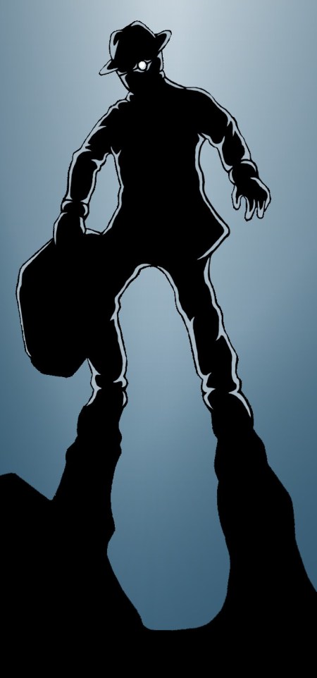
Antagonist Baby Face in a suitably menacing pose. What's in the case? You'll have to wait and see...

Again it seemed a cold mood was in order so I used a similarly restricted palette of blues to my previous concept of Scratch but placed all the focus on the character – Baby Face – and removed scenery altogether going for a super abstract silhouette. Having recently read Frank Miller’s Sin City: The Hard Goodbye I suppose this started out as an attempt to emulate him to some degree, however I was also considering the dark suited villains of classic Noir and the way their presence would be emphasised through high contrast lighting and threatening shadows.

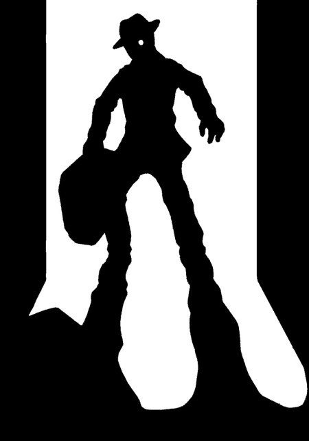
I added the highlights around his figure via computer on a whim as it appeared a little too stark against the coloured background with just a pure black outline – perhaps not an entirely successful effect but one which adds a greater sense of atmosphere and menace I think. Additionally I’ve included the basic black & white version below for comparison. Note the walls and slightly different arm/body shape, changed for the better I felt but then I quite like the original’s simplicity in some ways.

Original hand drawn version of 'Nightmares in Neon'

Which do you folks prefer?


Concept: Feeling the Blues

February 19, 2011

This piece was something of an experiment in style. Being urged to leave my comfort zone and use new techniques I suppressed my usual crosshatching tendencies and tried something different.

Drawing Scratch I attempted to integrate some of the noir aesthetic I’ve been researching recently, creating heavy areas of pure black shadow across her figure to give the impression of depth and stark lighting. While I was basing this on the look of genre films I additionally drew on comics featuring appropriate high contrast styles such as Sin City and Savage, sacrificing detail for intensified mood. The trench coat she’s wearing resembles the kind Bogart wears in Casablanca and The Big Sleep, a new design which pushes her appearance away from that of traditional sci-fi with the prominent cyborg fixtures being concealed beneath it. This may seem illogical given my setting, however I feel it counterbalances by introducing intriguing themes of concealment and deception. Dressed like this Scratch could almost pass for being a regular human being, were it not for jagged circuitry mark on her neck and unnatural shine to her eyes.

The background interior was loosely based off one of Marchand and Meffre’s photographs of downtown Detroit – somewhere suitably bleak for the tone with a few additions to suggest a futuristic scenario. However, as with Scratch I’ve toned down the more obvious cyberpunk facets in favour of a more credible scene, with only the slightest hint it take place in the future. The focus being on the ambience rather than technological wows.

In relation to this I considered how Eduardo Risso’s artwork in 100 Bullets would often be given a specific colour palette for different settings and characters, giving stories their own distinct visual flavour and creating a vivid atmosphere. Here I wanted to reflect Scratch’s cynical personality with cold blues, also approaching the appearance of monochrome inherent in classic noir cinema.

My biggest complaint of the final image is that the lighting of the subject and setting don’t quite mesh with the background lacking the same sharp definition of light and shadow Scratch has. I’m pleased with the brooding atmosphere and look of the new trench coat, but I think I need more practice getting to grips with digital colouring and convincing lighting.