
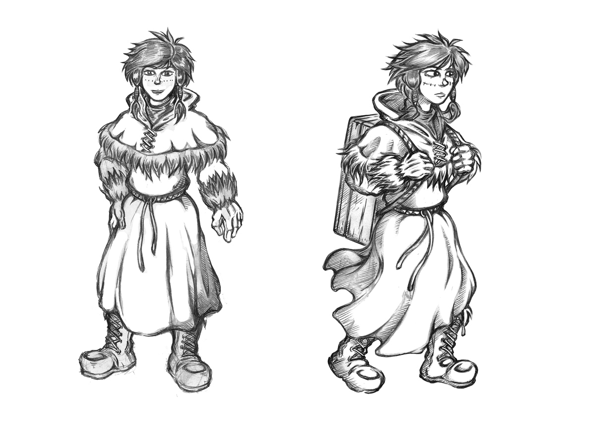
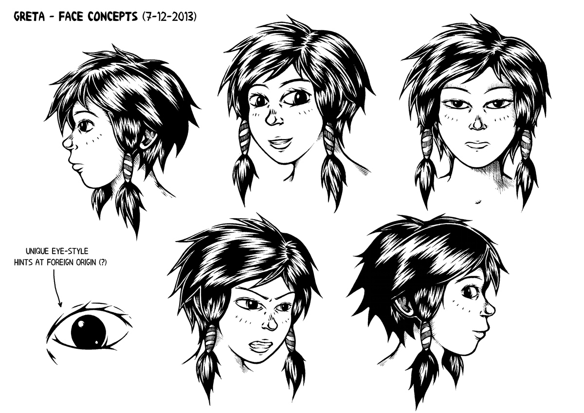
Well here you have it, Sasaki has literally become a ‘cyberpunk’. Continuing the direction I’ve been exploring in recent posts, this time around I’ve toned down the slobish aspects and tried to create something more distinct and vibrant, incorporating some of the cyberfashion I looked at last time for a stronger design.
The influence should be pretty evident from areas such as the cowl, straps and leggings, being taken from my previous research images or ones like them. I received a sizable criticism recently about making my characters overly functional in appearance, so here I tried to inject a little more fun into her look, reflecting what is largely a fun character. While being an agoraphobic oddball, Sasaki was also intended as an antidote to the largely serious, angsty cast; a slightly comical addition included to offset the inevitable misery and balance things out.
To summarise the problems with the old concepts: there’s a difference between a character who’s lazy and a lazy design.

The original concept was simultaneously bland and overly complicated, lacking a sense of coordination to the look. The VR helmet on the one hand had far too much going on, appearing bulky and impractical, especially by sci-fi standards. Areas such as the jumper and legs meanwhile lacked much in the way of distinctive features, resulting in an impression that’s both frustrating and forgettable to the casual reader. I’d intended her to look a bit of a mess, but the result is an artistic rather than intentional one.
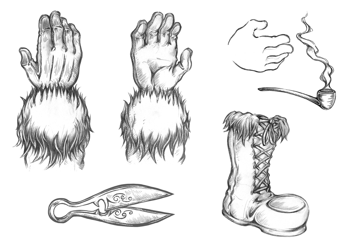
The biggest change I’ve made is reducing the helmet to an implanted set of cyborg eyes. I’ve kept the spider-like arrangement but in retrospect it seemed strange I didn’t fit them into my cyborg scenario on a character who already has ‘modifications’ and never removes it throughout the script. The four cables running into the back of the hands have also notably been reduced to one, simpler but far more striking as a result.
I purposefully included colour in this design too as it struck me as an important aspect of the ‘cyber’ look. It falls into the orange/blue scheme that I’ve been using for much of the comic, though I’ve gone for a brighter look than usual to emphasise an exaggerated personality; there are still sharp blues representing the mechanical element encroaching on humanity but the orange sweater dominates Sasaki’s design, emphasising warmth and energy of the character. The dyed hair again draws upon the fashion influences and generally punk vibe, but on an aesthetic level seemed a good way to make her more distinct.
As is becoming increasingly common, I drew over the basic sketch digitally for linework and colour. I process which I’m finding beneficial in some ways and problematic in others. The advantages are the ability to easily scrub out and redraw mistakes until I’m completely happy, while the final result is a lot sharper and easier to colour than my hand drawn efforts. The downside is that it can take a long time to complete art this way as the zoom tool often causes me to obsess over miniscule, barely visible details I’d never worry about in a pencil and pen drawing. Plus, spending all that time in front of a monitor can be a recipe for a killer headache. I’m enjoying the experimentation but I don’t think I’ve nailed down the definitive method just yet.
At any rate, overall I’m much, much happier with Sasaki’s new concept and while I’m not sure it will mesh perfectly with my existing pseudo 1940’s style, it’s better than sticking to a constrictive and frankly boring uniformity. I regret not being able to create a thorough multi angled study as with the original design, but with the tradeoff in time being colour and higher quality drawing I can hardly complain – as an experiment it feels like it’s been a success and what’s important now is getting back to the comic itself and applying the influence on a wider scale.


 Posted by Ozy
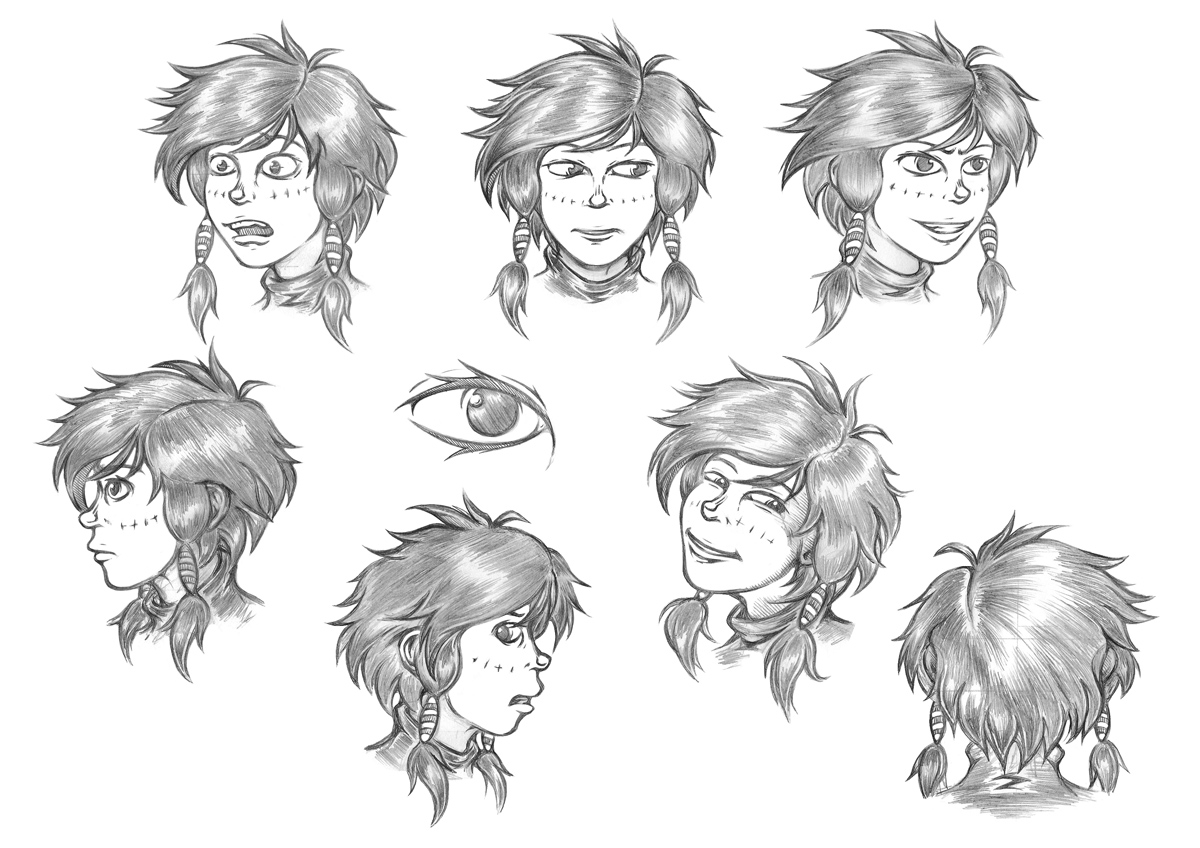


")
")
