Concept: Branch (external)

April 16, 2011

Here’s an odd addition to my concept work: the outside of the titular ‘Branch’ space station, the setting for my story.

I say it’s odd because this is an uncommon viewpoint, likely to only occur maybe once or twice in the narrative while the rest of the action takes place within – as you may recall I uploaded a concept of the internal cityscape some time ago – all the same, I still felt compelled to draw the outside in order to create a stronger sense of the space within and firmly acknowledge the orbital setting.

Much like the buildings inside it’s intended to be a poorly maintained ramshackle structure; an installation which started life as a shipyard before the original owners were crushed under debt and forced to appropriate it as improvised real estate. Much like the cyborgs who populate it, the setting  is an uncomfortable hybrid of old and new that was repurposed out of necessity rather than some shining conviction. An unglamorous stop-gap that’s acquired a population it can’t shake; part corporate venture, part ghetto and part prison.

While the general shape and design of the structure are more or less as I initially envisioned I will admit that I scaled it down considerably to meet both artistic and practical considerations. Originally I had written that Branch would have a diameter of three kilometers by over a dozen in length, but as you may guess looking at the internal view for comparison it ended up as less than half of that. That isn’t necessarily a bad thing as it enhances the atmosphere of claustrophobia and tension while still providing a sizable setting to work with – that, and it gives me much less to draw :p

Being serious though, I tried to be sensible with the design to give the impression of a rugged but ultimately sturdy structure which could sustain itself to some degree. The enormous solar panels wrap around the hull on either side ensuring the maximum amount of sunlight is caught for power, while the multiple docking arms allow arrivals and departures to be handled en mass. It’s not the most attractive design in some respects, but then I couldn’t imagine such a structure realistically would be.


Concept: Deadly Serious

April 8, 2011

Just a little something to keep things moving here:

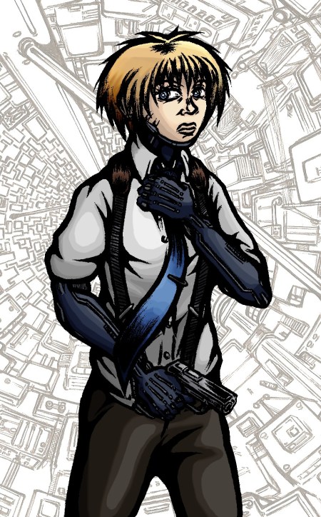
Despite suffering a particularly malignant ‘hands won’t draw’ day earlier this week I eventually got this small concept together. Nothing particularly new or adventurous content wise I’m afraid but it did give me an opportunity to experiment with my colouring technique a little more and to consider Scratch’s general look without the coat on.

In my recent concepts I’d been reliant on layers of colour filters and brush strokes, here however I made stronger use of the dodge and burn tools to create highlights and shadow resulting in an altogether different appearance to the character. As before I can’t shake the feeling it came out a little too bright, but I’m otherwise pleased how the colour scheme fits together with the sharp blues playing off the more muted greys and browns in a distinct arrangement.

And yes, I finally succumbed to the cliché and included a gun in a concept. Forgive me D:


Concept: Sasaki’s Den

April 2, 2011

Here’s a somewhat psychedelic addition to my concepts:

As I outlined in the original post for her design; Sasaki is someone of immense skill when it comes to computers and technical activities at the cost of just about everything else – hence her ‘den’ being something of a garbage heap. In one regard at least she serves as comic relief for the story, but her dysfunctional nature and living space also highlight the drawbacks of a life built around technology.

Unlike Scratch, Sasaki only has minor cybernetic augmentations rather than full replacement prosthetics – her use of externalised equipment pushing the character closer to reality than other more developed cyborgs in the narrative. Besides the Augmented reality helmet – and unseen virtual keyboard assumedly projected in front of her (expect a concept) – I was intentionally restrained with much of surrounding scene, making it not too dissimilar to the kind of slobbish dwelling that would exist today.

In line with the graphic’s themes, the concept is intended to depict contradictory symptoms of advancement and neglect, reflecting a very real social problem that’s arisen from our internet culture. Sasaki embodies a worrying misallocation of priorities, disregarding much of our real lives in favour of a more manageable online identity and its attached functions. Technology is an inherently blameless thing, but as with almost anything it can be taken to extremes and end up being abused for warped purposes to the point where it becomes consuming.

I took a risk by going for a more lurid colour scheme this time around, using a complimentary play of green monitor lighting against dark red shadow. Again this emphasises the technological domination of the space, while giving the scene both exciting and sickly qualities in line with the subject’s personality. Its got a few rough edges but it marks an interesting departure from the norm away from more conventional colouring and ultimately possesses a stronger sense of atmosphere.


Concept: Street Level

March 23, 2011

Excuse my recent absence, I was away longer than I’d like and WordPress went down when I finally did have something to post. Anyway I present to you the fruits of my recent labours:

This concept is a first in more than one respect; it’s the first full colour image I’ve created for this project (excluding my previous experimentation in shades of blue) while it’s also the first piece to feature two of my characters within the same scene. The latter point I felt was especially important, the intention here being to portray a quieter moment placing emphasis on more subtle body language over action or high drama. Scratch is laid back whilst remaining cold and calculated – a casual smoke in hand but a backwards glance and straightening of the tie suggesting caution. In contrast Curt’s neurotic personality is suggested respectively by a wringing of the hands and eyes focused on the ground.

I should also note that this is the first time I’ve drawn my setting from a street level perspective; something which proved a challenge thanks to the curved cityscape but is ultimately reassuring to have tested, appearing much as I’d have hoped. The characters fit into the setting convincingly while there should be just enough sci-fi evident in the backdrop to keep things intriguing.

Possibly the most troublesome aspect of the piece though was the colours, specifically creating a palette suitable to the mood but also striking enough to make the background and foreground distinct. As with previous colour work I used Corel Photo Paint 11as while I am competent with Adobe Photoshop I can work quicker with the former thanks to its preferable toolset and streamlined interface.In terms of the distant and immediate buildings, I gave the foreground a brown-orange hue and set it against a background of blue-grey tones to play upon complimentary colours and make the nearby scenery standout. I kept both of these elements fairly muted to evoke an appropriately grim atmosphere but also to avoid drowning out my characters. In contrast I made Scratch and Curt as brightly coloured as I dared to draw the viewer’s attention to them first.

Just as I attempted to communicate each character’s personality through pose and body language, so too have I tried to embody something of it in their colour scheme. Scratch is predominantly coloured with blues and greys to represent her cynicism and calm machine-like approach while emphasising her symbiosis with technology – the hard beetle like shell of her prosthetics and implants only furthering this sensation – Curt’s organic nature meanwhile is embodied through the green jumpsuit, while it could also be tied to less favourable (though appropriate) connotations such as inexperience, jealousy and sickness.

Generally speaking the concept is a sort of benchmark for the graphic itself, being a kind of prototype for the look of pages in the production phase. Truthfully I spent a disproportionate amount of time working on it and I can’t claim I’m entirely happy with the result but as ever it marks another significant step towards getting this thing off the ground and something to build upon further in my future work.


Concept: Nightmares in Neon

March 8, 2011

Having some free time today I felt like experimenting a bit, this being the result:

Antagonist Baby Face in a suitably menacing pose. What's in the case? You'll have to wait and see...

Again it seemed a cold mood was in order so I used a similarly restricted palette of blues to my previous concept of Scratch but placed all the focus on the character – Baby Face – and removed scenery altogether going for a super abstract silhouette. Having recently read Frank Miller’s Sin City: The Hard Goodbye I suppose this started out as an attempt to emulate him to some degree, however I was also considering the dark suited villains of classic Noir and the way their presence would be emphasised through high contrast lighting and threatening shadows.

I added the highlights around his figure via computer on a whim as it appeared a little too stark against the coloured background with just a pure black outline – perhaps not an entirely successful effect but one which adds a greater sense of atmosphere and menace I think. Additionally I’ve included the basic black & white version below for comparison. Note the walls and slightly different arm/body shape, changed for the better I felt but then I quite like the original’s simplicity in some ways.

Original hand drawn version of 'Nightmares in Neon'

Which do you folks prefer?