Busy Earning… Still going

January 17, 2016

Page20INPROGRESSA spoilerific image perhaps but I felt it was worth posting to show I haven’t ditched Greta & Co just yet.

I doubt I could convey quite how desperate I am to push things forward and finish this long overdue story (though my partner is probably sick of hearing about it), still I will finish it and I am getting serious again, just trying to find a rhythm that works with alongside the day job and all the other little distractions.

That update is coming soon and it should be followed by ones that aren’t a month apart.


Delays as always

December 14, 2015

Ack. Annoying as the sluggish comic updates may be I’ve got my hands full at the minute starting a new job and juggling an ongoing freelance project. As much as it pains me procrastinating at the climax of the story I’ve got to prioritize realistically to keep things sustainable…

On the bright side, the aforementioned freelance work is proving quite enjoyable indeed as I’m making storyboards, concepts and animatics (below) for a forthcoming short film; all good practice which appropriately goes full circle to my educational roots in film production.

One way or another, I’m determined as ever to press on and get plenty more Apothecary Supreme out around Christmas with a goal of finishing this story early next year. Am I massive fraud making up yet more empty excuses? We shall see…


Being a Busy Bee…

October 4, 2013

Busybees

… Not on the comic front obviously given the lack of activity here, but I’ve been working hard for the last week or so planning out an animation commission – among other things – and felt offering some kind of life signs here would be a good idea. I dare say my readership right now has dwindled to almost nill given my barren update schedule but on a personal level at least it seems important to push myself into regular posting again.

Having paid work that’s also creatively fulfilling is certainly more than agreeable but inevitably it has been stealing away a fair amount of my time being a responsibility rather than indulgence; plus I’ve been wrangling with a few long-term concerns right now that are threatening to go nuclear if I don’t face them head on.

The good news is that while poorly timed I feel like I’ve finally found a way to speed up production of Branch without compromising the quality too severely. The proof will be in the pudding so to speak so I’ll go into details about it when I next post a page which hopefully will be sooner rather than later.

The bad news is that it seems increasingly unlikely I’ll have new material ready for October’s MCM Comic Con in London. More than a bit of a shame given how much I wanted to redeem my last spindly offering, but it’ll at least be nice to visit the comic village again and see what other folks are up to.

Regardless, when it does arrive I’ll really have to make sure my next finished issue is something special now.


Page 19 + breakdown

March 15, 2012

Remember when I said I’d have this page up last week?

Somehow I had it in my head when I pencilled this one out that it would be relatively simple, unfortunately it ended up being the proverbial greased eel. The end result is solid enough but there’s no way it can justify weeks of hiatus; while there may be artistic merits to the work it’s also entertainment. Entertainment with readers. Readers with limited patience who I’ll wager have a hard time maintaining interest in a conversation spanning across a month and would rather spend their time with Batman or watching funny cat videos on YouTube…

To anyone who is still following I really am sorry for the slow output and continual broken promises, speed is by far my biggest weakness but I’d still rather delay than churn out something unremarkable which I’m deeply unhappy with. Anyway, rather than moping about my inadequacies again or making more shady promises I thought I’d do something different here and provide some insight into how I work while considering how I might tighten things up in the process:

The rough pencil plan which I start with (above, left) based on the script is perhaps the easiest part of making a page, I sometimes end up wrangling with the layout a bit but it’s usually over and done with in a day. Anatomy tends to be wonky while the linework itself is immensely crude but since it’s all going to be redrawn it hardly matters, what’s important is that I get a sense of the overall thing  and whether it works compositionally before beginning proper.

Conversely, ‘inking’ (pictured above right) is typically the most difficult and time-consuming portion of the process. Previously I’d draw out each panel individually with fine liners but since realising I’d have a far easier time doing the same digitally I now work over the layout in Corel. The new approach affords me more control and makes mistakes – of which I make many – much easier to reverse, on the downside though it tends to bring out my obsessive side. Given the option to redraw things as many times as I like means I can often lose focus on the bigger picture and end up repeatedly reworking a nose/eye/hand/miniscule detail, whereas on paper I’d get it down and that would be it – no going back.

To my mind at least the quality of the art has risen over the last several pages or so thanks to the new methods but I need to be stricter as to how I allocate my time and avoid being tempted to overcook irrelevant minutiae.

Stripping away the linework – and inadvertently creating some seriously trippy imagery – you should get a sense from the two stages above of how I build up colour. Given that this scene is saturated in sickly greens the palette isn’t as complex as some other pages but I still ended up putting in a lot of effort.

I start out with a base green, apply midtones, then work in shadows and highlights from there with the dodge and burn tools; I know that professionals often start with the darkest areas first and work up to lighter tones from there but I find the mids give me a greater sense of balance as I build up the layers, providing a kind of anchor I know not to stray too far from. Keeping everything in variations of green struck me as somewhat monotonous and unrealistic so you can also see how I’ve overlayed other colours in the second image to make certain features such as eyes and Scratch’s prosthetics standout.

Something I’ve additionally begun paying more attention to recently is lighting. Besides the regular greens being a little strong on their own adding the sense of a lightsource/s creates a far more interesting visual atmosphere; note the cyan highlights applied in the left image via brush selection and translucent gradients, in this case giving the characters a paler complexion along with the sense of cheap and nasty lighting overhead. For similar reasons I also applied a dark blue tinge to areas of heavy shadow to enhance the feeling of depth.

Finally, the last image (above right) shows two irregular effects I applied in this case: the mirror and the HUD overlay from Scratch’s viewpoint. The reflection was a simple affair only requiring some overlayed gradients and highlights, unfortunately getting the HUD right proved considerably more taxing, being largely responsible for the last day or so of delay. Unlike most other features it needs to look computerised rather than organic/living but on the flip side it has to fit with the style making it a mind-boggling contradiction to draw up. It took a few tries but the end results I hope are at least serviceable, appearing precise enough to be a computer readout with a suitably rough edged look to prevent it from jarring with the rest of the comic.

Putting aside smaller foibles I feel like my methods and techniques have evolved into something I’m fairly comfortable with, as ever the bottom line is the need for greater efficiency. With future pages I need to be more aware of where the time goes, which details are necessary and which are superfluous. I’ve seen others with less time produce far more than me at a higher standard so it’s not a question of whether it can be done, I’ve just got to keep refining and work towards a more respectable output.


Page 18

February 20, 2012

I. Live. Again!

Joking aside though that was a horrendous gap between pages. One I can’t afford to repeat.

It wasn’t as though I spent those weeks on self-appointed holiday as I have been working steadily but the page ending up taking forever. I’d call it burnout, but given how modest my output is I’m not sure that’s an acceptable excuse; to put it crudely my drawing mojo was off kilter and besides a forceful effort to get the project back on track, I had to take a few days out sketching unrelated stuff to rediscover my inspiration. I still can’t promise weekly updates every time, but I’ll do my damnedest to push ahead all the same.

In spite of the shocking delay however – or more likely because of it – this is definitely one of my better pages. Previous efforts have often had areas of clunky composition, wasted space or jarring flow but here the layout seems pretty efficient and streamlined. An additional longshot may have been good but besides that it all appears to hang together nicely and for once there doesn’t appear to be any wasted space.

In regards to shading and colour, I peeled back the heavy black shadows of the previous scenes to alleviate some of the intensity and cool off after the last few pages, there’s still tension but I don’t  want to overcook it.

In lieu of the heavy shadows I tried to introduce a little more depth to the colouring and experimented with a few new techniques which proved remarkably successful; I’ve applied hints of blue/purple to darker areas while making the highlights more dynamic and detailed. The green saturated lighting scheme might be stretching realism a bit at this point but since it’s a comic I think some flexibility can be afforded for the sake of visual expression.

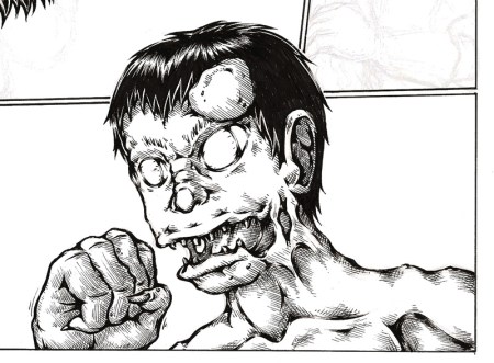
The ghostly look of the reflection in the mirror was something improvised quite late on but it seems fitting, besides clearly showing it to be a reflection it seems to emphasise the sickly panic on Curt’s face while giving Scratch an appropriately ghoulish quality – getting slightly pretentious I could also make a point of how the shine marks on the mirror appear to fracture her figure, foreshadowing a somewhat fractured character.

On the page content itself: I changed quite a bit from the script here simply because much of it just didn’t seem natural on review. Scratch was originally far too chatty, while it stuck me that given Curt’s personality he’d be more likely to babble anxiously in a tense situation than become laconic. Additionally Scratch was far more aggressive and hands on with him but as with much I’ve reconsidered it struck me as heavy-handed and largely unnecessary – in short it’s a case of KISS (Keep It Simple Stupid).

Finally, I’d like to conclude with a more general thought regarding motif.

When I talked about my project with Paul Gravett he was very insistent that I implement reoccurring motifs and iconography. At the time I decided to let them ‘emerge gradually rather than being heavy handedly emphasised‘ and as I hoped I feel like some have begun to develop.

For one there’s barcodes. I have a general fascination with them, but beyond aesthetic I suppose the reason they’ve appeared so frequently is to enforce the idea of what a blurred divide between humanity and technology entails. Considering cybernetic prostheses as products (which they undeniably are in this scenario) does that by extension make the owner a kind of walking product? Even on an everyday level, couldn’t fashion and various other bought accessories we use to define ourselves have a similar effect? Are our identities themselves a kind of product, marketed to the world around us?

Thus far these barcodes have been on bulkheads, luggage and ID badges but here on Scratch’s eye is the first instance where it’s literally a part of someone. It’s not an entirely original concept as similar things have been done in Gibson’s Neuromancer and Ghost in the Shell but it seems a logical – though frankly chilling – direction for cyborg technologies to go in.

On a more shallow level I’ve also inadvertently been using danger stripes a lot, something which has less of a basis in thematic backing and more in striking imagery/lack of imagination on my part. They seem fitting though in the sense that Branch is a hazardous place and right from the off Curt has been walking into rising danger – it’s a motif that needs more development but it’s a start. There is one other detail I’ve been repeating for a while now but I think it’s too early to give the game away on that one, I want to see if anyone notices it and figures out the plot hint ;)

I’ve babbled on more than enough for now so I think I’ll call it and promise more of something soon!