Signing up for MCM again, AWOL updates and ACTION

March 8, 2013

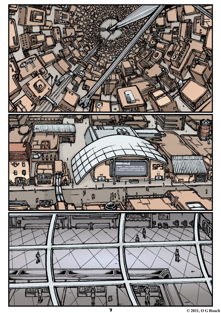
Well, I’ve gone and done it now. I’ve signed up for London’s MCM Comic Con this May, so where the hell are all those new pages I was meant to have?

‘In progress’ is a frustrating label to tack on I know but it’s the best way I can describe it, they’re coming together but I’ve had to run through a veritable factory of brick walls to get there. Hard brick walls, covered with rusty nails and that delightful black paint you can’t seem to wash off. The name of this factory? Action.

Much harder than it looks it turns out...

Much harder than it looks it turns out…

To clarify I’ve had plenty of other stuff keeping me busy too – which all being well should appear online eventually – but for the most part there’s no avoiding the fact I have almost no experience in planning or drawing a proper action sequence in a comic. I’ve had bursts of violence and quick motion before but they’ve generally been ancillary to the scenes they’re in rather than the focus.

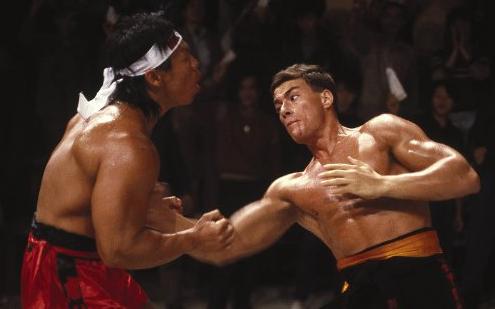
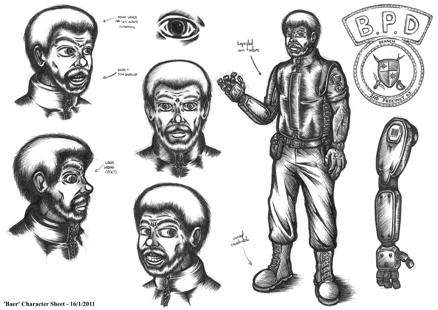
The last time I really had a crack at it was around six years ago with my first proper comic Cyberdog…

The hands, the faces, the wasted space in the layout... Can we just pit it away now and stop talking about it?

The anatomy, the faces, the wasted space in the layout… Can we just launch it into the sun and stop talking about it forever?

<Insert shudder>

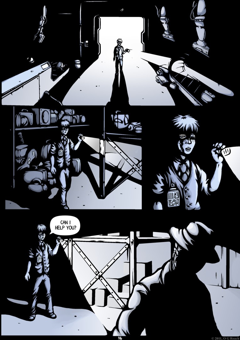
Suffice to say I had a lot to learn back then and the whole endeavour left a foul taste in my mouth that likely put me off trying anything similar for a long time. Still here I am again, facing a similar set of problems; my drawing’s certainly improved and actually having a script this time has helped but learning to draw action from Scratch (pun intended) has proved a challenging process.

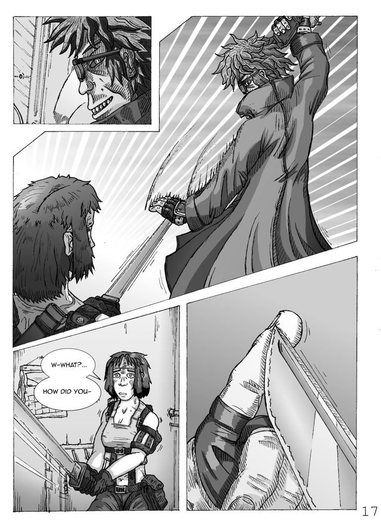
The early sketches for page four highlight some of my worst sins, I apologise in advance for their slightly spoilerific nature:p4actionpose1

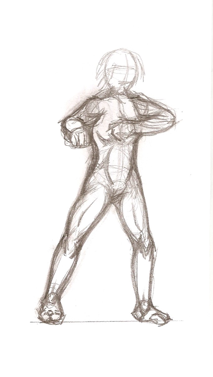
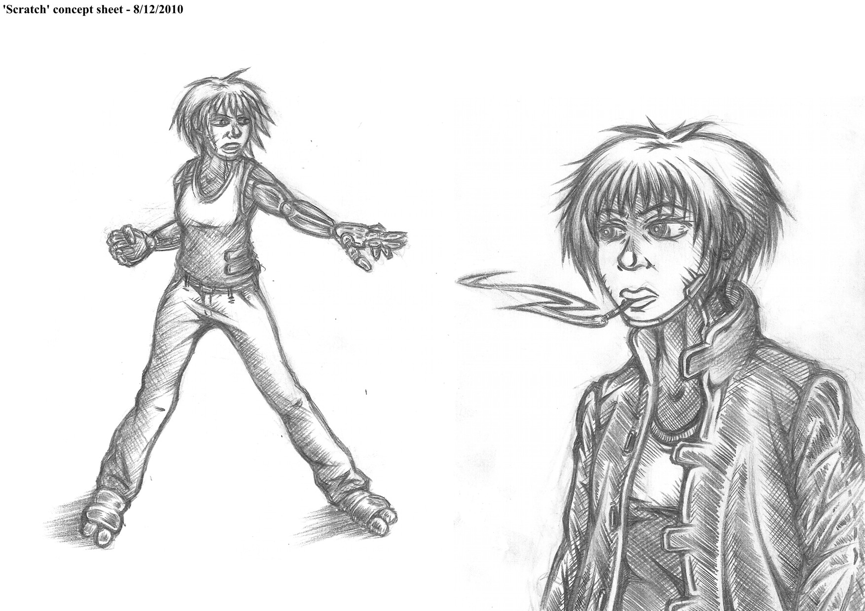
Here we have the bare bones of Scratch someone delivering an elbow thrust. I roughed it out, looked at it and wondered what was wrong with the picture when the obvious struck me; there is no thrust. Indeed no motion at all, this isn’t a professional delivering a crushing neck strike it’s an exercise enthusiast having a gentle warm up. Argh.

I’d literally got so wrapped up in the anatomy I’d neglected to think about the pose and how I might make it exciting. Conveniently it was at this point my memory fired up – for once – and I recalled a good bit of advice from How to Draw Comics The Marvel Way about exaggerating poses to emphasise motion.

Armed with this reclaimed knowledge I tried again:

p4actionpose2
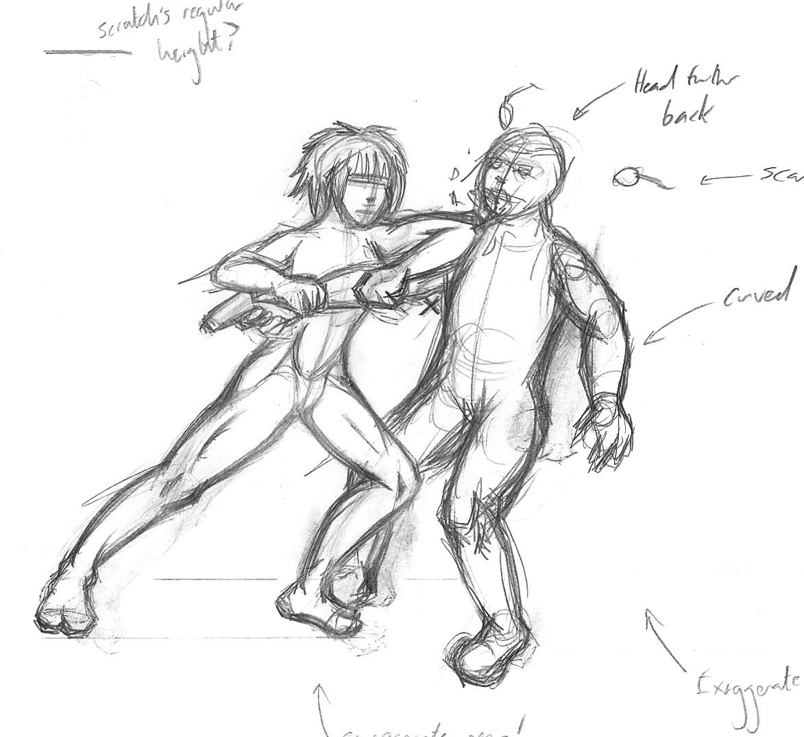
Better; the subjects legs are actually pushing them into the strike this time, with a general lean in the direction of movement and the arm extending further out suggesting actual force is being applied. It remains far to stiff though, with the victim being altogether too upright for someone who’s just been struck in the chin full force, while knees should be bent much further in both cases if this is at the end of the motion.

Aiming to make third time the charm I created a digital mockup this time:

Branchissue2page4rough Much better. There’s a far stronger sense of engagement between characters here while Scratch’s the attacker’s front leg being bent further suggests a much longer run up and push into the strike. The victim’s head being knocked back further also emphasises the force of the impact more tangibly.

By exaggerating the key areas of the action – exertion and impact – the snapshot’s extreme qualities imply what preceded them – approach and attack – allowing the reader to fill the gaps without even realising it.  We immediately know that it’s the end of a quick and likely powerful movement by the positioning of the aggressor’s arms and legs, while the victim’s reeling off-balance makes it clear that a painful strike has been made.

Unlike films and games comics can only imply an action since the reader is in control of acquisition; everything that goes in between the panels comes down to the mental images inspired by the real ones. The issue here is a broader one really and interconnects with much of what I’m learning and practicing in the medium as a whole, elbow strikes may not be subtle but the methods used to create genuine excitement and credibility are.

I’m still struggling a lot though the next page and those following it are closer to the right track now at least; I’ve set myself a tall order getting a new issue ready for the end of May but if I take some of that fighting spirit onboard maybe I can make it work after all.

Thus:

VanDamme

HEURGH!


Getting back to Branch

January 19, 2013

branch2p3previewroughIt’s got to be said, trying to get back into Branch after months of hiatus is like trying to start a rundown car in the middle of winter; there’s more than a little stalling.

Not to say things aren’t taking shape, I’ve just had to reaquaint myself with the art, themes and characters again these past few days in order to rediscover my inspiration. Plenty of initial efforts ended up getting the slam dunk treatment in my waste paper basket but I think I’ve finally rehabilitated myself and got started on a continuation proper. More soon ;)


Introducing ‘Replay Value’

October 2, 2012

As proof I’m still alive and working I thought I’d post a taster of what I’m up to:

As mentioned on the last Branch page I’m taking some time out from my regular comic, this being the reason; Replay Value is a four-page short I’m in the process of pencilling and inking right now with the intention of making something simple and self-contained that I can promote myself with more succinctly. Essentially it’s a bit of sci-fi number with a darkly humorous take on video game logic which I’ve been mulling over for a while now and wanted to get on the page.

On a general note I felt it would be good to take time out after the all consuming focus of my Masters and create something short and sweet for fun, breaking up my current collosal endevour and preventing my creative process from becoming a linear drudge.

Ideally it shouldn’t take all that long finish so expect some finished pages to appear here soon!


MA Exhibition: Final Plan

July 25, 2012

With time pressing on and next month’s setup for the Masters Exhibition looming large – eek! – I felt it was time to make some concrete decisions on exactly which pieces will be going display, while becoming specific on a few other vague areas.

I’m still planning to use eight 800 x 600mm frames for this; however after some thought and discussion with others I’ve changed my mind on a few critical details as pictured and explained below:

For one, considering that half these frames will be holding A4 landscape concepts (eight pieces with two to a frame) it logically followed that the first four frames should all be hung in portrait to make the pieces fit neatly at the correct orientation. Meanwhile the one frame in the second half required to hang as a portrait (due to the positioning of the DVD player and TV) will contain my two complete covers as an introduction to the finished pages, with their landscape format making them more or less the perfect fit.

The next two frames will be – as I previously planned – hung in landscape with two A4 pages set within each in their native portrait format, the last frame though I’ve decided warrants something slightly different. During the planning presentation a couple of weeks ago, I was advised to include at least one larger format piece and on admitting I didn’t have much I could blow up beyond A4 the suggestion arose that I construct an A3 collage from my existing art.

Besides the fact that reworking art rather than working from scratch should be quite feasible in the time remaining, it strikes me this should be an effective way to conclude my exhibit and break up the regular page work a little. I’m still making this – hence the no show – but as such I’ll just consider that last frame (15) to be reserved.

So, what of my other eight concept pieces and six finished artworks? What follows is a numerical rundown – relating to the above diagram – with attached reasoning for my choices:

1.  ‘Branch’ Station Concept

This seems as good a starting point as any. Besides being the titular setting for the comic, it can also be seen directly in the second page of the first issue, firmly anchoring the concepts to my finished work.

2.  Scratch Pose/coat concepts

While these sketches are somewhat crude and Scratch’s design has since seen a complete overhaul they do illustrate an early stage of development and emphasise how much has changed since preproduction, that and I feel they draw attention to her physicality and weary attitude as a character.

3.  Sasaki’s Den

Another character design which has seen a lot of changes since this concept, regardless it remains one of my more accomplished preproduction pieces. What I like in particular about it is the use of an environment to mirror the personality of the subject; essentially technical astuteness offset by a lack of hygiene or care in day to day life. I went with B&W version here and with image ‘7’ since the colour work unfortunately ended up being a bit substandard.

4.  Scratch Concept Sheet 7

A tweaked version of my final concept sheet for Scratch, it more or less shows her finished look and compared to the earlier sketches demonstrates the overall development of the design particularly in areas such as the arms and clothing.

5.  Baby Face Concept Sheet 3

Probably my favourite of all Branch’s character designs. Earlier drafts for Baby Face were problematic to say the least but the final concept turned out rather well; on the one hand the 1940’s style formal attire reflects the characters overblown sense of superiority and sophistication, while the alarmingly rough, angular prostheses emphasise his unrestrained brutality.

6.  ‘Baer’ Concept Sheet

Another of my better concepts, what I like about Baer is the way he balances ruggedly human qualities with those of a machine. It might seem like an odd choice given that he hasn’t appeared in the comic itself yet, but he’s a character who embodies a great deal of Branch’s human-machine symbiosis themes, with an old school attitude in conflict with the world around him and even his own clunky prosthetic “grabber”.

7.  Branch Street Concept

Not my favourite setting piece but a good one to show some of the earlier word building, while it also forms the basis for my first cover. Furthermore, the inclusion of both Scratch and Curt here hints at the central relationship which the story revolves around.

8.  Character Line up

Technically a collection of concepts rather than a fresh set, still this line up shows my entire cast at the point I started production making a good conclusion to my concept work in the exhibit. The height comparison is a nice touch too as it gives a greater sense of context to each and how they relate to one another.

910. Covers

As previously mentioned these frames will hold my two issue covers; not just because their full landscape format fits a portrait frame better than a regular page, but also because they are naturally intended as an introduction to the comic when it’s read. Having them come before the actual pages seems like good sense to me, even though they were admittedly made quite late on in production.

11.  Issue 1, Page 2

As mentioned earlier with my design for the space station, I felt that this one was an important inclusion to set the scene and tie production to preproduction as explicitly as possible. Even out of context it feels suitably introductory.

12.  Issue 1, Page 7

Besides being easily my most positively received page, this one makes a good companion piece to page 2 in the same frame featuring another establisher only this time inside the station. It also sets out a few key features of the setting such as the 360˚ curve of gravity and crumbling favela style setting.

13.  Issue 1, Page 16

Being one of my more atmospheric additions this one was something of a no-brainer , importantly demonstrating the influence of noir stylings on my work and showing Baby Face within the comic.

14.  Issue 1, Page 20

There were plenty of options to choose from for my last actual displayed page but this one seemed like a good bet. It has a sort of introduction from Scratch and begins to show the uneasy dynamic between her and Curt, while additionally featuring what may be my most ambitious perspective drawing in the bottom panel.    

I realise this seems like a relatively small selection considering the number of pages I’ve produced but bear in mind that there will also be a TV/DVD player running a slideshow of all my work to date should anyone want a more extensive look, while I’m also considering leaving a few printed copies out for people to flick through.

I should also take this opportunity to underline my decision not to use the acetate layering idea I mentioned in my ‘Development’ post. This isn’t to say I didn’t like the concept but after talking it through with our resident technician again it seems like there are just too many problems involved; I wouldn’t be able to hang them up for health and safety reasons, while keeping them in shape without becoming distorted would require rods to hold the sheets in place – not to mention a spare surface for it all to be fixed upon.

I could alternatively have done the same thing on a smaller scale with a booklet or folder but I feel that would lack the same impact, break up the overall cohesiveness of the exhibit and really be far more trouble to prepare than it’s worth. I’d much rather spend my remaining time on other areas of the display and I can always do something similar with my DVD, creating a time-lapse of the layering alongside the main slideshow to reveal more of the process.

So, with all that sorted out all I have to do now is prepare business cards, put together that A3 collage and I should be ready to visit the printers before the end of the month!


Sasaki Redux

December 20, 2011

Well here you have it, Sasaki has literally become a ‘cyberpunk’. Continuing the direction I’ve been exploring in recent posts, this time around I’ve toned down the slobish aspects and tried to create something more distinct and vibrant, incorporating some of the cyberfashion I looked at last time for a stronger design.

The influence should be pretty evident from areas such as the cowl, straps and leggings, being taken from my previous research images or ones like them. I received a sizable criticism recently about making my characters overly functional in appearance, so here I tried to inject a little more fun into her look, reflecting what is largely a fun character. While being an agoraphobic oddball, Sasaki was also intended as an antidote to the largely serious, angsty cast; a slightly comical addition included to offset the inevitable misery and balance things out.

To summarise the problems with the old concepts: there’s a difference between a character who’s lazy and a lazy design.

The original concept was simultaneously bland and overly complicated, lacking a sense of coordination to the look. The VR helmet on the one hand had far too much going on, appearing bulky and impractical, especially by sci-fi standards. Areas such as the jumper and legs meanwhile lacked much in the way of distinctive features, resulting in an impression that’s both frustrating and forgettable to the casual reader. I’d intended her to look a bit of a mess, but the result is an artistic rather than intentional one.

The biggest change I’ve made is reducing the helmet to an implanted set of cyborg eyes. I’ve kept the spider-like arrangement but in retrospect it seemed strange I didn’t fit them into my cyborg scenario on a character who already has ‘modifications’ and never removes it throughout the script. The four cables running into the back of the hands have also notably been reduced to one, simpler but far more striking as a result.

I purposefully included colour in this design too as it struck me as an important aspect of the ‘cyber’ look. It falls into the orange/blue scheme that I’ve been using for much of the comic, though I’ve gone for a brighter look than usual to emphasise an exaggerated personality; there are still sharp blues representing the mechanical element encroaching on humanity but the orange sweater dominates Sasaki’s design, emphasising warmth and energy of the character. The dyed hair again draws upon the fashion influences and generally punk vibe,  but on an aesthetic level seemed a good way to make her more distinct.

As is becoming increasingly common, I drew over the basic sketch digitally for linework and colour. I process which I’m finding beneficial in some ways and problematic in others. The advantages are the ability to easily scrub out and redraw mistakes until I’m completely happy, while the final result is a lot sharper and easier to colour than my hand drawn efforts. The downside is that it can take a long time to complete art this way as the zoom tool often causes me to obsess over miniscule, barely visible details I’d never worry about in a pencil and pen drawing. Plus, spending all that time in front of a monitor can be a recipe for a killer headache. I’m enjoying the experimentation but I don’t think I’ve nailed down the definitive method just yet.

At any rate, overall I’m much, much happier with Sasaki’s new concept and while I’m not sure it will mesh perfectly with my existing pseudo 1940’s style, it’s better than sticking to a constrictive and frankly boring uniformity. I regret not being able to create a thorough multi angled study as with the original design, but with the tradeoff in time being colour and higher quality drawing I can hardly complain – as an experiment it feels like it’s been a success and what’s important now is getting back to the comic itself and applying the influence on a wider scale.