Page 22 + Printing for the Expo

May 22, 2012

Well here it is, the conclusion to Branch issue 1…

This may not be my best page but at least it gives some sense of the issue/chapter going somewhere as the threads mesh together. Curt realising his delivery has being stolen more or less concludes the introductory section and marks an important shift towards the main plot.

On the downside I haven’t covered anywhere near as much of the story as I would’ve liked though. The first third of my script was written with the intention of setting everything up and giving readers a balanced cocktail of excitement, drama, intrigue and dark humour; as it is I manage about half of that first act here, with the majority of my favourite moments infuriatingly just around the corner. There’s no use in dodging it, I need to work faster.

Not that I haven’t been working hard. I doubt it shows in the finished piece but I seriously short-changed Mr. Sandman this weekend finishing this last page for the printers. I’ve still got red roadmaps all over my eyes and the kind of complexion which has people barricading doors and brandishing crucifixes…

Still, I guess it was a valuable lesson in working economically, I didn’t get time to do everything I wanted to with this page though maybe that was the point. While the backgrounds are a little sparser than usual and the shading less detailed the flow appears reasonably clear. I could quite easily have spent another four-five days polishing this up and adding things in but would it have been worth the additional wait? Maybe having an unbreakable submission deadline yesterday demonstrated the kind of discipline I’ve been lacking till now.

Anyway on that note it’s at the printers now and will be ready just in time as I leave for the MCM Expo. As planned I’m going with an A5 colour format going for a suitably modest price of £4-5 – I’ll see how it sells :p Given that it’s the first time I’ve done something like this I’m naturally terrified, but like everything on this project I’m sure it will be a useful experience even if it isn’t a massive success. I’ve had various people telling me to get my work out there in physical form so I can at least say I’ve finally given it a shot – that and seeing other folks at the comic village should also be a lot of fun!

I’ll post again before I set out to London, in the meantime I just need to make sure I’m prepared. Stay tuned.


Cover Complete

May 9, 2012

Like most things this took longer than I would have liked, but as I mentioned previously people are more likely than not to judge a book by its cover and I really wanted to make sure that even a glance will leave an impression. As usual there are the perennial gripes over the details, anatomy and rendering, however this may well be the best cover I’ve ever made.

That’s not really as big an achievement as it sounds, all my past efforts have been single sided, ramshackle affairs, typically rushed out as something quick between story pages; the difference here was making an investment of time, thought and care that the former desperately lacked. It’s a long way off perfect, but it stands head and shoulders above my initial effort

The above version of the cover is intended to wrap around the printed issue I’ll be peddling at the MCM Expo, though it can just as easily be halved for a web version. I already showed the black and white drawing of Scratch, the background meanwhile is loosely based on an old bit of concept art with the original figures removed – they were wonky – and the setting itself re-rendered to fit with the heavily shadowed noir vibe style.

I kept the colour palette down to oranges playing off blues and greys as I felt it would create a stronger impact than the alternative. Personally speaking my best pages thus far appear to be those with a simplified scheme, creating a more intense atmosphere and more striking imagery. As I’ve mentioned on several occasions, much of Branch’s colour schemes is based out of oranges of blues with the intention of portraying the symbiosis between humans (warmth) and machines (cold), here I wanted to boil that theme and aesthetic down to its essence, making it as overtly obvious as possible.

Besides the titles though, Scratch is the only element of the cover in orange; it could be taken as being symbolic of her ultimately human qualities beneath the cold exterior, in truth though I was more interested in emphasising her alienation – cyberpunk protagonists are typically such, but without giving away too much it does become a key part of her character development later. On a visceral level, it also ensures she pops out from the setting being the immediate focus of the viewer.

On the translucent circuit textures; they were largely to create a more intriguing and surreal image but again, thematically support the themes of human-machine symbiosis, with technology seemingly lurking beneath every shadow – I should credit Lain with sparking this idea through its similar use of red splatter in the shade – the Branch station is built out of technology, though more pertinently it has literally become a part of people.

The specific background features should tell people things about the story as well; the curving cityscape is shown in the background establishing an important aspect of the setting, there is notable wear, tear and grime indicating it to be a used future along with other decidedly unsettling aspects.

With an initial version of the cover I showed a friend which had Scratch on her own he told me it looked a little too barren and that I ought to capitalise on the sense sleaziness indicated by the posters next to the Treenet booth and have a couple in the back alley. Given my intention to disturb rather than titillate with this I may have pushed a little further than intended, it started out as a kiss/embrace but now looks somewhat more explicit.

Still, the potential shock value isn’t necessarily a bad thing as controversy and sex do tend to draw interest, as an Expo newbie it may well work to my advantage catching attention and given the places the storyline will eventually go a darker cover is perhaps a fairer indication of content. Also, yet again in line relation to my theme a fusion of very human sexuality juxtaposed with freakish cyborg appendages seems quite appropriate.

Finally, the titles. The main one proved quite a headache, with several scrapped attempts before I made something I was happy with. My original alphanumeric title appeared too spindly for the most part and either sunk into or jarred horribly with the rest of the cover. The final redesign (which I’m quietly proud of) is essentially a heavily mutated version of my original title font, fleshed out with extra bordering and a chrome style finish. It may be a touch too forceful for my liking but its bold and ideally grabs your attention.

Following on from my point about shock value, the new issue/act subtitle is an addition I added feeling it had an amusing double meaning. The immediate assumption that it’s one of English’s foulest swear words is offset by the reveal on page 6 and the alternative connotations in relation to the story’s context. As a way to intrigue and sneakily build immersion I think there could be something in it, regardless it’s more interesting than some bland ‘ACT 1‘ caption.

There’s always more that could be done, but I’m hoping that as an advertisement of content this does the job. A blurb felt unnecessary on the basis that it’s going to be relatively short and I’m hoping the image will be enough to get people reading, what I need to put all my energies into now is getting a few more pages out of the door before printing so I can deliver a satisfactory ‘to be continued’ and not some vague dropped-off-a-cliff cutoff.


Cover in Progress…

May 3, 2012

Just a little update on the cover I’m working on for my printed issue.

To my mind it’s an improvement over my previous ‘act’ cover, showing more of Scratch than her back and being of a much higher standard generally. At the same time, it retains the heavy shadowing and emphasis on noir stylings, ideally giving a fair indication of what to expect within – the pose itself is a homage to a certain noir icon

It still needs a backdrop to wrap around both covers, colour and text but as starts go I’m pretty pleased with this one.


Cover Me!

May 1, 2012

With the MCM Expo under a month away and a pressing need to make Branch into some kind of physical volume, I spent this afternoon investigating local print options. I’ve found a few good deals and have a pretty clear idea as to what format I’ll be going with , but while I was mulling over the details of exactly what I’ll be printing it occurred to me that I’ve neglected something important.

Currently I’m thinking I’ll be going with A5 colour books of some sort as I’d like to keep things modest and affordable, while I also feel that the lower number of larger panels I favour wouldn’t sit as comfortably in A4 format. Ideally I want to power through a few more pages before printing so that I can bring the plot to a satisfactory ‘to be continued’ point I have in mind, however first and foremost I realised that I need a cover.

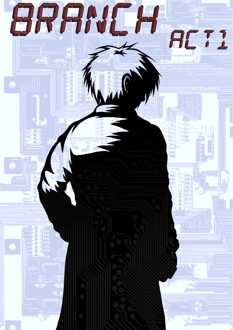
I have my ‘ACT 1’ cover but I intentionally made it as a stand in and it feels somewhat inadequate for a printed iteration. Not only do I need art and text that will wrap around both covers but the importance of an appealing advertisement cannot be underestimated; people say don’t judge a book by its cover but quite honestly most of us do, particularly with comics where the visual aesthetic has such a major role in what’s being read. Not having a cover prepared for a comic strikes me as being like not having an outfit prepared for a dance ball – showing up naked is not the way to go with either.

Putting it bluntly a new cover is my most urgent priority right now. I’ve got some design ideas as to how it might look, but rather than simply charging into it blindly as I have every other time it seemed prudent to do a little homework and look for possible inspiration and pointers amongst my own comic collection.

So, without further ado here’s a small – though varied – cross-section of my favourite first volume covers along with why I think they work:

Transmetropolitan: Back on the Street – Cover art by Geof Darrow

Starting with something truly cyberpunk for the sake of relevance, Darrow’s first cover for Transmetropolitan is a fine representation of Warren Ellis’s grubby future and unhinged protagonist ‘Spider Jerusalem’.

Considering Spider’s portrayal first, he’s pretty much centre stage here much as he is in the comic itself, seemingly looking at the viewer while holding a confident pose; from this alone we already get a sense of his personality as the fearless gonzo journalist, his chain smoking also being openly displayed while his strange tattoos suggest a complicated and unpleasant history. The way his skin has been left largely uncoloured is another nice touch too, giving him an otherworldly kind of quality while creating a strong contrast with the backdrop – a indication of his charismatic presence perhaps?

The background itself meanwhile appears to be consciously muted in greys, greens and dark blues to keep the emphasis on Spider and thanks to the raised angle seemingly stands beneath him –another character hint – and is packed with litter, grime and filth of several varieties. This is evidently a used future and not a pleasant one at that.

The title format is a nice finishing touch I feel as it embodies a sort of trashy magazine look thanks to font and orientation down the side, a representation of the story’s news focus and once again its pervasive grubby atmosphere. The back cover is a little uninspired by comparison, being a recycled image of spider against and abstract backdrop, though points for quoting one of Spider’s best lines: “If you loved me, you’d all kill yourselves today.”

100 Bullets: First Shot, Last Call – Cover art by Dave Johnson

A more stylised effort here; Johnson’s work captures Eduardo Risso’s high impact art for the series while emphasising the premise and neo-noir tone.

The whole character-collage thing with covers and posters can go horribly wrong in some cases but what pulls it altogether here is the fact everyone pictured falls under Agent Graves’ shadow. Connotations of control, conspiracy, mystery and evil are all present but most of all it neatly encapsulates the central premise; Graves appears offering someone the chance for revenge, a perfect murder with 100 untraceable bullets, in almost every case casting a proverbial shadow over their lives.

The restrained colour palette works in favour of the general look too, preventing the image from feeling overcrowded or messy. Almost everything is black and blue against a white backdrop, an echo of classic noir’s monochrome stock perhaps or least another way to help make the cover design feel cohesive. The exceptions of Graves’ orange sunglasses and the red title text simply help draw more attention to them initially, catching the viewers eye first before they assumedly look to the cast – a nice solid hook for intrigue and purchase.

Appleseed: Book One – Shirow Masamune

A resolutely old school 1980’s manga cover drawn by Shirow Masamune before his descent into a dark realm of underclad women and overbearing technophilia…

Ahem, anyway there’s nothing particularly clever about this one but for the most part the straightforward design works in its favour; Masamune is clearly confident enough with quality of his artwork to put it front and centre unhindered and since much of Appleseed’s appeal arises from its cool cyborgs, robots, mecha, vehicles and firepower, showing them off up front is by no means a bad idea.

Besides this, the focus is firmly upon two things: the relationship between Deunan (the lady) and Briareos (the big cyborg) along with a large scale struggle to establish a peaceful future on post apocalyptic earth. The close relationship between the two characters is made explicit by how Briareos literally carries Deunan here, while the background earth covered in lights and computer marks indicates the epic scale of the story and connected technological themes.

I suppose it’s pretty cheesy but it must have done something right to make me buy it…

Preacher: Gone to Texas – Cover art by Glenn Fabry

Fabry’s covers stand apart from my other examples in that they actually appear to have been painted, marrying uncanny realism with the supremely grotesque content Preacher explores. There have been ongoing attempts to get TV and film adaptations of the series off the ground but in most cases they seem to have stumbled due to the sheer level of controversy and gruesome material involved. Preacher may well be able to push so far since its impact is arguably softened through the filter of a comicbook, what I love about its covers is how they strip that away and display this world down to the last cringe inducing wrinkle, bringing if far closer than you’d comfortably like.

Preacher’s first cover is one of its best; our titular preacher Jesse Custer – looking very Michael Keaton – smirking over the flaming wreckage of his own church; the event which gave him his troubling new power ‘The Word’. Combining the elements of religion and gleeful destruction it’s a fair statement of intent for what to expect; suffice to say if you’re a devout Christian of the “ban this sick filth” persuasion then the awaiting orgy of violence, horror and gallows humour probably won’t be your bag, for most others the direct stare and grin are a morbid invitation: “Go on. Read me.”

Special mention should go to title and subtitle fonts too, both aspiring to an old west aesthetic, A fitting touch given that I’ve always felt Preacher is a western at heart. Besides having probably hundreds of references to the genre, take away the modern day setting and fantasy elements then there’d be absolutely no doubt; that and Jesse has John Wayne as an imaginary friend…

Top Ten: Book 1 – Cover Art by Gene Ha and Alex Sinclair

If I liked 100 Bullets for its conservative style then in the case of Alan Moore’s Top Ten it’s the sheer amount of little details which won me over. Gene Ha’s covers and art for the series are always packed with things to look at and small jokes, making it pretty much sublime to my mind in combination with Moore’s standard of writing. As should be evident from the pictured cover it’s an ensemble cast again, but with one crucial difference to what most would instinctively draw; It’s completely anti-dramatic.

To give a little context Top 10’s central conceit is that everyone in the world is a superhero, from top executives right down to the homeless, being special is really nothing special. As such, the ‘Top 10’ of the story are a police force tasked with keeping this burgeoning population of the super powered under control and frankly, having a hard time with it. While they are all super in some way, at the same time they’re all completely human and fallible, often to hilarious effect. At the end of the day they’re cops who just happen to have powers, so picturing them standing around talking over lunchtime coffee seems completely appropriate.

It’s a witty and somewhat refreshing twist compared to Marvel style WHAM BAM! covers, the appeal arising from the intrigue and humour of seeing the heroes being distinctly un-super… Still being completely honest I’m sure the part about ‘Multi-Eisner Award Winner’ and the name ‘Alan Moore’ probably went some way to helping.

Parasyte: Volume 1 – Hitoshi Iwaaki

What the hell is that?!

But seriously, I like this one and indeed all of Parasyte’s covers for the sheer weirdness factor. It’s a demonstration that a covering image doesn’t always need to feature attractive characters or stylised collages; if it’s genuinely bizarre and imaginative enough sometimes it’s enough to get people reading.

Aaaanyway, having run through a bunch of professional covers, returning to my own with fresh eyes what could be better?

Mostly, I feel like it’s too flat and too basic. As I’ve covered there’s nothing wrong with a strong simple cover but there’s really not enough here to make people care. A shadowy figure with their back turned tells us very little on its own; it might of cut it within a printed issue but not as the sole image promoting it.

Just about every example I’ve looked at suggests something about the characters and plot, so in this respect a viewpoint and rendering style showing more of Scratch in a more interesting pose makes sense, an emphasis on her cyborg features would also be a good move in relation to the human-machine symbiosis themes the story explores – It might even be worth getting her full figure in to so areas such as her hoofish feet can be shown for additional intrigue.

I’m of half a mind to include Curt on the cover as he is effectively co-protagonist but I wonder if this might be unnecessarily complicating things (e.g. including a sweaty, cyberphobe on the cover may not appeal as directly an ice cold cyborg detective).

There are things I’d like to keep though such as the alphanumeric title design, while I’d also like to reuse circuit pattern effect on the shadows as it adds a more original touch and adds further emphasis on the idea of a dependent relationship between people and technology.

Bottom line, I won’t know what works for sure until I try. Time to get experimenting!


Page 21

April 30, 2012

Excuse me as I pick the tar out from between my toes (see the end of the last post). Obviously out later than planned though hopefully better for the extra spit and polish here’s page 21!

There a few things of note here, mostly in relation to the change of scene as we return to the spaceport lobby. For one it should be evident to anyone who flicks back to page 11 or earlier how much the rendering of the art has changed; linework and colours are far cleaner and less murky creating what I hope are clearer, stronger images. It’s annoying that the stylistic continuity has taken a hit in the process but it’s better that the larger changes are made now than later, in an ideal world I’d redraw the backlog but time isn’t on my side so for the immediate present I shall be pressing on…

The colours themselves aren’t as striking as with the previous scenes, moving back to a less restricted more subtle palette of oranges and browns off blues and greys. Besides the practical change of location and consequent lighting I felt that it was time to turn down the intensity for a little while and wind up the tension again for the next major beat of the story – in relation to this, I’d like to draw attention  to the use of repetition on this page.

Pauses and reoccurring elements if used heavy handedly are liable to simply create tedium, but they can also help garner a sense of unease between events, creating a rising rhythm and suggestion that we are waiting for something to happen. Emphasising an awkward pause in a comic is an odd affair as sense of time is often determined by reading speed; a dramatic moment the author intends to be held may well be skipped over in an instant by an impatient reader given that they are ‘in control of the acquisition’ (Eisner, 1996, page 52).

What I’ve done here in effort to create the impression of an uncomfortable pause is use three panels that are almost the same but with varying details; I didn’t want to just repeat the same image three times with gratuitous copy and paste – it tends to derail my immersion in a comic when I see recycled art – so I reused the composition for each but gave the characters slightly different expressions and poses, thus holding the moment while hopefully avoiding tedium or literally appearing to stop the comic.

An additional area of pseudo repetition I’d like to point out is the first panel; an entirely new drawing but with composition which echoes a panel from page 11 (looking past the security guard over the desk) and to a degree the first panel from the previous page. Whether these touches register with reader subconsciously or knowingly it should in theory dial things back a few notches while maintaining the feeling of impending danger I’ve been developing along the way.

One last minor mention I should make is that I changed the colour of Scratch’s trench coat now that it’s in neutral (i.e. not green) lighting. In early concept art it was greenish-grey but it struck me that brown-beige was a better fit for both the character and comic’s colour schemes, it also pushes it closer to the kind of 1940’s trench coats I based it’s look off in the first place.

That’s all for now folks!