Influence: Mike Mignola’s Hellboy

February 29, 2012

I’ve decided to try something new here; given that lately I’ve had difficulty finding time for research writeups and been increasingly locked into production itself it seemed a slightly different approach might be in order.

Up till now I’ve largely written about films, comics and other illustrative sources in a kind of review style which has been stimulating and a lot of fun, it has however proven to also be quite time-consuming. I’ve looked at a lot of sources which have influenced my artwork and storytelling but often not had time to acknowledge them properly as I felt obligated to do a lengthy analysis or nothing at all.

To change things up a bit I thought I might do a few smaller summaries of ‘influences’ giving a concise rundown on exactly what I like about them, why they’re relevant and what I should take from them. I’m not going to stop doing longer reviews altogether, but this way I can cover a lot more material and prevent embarrassing periods of inactivity on my blog.

So, without further ado…

What is it?

Hellboy Volume 1 (Library Edition) containing Seed of Destruction and Wake the Devil; a rather generous Christmas present from a good friend. I’d heard lots of other big names in comics talk about Mignola’s work but previously my only real exposure to it had been through the brilliant (though sadly unsuccessful) TV pilot to The Amazing Screw-On Head.

What do I like about it?

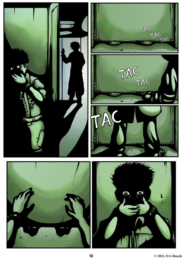
Lots. Admittedly the story and characters are a little too dry for my tastes to begin with but it’s quickly made up for by bold artwork, strong atmosphere and a quirky sense of humour. Similar to Miller’s approach with Sin City, Mignola’s art style creates dramatic images that are in many ways remarkably simple; what it lacks in detail it compensates for with eye-popping contrast of ink black shadow and colour with strong composition. Special mention should additionally go to the memorable character designs and use of typography too.

How is it relevant to my own work?

Being placed firmly within the fantasy genre thematically there isn’t much relevance to a cyberpunk comic, on the other hand, stylistically I found a great deal to draw upon. While the visuals seem to have more of a gothic than noir lean, they adhere closely to the idea of ‘less is more’ with details tending to be minimal or abstract. Almost every scene is bathed in pitch black shadow with emphasis upon highlights and silhouettes, nurturing a brooding atmosphere and fitting sense of lurking danger. Handled differently it might have appeared clumsy and incoherent but Mignola always knows exactly what to exaggerate and what to hide.

What Hellboy demonstrates is that not seeing everything can result in imagery that is not only economical but more distinct and eye-catching than a cluttered maximalist approach creates in many cases – suggestion rather than rigid visual explanation if you will. Being so understated the art doesn’t always amaze on an obvious level perhaps but it’s always clear, streamlined and effective.


Pulling Faces: The Art of Paddy Hartley

February 23, 2012

I must admit recently I had lost track of the college’s lecture programme, having missed a fair number of talks under the assumption they were on hiatus before learning they’d restarted again. We’ve previously had some very interesting and inspirational speakers from a wide variety of mediums and last week’s was no exception.

I felt  Paddy Hartley (or ‘Patrick Ian Hartley’ as he’s sometimes known) was worth at least a brief mention here as his work stems from interests in body modification that are comparable to my own. As his website puts it, the majority of the art’s focus is on ‘the way in which the human body is changed, modified and reconfigured either by choice or circumstance’ – unintentionally or otherwise, it certainly has a post-human ring to it.

Originally commissioned a decade ago for an exhibition ‘Short Cuts To Beauty‘ at London’s V&A Museum, the striking ‘face corsets’ pictured above and below were made by Hartley in response to a variety of inspirations. Besides projecting a grotesque parody of cosmetic procedures and ways they lift and reshape the flesh he revealed a deeper, more scientific dimension to his work aswell; as part of his research into the project he worked with a biomaterials scientist Dr Ian Thompson, specifically learning about ‘bioactive glass’ and its use replacing damaged parts of the skull due to its remarkably bonding properties with organic matter.

What’s most interesting about all this is that it was a genuine collaboration with benefits to both sides. Hartley learned a lot about facial reconstruction and anatomy from Dr Thompson, however Dr Thompson was reputedly able to refine the casting of implants and further the field generally thanks to Hartley’s expertise in molding techniques. Having ruminated on the possibility of science doubling as art in my Power of Making write-up this certainly makes another strong case for it.

Considering the visual impact of these pieces on a purely visceral level I get an odd sense of conflict. There’s something mildly disturbing, even intimidating about them but in another way they’re actually quite beautiful; despite having no idea how to work a sewing machine when he initially embarked on the project they display a high level of refinement and thought in their design and construction while apparently being rather durable to boot – they’ve even made it through wind tunnels intact!

It seems to me that this conflict extends to the various contexts they’ve been used in aswell; besides garnering artistic acclaim in recent years the corsets have made a rather sizable splash in the fashion world, while Hartley also begrudgingly admitted they’d attracted fetishistic interests he’d rather have avoided. It could be that this diversity in interested parties and applications tells us something about the diversity in reasoning for and connotations attached to body modification generally. Just as one surgical implant might save a person’s life another may be there for altogether more aesthetical reasons.

In line with this, the talk took on a far more serious tone when he discussed one of his other projects ‘Facade’.  Similar to the other collaboration he worked with The Gillies Archives (named after the pioneering plastic surgeon Sir Harold Gillies) focusing on the ‘untold stories‘ of WW1 soldiers who’d suffered severe facial disfigurements. The final pieces (below) integrate photographs of the men in question alongside messages from their letters with replica army, naval and airforce uniforms.

The masks in particular are a unique touch, with fabric representing the servicemen’s injuries and the then cutting edge processes used to reconstruct their faces. Hartley didn’t elaborate on the exact reasoning behind this design but for me at least it seemed to emphasise the process of repair and replacing what was lost – something my own graphic holds at the heart of its themes.

As a part of all this, he insisted on showing photographs, drawings and diagrams of the men he’d based these outfits on and as much as it shames me to say it I had a hard time looking at many of them. I don’t consider myself particularly squeamish nor am I one to judge on appearances, but seeing such traumatic injuries and thinking about the pain they’d suffered was something I found surprisingly affecting. More than anything, I just felt angry with myself for having this response; given my subject matter can I really justify horror and disgust towards disfigurement and reconstruction when it’s at the heart of my own story?

It’s true that Branch is predominantly populated by characters who’ve already undergone a procedure for cyborg modification and replacements, while for many it’s meant to have been a voluntary rather than necessary decision. Regardless, after seeing historical examples of surgical repairs I feel as though I may not have attached enough weight to the issues I’m tackling.

Besides his aesthetics, if there’s one thing I should definitely take from Paddy Hartley’s work it’s the importance of being able to face the seemingly unpleasant with an open mind rather than revulsion and a blind eye. I might be working in science fiction, but I’d do well to remind myself from time to time of the realities that underpin the ideas and very real people who live them.


Page 18

February 20, 2012

I. Live. Again!

Joking aside though that was a horrendous gap between pages. One I can’t afford to repeat.

It wasn’t as though I spent those weeks on self-appointed holiday as I have been working steadily but the page ending up taking forever. I’d call it burnout, but given how modest my output is I’m not sure that’s an acceptable excuse; to put it crudely my drawing mojo was off kilter and besides a forceful effort to get the project back on track, I had to take a few days out sketching unrelated stuff to rediscover my inspiration. I still can’t promise weekly updates every time, but I’ll do my damnedest to push ahead all the same.

In spite of the shocking delay however – or more likely because of it – this is definitely one of my better pages. Previous efforts have often had areas of clunky composition, wasted space or jarring flow but here the layout seems pretty efficient and streamlined. An additional longshot may have been good but besides that it all appears to hang together nicely and for once there doesn’t appear to be any wasted space.

In regards to shading and colour, I peeled back the heavy black shadows of the previous scenes to alleviate some of the intensity and cool off after the last few pages, there’s still tension but I don’t  want to overcook it.

In lieu of the heavy shadows I tried to introduce a little more depth to the colouring and experimented with a few new techniques which proved remarkably successful; I’ve applied hints of blue/purple to darker areas while making the highlights more dynamic and detailed. The green saturated lighting scheme might be stretching realism a bit at this point but since it’s a comic I think some flexibility can be afforded for the sake of visual expression.

The ghostly look of the reflection in the mirror was something improvised quite late on but it seems fitting, besides clearly showing it to be a reflection it seems to emphasise the sickly panic on Curt’s face while giving Scratch an appropriately ghoulish quality – getting slightly pretentious I could also make a point of how the shine marks on the mirror appear to fracture her figure, foreshadowing a somewhat fractured character.

On the page content itself: I changed quite a bit from the script here simply because much of it just didn’t seem natural on review. Scratch was originally far too chatty, while it stuck me that given Curt’s personality he’d be more likely to babble anxiously in a tense situation than become laconic. Additionally Scratch was far more aggressive and hands on with him but as with much I’ve reconsidered it struck me as heavy-handed and largely unnecessary – in short it’s a case of KISS (Keep It Simple Stupid).

Finally, I’d like to conclude with a more general thought regarding motif.

When I talked about my project with Paul Gravett he was very insistent that I implement reoccurring motifs and iconography. At the time I decided to let them ‘emerge gradually rather than being heavy handedly emphasised‘ and as I hoped I feel like some have begun to develop.

For one there’s barcodes. I have a general fascination with them, but beyond aesthetic I suppose the reason they’ve appeared so frequently is to enforce the idea of what a blurred divide between humanity and technology entails. Considering cybernetic prostheses as products (which they undeniably are in this scenario) does that by extension make the owner a kind of walking product? Even on an everyday level, couldn’t fashion and various other bought accessories we use to define ourselves have a similar effect? Are our identities themselves a kind of product, marketed to the world around us?

Thus far these barcodes have been on bulkheads, luggage and ID badges but here on Scratch’s eye is the first instance where it’s literally a part of someone. It’s not an entirely original concept as similar things have been done in Gibson’s Neuromancer and Ghost in the Shell but it seems a logical – though frankly chilling – direction for cyborg technologies to go in.

On a more shallow level I’ve also inadvertently been using danger stripes a lot, something which has less of a basis in thematic backing and more in striking imagery/lack of imagination on my part. They seem fitting though in the sense that Branch is a hazardous place and right from the off Curt has been walking into rising danger – it’s a motif that needs more development but it’s a start. There is one other detail I’ve been repeating for a while now but I think it’s too early to give the game away on that one, I want to see if anyone notices it and figures out the plot hint ;)

I’ve babbled on more than enough for now so I think I’ll call it and promise more of something soon!


Split Style Disorder (or How I Learned to Stop Worrying and Love Corel)

January 31, 2012

This post has been brewing for a while, a decision I grudgingly knew I’d have to make at some point as the problems became increasingly difficult to ignore. Having just redrafted my statement of intent for the MA’s final module, now seems as good a time as any to set things straight and confirm a significant change in my approach.

Branch is suffering from an identity crisis. Not in the sense I don’t know what to say with the story or that the characters aren’t clearly defined, no it’s in the style where the problem lies.

Starting out with the firm intention of keeping it hand drawn, I took my time penciling and inking the imagery with only colour being done digitally for the sake of feasibility. This method was not without its drawbacks; countless attempts have concluded with slam dunks in the nearest bin while the knife-edge “tremble and you’re screwed” nature of indelible ink often reduced me to a meticulous crawl, still there’s a lot I love about traditional art.

The imperfections often give it a warmth which is lacking from clearcut Photoshop lines, while certain techniques such as crosshatching just don’t seem to translate across the computer screen divide. Irrational as it may sound, perhaps my biggest hesitation to embracing an all digital approach was the feeling of bringing a machine between me and what I’m trying to express, introducing a technique which strips away a significant portion of the humanity the work projects.

At least, that’s how I felt at first.

As I planned out the 12th page and began to introduce my promised noir stylings the first real signs of dissonance appeared. I quickly realised that the hatching I’d been using so extensively up to that point detracted from clearcut heavy black shadowing and highlights I was starting to use, creating something closer to an indecipherable mess than a satisfying image. The two techniques simply cannot occupy the same page without looking odd. I initially assumed this could be dealt with by separating the two looks according to the lighting of scenes and dramatic intensity, but the root of the problem is inescapable. The styles are in a tug of war and until I give myself over to one whole heartedly the end results will always be conflicted.

Also weighing in on this matter is my increasing lean towards digital inking over the last few pages; it started out as an experiment with a single panel on page 13 before being applied to whole pages in the last few. In spite of my initial impressions the process works remarkably well with light and shadow imagery, making it more a process of cutting out highlights than awkwardly planning out shadow on paper (I only have so much ink to waste after all).

More than anything though it makes production fundamentally easier and quicker all round. Being accident prone with both life and drawing, inking over my pencil plans in Corel lets me make mistakes without having to start again, attempt a messy correction or be forced to settle for something I’m seriously unhappy with. I can work at something that’s easy to erase or modify parts of until I have a satisfactory result. Furthermore, applying colour to lines which are already clean and digital feels like a far smoother transition than scanning linework from paper and performing awkward cut and paste actions.

I can’t deny that some things will be lost in this transition, though there are pros and cons to either method; the big difference with using digital linework and a more economical style being that I expect increased productivity and a higher page count by the conclusion of the MA. Hand drawings will continue to play a significant role in my pencil plans and help preserve my general style (as seen above) but thus far everything suggests this new approach will mean far nicer looking pages appearing sooner.

I might also add that it seems bizarrely appropriate that I’m letting machines take a progressively larger role in my production process when the graphic is all about human-machine symbiosis. It’s a bittersweet farewell but I guess this is goodbye to excessive crosshatching and hello to Corel.

I’m sure I’ll pick up my pen again here and there, but I think the machine has won this round…


Expo Confirmed (and other trivial stuff)

January 29, 2012

Following on from the other related post I’ve now gotten my badges/pass for a table at London’s MCM Expo in May so barring the most unfortunate of events I’m confirmed for it no matter what :) There’s still plenty to work on, sort out and decide upon in the coming months, however this sets me an unshakable deadline to gather my work up into a coherent printed volume of some kind.

On the subject of deadlines, I have another college one for next Wednesday requiring me to present a new statement of intent for the final MA project. This provides a good way for me to refocus my goals while taking into account the many developments and changes which have taken place over the masters. However, on the downside it also means I won’t have time to prepare a page for tomorrow; if this is a race to the finish line I need to get more organised and stop taking stumbles like this…

Regardless, I’ll make sure that when the page does arrive it’s worth the wait and since the blog has been research light as of late I’ll see to it I write-up on something a bit more substantial soon!