Practice in Context: Reality calls

June 8, 2011

Having just handed in my folders for assessment and delivered my presentation with a moderate level coherency, my Research Methods and Development module is more or less finished. For a moment at least I can breathe.

Or so I thought until the next module raised its terrifying head…

Okay that’s a complete exaggeration, but in all seriousness the next module has a change in focus which has caught me a little off guard. I’ve been so absorbed by the research, planning and production which is going into my graphic that I’ve given scarce thought as to where I might go with it when I finish or what sort of professional tactics I might adopt.

That said being tasked with making contacts, attending events and considering the context of my work in the real world may honestly be a wake up call I needed. I’ve been far too dependent on convenient college resources while scarcely taking my work outside of my room and this blog. It’s a significant shift in gears from the aims of the previous two modules but as daunting as it may initially seem I can’t deny the obvious longterm benefits.

With around three months to tackle the aims and considerable freedom allowed in approach its nothing insurmountable. My only real concern is that I may have difficulty balancing the work demands with production of the main graphic, something I’m aiming to work into a regular routine rather than the piecemeal updates I’ve delivered so far. I’ve probably said it before, but I’ll definitely need to be more disciplined to stay on target.

For now at least I’ll just be sticking out my feelers to see what’s out there before I decide on anything concrete.


Assessment

June 6, 2011

As expected, in light of my imminent module assessment the last week or so has been devoted to pulling together all my research and justifying the general direction of the project thus far. No bad thing as it made me stop for a moment and think about the strengths and weaknesses in my work as a whole, considering exactly what works and – perhaps more importantly – what doesn’t.

The area of my project I’m most satisfied with over the last few months is probably my study of film noir and how remarkably well its filtered into the sci-fi side of things. I realise the influence might not be readily apparent in my opening pages but I get the feeling that this research will affect the final work for the better bringing greater depth, originality and understanding of cyberpunk’s cinematic ancestry to the graphic.

At the same time I feel that  I may have been leaning a little too hard on film based research rather than theory, novels and my chosen medium; comics. This isn’t to say I’ll be forbidding myself from researching video based sources as there’s still an enormous wealth of material in that area I’d like to study, but I’ll be making an effort to branch out into more diverse mediums and sources in future.

Outside of my research, a recent development of key importance is receiving some professional feedback on my latest draft of the script (a big thankyou to Dave for that). While the response has largely been favourable and the structure as whole isn’t particularly problematic criticism has been made of unnecessary dialogue and exposition in the final act; something I’ll be looking to remedy before it comes to producing the actual pages.

I will however be continuing with production as the opening scenes appear to be solid and it seems important that I power forward and keep things moving. As I’ve mentioned before, I could remain in preproduction for a lifetime and still not be 100% happy with the preparations. Anyhow, all being well I should have a new page up sometime this weekend and be back to business as usual again.

Oh, and on a sidenote I’ve finally got my hands on a usable font program, hurrah! Special thanks to fellow MA student Havi for that one, my dialogue at least will be produced much quicker from now on :)


Page 3

May 28, 2011

Did I really say I was getting faster at these things?

Excuse the inexcusable lateness of this update, I could say it was down to wrangling with minute shading details or distractions mid-week but that in turn would be another excuse. Let’s just say I will definitely push my self for a quicker production schedule. That said I will be taking a week or more out from production as my module assessment is coming up and I need to focus on pulling the last few months of work together.

On the page itself, here we have an unflattering introduction to the story’s other protagonist ‘Curt’; it probably seems trivial at this stage but his unsteady phobic behaviour should hopefully foreshadow some of the key themes further down the line and perhaps provide some clues as to the plot’s direction. It’s additionally worth a mention how his green jumpsuit jars with the predominantly blue/orange colour scheme I’ve been using, emphasising the sense of him being out of place.

Balancing the colour for the scene generally proved a little more difficult than I anticipated. While I do intended to draw upon noir influences for my style I don’t want to dive straight into clichéd gloom and angular shadows – much of film noir starts out in daylight after all before approaching it’s narrative and stylistic ‘heart of darkness’ –  I don’t want to forcibly shoehorn such features in for the sake of it. All the same, my intial colours for the page came out jarringly bright which would be all well and good if I intended a light hearted atmosphere but is completely unsuitable for the tone of cyberpunk. As a solution I applied a subtle blue tint over the panels, giving the impression of the space being exposed to harsh artificial lighting and resulting in a much more even, bleak appearance to the scene.


Tomorrow was another day: Terry Gilliam’s Brazil

May 17, 2011

There are some things I find it near impossible to be objective about.
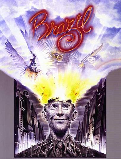
Some years ago during a film night with a friend I stuck on Terry Gilliam’s Brazil on the off chance she might like it. Not only did she not like it, but she refused to sit through more than thirty minutes and then went on to berate me the following week about how I was only into “cheesy 70’s B-movies” (for the record it was made in 1985). She’s not alone in her low opinion of it either it seems: Roger Ebert gave the movie two stars commenting that it was “hard to follow” and that there seemed to be “no sure hand at the controls”, while my copy of Halliwell’s Film, DVD & Video Guide gives it only one star condemning it as “expensive, wild” and “overlong”.

Perhaps the unrestrained outrage I feel towards these opinions says something about just how much I adore Brazil. Gilliam’s more recent efforts are often considered to be packed with original ideas at the cost of coherence, but for me this was always the one where everything really worked and delivered his unique oddity with a powerful punch.

Being genuinely objective though this wasn’t a film which immediately stood out to me as appropriate research material, there’s nothing obviously cyberpunk about the quirky retro-future it presents while some of it has more resemblance to fantasy than sci-fi. However, when I recently re-watched it with a friend who did like it, he pointed out that there may actually be more in common with my project than I initially thought.

Set in a dystopian society obsessed with mindless bureaucracy, there are obvious echoes of 1984 but what immediately makes it stand out from a torrent of other fascistic futures is the streak of dark humour which runs throughout it. The clumsy hybrids of computer/typewriters and ridiculous messaging tubes seem purposefully impractical, while constant paperwork requirements accompany even the most menial of tasks. Anti government bombings are brushed off by the media as being down to “beginners’ luck” while the majority of the populace appears preoccupied with endless shopping.

Even the main plot is bizzarely funny: largely revolving around the pursuit of a terrorist suspect Harry Tuttle, who through a bug related printing incident is mistaken as ‘Buttle’ a harmless family man consequently arrested, with the only comfort offered to his wife being a “receipt for her husband”. It’s from such sheer absurdity that the comedy arises, but the laughs are never entirely comfortable. Ridiculous as it may be the satire remains razor-sharp and more unsettling on reflection.

Were you to substitute the paperwork with more typical sci-fi computers, perhaps the film wouldn’t be too far off from cyberpunk after all. However, what really made me reconsider its relevance is the connection to classic Noir and by extension my subject genre. This is not to say there are venetian blind shadows cast at every turn or continual crooked angles, but the fashion and general aesthetic of the setting seems to draw primarily from a 1940-50’s vision of the future, albeit with extra piping. There are sensibilities here which approach those of steam rather than cyberpunk, but the post-modern fusion of aesthetics isn’t too far off from my own aims to infuse my design with something of the parent detective/noir genres.

Perhaps the protagonist Sam Lowry also has a little in common with the central characters from both genres as well; being heavily alienated by this society and in pursuit of an elusive love interest – dangerous enough to be considered a femme fatale – continually kept out of reach by the barrage of red tape. He makes for an inept, bumbling detective figure but he just about qualifies all the same. As a government employee in an unremarkable position, Sam takes a curious middle ground as someone clearly frustrated and out of step with this world who is simultaneously a part of the machine, his own enemy you might say.

In contrast to this continual bureaucratic drone we are intermittently shown vivid snatches of Sam’s dreams, depicting him as a winged warrior in pursuit of beautiful flying woman. These more typically Gilliam setpieces start out as an escapist fantasy offering insight into his suppressed desires, but after spotting his dreamed love in reality as the considerably more boisterous truck driver ‘Jill Layton’ he begins a hectic pursuit of her and the parallels quickly become more prominent and disturbing.

Possibly the most striking of these visions and allegorically most relevant to my own themes is a gigantic samurai who confronts him wearing armour decorated with electrical components – a representation of the bureaucratic machine as well as the literal one – a monstrous fire bleeding antagonist who when defeated is revealed to have Sam’s face under the armour, lending further weight to the idea of him being his own worst enemy.

Also, while it may only be a subplot the constant cosmetic surgery Sam’s mother and her friend receive throughout the film perhaps bears some connection to my own themes of human body modification. As with much of the film it’s played to darkly comedic effect but this is certainly humour which occupies an uneasy middle ground; the idea of unpleasant truths being concealed beneath a surface of outward prettiness as a layer of formalised documentation euphemises torture and the Gestapo like activities of the government.

This is where I get to the spoilers…

Much as I observed the rising clash between real and the wired in Lain, here a comparable crescendo takes place as the film progresses with an inevitable conflict set to occur when dreams collide with reality. As Sam attempts to subvert the sinister attentions of ‘information retrieval’ away from Jill his unattended paperwork and disregard for the authorities around him finally catches up.

Arrested and taken into a brutal interrogation by a man he formerly considered a friend, everything looks set to end horrifically when he’s abruptly sprung from torture by Harry Tuttle in a dashing rescue. Fleeing the government complex and demolishing it behind him everything looks set for an idyllic happy ending after a reunion with Jill and an escape to countryside.

It’s here that the film’s bittersweet masterstroke is delivered as we are returned to reality, revealing that Sam never left the chair he was strapped in having simply gone mad during the torture and retreated into his imagination, along with the additional implication that Jill was killed by information retrieval after all. It’s an ending which I find still ducks under my defences and hits where it hurts.

More than a valuable example of an aesthetic fusion, I suppose what really compelled me to include Brazil in my research is its sheer brilliance as piece of emotionally engaging science fiction. It’s packed with ideas, humour and satirical charge but not at the expense of cogency (well for me at least) surprising the viewer in its final moments with a conclusion which may well be sadistic but far from heartless.

It’s unfortunate that an altogether less satisfying conclusion awaits my Halliwell’s Film Guide now at the bottom of a recycling bin. Sorry Mr Ebert, but I think I’ll stick to Empire from now on…


Page 2

May 16, 2011

Seems I’m starting to get faster producing these things, though there were some tricky aspects to the page all the same.

If I was channeling Frank Miller for my cover, here it would be fair to say I had Stanley Kubrick on the brain; specifically my recent viewing of 2001: A Space Odyssey. Besides having one of cinema’s most memorable barmy computers and a practically unmatched epic scope the film struck a chord with me predominantly thanks to its meticulous space sequences and establishers. Modern sci-fi has a tendency to rush by the details of  technology and travel, whereas 2001 took it’s time to set the scene and let you soak it in.

Branch is really not intended as a space opera in spite of the story taking place on board the titular station, rather this is a means to isolate and more sharply define the cyborg focused society. At the same time it’s of distinct importance that I establish my world and its situation early on, while emphasising the other protagonist’s arrival. Once things move inside the station there won’t be much in the way of external establishers so all the more reason to take a page out showing it.

As mentioned drawing it proved trickier than I’d initially thought though. The issue with space settings in comics is that the dark composition tends to absorb traditional black line work and swallow up the overall image as a result. To get around this I took some artistic licence and lightened things up a little opting for a dark blue rather than pitch black backdrop, something which fits nicely with the blue-brown colour palette I’m developing.

The stars also proved a problem as it was hard to find an intensity that seemed credible without drowning out the foreground images. Hand drawing them didn’t really work, so in the end I created a texture in Corel and applied it as a translucent layer over my backdrops picking out a few brighter stars here and there for good measure.  It’s not a perfect fit for the graphic style but it’s infinitely better than my initial astral scribblings…

Finally, there’s the earth itself. This was something of an afterthought, but as it came to colouring it occurred to me that the traditional old green and blue might not be the case with our future home world. Call me a pessimist but it seems a fair bet that the planet won’t look quite so pristine in the near future; hence the lean towards polluted grey-browns (which again conveniently fits with my overall colour scheme). It sets a grimmer tone than I initially intended maybe, but it does serve as an effective signifier that time has passed and things have become more desperate.

Cheery stuff eh?