Platform Expo

March 27, 2011

As an experience in connection with my studies, the college rather kindly bought me a ticket to the local Platform Expo so today I took a stroll down to Hull’s KC Stadium to check it out.

I didn’t do much actual gaming there given the domination of ‘pods’ by sweaty 14 year olds – a grown man wrestling for a controller is not good look –  but there were enough interesting stands, talks and examples of bizarre cosplay to keep me preoccupied regardless. Initially looking into the concept art section I flicked through a few of the portfolio’s and was pretty awestruck at both the quality and sheer quantity of the art within. It’s a little daunting to see such rigorous work processes laid out like that, and while it was inspirational it also made me question whether my own output is below what it should be. Either way, for better or worse I’m glad I saw them.

Squeezing past the Master Chief, some storm troopers and a particularly eye catching Princess Peach I dropped in on a talk about copyright and trademarking. I’ll confess to having limited interest in the legal side of the creative industries but this lecture was something of an eye opener, giving a rundown on the dangers of pitching a new concept and how to protect it in turn. I’m not saying I’m going to be putting a ‘TM’ after my updates anytime soon but even if this isn’t of immediate use to me, I’m certain it will be in the future.

I finished up with a visit to the 18+ section – again this was seemingly populated by 14 year olds, again I was unable to wrestle a controller free. What it did make me realise though was that despite being a longtime gamer at an expo focused on the games, they weren’t necessarily the most interesting aspect. Rather it was the workings and planning behind the industry that really fascinated me.

It was nice to escape my desk for a while and recharge my inspiration batteries. All the same, I’m glad I don’t have to battle for a go on my console at home…


Print Making

March 25, 2011

Feeling on the one hand that I should make the most of College resources during my MA while on the other I’ve been encouraged to experiment I decided to learn something new earlier in the week and have a shot at traditional print making. Strictly speaking it isn’t the first time I’ve done it as I have taken part in workshops previously, but given that this was three or four years ago with poor results at best it was with a fresh mindset that I approached the technique again. Cutting rather than drawing an image certainly takes some getting used to but in the end I got somewhere.

The image above was the result of a lino print I created based vaguely on my Nightmares in Neon concept for Baby Face. I attempted to go for the same effect of semi-lit edges using crosshatching taking the negative printing into account, but unfortunately forgot to consider its reversal – hence the eye being on the wrong side and the initials in the corner being backwards. Furthermore, rather than spreading ink on the work surface first before applying to my linocut, I foolishly slapped it straight on resulting in my first prints coming out of the press blotchy or incomprehensible. Fortunately one of the tutors showed me how it was done though resulting in the clean version you can see now.

As far as first attempts go it’s pretty crude, my lack of skill being all the more evident looking at the other work made in the college printing room. All the same, I’d definitely like another go when I get the chance as I’m adamant I can do better, and for all my ineptitude it was actually pretty fun…


Concept: Street Level

March 23, 2011

Excuse my recent absence, I was away longer than I’d like and WordPress went down when I finally did have something to post. Anyway I present to you the fruits of my recent labours:

This concept is a first in more than one respect; it’s the first full colour image I’ve created for this project (excluding my previous experimentation in shades of blue) while it’s also the first piece to feature two of my characters within the same scene. The latter point I felt was especially important, the intention here being to portray a quieter moment placing emphasis on more subtle body language over action or high drama. Scratch is laid back whilst remaining cold and calculated – a casual smoke in hand but a backwards glance and straightening of the tie suggesting caution. In contrast Curt’s neurotic personality is suggested respectively by a wringing of the hands and eyes focused on the ground.

I should also note that this is the first time I’ve drawn my setting from a street level perspective; something which proved a challenge thanks to the curved cityscape but is ultimately reassuring to have tested, appearing much as I’d have hoped. The characters fit into the setting convincingly while there should be just enough sci-fi evident in the backdrop to keep things intriguing.

Possibly the most troublesome aspect of the piece though was the colours, specifically creating a palette suitable to the mood but also striking enough to make the background and foreground distinct. As with previous colour work I used Corel Photo Paint 11as while I am competent with Adobe Photoshop I can work quicker with the former thanks to its preferable toolset and streamlined interface.In terms of the distant and immediate buildings, I gave the foreground a brown-orange hue and set it against a background of blue-grey tones to play upon complimentary colours and make the nearby scenery standout. I kept both of these elements fairly muted to evoke an appropriately grim atmosphere but also to avoid drowning out my characters. In contrast I made Scratch and Curt as brightly coloured as I dared to draw the viewer’s attention to them first.

Just as I attempted to communicate each character’s personality through pose and body language, so too have I tried to embody something of it in their colour scheme. Scratch is predominantly coloured with blues and greys to represent her cynicism and calm machine-like approach while emphasising her symbiosis with technology – the hard beetle like shell of her prosthetics and implants only furthering this sensation – Curt’s organic nature meanwhile is embodied through the green jumpsuit, while it could also be tied to less favourable (though appropriate) connotations such as inexperience, jealousy and sickness.

Generally speaking the concept is a sort of benchmark for the graphic itself, being a kind of prototype for the look of pages in the production phase. Truthfully I spent a disproportionate amount of time working on it and I can’t claim I’m entirely happy with the result but as ever it marks another significant step towards getting this thing off the ground and something to build upon further in my future work.


Sin City: The Hard Goodbye

March 10, 2011

It occurs to me that I’ve made mention of Frank Miller’s Sin City a few times now in relation to my concept work without including a specific write up about it on this blog. Having read the first instalment The Hard Goodbye (1991) and included an entry in my folder I figured one was in order here.
Prior to reading, I was already something of a Miller enthusiast thanks to The Dark Knight Returns (1986) but had little knowledge of Sin City beyond a few glimpsed pages and the Robert Rodriguez movie adaption. His art here remains identifiable largely through the grizzled protagonist ‘Marv’ resembling TDKR’s aging Batman, poses featuring his billowing trench coat recalling the latter’s cape. At the same time though the approach remains quite different.  Style and technique here are minimal, eschewing colour in favour of stark black and white compositions; an approach which sets the graphic apart from the author’s preceding work.

The titular setting of Sin City is probably most notable for never specifying its location or exact period. References are made to everything from war torn Baghdad to 1950’s fashion trends. While this is only my take on the reason behind this ambiguity, I feel perhaps the intention was to free the story from restrictions of an exact backdrop, allowing the purest homage possible to the collective film noir and pulp fiction of the 20th century; a mish-mash of cherry picked influences you might say.

Though the influences may be worn on its sleeves, the story quickly sets itself apart from a plethora of similar works with some distinctly unconventional elements. Take the love interest Goldie for example – rather than being developed through a gradual romance she is introduced at the start in an opening sex scene before being abruptly murdered; a swift entrance and departure certainly but one which provides a genuinely compelling motive for Marv’s ensuing revenge. Elsewhere I think it’s fair to say most hardboiled detectives wouldn’t be caught dead visiting their mother’s house to collect a gun and yet it’s a moment which pushes past the established clichés and injects a sense of reality into the melodrama. The formula is pushed and warped in unexpected ways but remains uncompromised, for all its idiosyncrasy Sin City keeps a foot firmly in its subject genre.

Marv himself makes for an unlikely detective figure too: self described as dim witted and ugly he never hesitates in resorting to violence while an unspecified mental condition causes him to imagine things or become “confused”. He’s an anti-hero certainly but frequently appears alarmingly monstrous even by this measure. Besides inflicting injury and torture upon his enemies comparable to even the story’s worst villains, the inhuman amount of damage he takes from guns, cars and weapons throughout furthers the image of him being a sort of abomination.

I formerly mentioned how the opening murder provides a genuine motive for Marv’s actions later but at the same time the constant introspective narration seems to challenge this idea.  While he does have a personal stake in avenging Goldie there’s something oddly wanton to the glee Marv takes in the carnage, as he puts it to his parole officer “This is big and I’m right in the middle of it and there’s no place I’d rather be.” Perhaps in this sense the character is intended as a comment upon the audiences’ insatiable thirst for violence and tales of revenge, these moments of excess hinting at a metaphysical purpose for his existence and the carnage: to entertain the readership’s own dark desires.

Alternatively, I may be over thinking what is in essence a guilty pleasure. There’s a near continuous deluge of fighting, sex, murder, prostitutes, torture and cannibalism across the pages with few punches being pulled in the depiction of brutality. The violence isn’t mindless but nor is it particularly subtle either. Were I asked to consider which it has more of between style and substance, I wouldn’t hesitate to say style.
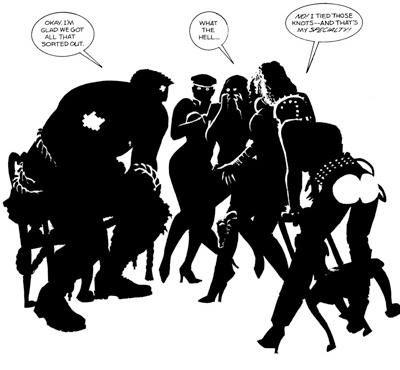
Fortunately it is in style that Sin City really excels. At times it can seem deceptively minimal for a graphic novel, characters and frames often lacking the firm outlines so commonly associated with comic books, but these economical black and white inks are ultimately all the more impressive for so clearly suggesting characters and scenery with so little. Patterns of light and shadow result in truly striking poses and expressions while bringing the stark contrasts of classic era noir to mind.  More outlandish touches often add a surreal element to the atmosphere too, something which seems all the more fitting in light of the protagonist’s deranged mind state. The classic noir silhouette is often inversed presenting light ghostly figures against a dark background as opposed to visa-versa, while the plasters on Marv’s battered face are occasionally highlighted as well covering him in tiny neon crucifixes – perhaps in reference of having the Cardinal Roark as a villain or alternatively portraying Marv as some twisted form of Martyr for Goldie; punishing the wicked only to take the fall for everything at the cost of his life.

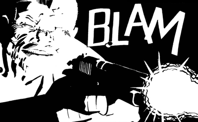
Given the smaller page size, emphasis on mood and large amount of action Miller fittingly opts for less panels of a larger size, allowing the artwork to take centre stage and really shine as a result. Occasionally the layouts can seem quite bizarre in this regard with a drawing only taking up a small portion of the page, but I suppose this only serves to draw focus on the moments in question, setting them apart from other sequences and giving them breathing room. Special mention should also be made of text such as onomatopoeias, with sound effects and exclamations often being a seamless and integral part of the art – the famous “BLAM! BLAM! BLAM!” page being a strong example of this.

Looking at the similarities Sin City bears to other works, beyond the obvious film noir inspiration I can see elements of Eisner’s The Spirit in the art – which Miller coincidentally directed the unfortunate film adaption of – while it doesn’t seem a stretch to suggest that more recent works such as 100 Bullets may have taken note of the economical style and technique used here too. If I were to take one thing from the book it would be that sometimes less is more, the suggestion of an object rather than a clear cut depiction being enough in itself, while often being far more interesting and atmospheric. Detail and realistic depiction isn’t everything.


Concept: Nightmares in Neon

March 8, 2011

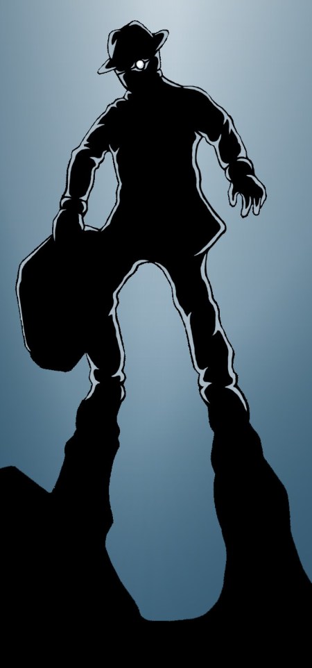
Having some free time today I felt like experimenting a bit, this being the result:

Antagonist Baby Face in a suitably menacing pose. What's in the case? You'll have to wait and see...

Again it seemed a cold mood was in order so I used a similarly restricted palette of blues to my previous concept of Scratch but placed all the focus on the character – Baby Face – and removed scenery altogether going for a super abstract silhouette. Having recently read Frank Miller’s Sin City: The Hard Goodbye I suppose this started out as an attempt to emulate him to some degree, however I was also considering the dark suited villains of classic Noir and the way their presence would be emphasised through high contrast lighting and threatening shadows.

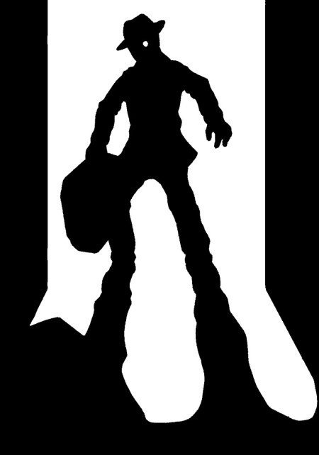
I added the highlights around his figure via computer on a whim as it appeared a little too stark against the coloured background with just a pure black outline – perhaps not an entirely successful effect but one which adds a greater sense of atmosphere and menace I think. Additionally I’ve included the basic black & white version below for comparison. Note the walls and slightly different arm/body shape, changed for the better I felt but then I quite like the original’s simplicity in some ways.

Original hand drawn version of 'Nightmares in Neon'

Which do you folks prefer?