Page 1

May 11, 2011

Okay, it’s late and I seriously need to get some shut-eye so I’m afraid this will have to be quick.

What’s good: I’ve finished my first page and it doesn’t look half bad if I do say so myself. True I could have been more adventurous with the scene’s lighting and colours but I felt it wouldn’t hurt to go for something simple and clear in the opening panels as I find my feet. I went for a scheme of warm brown-oranges playing off cold blue-greys as representation of the clash embodied by Scratch herself – namely between human and machine – while I also deviated from my page plan adding an additional panel (the ear) to make it clearer that the voice is from a coms device, not her.

What’s bad: It took far longer than it should have. I have the excuse of spending time on the cover and having some fairly malignant formatting issues but the bottom line is that I need to be much faster in future if I want to stay on schedule :(


All Systems Go!

May 7, 2011

Having run the latest by my tutor earlier this week, as I had hoped he agreed with my decision to enter production and start drawing the actual pages! I’m still testing the waters so to speak; gauging what sort of rate I can realistically work at in relation to the graphic’s final length, but otherwise it looks like production is definitely go.

One thing I have changed my mind on however is holding off on page uploads. Previously I had been printing off all concept work to run by my tutor, the problem now being that with every graphic page being in colour and  liable to see alterations according to criticism I would end up burning through a fortune in coloured ink cartridges. A fortune –  it goes without saying – which I do not have. Alternatively, uploading the pages to my blog allows me to maintain a work flow similar to that of the planning stage while making the images accessible just about anywhere without the need for costly printing.

It also means that anyone following this blog online can read the graphic online as it’s made, offering additional interest and criticism; which to my mind is no bad thing :) As you may have noticed there’s a new ‘Read it!’ tab on the toolbar where I will be collecting the pages in a similar manner to that of my concept gallery, while I shall also be doing write ups as usual on each as they are uploaded – assessing their strengths and weaknesses.

Anyway, to get things rolling I’ve made a sort of chapter cover for the first act:

I’ll be leaving the main covers until the end of production it seems, but I felt it would be a good idea to punctuate the three ‘acts’ of the story with chapter covers to make it a less unwieldy read. The intention was to have something relatively stark & experimental compared to the actual pages; I played with idea of giving it a subtitle or having more going on but in the end it seemed that something simple gave a stronger impression.

Looking at it, I’d say I was channeling a bit of Frank Miller influence into the stylised silhouette though the circuit patterning is something I thought of following my recent viewing of Serial Experiments Lain’s echoing some of its bizarre symbolic texturing. Essentially I was trying to present a fusion of Noir and cyberpunk aesthetics, while making a nod towards the intended themes regarding cyborgs and the blurred line between human and machine.

It’s not perfect as I still have a dozen insatiable niggles, but hopefully it’s a solid start.


Entering Production

May 2, 2011

I’m using the entry title tentatively for now as I still need to run everything by my tutor for approval, but it would seem that (as planned) I’m finally ready to begin production on the main graphic.

Truthfully, it’s hard not to feel a little nervous about starting something I’ve been planning and researching for months, but it’s also exciting seeing things start to take shape. Having completed my 2nd draft of the script I’m now confident it’s strong enough for me to begin pencilling rough drafts of the actual pages.

I say ‘rough’ but I’ll admit that I put some extra effort into the example above; it’s doubtful the page plans will remain this detailed, but it seemed important that I set the bar high, so when it inevitably slips further down the line it won’t fall too far. As can  probably be seen this opening page introduces us to Scratch as our central detective figure, highlighting her indifferent attitude while also firmly establishing the premise of a world based around cyborgs and technology within the opening panels. Generally I wanted to keep it simple with minimal speech to efficiently set up the themes and tone of the narrative without being overly complicated.

The plan is to draw up a batch of roughs like this before I start work on the inked and coloured versions, while I’d also like to build up a buffer of those which I am satisfied with before uploading to the net. To make an optimistic estimate; if I get the go ahead then the pages themselves should begin appearing online sometime next month. Fingers crossed…


Concept: Deadly Serious

April 8, 2011

Just a little something to keep things moving here:

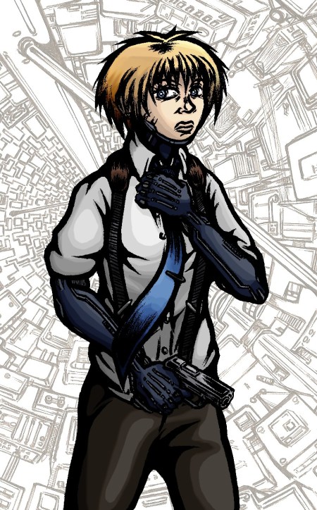
Despite suffering a particularly malignant ‘hands won’t draw’ day earlier this week I eventually got this small concept together. Nothing particularly new or adventurous content wise I’m afraid but it did give me an opportunity to experiment with my colouring technique a little more and to consider Scratch’s general look without the coat on.

In my recent concepts I’d been reliant on layers of colour filters and brush strokes, here however I made stronger use of the dodge and burn tools to create highlights and shadow resulting in an altogether different appearance to the character. As before I can’t shake the feeling it came out a little too bright, but I’m otherwise pleased how the colour scheme fits together with the sharp blues playing off the more muted greys and browns in a distinct arrangement.

And yes, I finally succumbed to the cliché and included a gun in a concept. Forgive me D:


Concept: Street Level

March 23, 2011

Excuse my recent absence, I was away longer than I’d like and WordPress went down when I finally did have something to post. Anyway I present to you the fruits of my recent labours:

This concept is a first in more than one respect; it’s the first full colour image I’ve created for this project (excluding my previous experimentation in shades of blue) while it’s also the first piece to feature two of my characters within the same scene. The latter point I felt was especially important, the intention here being to portray a quieter moment placing emphasis on more subtle body language over action or high drama. Scratch is laid back whilst remaining cold and calculated – a casual smoke in hand but a backwards glance and straightening of the tie suggesting caution. In contrast Curt’s neurotic personality is suggested respectively by a wringing of the hands and eyes focused on the ground.

I should also note that this is the first time I’ve drawn my setting from a street level perspective; something which proved a challenge thanks to the curved cityscape but is ultimately reassuring to have tested, appearing much as I’d have hoped. The characters fit into the setting convincingly while there should be just enough sci-fi evident in the backdrop to keep things intriguing.

Possibly the most troublesome aspect of the piece though was the colours, specifically creating a palette suitable to the mood but also striking enough to make the background and foreground distinct. As with previous colour work I used Corel Photo Paint 11as while I am competent with Adobe Photoshop I can work quicker with the former thanks to its preferable toolset and streamlined interface.In terms of the distant and immediate buildings, I gave the foreground a brown-orange hue and set it against a background of blue-grey tones to play upon complimentary colours and make the nearby scenery standout. I kept both of these elements fairly muted to evoke an appropriately grim atmosphere but also to avoid drowning out my characters. In contrast I made Scratch and Curt as brightly coloured as I dared to draw the viewer’s attention to them first.

Just as I attempted to communicate each character’s personality through pose and body language, so too have I tried to embody something of it in their colour scheme. Scratch is predominantly coloured with blues and greys to represent her cynicism and calm machine-like approach while emphasising her symbiosis with technology – the hard beetle like shell of her prosthetics and implants only furthering this sensation – Curt’s organic nature meanwhile is embodied through the green jumpsuit, while it could also be tied to less favourable (though appropriate) connotations such as inexperience, jealousy and sickness.

Generally speaking the concept is a sort of benchmark for the graphic itself, being a kind of prototype for the look of pages in the production phase. Truthfully I spent a disproportionate amount of time working on it and I can’t claim I’m entirely happy with the result but as ever it marks another significant step towards getting this thing off the ground and something to build upon further in my future work.