A3 Ensemble Piece

August 8, 2012

Ever found yourself in that situation?

Where you’re in the middle of something and you just happen to spot a bit of dust on a table? It could wait, indeed it can wait but you can’t. It’s there on your peripheral vision, burning a gaping hole in your attention. It’s got to go.

So you wipe it away, only now you look closely the table is covered in the stuff and you quickly resolve to start what you finish, scrubbing away with naive optimism unwittingly dislodging an avalanche of grey snow; reinforcements quickly follow too forming a vanguard of dead moths, fluff and crusty hairs from parts unknown. You open a window in an attempt to offer a peaceful solution but the invasion is underway; counter attacks have already begun on your nasal passage and eyes. Negotiation is out of the question.

Surrounded with battle lines drawn and full-blown war against the filth all but inevitable you shoulder the vacuum cleaner with a heavy heart and wonder why you ever trifled with that harmless little dust fluff…

Since you’re probably wondering where the heck I’m going with this overblown analogy I’ll get to the point; allegorically I had that dust situation with the above piece.

As I outlined in my exhibition plan my last hung piece (15) was intended to be a collage made up from existing artwork at A3 size, however as I started piecing it together I couldn’t resist the urge to tinker. It started out small with lines being thinned out for the sake of uniformity or the odd hand being redrawn but before the long that intention had spiralled out of control; the more I changed the more edits I wanted to make and in the end what started out as a quick collage became a full-blown artwork.

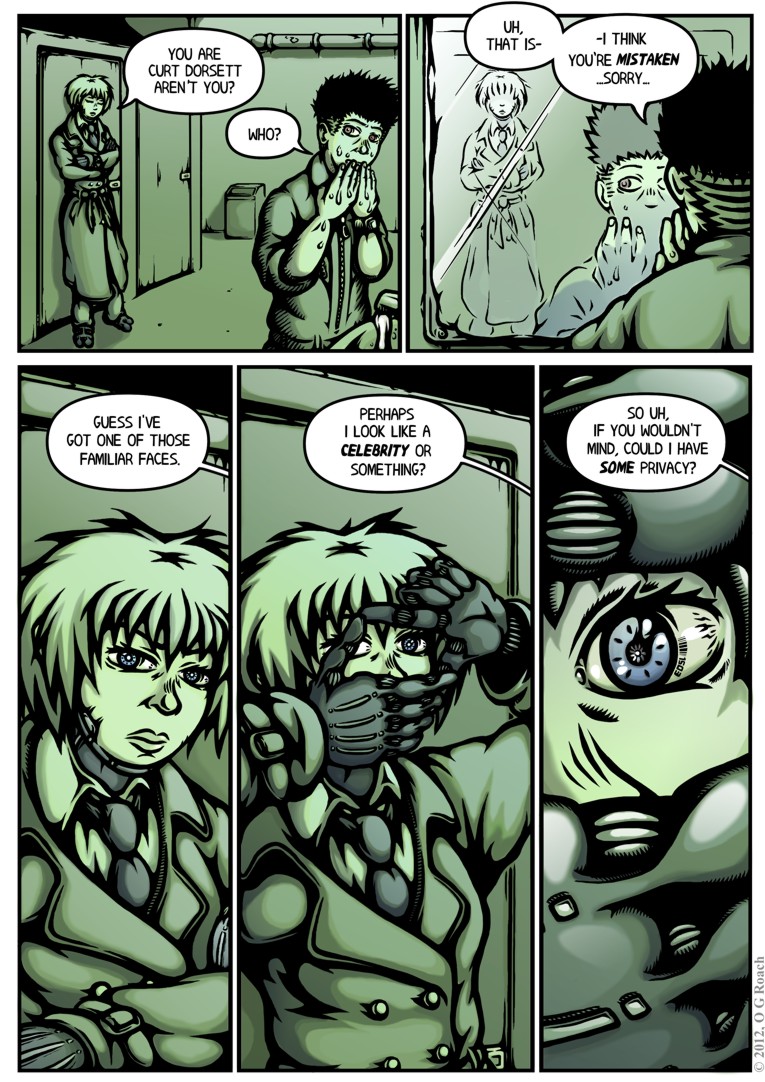
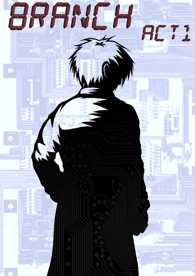
Though the end result here is all new, some of the poses will likely be familiar as they are based off old work but the lines and colours are completely redrawn. I went for an ensemble image of Branch’s key cast since it struck me that I have very few promotional pieces; I’ve done a fair amount of work on the comic itself but didn’t get around to creating much in the way bonus or self-contained art. Having felt this lack acutely at the last MCM Expo besides using it here it could additionally be useful for when I’m trying to sell myself in such situations.

On the technical side it’s worth a mention that I tried some new colour and shading methods here; I applied some very faint texture overlays in an effort to create a more interesting kind of graininess and character to clothing and hair, while I also endeavoured to give greater depth to shadowing and more sharply defined highlights. It’s experimentation so the results are slightly hit and miss but as always it’s good to be freed up a bit and try new things.

At any rate, ideally this should make for a strong closing piece to my exhibit, capturing the essence of the comic and its characters generally while breaking up the relative monotony of A4 art on show. There’s a lot more I wanted to do with it that time wouldn’t allow and of course I could of saved myself a lot of work by making a more modest final effort, but for the most part I’m glad I pushed myself this one last time for the MA. While Branch will be ongoing my formal studies end here and it seems only right that ensure everything finishes with a bang rather than whimper.

Strangely, I’m rather glad I decided to pursue this creative dust fluff!


Issue 2, Page 1

July 20, 2012

My deepest apologies on it taking so incredibly long to get issue 2 off the ground properly and indeed to anyone whose blogs and stuff I’ve failed to follow in recent weeks – things have been a tad hectic.

As I’ve noted/raved-about previously the MA is quickly drawing to a close and pressure has been on to wrap my current progress up into an exhibition and justify my the direction and development of the project as a whole. My maiden issue makes for a nice point to evaluate Branch as a formal Masters piece, but if I want to be serious about finishing this thing on my own time then I can’t start slacking off. Much of the worst panic is over for now as I have a relatively clear idea of what I’ll be doing for the next couple of weeks  – which is not to say I can promise regular updates, but I can promise the next page won’t take a month to materialise.

As for the page itself, I’m generally pleased with the overall effect as it quickly draws us into a tense situation with an immediacy my opening issue lacked. There’s a nice sense of balance to the layout and composition with steely hands forming the focus of two frames situated diagonally from each other, while the palette strikes me as an improvement aswell, being more cohesive than previous pages with a progressively cooler colour temperature as the dramatic tone changes.

Still, there are a few things I would/should have done differently: the last two panels really feel like they needed detailed rather than abstract backgrounds – there’s too much wasted space and it breaks the immersion a little – on a similar note, while the spaceport isn’t meant to be especially busy a few extra people dotted around would have been nice to enforce credibility and realism.

Elsewhere, a friend pointed out that Scratch seems a little off in the second to last panel, I was aiming for an alert sort of expression but it came out lacking the intensity required somehow. Up till now she’s typically appeared bored and I didn’t want to plunge her into ridiculous OTT bulging eyes and furrowed brows the second trouble appears but still, it’s not quite right… It’ll be something work at over the next few pages either way.


Issue 2 Cover

June 7, 2012

Branch: Mint edition!

Given the generally positive feedback I received on the last issue’s cover this one follows on from its template in most regards; I’ve been trying to establishing a running style and the mix of noir shadowing with circuit patterning seems like a solid representation of Branch’s mood and themes.

While I want to create a sense of visual continuity between installments though I was also conscious here of the need to differentiate them in some fundamental way. One of my customers at the MCM Expo talked with me about how they often forgot which purchases of a series or a particular author’s work they’d made between conventions, consequently putting them off the follow ups. In recognition of this problem I completely overhauled the colour scheme for this issue, maintaining what I hope to be recognisable stylings in a radically different flavour.

The orange-reds off grey-blues in my last cover were meant to emphasise the clash between human and machine – while also being a complimentary arrangement to catch the eye – here I reprised the greens in an echo of Scratch and Curt’s initial meeting to continue enforcing a sense of queasy unease as things become progressively worse for our downtrodden delivery man. The formerly red title also felt a little too extreme against these colours so I changed it to cooler looking blue to create a stronger sense of cohesion in the design.

On the content: I’ve been getting some feedback from people eager to see action and indeed this issue will be trading much of the last one’s intrigue for more in the way of excitement. I never specifically intended Branch to be an action comic but Scratch is a character of few words prone to expressing herself physically rather than verbally – she’s not a murderer but she’ll quite happily resort to violence, making full use of her prosthetics and the advantages they allow.

Perhaps it sounds like I’m getting a bit ahead of myself, but I’ve opted to loosely base Scratch’s fighting on kung-fu styles; I’ll save the exact details for another post, but along these lines I’ve been giving some thought to exactly how Scratch might fight. The idea of her being a trained thug of considerable self-confidence would suggest a refined level of skill – namely martial arts – and while I’m not planning to devote huge amounts of research to it (as fighting isn’t the story’s focus) I feel a reference model would lend greater credibility than clumsy abstractions. Besides the fact that Kung fu is the only martial art I have any hands on experience of, the directness of it strikes me as a good fit for a hyper efficient cyborg.

Hence the basis for the feisty pose. I toyed with the idea of her and Baby Face grappling as a cover image but felt compelled to include Curt given his role as co-protagonist and as a distinctly human counterbalance to Scratch’s OTT bravado. I want to avoid the heroic/badass stereotypes as much as possible and having Curt pathetically tailing Scratch with her coat hopefully takes the edge off the dramatic pose a little.

Anyhow that’s enough blabbing for now, I need to get back to work on what’s going inside this thing…


Page 22 + Printing for the Expo

May 22, 2012

Well here it is, the conclusion to Branch issue 1…

This may not be my best page but at least it gives some sense of the issue/chapter going somewhere as the threads mesh together. Curt realising his delivery has being stolen more or less concludes the introductory section and marks an important shift towards the main plot.

On the downside I haven’t covered anywhere near as much of the story as I would’ve liked though. The first third of my script was written with the intention of setting everything up and giving readers a balanced cocktail of excitement, drama, intrigue and dark humour; as it is I manage about half of that first act here, with the majority of my favourite moments infuriatingly just around the corner. There’s no use in dodging it, I need to work faster.

Not that I haven’t been working hard. I doubt it shows in the finished piece but I seriously short-changed Mr. Sandman this weekend finishing this last page for the printers. I’ve still got red roadmaps all over my eyes and the kind of complexion which has people barricading doors and brandishing crucifixes…

Still, I guess it was a valuable lesson in working economically, I didn’t get time to do everything I wanted to with this page though maybe that was the point. While the backgrounds are a little sparser than usual and the shading less detailed the flow appears reasonably clear. I could quite easily have spent another four-five days polishing this up and adding things in but would it have been worth the additional wait? Maybe having an unbreakable submission deadline yesterday demonstrated the kind of discipline I’ve been lacking till now.

Anyway on that note it’s at the printers now and will be ready just in time as I leave for the MCM Expo. As planned I’m going with an A5 colour format going for a suitably modest price of £4-5 – I’ll see how it sells :p Given that it’s the first time I’ve done something like this I’m naturally terrified, but like everything on this project I’m sure it will be a useful experience even if it isn’t a massive success. I’ve had various people telling me to get my work out there in physical form so I can at least say I’ve finally given it a shot – that and seeing other folks at the comic village should also be a lot of fun!

I’ll post again before I set out to London, in the meantime I just need to make sure I’m prepared. Stay tuned.


Cover Complete

May 9, 2012

Like most things this took longer than I would have liked, but as I mentioned previously people are more likely than not to judge a book by its cover and I really wanted to make sure that even a glance will leave an impression. As usual there are the perennial gripes over the details, anatomy and rendering, however this may well be the best cover I’ve ever made.

That’s not really as big an achievement as it sounds, all my past efforts have been single sided, ramshackle affairs, typically rushed out as something quick between story pages; the difference here was making an investment of time, thought and care that the former desperately lacked. It’s a long way off perfect, but it stands head and shoulders above my initial effort

The above version of the cover is intended to wrap around the printed issue I’ll be peddling at the MCM Expo, though it can just as easily be halved for a web version. I already showed the black and white drawing of Scratch, the background meanwhile is loosely based on an old bit of concept art with the original figures removed – they were wonky – and the setting itself re-rendered to fit with the heavily shadowed noir vibe style.

I kept the colour palette down to oranges playing off blues and greys as I felt it would create a stronger impact than the alternative. Personally speaking my best pages thus far appear to be those with a simplified scheme, creating a more intense atmosphere and more striking imagery. As I’ve mentioned on several occasions, much of Branch’s colour schemes is based out of oranges of blues with the intention of portraying the symbiosis between humans (warmth) and machines (cold), here I wanted to boil that theme and aesthetic down to its essence, making it as overtly obvious as possible.

Besides the titles though, Scratch is the only element of the cover in orange; it could be taken as being symbolic of her ultimately human qualities beneath the cold exterior, in truth though I was more interested in emphasising her alienation – cyberpunk protagonists are typically such, but without giving away too much it does become a key part of her character development later. On a visceral level, it also ensures she pops out from the setting being the immediate focus of the viewer.

On the translucent circuit textures; they were largely to create a more intriguing and surreal image but again, thematically support the themes of human-machine symbiosis, with technology seemingly lurking beneath every shadow – I should credit Lain with sparking this idea through its similar use of red splatter in the shade – the Branch station is built out of technology, though more pertinently it has literally become a part of people.

The specific background features should tell people things about the story as well; the curving cityscape is shown in the background establishing an important aspect of the setting, there is notable wear, tear and grime indicating it to be a used future along with other decidedly unsettling aspects.

With an initial version of the cover I showed a friend which had Scratch on her own he told me it looked a little too barren and that I ought to capitalise on the sense sleaziness indicated by the posters next to the Treenet booth and have a couple in the back alley. Given my intention to disturb rather than titillate with this I may have pushed a little further than intended, it started out as a kiss/embrace but now looks somewhat more explicit.

Still, the potential shock value isn’t necessarily a bad thing as controversy and sex do tend to draw interest, as an Expo newbie it may well work to my advantage catching attention and given the places the storyline will eventually go a darker cover is perhaps a fairer indication of content. Also, yet again in line relation to my theme a fusion of very human sexuality juxtaposed with freakish cyborg appendages seems quite appropriate.

Finally, the titles. The main one proved quite a headache, with several scrapped attempts before I made something I was happy with. My original alphanumeric title appeared too spindly for the most part and either sunk into or jarred horribly with the rest of the cover. The final redesign (which I’m quietly proud of) is essentially a heavily mutated version of my original title font, fleshed out with extra bordering and a chrome style finish. It may be a touch too forceful for my liking but its bold and ideally grabs your attention.

Following on from my point about shock value, the new issue/act subtitle is an addition I added feeling it had an amusing double meaning. The immediate assumption that it’s one of English’s foulest swear words is offset by the reveal on page 6 and the alternative connotations in relation to the story’s context. As a way to intrigue and sneakily build immersion I think there could be something in it, regardless it’s more interesting than some bland ‘ACT 1‘ caption.

There’s always more that could be done, but I’m hoping that as an advertisement of content this does the job. A blurb felt unnecessary on the basis that it’s going to be relatively short and I’m hoping the image will be enough to get people reading, what I need to put all my energies into now is getting a few more pages out of the door before printing so I can deliver a satisfactory ‘to be continued’ and not some vague dropped-off-a-cliff cutoff.