Page 12

November 13, 2011

With this page I tried to take some risks with the style and use of colour to match rising tension with appropriately intense visuals, something which bizarrely may have reduced production time on paper and digitally. I would probably of had this one out in three to four days if I’d worked straight, but prep for the symposium and my computer’s current helpful habit of locking up every few minutes (thank you again repair centre) held it back a bit.

I’ve tried to make a stronger connection to my noir influences here by using heavy shadowing in place of crosshatching; hence why drawing took less time thanks to details being obscured. It’s primarily a stylistic development but to keep it credible I’ve had it brought in with a scene change to somewhere which would assumedly be darker instead of the washed out spaceport lobby. It’s also worth noting that by blanking out the features of the entering figure (Scratch) we get a sense of Curt’s situation within the cubicle – being unable to determine their identity, enhancing the sense of an unknown menace.

Special mention should also be made of the colours. Thus far I’ve predominantly stuck to browns/oranges complimenting greys/blues in an effort to manifest the clash between organic and artificial at the heart of the story. What I can’t help but think though is that Curt forms a sort of anomaly in the scenario, being completely human and unfamiliar with the station and its occupant cyborgs.

When choosing colours for my character designs I decided on the green colour scheme for Curt to emphasise his personality and flaws. So it is that here I’ve drenched the toilets in overpowering shades of green in an attempt to subconsciously extend Curt’s character to the environment and atmosphere; emphasising his phobia’s, sickness and generally cowardly nature without having to unload a ton of exposition on the reader. In the same way the blast of blue light which accompanies Scratch’s entrance contrastingly emphasises her cold personality and firm manner, while also enhancing the sense of her bursting in on Curt’s life as the blues run over the greens.

I’ll tentatively say that I’m happy with this one as it seems to deliver the sort of striking impression I’d envisioned in the script. I worry that the flow of the panels could be clearer perhaps, while it’s let down by some of my usual wonky anatomy but otherwise it turned out much better than I frankly expected it to.


Page 11

November 4, 2011

What was it I said about taking a ‘ridiculously long time’ last page? The only excuses I can offer up for the majority of the delay this time are obsessing over trivial details and my typically slow technique. I would have had it done a little sooner but after being struck by another ocular migraine – and foolishly attempting to ignore it – I ended up wasting a day recuperating in the dark. Ack.

Putting pathetic excuses aside though, what of the page? Well, ignoring the obligatory botched panel – I swear there’s always one – I rather like how it turned out.

As you may have noticed the layout and composition is much tighter here than in previous efforts. I tried to use space as efficiently as possible overlapping panels and going right to the edge of the page. This was partially to introduce more variety into my presentation and escape more predictable templates, but also to reflect a shift in tone as the plot begins to gather momentum. With the discovery of Curt’s unexpected cargo a more intense atmosphere takes hold of the story, so I wanted this emphasised by the more claustrophobic arrangement.

I tried to take more risks with shading/colouring than usual too; exaggerating the monitors glow to draw attention to the unsavoury discovery. Not strictly realistic, but hopefully a fitting stylization to help the transition over to the more intense pages which will follow. Also, take note of the slightly more noirish features appearing in the 2nd panel, something else which should hopefully prevent the aforementioned transition from jarring with earlier material.

As is becoming an unavoidable habit, I deviated from the script here again on two major points. For one, I cut away the arrival of Scratch  at the spaceport since it seemed unnecessary and somewhat deflating for her entrance in the next scene (more on that when I’ve drawn it). Secondly, the dialogue between the attendant and guard here became considerably more explicit, which might seem like a silly matter to draw attention to but it struck me as being a great deal more credible. When things go wrong the common man is less likely to spew out carefully considered prose than they are to erupt into swearing.

There are inevitable detractors, with the bottom left drawing being a little sketchy and the backgrounds maybe being a touch too crude for my liking but I feel confident that the tone of the page hits the mark pretty squarely at least. Anyway, with the plot getting more exciting now the next few pages should be a lot of a fun to make :)


Page 10

October 12, 2011

Late but seemingly satisfactory – here’s page 10!The last two panels honestly could have been better in terms of anatomy and composition but I’m generally pleased with how this one turned out. The last page ended up looking a bit flat so I tried to give the colours/shading greater depth and complexity here, without pushing too far away from the established scheme to maintain continuity.

I’d say more but I really need to crash for a bit. I’ll make sure the next page doesn’t take such a ridiculously long time.


Concept: Deadly Serious

April 8, 2011

Just a little something to keep things moving here:

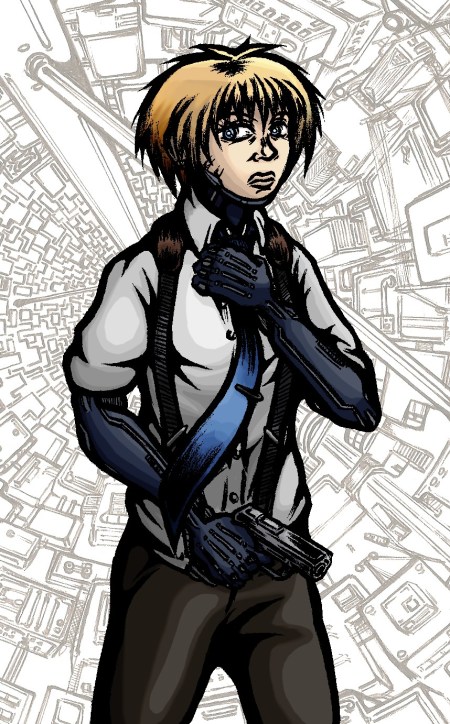
Despite suffering a particularly malignant ‘hands won’t draw’ day earlier this week I eventually got this small concept together. Nothing particularly new or adventurous content wise I’m afraid but it did give me an opportunity to experiment with my colouring technique a little more and to consider Scratch’s general look without the coat on.

In my recent concepts I’d been reliant on layers of colour filters and brush strokes, here however I made stronger use of the dodge and burn tools to create highlights and shadow resulting in an altogether different appearance to the character. As before I can’t shake the feeling it came out a little too bright, but I’m otherwise pleased how the colour scheme fits together with the sharp blues playing off the more muted greys and browns in a distinct arrangement.

And yes, I finally succumbed to the cliché and included a gun in a concept. Forgive me D:


Concept: Sasaki’s Den

April 2, 2011

Here’s a somewhat psychedelic addition to my concepts:

As I outlined in the original post for her design; Sasaki is someone of immense skill when it comes to computers and technical activities at the cost of just about everything else – hence her ‘den’ being something of a garbage heap. In one regard at least she serves as comic relief for the story, but her dysfunctional nature and living space also highlight the drawbacks of a life built around technology.

Unlike Scratch, Sasaki only has minor cybernetic augmentations rather than full replacement prosthetics – her use of externalised equipment pushing the character closer to reality than other more developed cyborgs in the narrative. Besides the Augmented reality helmet – and unseen virtual keyboard assumedly projected in front of her (expect a concept) – I was intentionally restrained with much of surrounding scene, making it not too dissimilar to the kind of slobbish dwelling that would exist today.

In line with the graphic’s themes, the concept is intended to depict contradictory symptoms of advancement and neglect, reflecting a very real social problem that’s arisen from our internet culture. Sasaki embodies a worrying misallocation of priorities, disregarding much of our real lives in favour of a more manageable online identity and its attached functions. Technology is an inherently blameless thing, but as with almost anything it can be taken to extremes and end up being abused for warped purposes to the point where it becomes consuming.

I took a risk by going for a more lurid colour scheme this time around, using a complimentary play of green monitor lighting against dark red shadow. Again this emphasises the technological domination of the space, while giving the scene both exciting and sickly qualities in line with the subject’s personality. Its got a few rough edges but it marks an interesting departure from the norm away from more conventional colouring and ultimately possesses a stronger sense of atmosphere.