Page 13 + More Life Drawing!

November 20, 2011

This page pretty much continues in the stylised vein the last one did, so much of the composition and its colour choices are for the same reasons. However, as usual there are a few noteworthy additions and decisions.

The pace has slowed dramatically and what I’m covering here in three to four pages arguably could have been summarised in one, but still I feel it’s worth taking a pause here. The focus of this scene is upon two things: Curt’s rising fear of cyborgs and Scratch’s imposing, steely demeanour, both of which will be of increasing importance to the central theme of the narrative as it progresses. While previously there was a lot of information imparted through dialogue, here I want the visuals and mood to do all the talking for a moment.

Considering the technique itself; while I normally pencil and ink all my linework by hand I do clean it up digitally after scanning and occasionally correct mistakes, with the first panel here I tried something a little different as an experiment. Having penciled the panel in rough I scanned it in and worked over it in Photo-Paint, beginning with a purely black overlay set to 50% transparency and cutting out the highlighted areas. This wouldn’t have worked were it a well-lit scene featuring cross hatching rather than heavy shadow, but in this case the results weren’t half bad inadvertently having a slightly Geoff Grandfield quality. I’m not changing over to an entirely digital production process anytime soon, but I may well dabble in future.

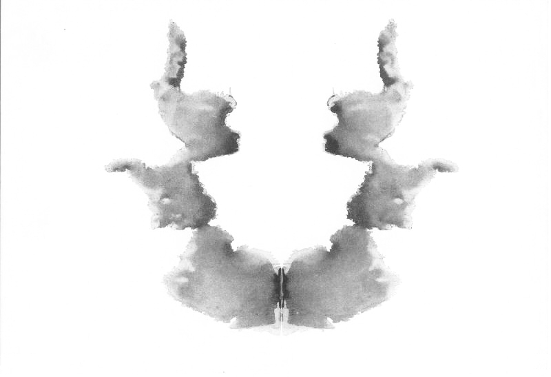
My favourite panel is probably the fifth taken from POV, mainly for its simplicity. Being almost symmetrical with the shadowing connecting into a surreal whole it has a sort ink blotch feel slightly reminiscent of a Rorschach test card. There’s something surreal and unsettling about it which taps into exactly the kind of mood I want.  The weakest panel meanwhile is easily the last one. The way the light splashes across Curt’s chest turned out okay but the hands just look too small, even after I reworked them.

…And on the subject of weak anatomy, a spot of good news is that I’ve gotten back into life drawing this week!

Despite having the same model as last year the new classes are run quite differently; favouring a series of short three-minute poses alongside a longer one (above – I won’t post the quickies since they’d burn your eyes). Fast drawing is not one of my strengths, but for this very reason perhaps being forced to do so will prove good practice in the long run.

Regardless, it’s another step in the right direction to refine my technique and help reduce my anatomical embarrassments.


Page 12

November 13, 2011

With this page I tried to take some risks with the style and use of colour to match rising tension with appropriately intense visuals, something which bizarrely may have reduced production time on paper and digitally. I would probably of had this one out in three to four days if I’d worked straight, but prep for the symposium and my computer’s current helpful habit of locking up every few minutes (thank you again repair centre) held it back a bit.

I’ve tried to make a stronger connection to my noir influences here by using heavy shadowing in place of crosshatching; hence why drawing took less time thanks to details being obscured. It’s primarily a stylistic development but to keep it credible I’ve had it brought in with a scene change to somewhere which would assumedly be darker instead of the washed out spaceport lobby. It’s also worth noting that by blanking out the features of the entering figure (Scratch) we get a sense of Curt’s situation within the cubicle – being unable to determine their identity, enhancing the sense of an unknown menace.

Special mention should also be made of the colours. Thus far I’ve predominantly stuck to browns/oranges complimenting greys/blues in an effort to manifest the clash between organic and artificial at the heart of the story. What I can’t help but think though is that Curt forms a sort of anomaly in the scenario, being completely human and unfamiliar with the station and its occupant cyborgs.

When choosing colours for my character designs I decided on the green colour scheme for Curt to emphasise his personality and flaws. So it is that here I’ve drenched the toilets in overpowering shades of green in an attempt to subconsciously extend Curt’s character to the environment and atmosphere; emphasising his phobia’s, sickness and generally cowardly nature without having to unload a ton of exposition on the reader. In the same way the blast of blue light which accompanies Scratch’s entrance contrastingly emphasises her cold personality and firm manner, while also enhancing the sense of her bursting in on Curt’s life as the blues run over the greens.

I’ll tentatively say that I’m happy with this one as it seems to deliver the sort of striking impression I’d envisioned in the script. I worry that the flow of the panels could be clearer perhaps, while it’s let down by some of my usual wonky anatomy but otherwise it turned out much better than I frankly expected it to.


Page 11

November 4, 2011

What was it I said about taking a ‘ridiculously long time’ last page? The only excuses I can offer up for the majority of the delay this time are obsessing over trivial details and my typically slow technique. I would have had it done a little sooner but after being struck by another ocular migraine – and foolishly attempting to ignore it – I ended up wasting a day recuperating in the dark. Ack.

Putting pathetic excuses aside though, what of the page? Well, ignoring the obligatory botched panel – I swear there’s always one – I rather like how it turned out.

As you may have noticed the layout and composition is much tighter here than in previous efforts. I tried to use space as efficiently as possible overlapping panels and going right to the edge of the page. This was partially to introduce more variety into my presentation and escape more predictable templates, but also to reflect a shift in tone as the plot begins to gather momentum. With the discovery of Curt’s unexpected cargo a more intense atmosphere takes hold of the story, so I wanted this emphasised by the more claustrophobic arrangement.

I tried to take more risks with shading/colouring than usual too; exaggerating the monitors glow to draw attention to the unsavoury discovery. Not strictly realistic, but hopefully a fitting stylization to help the transition over to the more intense pages which will follow. Also, take note of the slightly more noirish features appearing in the 2nd panel, something else which should hopefully prevent the aforementioned transition from jarring with earlier material.

As is becoming an unavoidable habit, I deviated from the script here again on two major points. For one, I cut away the arrival of Scratch  at the spaceport since it seemed unnecessary and somewhat deflating for her entrance in the next scene (more on that when I’ve drawn it). Secondly, the dialogue between the attendant and guard here became considerably more explicit, which might seem like a silly matter to draw attention to but it struck me as being a great deal more credible. When things go wrong the common man is less likely to spew out carefully considered prose than they are to erupt into swearing.

There are inevitable detractors, with the bottom left drawing being a little sketchy and the backgrounds maybe being a touch too crude for my liking but I feel confident that the tone of the page hits the mark pretty squarely at least. Anyway, with the plot getting more exciting now the next few pages should be a lot of a fun to make :)


Page 10

October 12, 2011

Late but seemingly satisfactory – here’s page 10!The last two panels honestly could have been better in terms of anatomy and composition but I’m generally pleased with how this one turned out. The last page ended up looking a bit flat so I tried to give the colours/shading greater depth and complexity here, without pushing too far away from the established scheme to maintain continuity.

I’d say more but I really need to crash for a bit. I’ll make sure the next page doesn’t take such a ridiculously long time.


Page 9

September 15, 2011

Ack, feel like I’m sneaking into class late here…

It goes without saying that this is another embarrassingly late post as for one reason or another I just couldn’t get the page done until now. I suppose this is especially disappointing given that I’d intended to work for weekly updates now I’m posting elsewhere but it ultimately came down to either rushing out something severely dissatisfactory or delivering a more accomplished page at a later date. I could rave on about how I’m justified by the quality over quantity argument, but I’ll stick with a summary: I suck, I’ll try harder.

Unfortunately things will almost certainly be stalled again in the immediate future as my impending Practice in Context deadline means I’ll have to prioritize my essay till the deadline on the 26th. It’s another area that’s been a little neglected lately and a timely reminder not to lose focus on the goals of the MA, I’ll attempt to squeeze in drawing but I think the next page is liable to appear around the end of the month rather than next week. Sorry but consistent releases will have to wait :(

The page itself is a bit of a mixed bag. I’m getting to some of the more interesting story material now as Curt runs into cyborgs for the first time and begins to develop a phobia which plays a prominent role in the ensuing narrative.

I tried to make his growing discomfort with what he’s seeing apparent in the artwork by emphasising the attendant and guard’s grotesque enhancements; the second and third panels reflect composition and posture between Curt and the man on desk drawing attention to their similarities (both being in fairly low-level jobs) while also stressing the startling difference. The last panel meanwhile marks the rising tension with hard lines around the implants, aggravating their unsettling presence and bringing the guard who was formerly in the background to the centre of the reader’s attention.

While these parts turned out as I’d hoped the effect is unfortunately marred by the weaker first and fourth panels  which suffer from unrealistic anatomy and perspective issues – they’re acceptable perhaps but someway off from my best. The colour too could have been much stronger; I’m aiming for a washed out, overexposed sort of look in this setting but the tones feel a little off balance to me. I’ve likely said it before but colouring is something I’m still adjusting to, with the necessary experimentation naturally leaving some casualties along the way – this page is one of them.

Outside of scrutiny on single panels/aspects though there is a stronger sense of flow than earlier pages, with more continuity and less of the disjointed progression formerly criticised by Paul Gravett. It’s a small thing but progression in anything is good news to me, the sense of imbalance is still pervasive but I’m starting to get a foothold on the problems.

Anyhow, I’ll try to get another page out as soon as I can but for now it’s time to hit the books and get writing.