Science as Art?: The Power of Making

January 14, 2012

Having been in London over the new year, on a whim I visited an exhibition ‘Power of Making’ on its last day at the V&A. Featuring an eclectic array of modern objects including traditional craft, robots, designer lingerie and – most notably in my case – prosthetics, initially I felt so enthused by what I’d seen I’d intended to write about it fresh off the train. That was until the work in waiting collapsed on me when I got home…

Fortunately however I took some detailed notes, so even while my inspiration may have lost some steam in the past few weeks, I only had to open my pad to find it again.

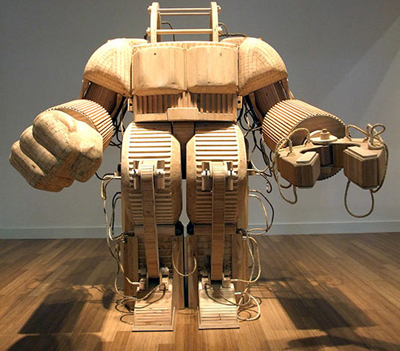
Entering, the eye is immediately drawn to Michael T Rea’s A prosthetic Suit for Stephen Hawking with Japanese Steel (below) a fittingly bizarre construction for a bizarre title. In terms of design it bears resemblance to the power loader from Aliens or an anime style mecha but what really stands out is the fact it’s made of wood. The sort of object we would normally expect to have a metallic production line sheen suddenly adopts an unexpectedly DIY quality, a garden chair dimension that makes it feel more ornamental than it would have in steel or iron.

Following this line of thought, perhaps the intention in using such unexpected building materials was  to make an otherwise impressive creation obviously ridiculous. The title suggestion of Stephen Hawking using this suit in place of his wheelchair is amusingly extreme but also appears to be pointing a finger at the excesses of science fiction, emphasising the gap between the realities of modern machinery and the romanticism of its fictional counterparts. In spite of the obvious lavish care that has gone into its construction, I suspect the motives behind ‘suit’ could be more pessimistic than they seem; expressing disappointment rather enthrallment over the development of technology to date. In other words: where the hell are the androids and flying cars we were promised?!

Contrastingly though there was also a great deal of very real technology on display. Strolling by the unsettling gaze of some artificial eyes I stumbled upon a familiar object:

I wrote about the i-Limb Pulse prosthetic in a previous post and indeed, it was an unexpected delight to see a real one in the gallery. With each finger visibly powered by a separate motor and the apparent dexterity to do up a belt or shoelaces, its marvel is made all the more impressive in light of how recent such developments are; according to the accompanying information (and my own research) prior to 2007 prosthetic hands were typically three-fingered claws, with the same basic pinching action for every task. To have such massive breakthrough’s in the field from this and the Deka ‘Luke arm’ promises much for the future, with the advanced cyborgs of SF not being so far off after all.

Beyond practical and humanitarian prospects though, the i-limb’s presence in the exhibition sparked another interesting thought: can science and its connected technologies be considered art?

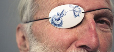
The porcelain eye patch above from ProAesthetics designed by Damian O’Sullivan was on display along with a crutch of similarly decorative design. As the name and image implies this was originally intended to make typically sterile prosthetics and assists more aesthetically pleasing by introducing decorative qualities, however the accompanying notation explained they were never put into production being deemed too impractical and having outgrown their function.

From my perspective these objects did seem ostentatious, but why is that the case? Why exactly are more artistic or culturally refined qualities deemed inappropriate in the supplementation of injury or disability? Are we simply conditioned to expect utilitarian design in such areas or does it arise from some deeper psychological impulse relating to the context of damage or dysfunction? Why does it seem strange to decorate an eye patch but not a tea set?

Their presence in the exhibition solidifies their status as art but seemingly moves them away from serious use enforcing the idea of a divide between application and decoration, but there are other ways the matter might be approached.

The ‘Hexapod’ robots (above) from Micromagic Systems were busy shuffling around a corner of exhibition in their distinctly eccentric manner, their Johnny 5 eyes creating a sense of amusement rather than Terminatoresque foreboding. Regardless, they have impressive applications that could potentially change much in the near future; fitted with interchangeable toolheads and capable of repair or fabrication tasks in awkward places, as the placard put it they ‘promise a world in which factory-style production roams the earth’.

Continuing in this vein, nearby there was also a row of advanced 3D printers; technology which may well become readily available to the common household in years to come with the idealised vision being ‘a machine with the potential to make itself’. If the Hexapods promise a world of roaming factory production, what if these printers promised an industrial revolution within the household? What’s more, suppose such printers came into widespread use of artists in construction of their work? Even if there is a firm divide between technology and art, couldn’t we say that they are interlinked regardless? Sewing machines, pencils, brushes and camera’s may not be appearing on pedestals but they still play an important part in the creation of art. Perhaps this is the ‘power of making’ that the exhibition title itself speaks of.

The lines are ultimately pretty blurry on which of our creations qualify as art and which don’t, which are a boon to human causes and which are a blight but I firmly believe that it is this inherent duality, this sense of contradiction which fascinates and compels so many of us to pursue and develop these inventions. Perhaps it was the show’s most startling juxtaposition which spoke loudest and most clearly of this;  a glass case containing a pair of objects, both beautifully hand crafted, both of similar size, both a similar composition of metal piping with completely polarised applications.

A flute and a shotgun.


Insert page here…

January 9, 2012

I need to be more careful how use the word ‘DEFINITELY’.

It’s no secret that I’m somewhat slow in the art department; an unfortunate combination of misguided perfectionism (my work being far from perfect) and general incompetence. Seeing people who can effortlessly churn out pages of a superior standard in less than half the time frankly makes me green with envy, but I’m not going to get quicker overnight. Regardless, the truth is that I could and should have had the latest up this afternoon as planned.

Yesterday I worked till late/early in a drive to complete the page before stinging eyes and a headache biologically informed me it wasn’t happening. Short of cutting back to stick men and eschewing colour I doubt it could have been done in one night, the real problem however is somewhat bigger. I rave on about trying to be disciplined on a regular basis, but looking back over the past week I can think of literally dozens of small breaks and distractions I might have avoided if I’d planned ahead. A couple of hours on a film one evening, a walk into town here, the compulsive urge to google topics I’m unfamiliar with on a whim; had I just allocated a set block of several hours on the page every day I’m certain it would have been done with time to spare.

So yeah, more excuses :( Rather than pledging to DEFINITELY have that page ready by next Monday, I’ll just say that if it isn’t together by then I simply don’t deserve to be making a comic.  It’s approaching the one month mark since my last page and the credibility of Christmas/New Year excuses is wearing thin.

So, without further ado I’ll do something right by shutting up and getting back to work.


Home Again

January 2, 2012

As indicated by the puerile train-scribble above I’m afraid it’s yet another Monday with no comic update. Between seeing family, a wedding and visiting London this season I’ve certainly had a great time but my working habits have been less than stellar.

I’ll get the other bad news out of the way right now; my promised transfer of the blog’s ‘read it!’ archive over to ComicPress is going on indefinite hold. I could give you some terrible excuse about managing my time or changing my mind, but the honest truth is that I’m having a very hard time figuring it out. I’ve taken a DIY approach with just about every aspect of this project thus far but as Matt Hemsworth warned me it’s the sort of thing I’ll need a real web designer for. I’m sure with some perseverance and a couple of months weeks I could botch together a shoddy effort but that would be time – hey, I made that excuse after all! – I could spend moving ahead with actual comic.

Distribution and promotion will become increasingly important in future, but my first priority was and still is the production of the graphic itself. I dare say I’ll pursue this possibility again and pay for seek out professional assistance when my finances my schedule allows, but right now I’m more concerned about realising what I’ve planned. Having great web presentation for an unrealised comic strikes me as being like selling a shiny car without an engine; the shininess might help, but it’s kind of missing the point. For the immediate future this blog, The Duck and ComicFury should at least be adequate as mirrors for Branch.

On the bright side my holiday wasn’t entirely dominated by lethargy. Wranglings with ComicPress aside, today I went to see a pair of exhibitions in London baring surprising relevance to my project and which I shall no doubt write about in the next few days. Also, I’m a fair way into that next page now and will DEFINITELY have it ready by the start of next week.

With a bit of luck my 2012 resolution to be more disciplined and avoid unwarranted failure compromise should mean more in the way of consistent releases and less apologies and delays. In around six months the MA will be finishing so fingers crossed that the next few months will be productive!

Happy New Year folks!                        


Sasaki Redux

December 20, 2011

Well here you have it, Sasaki has literally become a ‘cyberpunk’. Continuing the direction I’ve been exploring in recent posts, this time around I’ve toned down the slobish aspects and tried to create something more distinct and vibrant, incorporating some of the cyberfashion I looked at last time for a stronger design.

The influence should be pretty evident from areas such as the cowl, straps and leggings, being taken from my previous research images or ones like them. I received a sizable criticism recently about making my characters overly functional in appearance, so here I tried to inject a little more fun into her look, reflecting what is largely a fun character. While being an agoraphobic oddball, Sasaki was also intended as an antidote to the largely serious, angsty cast; a slightly comical addition included to offset the inevitable misery and balance things out.

To summarise the problems with the old concepts: there’s a difference between a character who’s lazy and a lazy design.

The original concept was simultaneously bland and overly complicated, lacking a sense of coordination to the look. The VR helmet on the one hand had far too much going on, appearing bulky and impractical, especially by sci-fi standards. Areas such as the jumper and legs meanwhile lacked much in the way of distinctive features, resulting in an impression that’s both frustrating and forgettable to the casual reader. I’d intended her to look a bit of a mess, but the result is an artistic rather than intentional one.

The biggest change I’ve made is reducing the helmet to an implanted set of cyborg eyes. I’ve kept the spider-like arrangement but in retrospect it seemed strange I didn’t fit them into my cyborg scenario on a character who already has ‘modifications’ and never removes it throughout the script. The four cables running into the back of the hands have also notably been reduced to one, simpler but far more striking as a result.

I purposefully included colour in this design too as it struck me as an important aspect of the ‘cyber’ look. It falls into the orange/blue scheme that I’ve been using for much of the comic, though I’ve gone for a brighter look than usual to emphasise an exaggerated personality; there are still sharp blues representing the mechanical element encroaching on humanity but the orange sweater dominates Sasaki’s design, emphasising warmth and energy of the character. The dyed hair again draws upon the fashion influences and generally punk vibe,  but on an aesthetic level seemed a good way to make her more distinct.

As is becoming increasingly common, I drew over the basic sketch digitally for linework and colour. I process which I’m finding beneficial in some ways and problematic in others. The advantages are the ability to easily scrub out and redraw mistakes until I’m completely happy, while the final result is a lot sharper and easier to colour than my hand drawn efforts. The downside is that it can take a long time to complete art this way as the zoom tool often causes me to obsess over miniscule, barely visible details I’d never worry about in a pencil and pen drawing. Plus, spending all that time in front of a monitor can be a recipe for a killer headache. I’m enjoying the experimentation but I don’t think I’ve nailed down the definitive method just yet.

At any rate, overall I’m much, much happier with Sasaki’s new concept and while I’m not sure it will mesh perfectly with my existing pseudo 1940’s style, it’s better than sticking to a constrictive and frankly boring uniformity. I regret not being able to create a thorough multi angled study as with the original design, but with the tradeoff in time being colour and higher quality drawing I can hardly complain – as an experiment it feels like it’s been a success and what’s important now is getting back to the comic itself and applying the influence on a wider scale.


Do My Cables Look Big in This?: Cyberfashion

December 16, 2011

When I met with the college’s lead fashion tutor last week for advice on character design and clothing, you may recall there was a degree of disagreement. Nevertheless, while I might have been at odds with some suggestions on reflection I found that many of the criticisms rang true. As is often the case with the project I’ve been completely sucked into certain areas while I’ve neglected others – fashion being one of them.

Conveniently and somewhat kindly, Lucy Markham – a fellow MA student – offered to meet up and provide another fashion perspective on my project. Doing so yesterday she threw a number of interesting research ideas my way, but most pertinently she highlighted an obvious area I’ve completely overlooked; besides being a genre, cyberpunk is also a subculture fashion.

To date I’ve been drawing most of my clothing concepts from the early 1940’s in order to connect with genre roots in film noir and detective fiction of the era, which was certainly a better move than falling back on SF clichés. Still, what’s becoming strongly apparent as I progress is the need for variety and range in the character’s appearances; not everyone can wear a suit, tie, trench coat or gown. In order to create a genuinely immersive environment I need to draw upon a broader set of influences.

Having been lead to a number of specialist websites in ‘cyber’ clothing (thanks Lucy!) I’ve spent the last day or so exploring what the internet has to offer, being the most immediate and up to date source for this kind of niche. Indeed, there’s a bigger market for this kind of stuff than I knew, but before I go into the examples which I found useful its important to explain a couple of issues regarding the ones I didn’t.

First of all: cybergoths.

No offence to them or anything. In fiction gothic can work marvelously with more traditional cyberpunk stylings – the work of Tsutomu Nihei being one of the best examples I can think of – still I struggle to find relevance for it in my own project. I’ve tried to remain careful of tone and consistency in Branch’s design and frankly the romanticized nature of gothic influences seems a poor fit for the kind of cynical used future I have in mind. I wouldn’t rule out the possibility of inadvertent gothic touches – one scene near the end of the script comes to mind – but I doubt it will ever become a major influence.

Additionally, while it’s uncommon I noticed a few instances of steampunk and cyberpunk being mixed up or similarly combined. Again, a heavily romanticized genre which elaborates on historical possibilities rather than future ones. Again, largely irrelevant to my own work.

My second set of disregarded sources present a larger problem with cyberfashion: genre awareness.

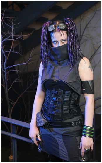
As illustrated by the lady above cyberfashion often plays on cyberpunk themes and iconography, integrating circuitry, parts of machinery and a typically industrial vibe. In reality I find this to be pretty cool, but in a fictional context it becomes more problematic.

The issue is motive. As a real life fashion people adopt the look in order to be idiosyncratic and possibly to reflect adoration of the cyberpunk genre, whereas within cyberpunk fiction a character’s dress will typically reflect the world they live in lacking the self-awareness the former has. To put it another way: in Branch, would characters bother with superfluous circuit patterning and nods to fictional cyborgs when they are already cyborgs themselves? In the end the result would be a broken fourth wall and a loss of immersion.

Excluding these subcategories what I’m left with is a more muted collection of what might be called industrial punk. Suddenly integrating such a thing with 1940’s influences might normally seem like an impulsive move, but looking over my backlog I realized that hints of it may inadvertently already be present. Perhaps it’s from the 80’s/early 90’s SF influence Lynn criticised but touches of punk do permeate the more restrained noir era clothing. Heck, the security guard who appears on pages 9 to 11 was at least partially inspired by a cyborg henchman from Tetsuo II:

Other things like Curt’s decidedly punkish hairstyle arose incidentally from random design ideas and character quirks, still, all the more reason to directly acknowledge the references and research them properly. So without further ado let’s look at some of the research examples that did work for me and talk about why they work:

The trousers pictured above – the first two taken from Bizzare.nl, the last from crisiswear.com – appealed to me thanks to restraint in design compared with most others (e.g. no ridiculous chains, no manskirt, no tribal script down the side etc). Yes there’s still a fair amount of goth exaggeration to the boots, but otherwise things are nice and simple. They have a hard-wearing look probably taken from worker’s gear and while the straps and rivets are fairly redundant they have aesthetic appeal without being over the top. The tool holster on the last image is also a neat addition, further emphasising a sense of functionality with a sort of engineering/technical edge.

Again taken from crisiswear and again striking for its simplicity, I like this cowl because it’s not too over the top. It’s undeniably decorative rather than functional but projects a sense of functionality through inclusion of facets from working clothes; again straps and rivets (beginning to see a pattern here?). It looks like it was made for a practical purpose, even if it’s not.

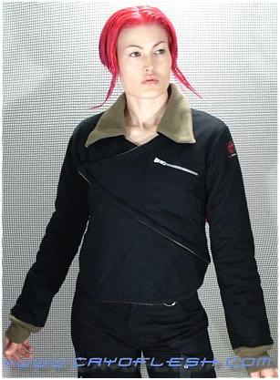
This aviator’s jacket from cryoflesh.com isn’t too different in most respects from its everday counterpart, however the ‘V’ which wraps over makes a bold visual statement without obliterating the garments basis. I also can’t help thinking this may have been influenced by the folding design of Japanese kimonos which brings me to my last example and closing thoughts.

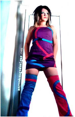
I selected the above ‘spiral out’  here from NerveDamage because it shows a very different side to cyberfashion. Unlike the previous three examples this outfit eschews muted blacks and dark blues and adopts eye searing neon. It’s flamboyant rather than functional, being purely aesthetic. More than anything though these colours, the general design and hairstyle all remind me of the wilder designs for characters in Japanese manga and anime.

Following this line of thought I’ve decided to redesign my character Sasaki with more of a cyberfashion slant. This is partially to provide a sort of prototype to try applying these influences to, while unlike much of my cast she hasn’t been shown in the comic yet giving me freedom to tinker. However, the main reason is that in retrospect she strikes me as a missed opportunity; as a play on Japan’s otaku it seems a shame not to capitalise on the parallels between cyberfashion’s manga/anime influenced designs and the characters ethnicity/basis. Putting aside dysfunctional characteristics she’s also one of the cast’s only truly upbeat personalities whereas the current design conversely seems drab and uninspired. Much of my character design has been relatively formal and muted but if there’s appropriate subject for something a little wilder, it’s Sasaki.

I can’t say how successful this new design direction will be, but hopefully by experimenting on a small-scale first I can get a sense of how well it  meshes with my existing universe and be able to apply it with greater confidence to the wider setting.